Share
Say hello to Avada Programmer. This Avada prebuilt website is ideal for beginners, marketers, professionals and anyone in between. Avada Programmer can be imported at the click of a button and is highly flexible. Every aspect of the prebuilt website is easily customizable, and it can be adapted and branded to suit any business model or venture using the Avada Website Builder.
In this article, we will explore the header, footer, and homepage layouts that make up the overall website structure to explore how the Avada Website Builder is used to create successful websites. The Avada Programmer article is a part of a deconstruction series and is the follow-on article that explores the Avada Magazine prebuilt website. It is important to highlight that Avada gives you total design freedom to create unique layouts for your website that work, with the only limit being your imagination.
Overview
- Overview
- Styling and Features
- Performance & Optimization
- To Get Started You Will Need The Following
- What is a Prebuilt Website?
- Fast One-Click Install
- Website Structure
- Explaining Layouts & Layout Sections
- Explaining WordPress Pages vs. Posts
- What Can I Change? Is the Design Flexible?
- A Side By Side Comparison (Builder vs. No Builder)
- Exploring The Homepage Layout
- The Footer
- In Summary
Styling and Features
Creating a style guide for your website will prove to be invaluable in the future. A style guide will help you to address usability, the user experience, design consistency, and online trends in an organized and consistent manner.
The Avada Website Builder has a vast array of features and styling options; however, you do not need to use all of them for your website, and this is where your style guide comes in. Decide upfront which styling options align with your brand and which design features are needed to make your website stand out.
Performance & Optimization
Optimizing your websites for page load speed can be a seemingly complex subject because so many different facets affect how fast a page loads. It can range from the server’s speed to the options and settings selected, right through to the type and amount of content and even the size of the images added to the page or post.
The Avada Performance Wizard
The Performance Wizard takes the guesswork out of how to best optimize your Avada website. To get you started you are presented with a step-by-step interface that will guide you through the process.
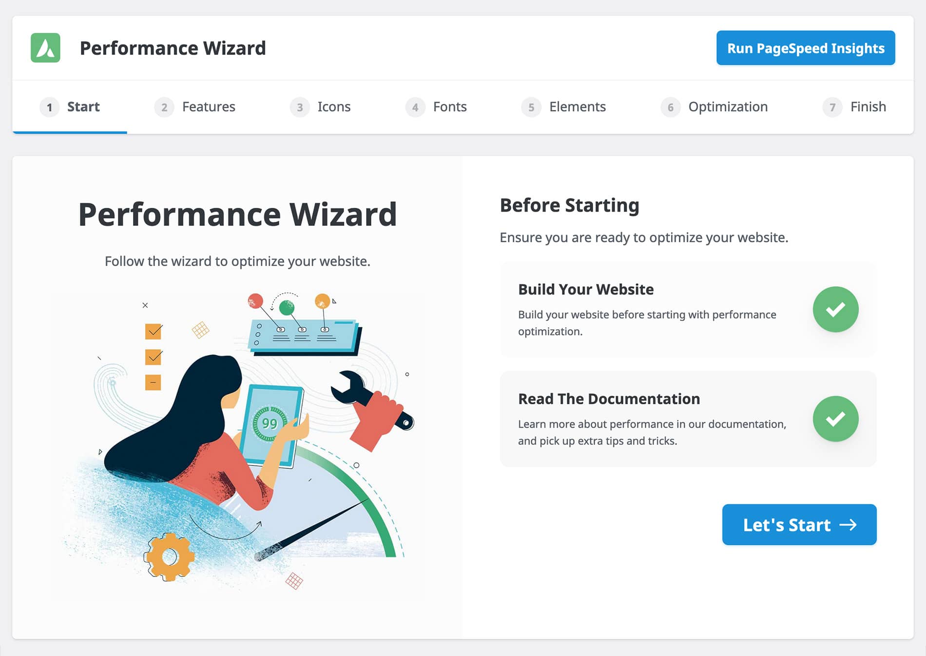
What is important to note is that you should build your website first before running the Performance Wizard. Creating your website’s structure, placing design elements in situ, and formulating content ensures that the system has something to work with when searching for recommendations at each step of the process. The recommendations provided are for options that can be disabled or enabled to enhance overall performance.
Above The Fold Optimization
“Above the fold” is the part of a webpage that is immediately visible on your desktop or mobile screen without scrolling down. Traditionally, this digital real estate is where most would choose to display attention-grabbing headlines, important sales/marketing content, images, and even slider plugins as part of the page’s hero.

The rate of content delivery for a website, and in particular the perceived speed experienced by the end-user on a mobile device, is at the heart of Google’s Core Web Vitals. Thus, passing Core Web Vitals inevitably leads to a delicate balance between good SEO, attention marketing, and page load times for a website owner.
To assist you with managing your website’s performance and optimization, our team introduced purpose-built tools and features for Avada that can make it possible for you to fine-tune your website’s performance on mobile & desktop.
Generate Critical CSS
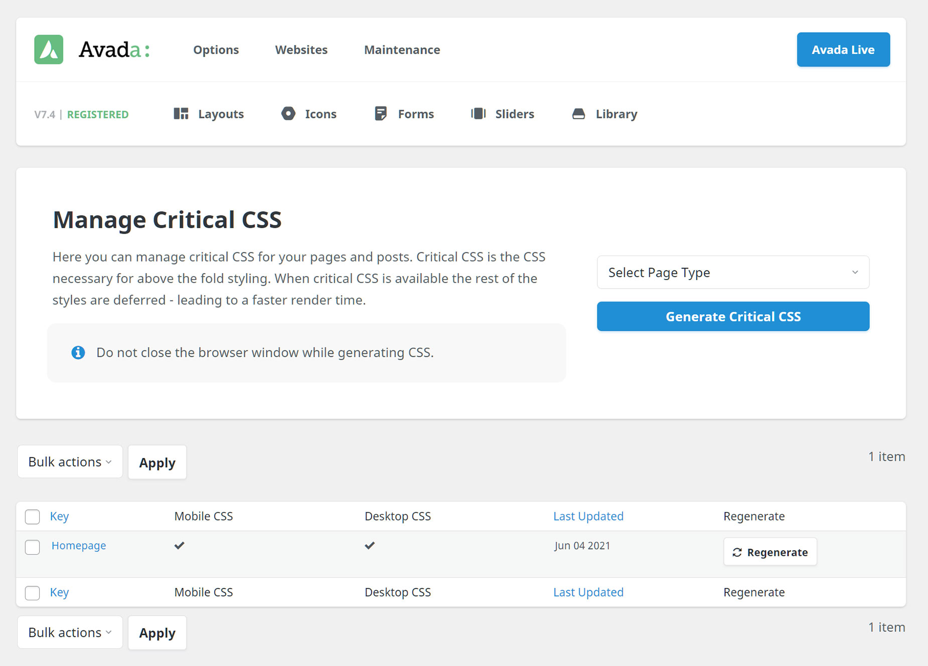
Critical CSS is a convenient performance feature. You can enable Critical CSS by going to the Performance Wizard > Optimization tab. Once it has been enabled, you can access the Critical CSS page from the WordPress sidebar at Avada > Critical CSS or Maintenance > Critical CSS from the Avada Dashboard. Both take you to the Critical CSS page to generate Critical CSS for both pages and posts.
Critical CSS is the CSS necessary to style the above-the-fold content. When generated for a page, it will be loaded into the page head, and the rest of the CSS styles moved to the footer, resulting in less render-blocking and a faster page load time.
Resources
Even with all of the performance options provided, Avada plays a lesser part than you might imagine when it comes to site optimization. Websites running Avada as the primary WordPress theme can be configured to optimize the layouts and structure that can lead to vastly improved page load scores. Still, ultimately, user content will principally dictate how fast and efficient your website will perform according to Google Core Web Vitals.
Color Palette
The color palette selected for the Avada Programmer prebuilt website is a set of split complementary colors, as seen above. If you would like to change the Avada Programmer color palette, this can be done within the options panel, as explained in this help file and video.
Color increases brand recognition, and it can influence people in how they feel about a website. Colors produce different emotions in people, making it essential to choose the right colors for your website. The balance of white space, contrast, and well thought out color schemes are vital elements of good web design. If you have not already decided on your brand colors, choosing a color palette for your website can be confusing. However, using a handy tool like the Adobe Color Wheel or any of the myriad of app choices online, you can undoubtedly make this task effortless.
We suggest checking out HubSpot’s article on color theory.
Typography
Website Typography can be more important than you realize, from your brand and user perspective to your website’s overall look and style. It is often underrated and is, in fact, an art form and technique in itself. The following HubSpot guide to website typography will give you some great insights into the do’s and dont’s choosing which fonts work best for your Avada website.
The Avada Website Builder has a vast array of Typography controls, options, and font selections to make your job easier. See this detailed help file and video to get you started.
Below are the fonts used for the Avada Programmer prebuilt website:
Headings
Body
We suggest checking out HubSpot’s article on The Ultimate List of Web-Safe HTML and CSS Fonts.
To Get Started You Will Need The Following
To get started with the Avada Website Builder and to create your ideal website, there are a few things that you will need;
Recommended Plugins
What are recommended plugins, and do you need them? In short, it is not the end of the world if you choose not to install and activate the plugins used with any particular Avada prebuilt website. Let’s take the Avada Programmer prebuilt website as an example:
It is created using Advanced Custom Fields Pro, which is a WordPress plugin that allows you to add extra content fields to your WordPress edit screens. Therefore the ACF Pro plugin should be installed and activated at the point of installing the prebuilt site.
If you decide not to install the ACF Pro plugin, the full site will still be imported, but the option to add extra content fields will not be active. The following plugins have been used with the Avada Programmer website:
World-Class Support And Resources
Many facets set the Avada Website Builder apart from the competition. None more important is that Avada is not reliant on 3rd party builders and tools to deliver a stable and seamless website building experience. No waiting for external developers and toolset creators to deliver the next update for your theme. We take pride in the fact that Avada is 100% maintained, evolved, and developed according to strict WordPress and PHP coding standards. Avada gives you peace of mind and guarantees that what you have to work with will always be ahead of the latest industry requirements.
What is a Prebuilt Website?
Simply put, prebuilt websites are complete websites that have been designed and built to fit an industry niche. Each website comprises pages, posts, content layouts, images, or various media types representing or showcasing an online presence for a target audience or business type.
Avada prebuilt websites and prebuilt content layouts (individual page or post content, layout sections, Call-to-actions, etc.) are carefully crafted by our talented team of designers to give you, the Avada user, a way to save time when prototyping a new website.
Avada’s prebuilt websites are a fantastic resource for creativity and inspiration. They will make web design a more efficient and productive process for beginners, marketers, and professionals alike. Here are some essential facts:
Fast One-Click Install
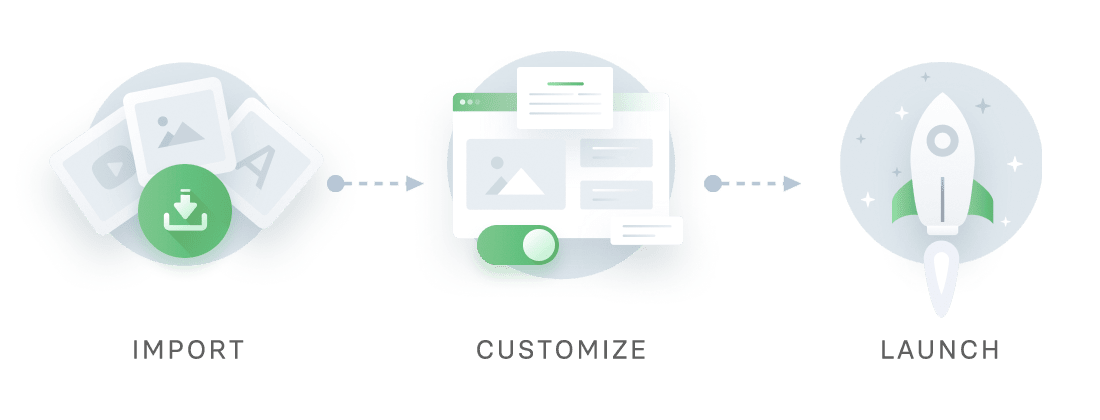
Importing any Avada Prebuilt Website is as simple as clicking a button, with pre-import selections making it highly flexible. You can choose to import a full website (more than 112 to choose from) and parts of any other and anything in between. Choose pages, posts, portfolios, images, sliders, theme options, widgets, or uninstall as you prefer.
Website Structure
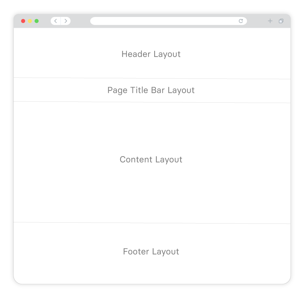
A page or post structure is divided into four main sections: the Header, the Page Title Bar, Content, and the Footer. With the Avada Website Builder, you can independently edit each of these sections to create super flexible and stunning layout designs.
Below is a list of the Avada Programmer pages and posts that have been prebuilt just for you. Once installed, you can change all aspects of each Layout, and at any time, add new pages to suit your online business needs.
Explaining Layouts & Layout Sections
Before we look at the specific Layouts on the Avada Programmer prebuilt website, the first thing to understand is the Layouts and Layout Sections’ architecture. You can think of Layouts as a container for the page content. In contrast, the actual content comes from the various Layout Sections. There are four Layout Sections on a page – the Header, Page Title Bar, Content, and Footer Layout Sections.
There is a default Global Layout, and any Layout Sections added to that will be shown on all pages of your website. There are Conditional Layouts with conditional logic to determine how the Layout will be used.
You can make as many Layouts and Layout Sections as you like, and you can use the Layout Sections in multiple Layouts. But you can only use a specific condition on a single Layout, so the theme knows which one to use.
See Understanding Layouts & Layout Sections and Understanding Conditional Layouts for more info.
Explaining WordPress Pages vs. Posts
Website pages are allocated for static content such as your website’s homepage, about, contact page, and so on, and are timeless entities.
Website posts are allocated to blog content listed in reverse (newest to the oldest) chronological order and are timely. Older posts are archived based on month and year. You can also create content for custom post types or CPT. In Avada, an example of this is the Portfolio post type. Check out this detailed WordPress article for more information.
What Can I Change? Is the Design Flexible?
The Avada Programmer prebuilt website is exactly that, prebuilt, for you. If the design and style suit your website needs, you can use it as a starting point, and you can change as much or as little as you need to.
The most obvious details that you will want to change at first is the website’s wording, titles, color scheme, and images. You can choose to leave the overall layouts as is or Drag and Drop to rearrange the content’s order. Further to that, you can add or remove any of the Design Elements to fine-tune your preferred business narrative. In short, you can change every single aspect of the prebuilt website’s Layout and content.
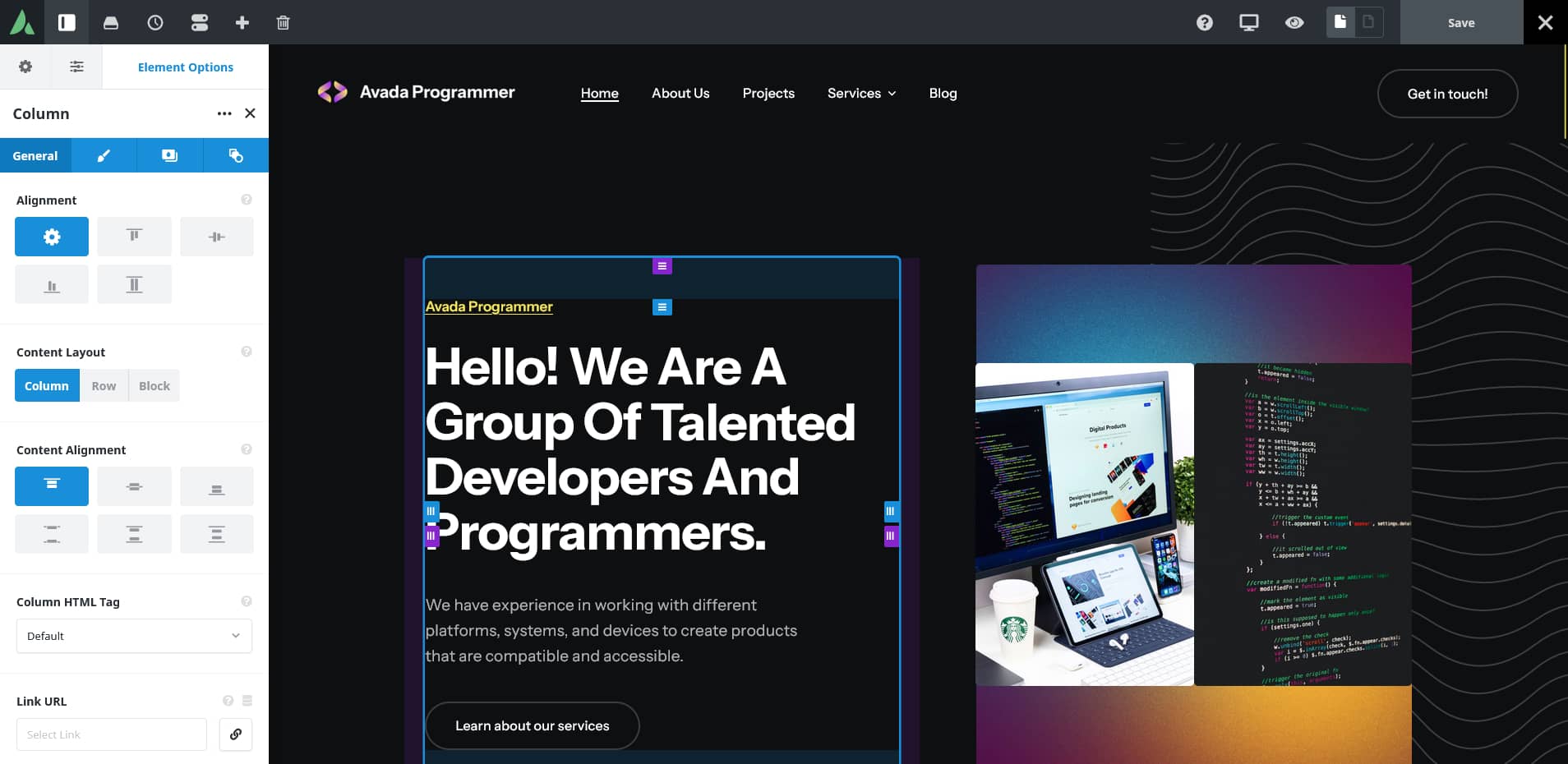
Editing a page’s content and layouts is done using the Drag and Drop live editor or using the traditional back-end method. The first image below shows the Live visual Drag and Drop editor is used to edit the content:
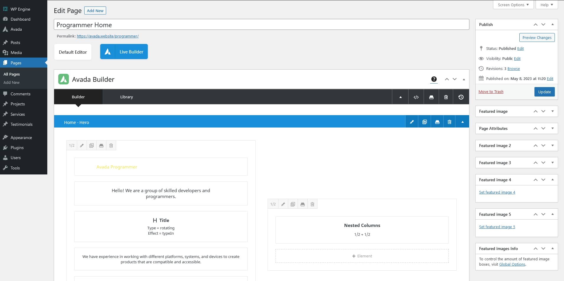
The image below shows the traditional back-end method is used to edit the content:
A Side By Side Comparison (Builder vs. No Builder)
We have created a side by side point of reference that illustrates the differences in building a website using the Avada Website Builder to design custom Layouts vs. not using The Avada Website Builder and only using predefined options. The latter will allow you only to build a basic site, in comparison.
Exploring The Homepage Layout
Website pages are allocated for static content such as your website’s homepage, about, contact page, and so on, and are timeless entities.
Website posts are allocated to blog content listed in reverse (newest to the oldest) chronological order and are timely. Older posts are archived based on month and year. You can also create content for custom post types or CPT. In Avada, an example of this is the Portfolio post type. Check out this detailed WordPress article for more information.
The Header
For the Avada Programmer prebuilt website, the Header was created using the Avada Header Builder and is set globally across the website. This means that every page and post will use the same Header layout without any further conditions set. For example, you can change this if required by creating a unique Header layout for different pages or posts.
The Page Content
The content part of the homepage, the area between the Header and Footer, does not use a page title bar. You can change this page’s content in an infinite number of ways to best suit your business marketing and brand requirements.
Page and Post content is structured using Container and Column Elements, and if required, Nested Columns. Check out the help file links below for detailed information and videos explaining what they are and how to use them:
The Hero
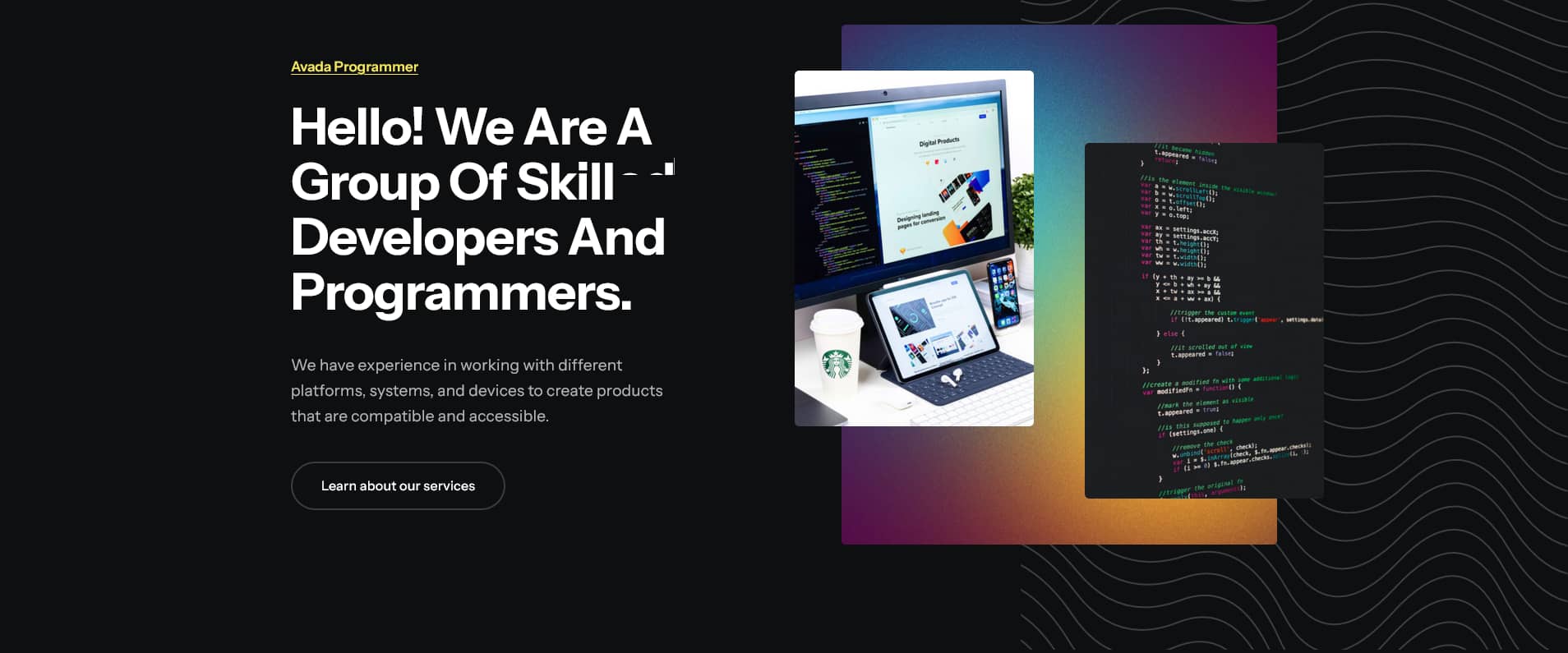
Instead of using a traditional image slider, like the Avada Slider or Slider Revolution, as the above-the-fold hero section, this prebuilt site uses a single Container with a Background Image. The container holds two 1/2 (50% width) Columns with the first holding three Title Elements, a Text Block Element, and a Button Element and the second column holds a Nested Columns Element.
Simply put, Nested Columns are columns within columns. This Nested Columns Element is structured with two 1/2 (50% width) Columns, each holding an Image Element.
Sponsors
This section was built using a Container with five 1/5 (20% width) Columns each holding an Image Element.
Information
This section was built using a Container holding one 2/5 (40% width) Column holding an Image Element and one 3/5 (60% width) Column holding a Title Element, a Text Block Element, a Separator Element, and a Nested Columns Element.
The Nested Columns Element is structured using two 1/2 (50% width) Columns, each holding two Title Elements and a Text Block Element.
Services
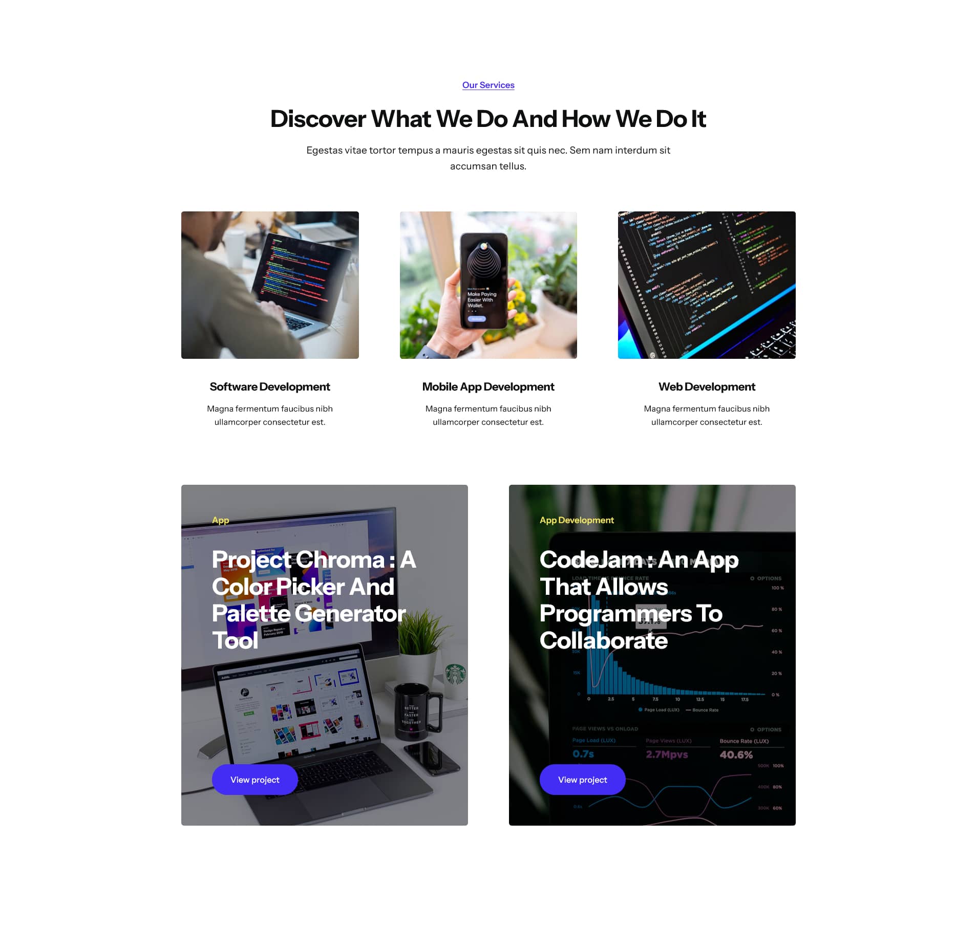
This section was built using a Container with three 1/1 (100% width) Columns. The first Column holds two Title Elements and a Text Block Element, while the other two columns each hold a Post Cards Element.
More Information
To create this layout, a Container with two 1/2 (50% width) Columns and two 1/1 (100% width) was used. The two 1/2 Columns hold three Title Elements, a Text Block Element, a Button Element, and Nested Columns Element. The Nested Columns Element is structured with one 1/1 (100% width) Column holding an Image Element, while the two 1/1 Columns collectively hold a Separator Element and a Nested Columns Element.
This Nested Columns Element contains one 1/3 (33.33% width) Column and one 2/3 (66.67% width Column. Collectively, these columns hold two Image Elements, a Title Element, a Text Block Element, and a Button Element.
Blog
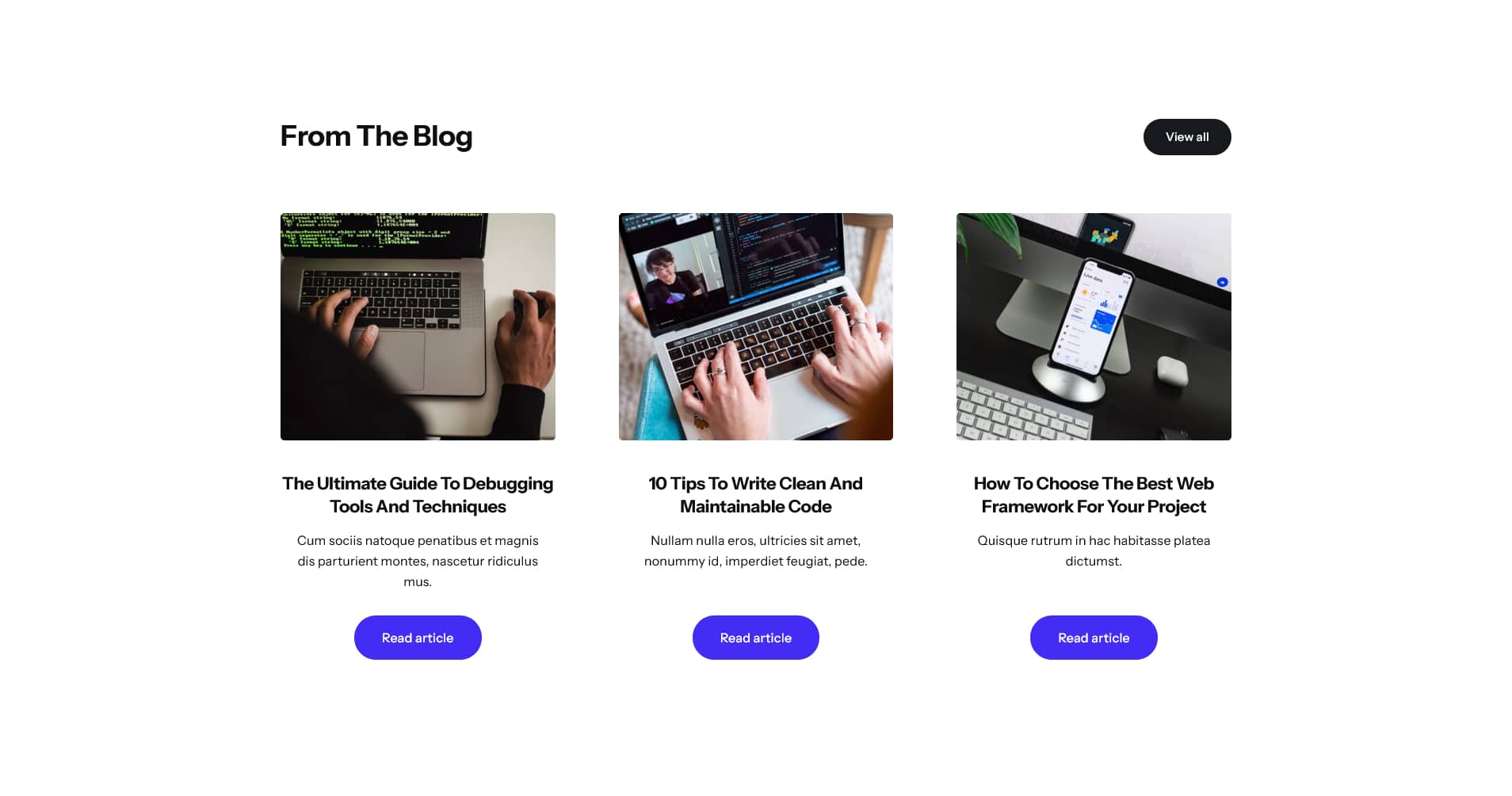
This section was built using a Container with two 1/1 (100% width) Columns with the first containing a Title Element and a Button Element and the second holding a Post Cards Element.
Services
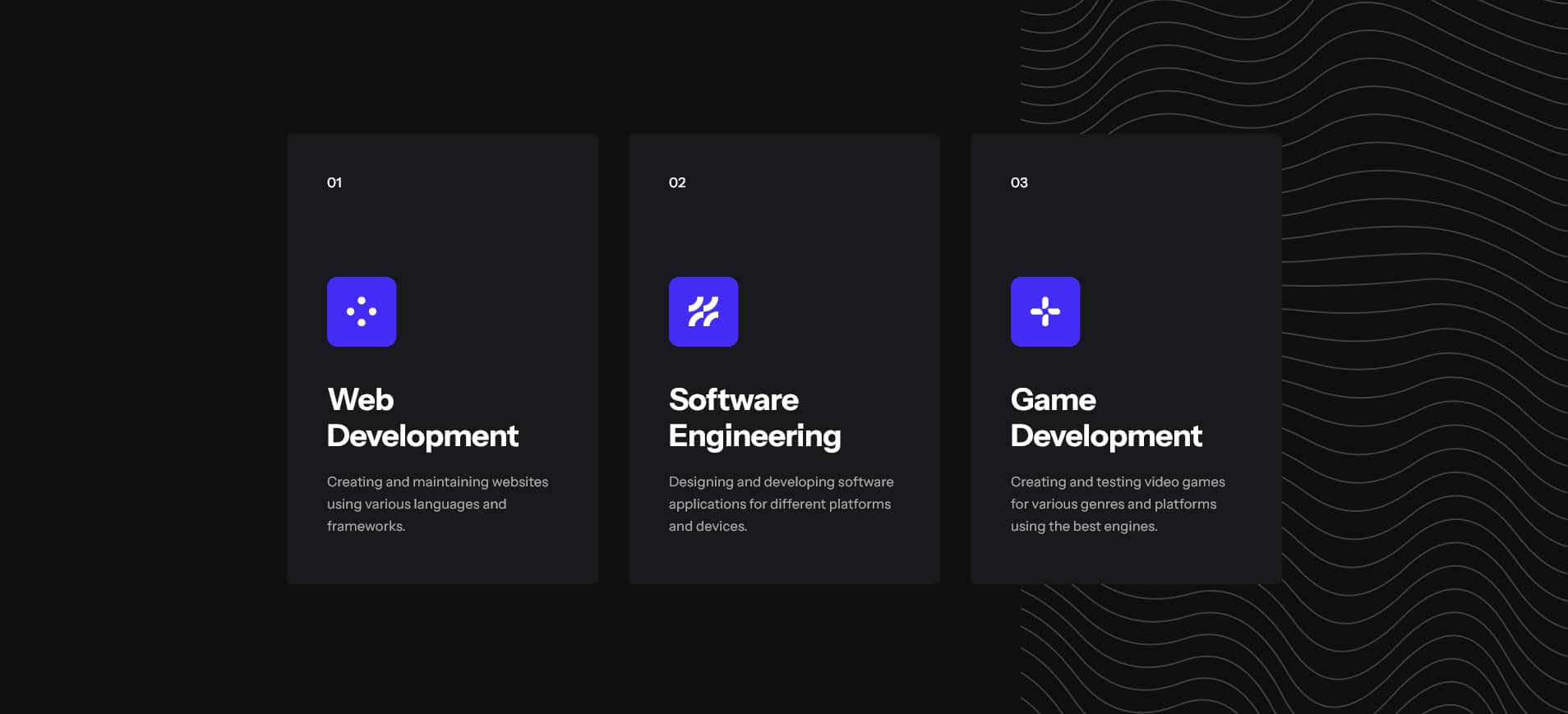
This section was built using a Container holding three 1/3 (33.33% width) Columns, each containing a Nested Columns Element.
Each Nested Columns Element is structured with two 1/1 (100% width) Columns, with the first holding two Title Elements, an Icon Element, and a Text Block Element, and the second Column holding a Button Element.
CTA Banner
This section was built using a Container with a Background Image and one 2/3 (66.67% width) Column holding three Title Elements, a Text Block Element, and a Button Element.
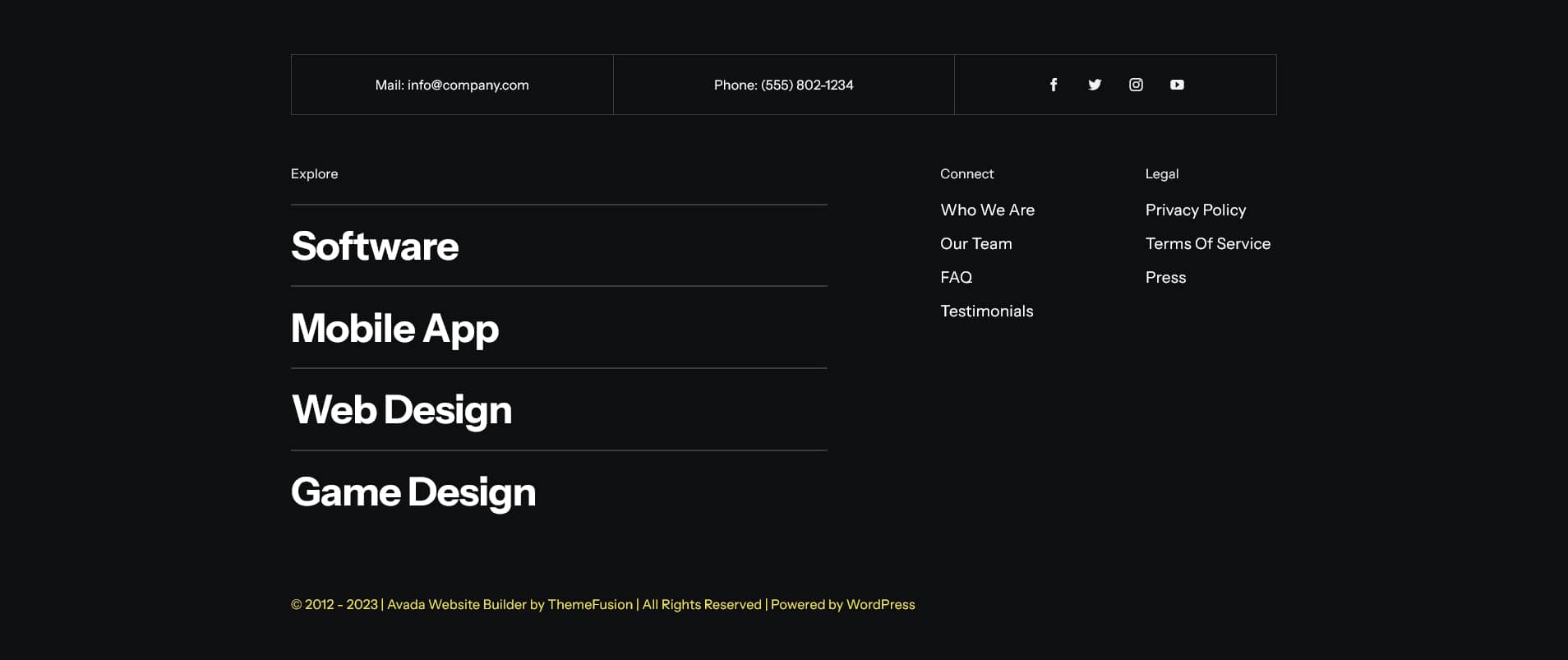
A website footer aims to help visitors by providing appropriate information and navigation options at the bottom of website pages. Website footer design is underrated and more valuable to your website than you may think and is essential to the overall end-user experience. Three key points stand out, namely:
For the Avada Programmer prebuilt website, the Footer was created using the Avada Footer Builder and this particular Footer content and Layout is set to display globally across the website. This means that every page and post will use the same Footer layout without any further conditions set. For example, you can change this if required by creating a unique Footer layout for different pages or posts. Let us take a closer look below:
Footer Content
The Footer section is created using a container and multiple Columns. These columns contain a Nested Columns Element, Menu Elements, Title Elements, and a Social Links Element, with the use of the Dynamic Data Options to display the website information.
In Summary
There are 112 Avada prebuilt websites to choose from, with more being added regularly. Our amazing design team created these prebuilt websites as a way to give you a head start when building your next website.
You can change the styling, Layouts, content as much or as little as you need to quickly adapt any individual prebuilt site to suit your chosen niche. Get started with the Avada Website Builder today and launch your business online; Fast.
