Column Element
Last Update: October 30, 2025
The Column Element goes hand in hand with the Container Element, and is another essential structural component when building your site in Avada.
The Container and Column Elements are based on CSS Flexbox. This means that extremely flexible positioning and spacing are built in. For more information on this, see the Flexbox For Containers and Columns help file. The options below are what you will see for the Flex-based Columns. If you are using the Legacy options, please see the Container and Column Element legacy settings document for a rundown of those options.
Watch the video below for a visual overview of the Element, view the Avada Column Element page for live examples, and read on to see the complete list of options of this foundational Design Element.
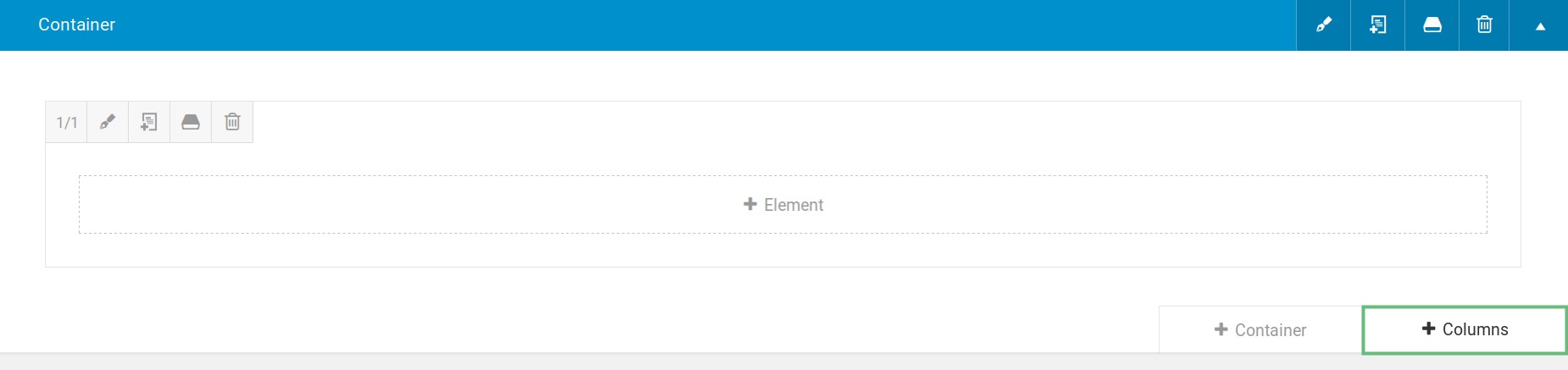
How To Add Columns in Avada Builder
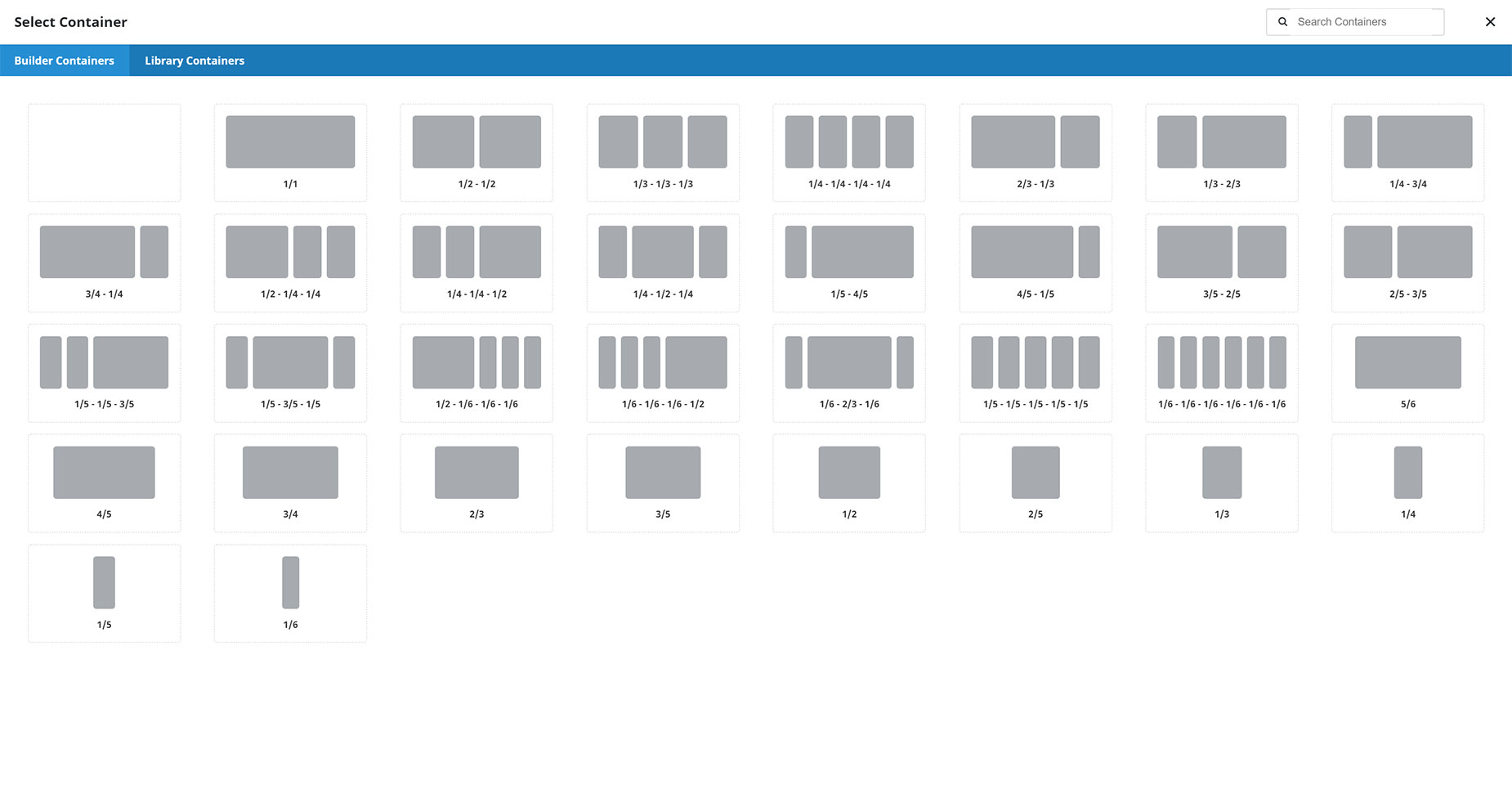
How To Add Columns in Avada Live
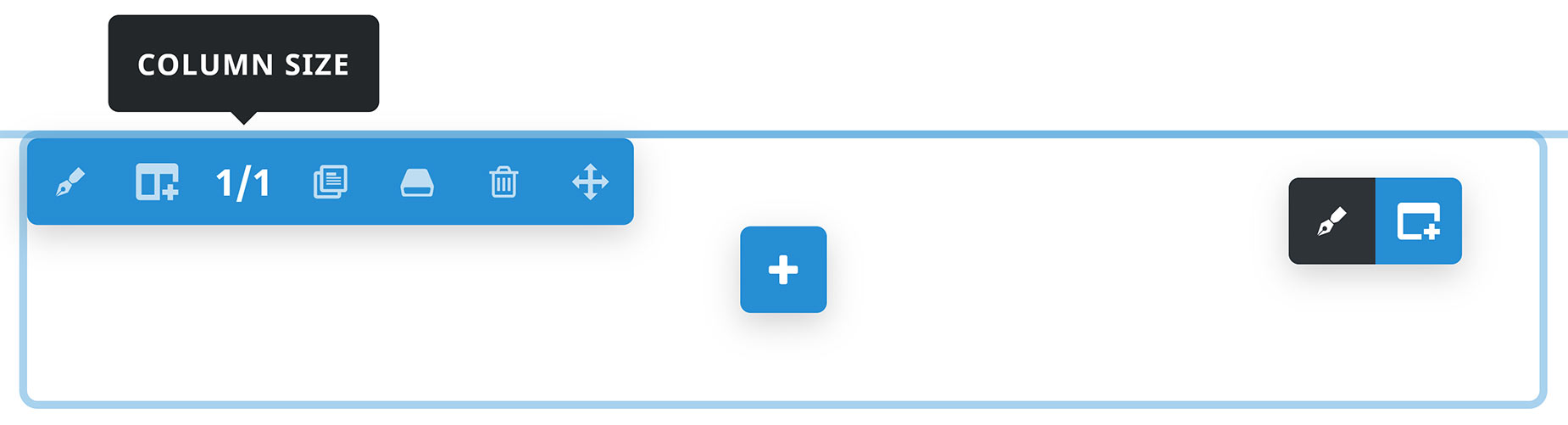
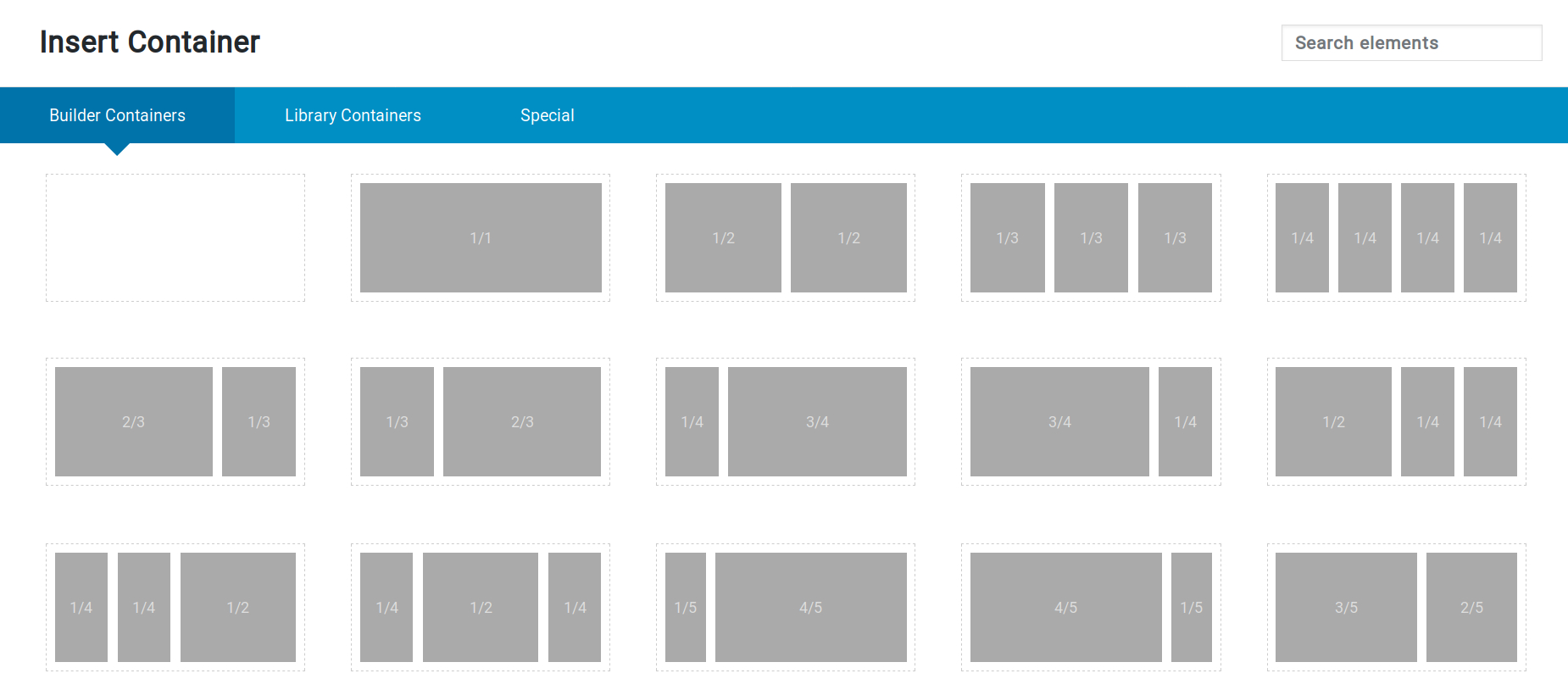
Column Sizes
A Column can only be placed inside a Container Element, and it will always base its divisions on the parent container’s width. Most of the time, this will be the Site Width you’ve set for the site. For example, if you’ve set the Site Width to be 1200px, then a 1/2 Column will be 600px wide, minus any Column spacing you’ve set. Below you can see the possible preset Column sizes when added to the page.
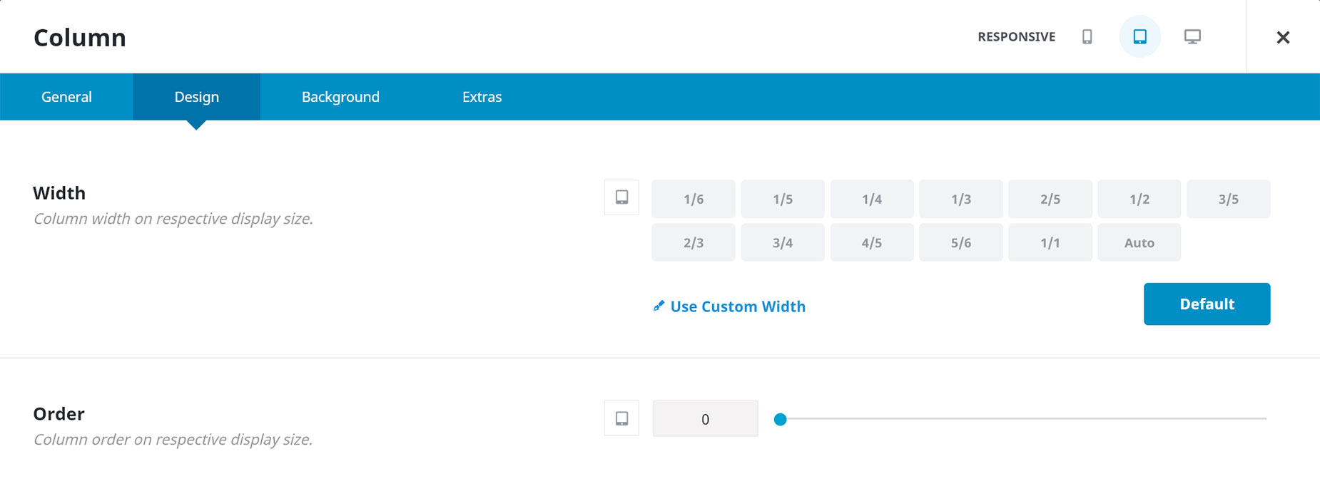
Preset Sizes or Custom Width
Columns can have a preset size as above, but they can also have a custom width. You can set Column widths (and more) independently for large, medium, and small devices. For more information on how to use this feature with Columns, please read the How To Set The Display Order And Size Of Columns In Responsive Layouts help file.
You will find Custom Widths under Columns > Design > Width. As seen below, you can click on Use Custom Width, which allows you to set a Custom Width using any valid CSS unit. A percentage value is the default, but you can also set a pixel value, or any other valid CSS unit. This provides ultimate freedom in Column sizing.
Flex Grow & Flex Shrink Options
Under this, you will also find two options called Flex Grow and Flex Shrink. These are useful when the sum of your Columns does not add up to 100%. With these values, you can instruct the browser on how to allocate the remaining space.
Flex Grow
Flex-grow determines whether your Column can expand to occupy additional space within its wrapping Container. Initially, the option will be empty, which means a default value of 0; thus, the Column will not expand to utilize any available space. With a value of 1 or higher, we instruct the Column to expand and occupy the available space.
It’s easiest to explain this with an example. Let’s say you have three Columns of 1/4 width. This means they take up seventy-five percent of the Container. If nothing is set, the Columns will not grow and remain at 1/4 each. However, if they all receive a flex-grow value of 1, the remaining twenty-five percent is distributed equally among all three Columns (an extra 8.333% for each one).
But if you set a value of one on the first and third Column, but a value of two in the middle Column, then the browser would divide the remaining space by four (25% / 4 = 6.5%) and apply two units to the second Column (13%) while the first and third Column would only grow by one unit (6.5%).
Flex Shrink
This option only works if the parent Container’s Content Wrap value is set to No Wrap. By default, the Containers are set to wrap, so if the Columns take up too much space, the last one will be pushed to a new row. But when Content Wrap is turned off, all Columns are forced to stay on the same row. That could lead to overflow when some Elements in the Columns can’t be reduced in width.
Similarly, the Flex Shrink factor, like Flex Grow, allows the browser to determine which Columns can shrink more than others. Initially, all columns have a factor of 1, so if you set one of them to e.g. 2, it can shrink twice as much as the others.
Another significant value is a Flex Shrink value of 0, which means the Column must not shrink at all. For example, if you use a px-width Column, it ensures that the Column will always remain at its set px width, regardless of available space. If Flex Grow is set on the same Column, it will not shrink beyond the overall width of its content.
Auto Width
There is also a new width option called Auto. With this selection, instead of a fixed width size, the Column will take up the space of the largest Element inside it that has a set width. So it will only work in certain instances. But any time you have an Element that has a set width, such as an image or an icon, etc, you can set the parent Column to Auto, and the Column will resize to the width of the Element.
Examples of Auto Width
On the Home page of the Pet Supplies Website, there is a banner at the bottom of the Page Title Bar, with an image of some pet food, and some text. This becomes a sticky Container as you scroll up, and the image has an Image Sticky Max Width that reduces its size as the Container becomes sticky. This image is in a Column set to Auto, so that the Column also resizes with the image, and so the spacing between it and the text next to it remains the same.

Sticky Columns
This feature is enabled on the Extras tab of the Column Element. There is also a Responsive Position Sticky option, as well as a Sticky Column Offset option. For full details on how to use Sticky Columns, please see the How To Use Sticky Columns document.
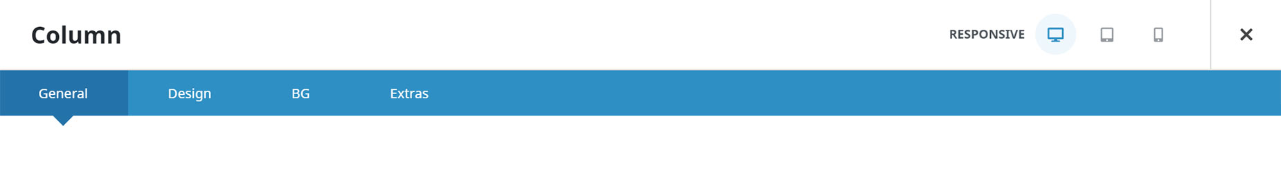
Responsive Option Sets
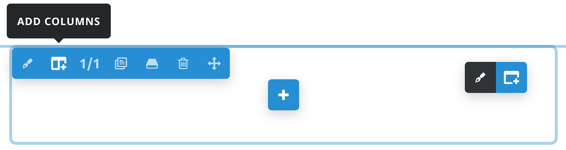
You can see the Responsive Icons at the top right of the Element on any Columns when in the back-end of the Builder, as seen in the image below of the Column Element. In the Front-End Builder, you will see the Responsive Icons directly on the individual options.
You will only see Responsive Option Sets when using the new Flex Containers. With Columns inside Legacy Containers, they will not be available.
Please see the Responsive Option Sets help file for details on this feature, which allows you to set independent options for multiple screen sizes without having to duplicate Containers and use visibility options. You will also see a screen icon next to the individual options that are part of this feature.
Element Options
Note: The Default setting will use the global settings assigned for this element in the Avada Global Options, found at Options > Avada Builder Elements > Column. Also, please note that the displayed options screens below show ALL the available options for the element. If you have Avada’s Option Network Dependencies turned on, you will only see options relevant to your selections and your Column type (Flex or Legacy), and so the options screen may look somewhat different.


