Share
Say hello to Avada Online School — a prebuilt website designed for modern e-learning, with course listings, event schedules, and student-focused layouts ready to go out of the box. Like all Avada prebuilt websites, it imports with a single click, and the entire site is fully customizable to suit your needs.
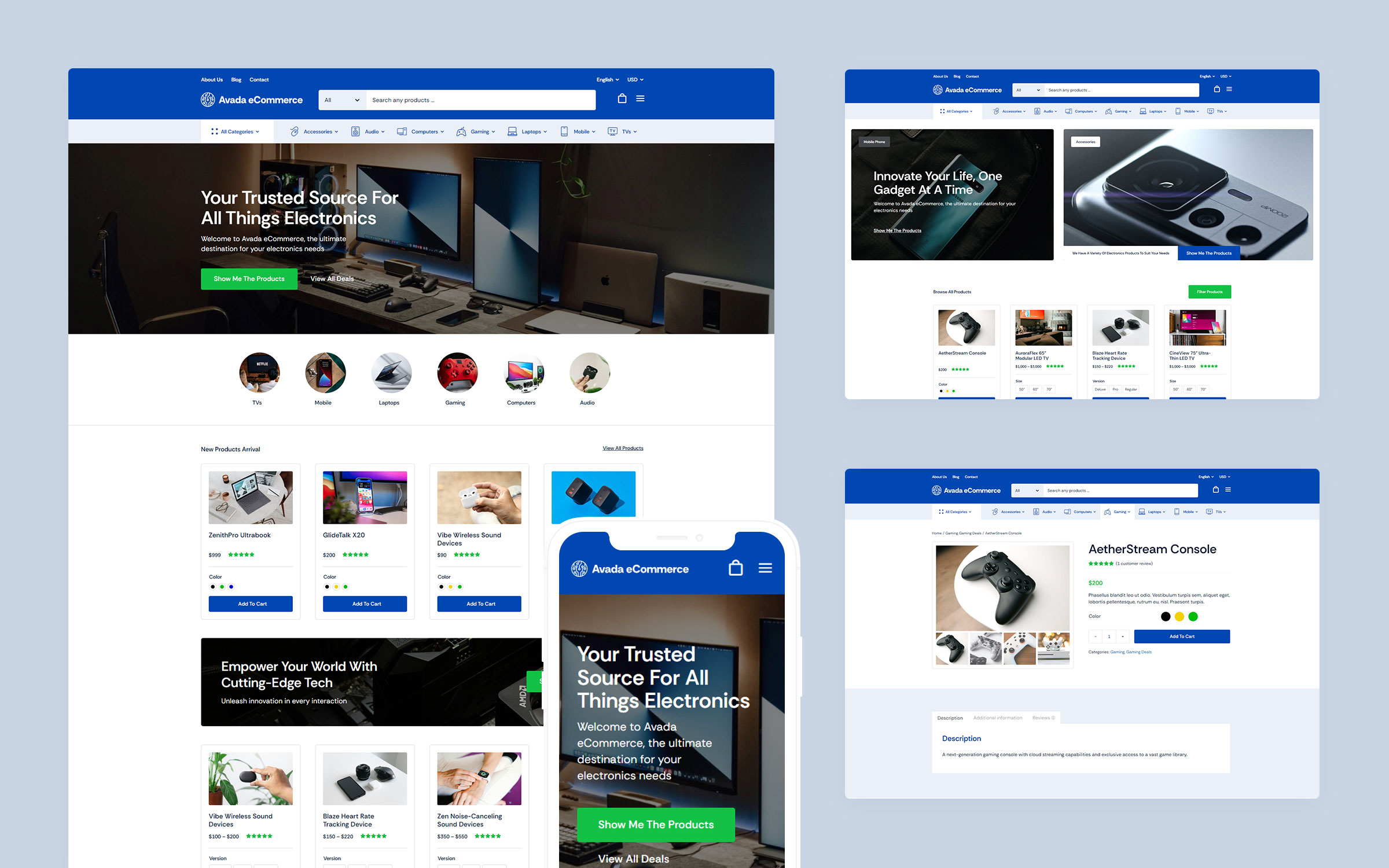
This post walks through how the site is built: the plugins that power it, its color palette and typography, and a section-by-section breakdown of the homepage, header, and footer. It follows on from our deconstruction of Avada Ecommerce — the previous prebuilt website in this series.
Overview
Who Is It For?
The Avada Online School website is built for schools, training providers, and independent tutors, but can be customized to suit any particular niche. It organizes courses, events, and resources into a clear structure that students can navigate without guidance. Layouts are fully customizable within Avada and WordPress, so educators can adapt the site to their content rather than the other way around. The result is a site that handles enrollment, communicates a program, and gets out of the way.
Recommended Plugins
Two plugins are used alongside Avada to deliver the full Online School experience:
You can still import the site without these plugins; the corresponding sections will simply be inactive.
Color Palette
The site uses an analogous color palette built around three tones:
The palette can be changed at any time via the Avada Global Color Options.
Typography
A single font family is used across all headings and body text:
We suggest checking out HubSpot’s article on The Ultimate List of Web-Safe HTML and CSS Fonts.
Website Structure
A page or post structure is divided into four main sections: the Header, the Page Title Bar, Content, and the Footer. With the Avada Website Builder, you can independently edit each of these sections to create super flexible and stunning layout designs.
Below is a list of the Avada Online School pages and posts that have been prebuilt just for you. Once installed, you can change all aspects of each Layout, and at any time, add new pages to suit your online business needs.
Explaining Layouts & Layout Sections
Before we look at the specific Layouts on the Avada Online School prebuilt website, the first thing to understand is the Layouts and Layout Sections’ architecture. You can think of Layouts as a container for the page content. In contrast, the actual content comes from the various Layout Sections. There are four Layout Sections on a page – the Header, Page Title Bar, Content, and Footer Layout Sections.
There is a default Global Layout, and any Layout Sections added to that will be shown on all pages of your website. There are Conditional Layouts with conditional logic to determine how the Layout will be used.
You can make as many Layouts and Layout Sections as you like, and you can use the Layout Sections in multiple Layouts. But you can only use a specific condition on a single Layout, so the theme knows which one to use.
See Understanding Layouts & Layout Sections and Understanding Conditional Layouts for more info.

Explaining WordPress Pages vs. Posts
Website pages are allocated for static content such as your website’s homepage, about, contact page, and so on, and are timeless entities.
Website posts are allocated to blog content listed in reverse (newest to the oldest) chronological order and are timely. Older posts are archived based on month and year. You can also create content for custom post types or CPT. In Avada, an example of this is the Portfolio post type. Check out this detailed WordPress article for more information.
What Can I Change? Is the Design Flexible?
The Avada Online School prebuilt website is exactly that, prebuilt, for you. If the design and style suit your website needs, you can use it as a starting point, and you can change as much or as little as you need to.
The most obvious details that you will want to change at first is the website’s wording, titles, color scheme, and images. You can choose to leave the overall layouts as is or Drag and Drop to rearrange the content’s order. Further to that, you can add or remove any of the Design Elements to fine-tune your preferred business narrative. In short, you can change every single aspect of the prebuilt website’s Layout and content.
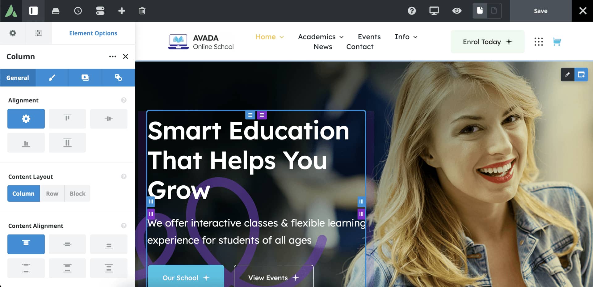
Editing a page’s content and layouts is done using the Drag and Drop live editor or using the traditional back-end method. The first image below shows the Live visual Drag and Drop editor is used to edit the content:
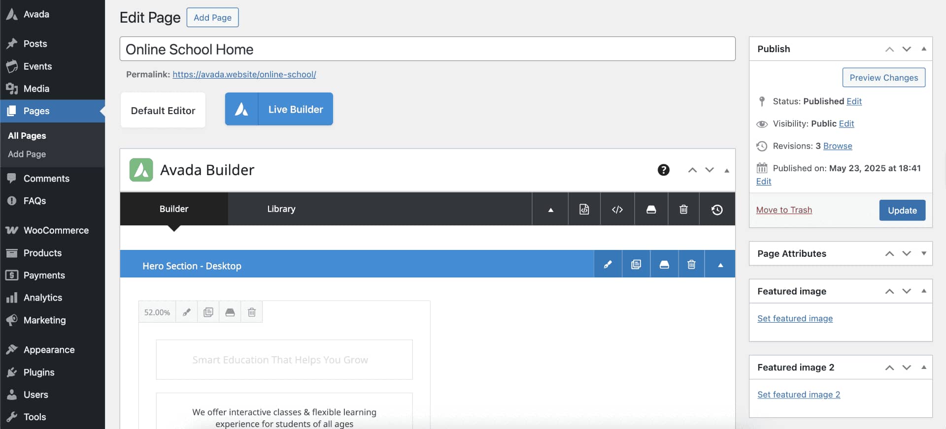
The image below shows the traditional back-end method is used to edit the content:
A Side By Side Comparison (Builder vs. No Builder)
We have created a side by side point of reference that illustrates the differences in building a website using the Avada Website Builder to design custom Layouts vs. not using The Avada Website Builder and only using predefined options. The latter will allow you only to build a basic site, in comparison.
Exploring The Homepage Layout
Website pages are allocated for static content such as your website’s homepage, about, contact page, and so on, and are timeless entities.
Website posts are allocated to blog content listed in reverse (newest to the oldest) chronological order and are timely. Older posts are archived based on month and year. You can also create content for custom post types or CPT. In Avada, an example of this is the Portfolio post type. Check out this detailed WordPress article for more information.
The Header
For the Avada Online School prebuilt website, the Header was created using the Avada Header Builder and is set globally across the website. This means that every page and post will use the same Header layout without any further conditions set. For example, you can change this if required by creating a unique Header layout for different pages or posts.

The Page Content
The content part of the homepage, the area between the Header and Footer, does not use a page title bar. You can change this page’s content in an infinite number of ways to best suit your business marketing and brand requirements.
Page and Post content is structured using Container and Column Elements, and if required, Nested Columns. Check out the help file links below for detailed information and videos explaining what they are and how to use them:
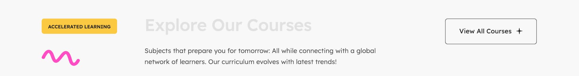
Hero Title

Instead of using a traditional image slider, like the Avada Slider or Slider Revolution, as the above-the-fold hero section, this prebuilt site uses a Container with a Background Image and one 52% width Column holding a Title Element, a Text Block Element, and a Nested Columns Element, and one 3/5 (60% width) Column holding an Image Element.
Simply put, nested columns are columns within columns. This Nested Columns Element contains one 1/1 (100% width) Column holding two Button Elements.
This is followed by a second Container that has one 1/1 (100% width) Column holding a Section Separator Element.
About School
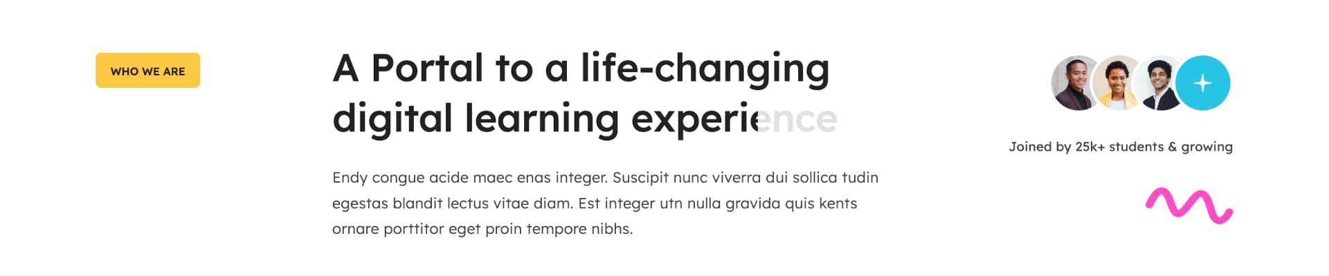
This section was built using a Container with two 20% width Columns on either side of one 52% width Column. These columns collectively hold a Button Element, two Image Elements, a Title Element, and two Text Block Elements.
Study Features
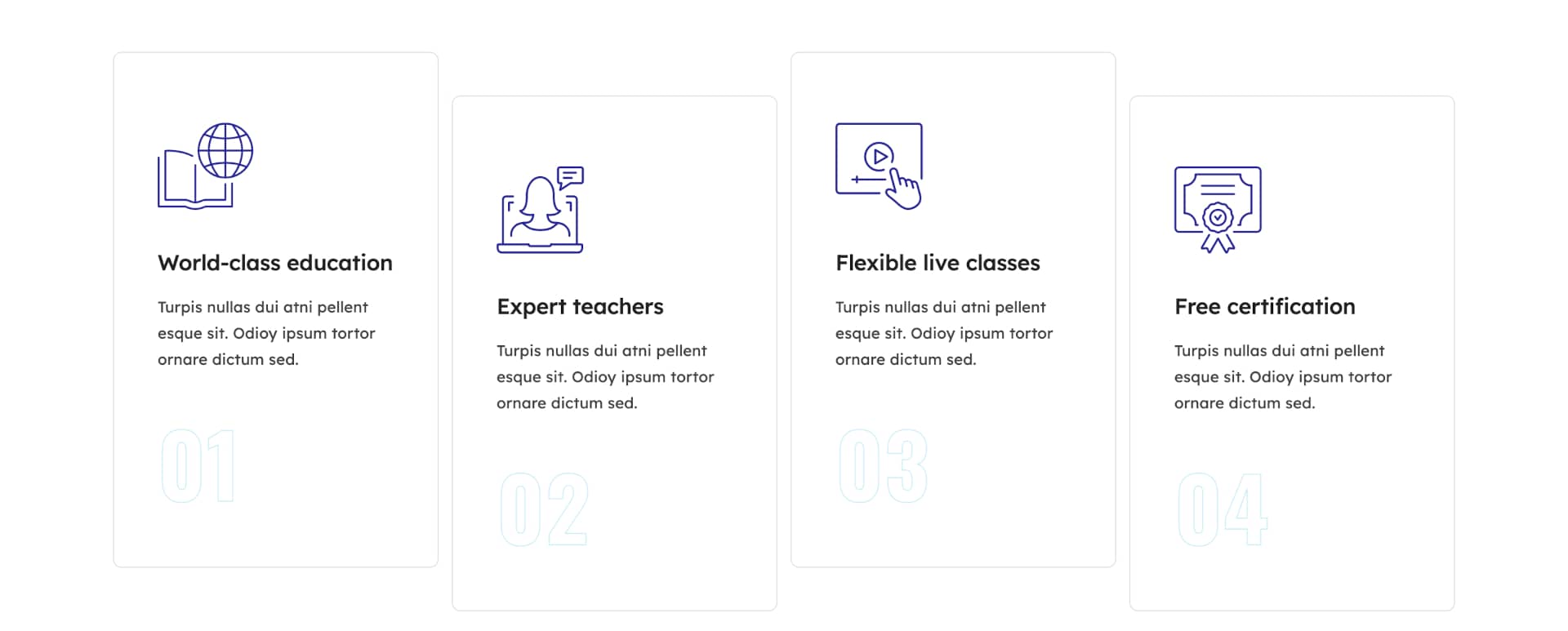
This section was built using a Container holding four 1/4 (25% width) Columns, each containing an Icon Element, a Title Element, a Text Block Element, and a Nested Columns Element.
The nested columns element contains one 1/1 (100% width) Column holding a Title Element.
School Academics
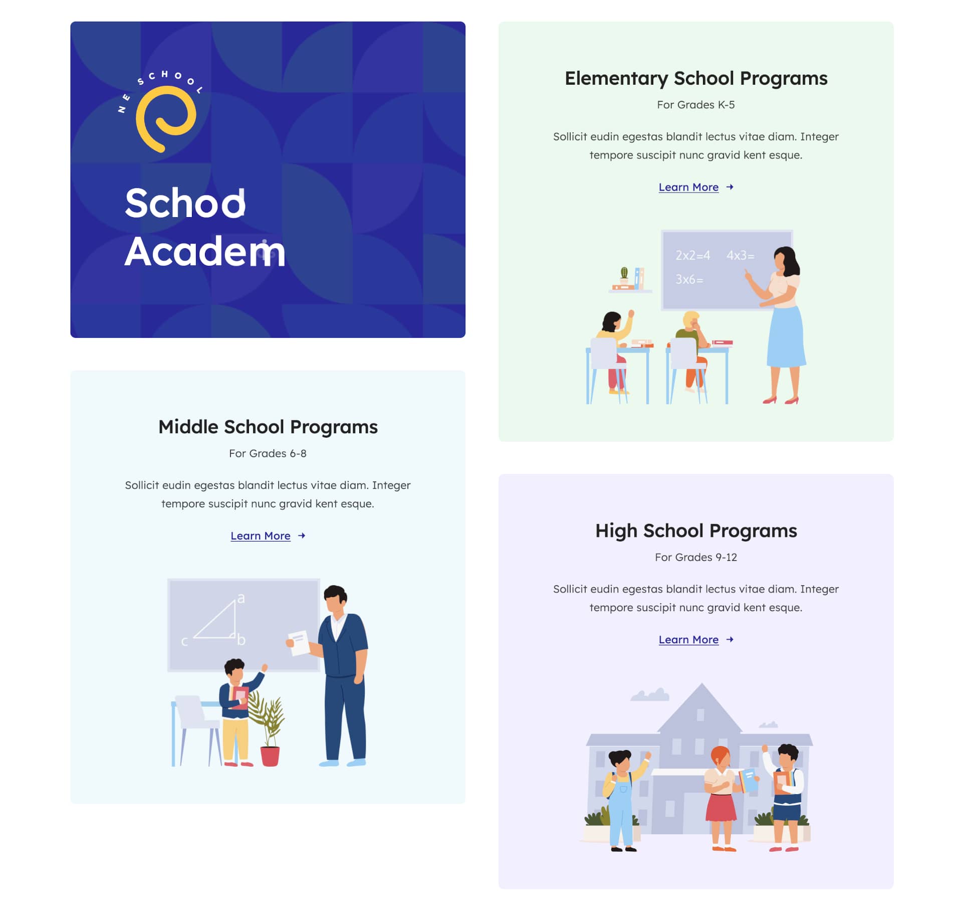
To create this layout, a Container with two 1/2 (50% width) Columns, each holding two Nested Column Elements.
The first nested column contains an Image Element, a Text Path Element, and a Title Element, while the other three nested columns contain a Title Element, two Text Block Elements, a Button Element, and an Image Element.
Marquee Titles

This section was built using a Container with one 1/1 (100% width) Column, holding a Title Element, which uses the Marquee Title Type.
School Events
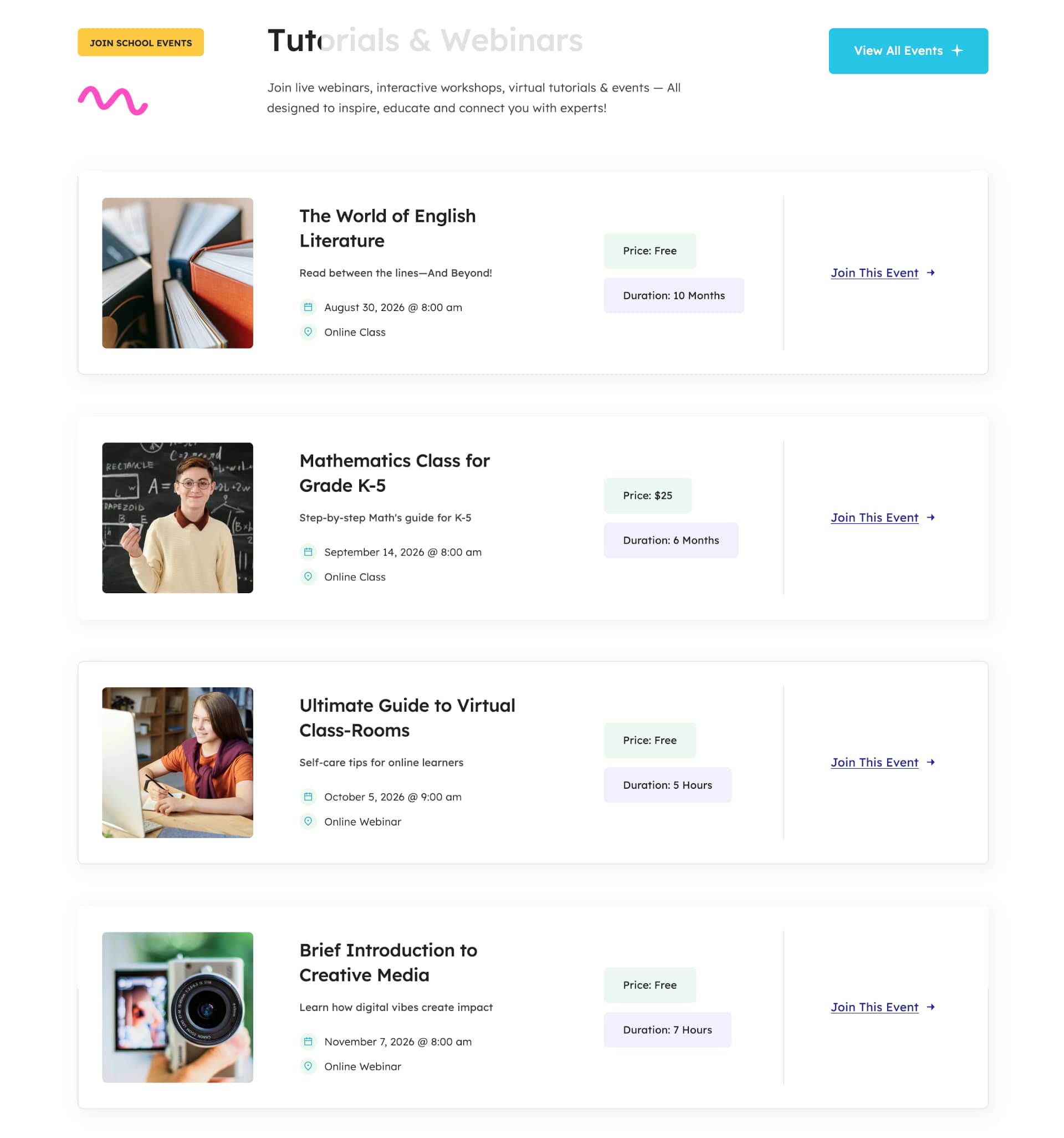
This section was built using a Container holding one 20% width Column containing a Button Element and an Image Element, one 52% width Column containing a Title Element and a Text Block Element, and one 28% width Column containing a Button Element.
This is followed by two 1/1 (100% width) Columns, where one is used for spacing and the other contains a Post Cards Element.
Personalized Study
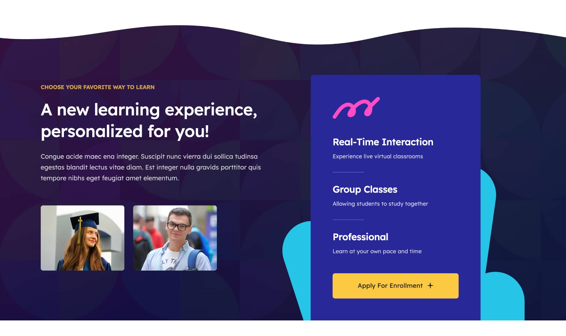
This section was built using two Containers, with the first holding one 1/1 (100% width) Column containing a Section Separator Element, and the second container holding one 48% width Column and one 52% width Column. Collectively, they contain two Text Block Elements, one Title Element, and two Nested Columns Elements.
The first Nested Column is structured using two 2/5 (40% width) Columns, each holding an Image Element, and the second is structured using one 1/1 (100% width) Column containing an Image Element.
School Stats
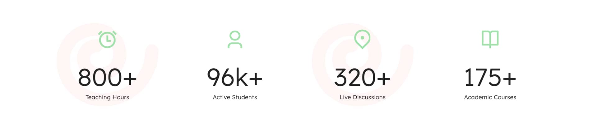
This section was built using a Container holding four 1/4 (25% width) Columns, each containing an Icon Element and a Counter Boxes Element.
Courses & Tutorials Title
This section was built using a Container holding one 20% width Column containing a Button Element and an Image Element, one 52% width Column containing a Title Element and a Text Block Element, and one 28% width Column containing a Button Element.
This is followed by one 1/1 (100% width) Column for spacing.
Courses & Tutorials
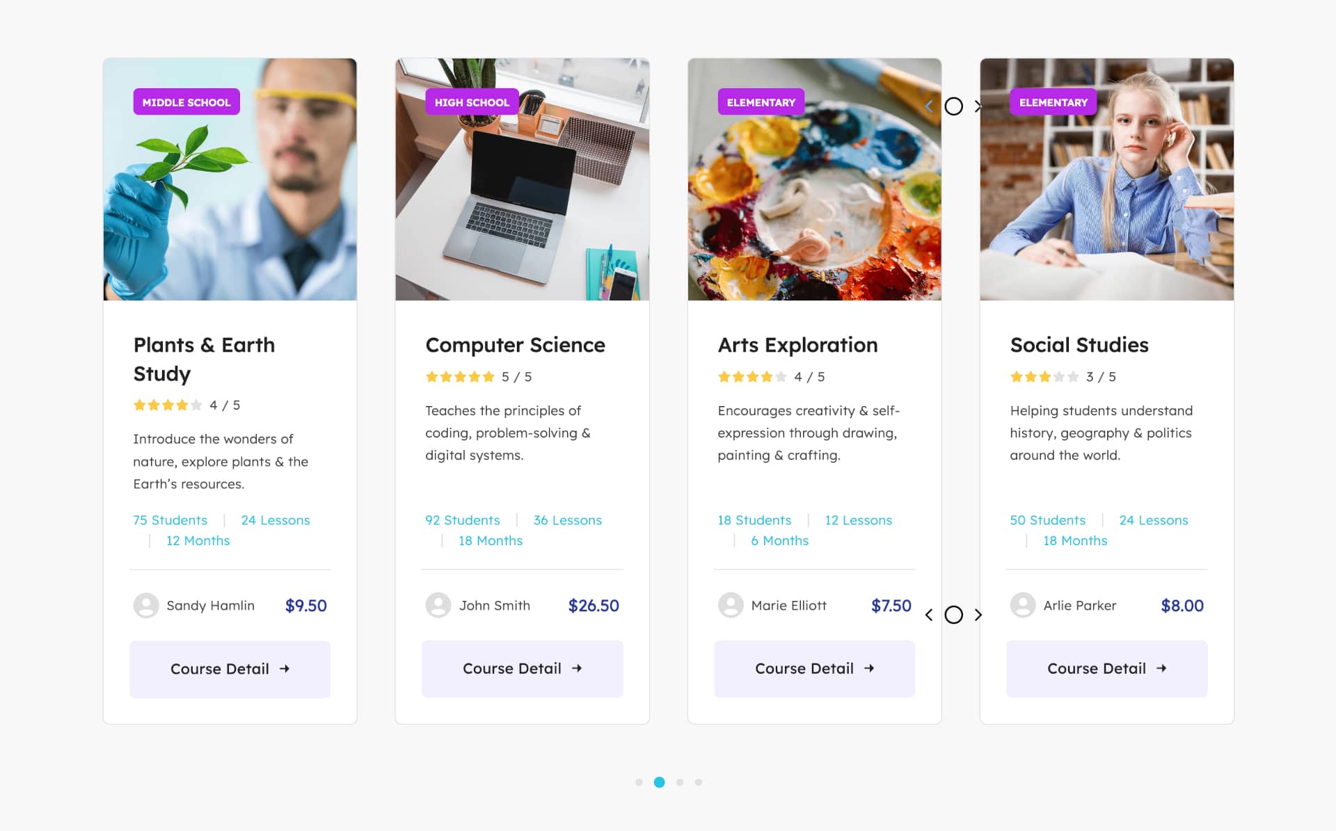
This section was built using a Container holding one 1/1 (100% width) Column containing a Post Cards Element.
Learn Smarter
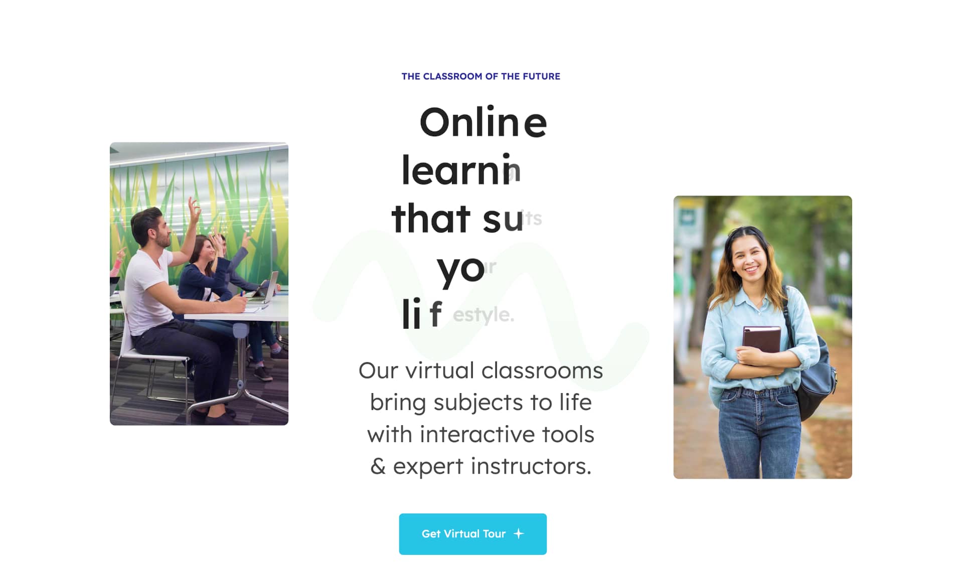
This section was built using a Container with a Background Image and two 27% width Columns, each containing an Image Element on either side of one 46% width Column containing two Text Block Elements, a Title Element, and a Button Element.
Section Separator

This section was built using a Container with a Background Pattern and one 1/1 (100% width) Column for spacing.
News & Highlights
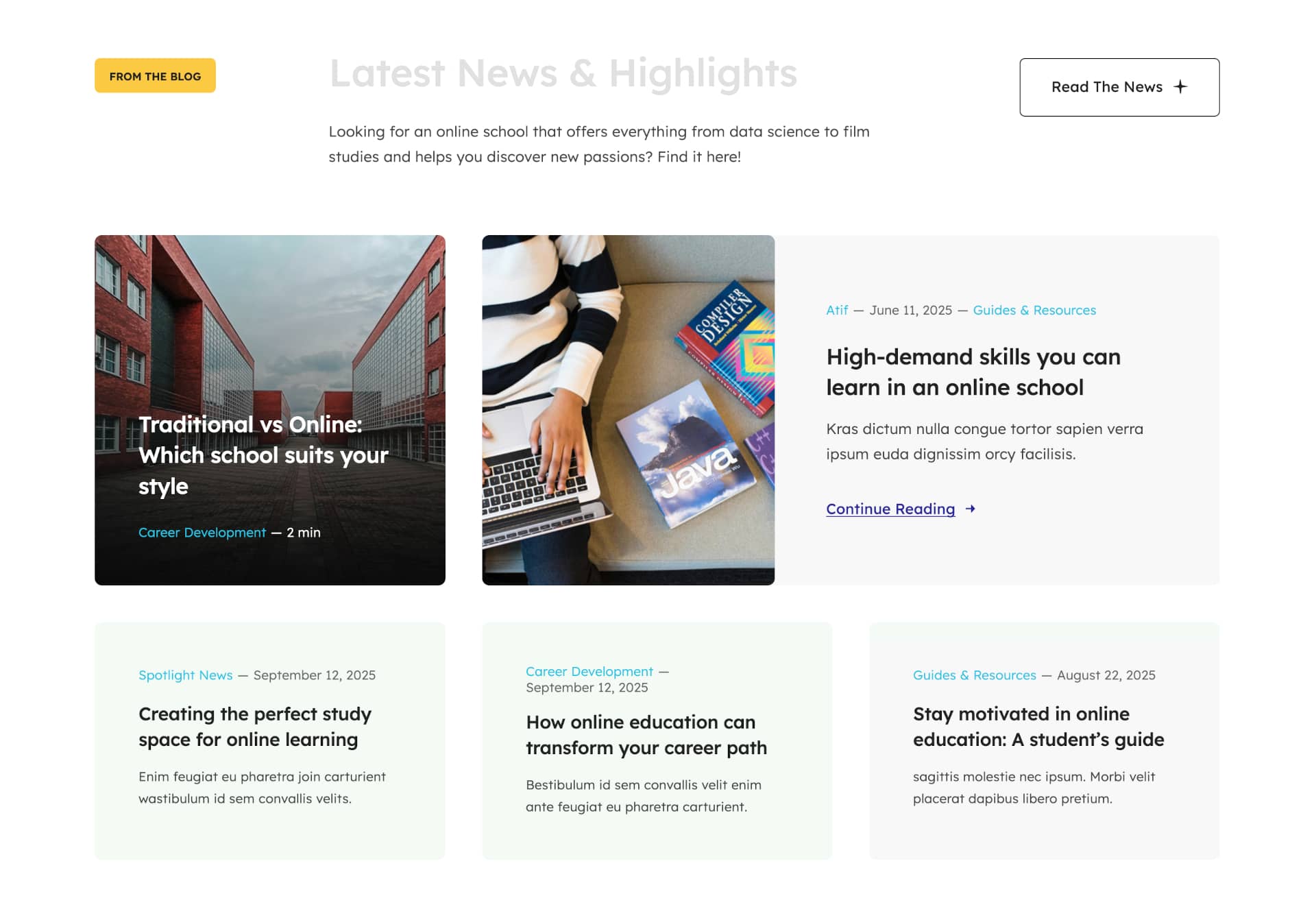
This section was built using a Container with one 20% width Column holding a Button Element and an Image Element, one 52% width Column holding a Title Element and a Text Block Element, and one 28% width Column holding a Button Element.
A website footer aims to help visitors by providing appropriate information and navigation options at the bottom of website pages. Website footer design is underrated and more valuable to your website than you may think and is essential to the overall end-user experience. Three key points stand out, namely:
For the Avada Online School prebuilt website, the Footer was created using the Avada Footer Builder and this particular Footer content and Layout is set to display globally across the website. This means that every page and post will use the same Footer layout without any further conditions set. For example, you can change this if required by creating a unique Footer layout for different pages or posts. Let us take a closer look below:
Footer Content

The Footer section is created using a single Container with multiple Columns, collectively holding Image Elements, Title Elements, Menu Elements, Nested Column Elements, a Social Links Element, with the use of Dynamic Data Options to display the website information.
In Summary
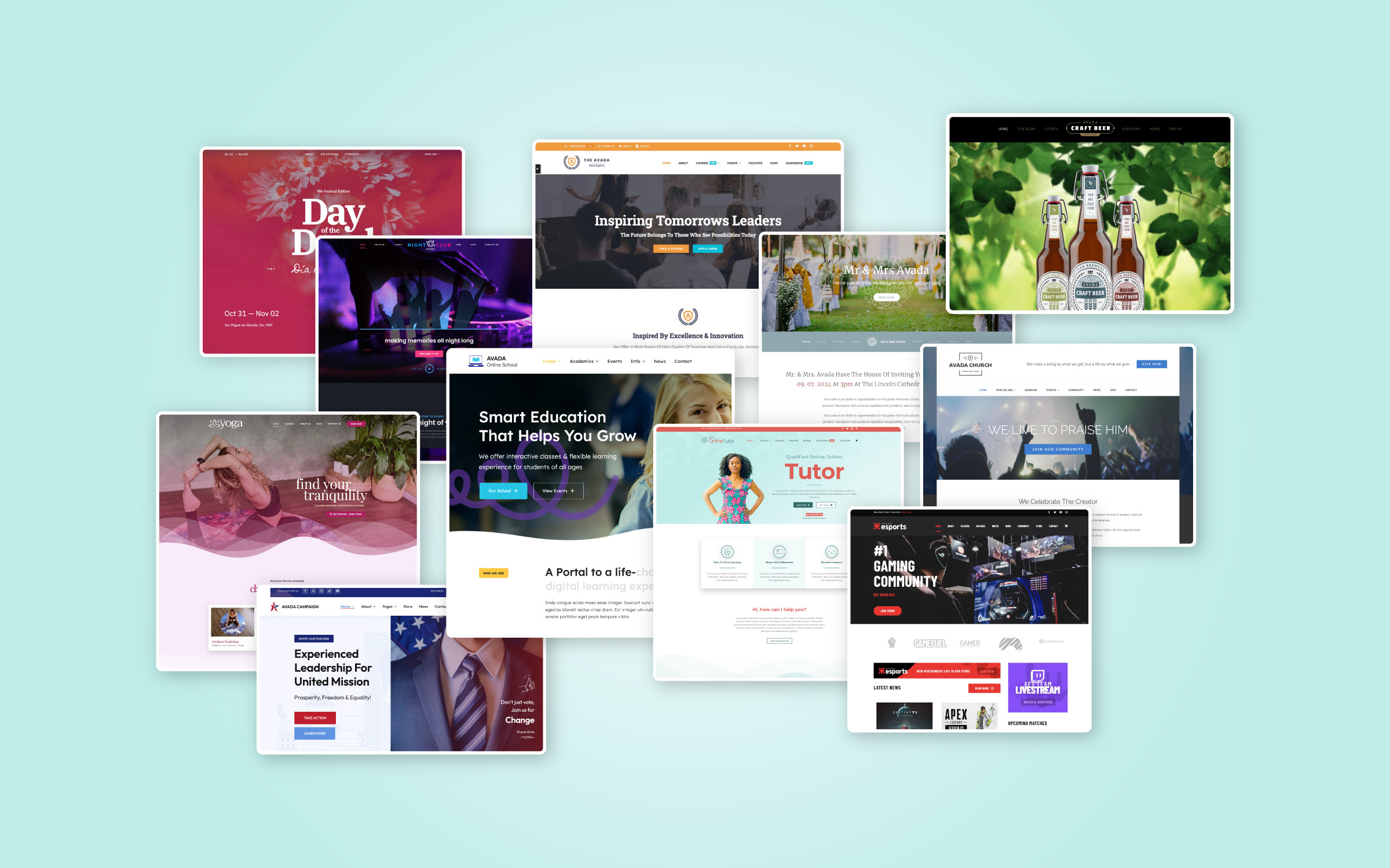
There are 113 Avada prebuilt websites to choose from, with more being added regularly. Our amazing design team created these prebuilt websites as a way to give you a head start when building your next website.
You can change the styling, Layouts, content as much or as little as you need to quickly adapt any individual prebuilt site to suit your chosen niche. Get started with the Avada Website Builder today and launch your business online; Fast.


