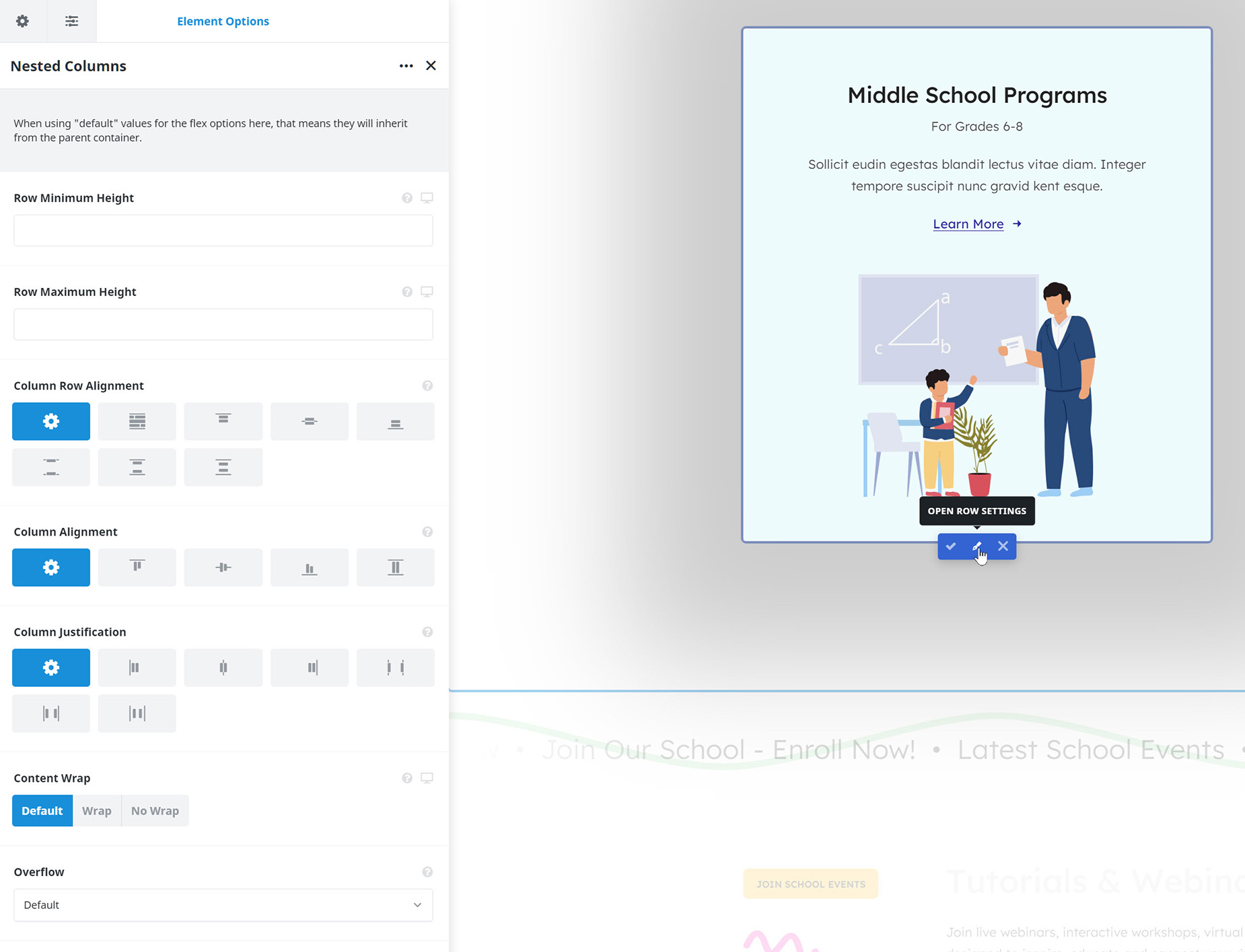
| Heading | | Description | | Alignment | | Defines how the column should align itself within the container. Overrides what is set on the container. |
| Content Layout | | Defines how the column content should be positioned. If block is selected it will not use flex positioning and will instead allow floated elements. |
| Content Alignment | | Defines how the column content should align. Works only with full height columns. |
| Content Vertical Alignment | | Defines how the column content should vertically align. |
| Gap | | Enter values including any valid CSS unit, ex: 20px. |
| Content Wrap | | Defines whether elements are forced onto one line or can wrap onto multiple lines. |
| Column Spacing | | Controls the column spacing between one column to the next. Enter value including any valid CSS unit, ex: 4%. |
| Center Content | | Set to "Yes" to center the content vertically. Equal heights on the parent container must be turned on. |
| Column HTML Tag | | Choose column HTML tag, default is div. |
| Link URL | | Add the URL the column will link to, ex: http://example.com. IMPORTANT: This will disable links on elements inside the column. |
| Link Target | | _self = open in same browser tab, _blank = open in new browser tab. |
| Link Description | | Add descriptive text to the link to make it easier accessible. |
| Ignore Equal Heights | | Choose to ignore equal heights on this column if you are using equal heights on the surrounding container. |
| Column Visibility | | Choose to show or hide the column on small, medium or large screens. You can choose more than one at a time. |
| Element Sticky Visibility | | Choose to show or hide the element, based on the current mode (normal or sticky) of its parent container. You can choose more than one at a time. |
| CSS Class | | Add a class to the wrapping HTML element. |
| CSS ID | | Add an ID to the wrapping HTML element. |
| Attributes | | Add custom HTML attributes to the element. |
| Heading | | Description | | Width | | Column width on respective display size. Enter values including any valid CSS unit, ex: 4%. |
| Maximum Height | | Set a maximum height for the column. Leave empty or set to "none" for automatic sizing. |
| Flex Grow | | Flex grow specifies how much of the remaining space in the container should be assigned to the column. |
| Flex Shrink | | Flex shrink specifies how much the column may shrink within the container if not enough space is available. |
| Order | | Column order on respective display size. |
| Column Spacing | | Enter values including any valid CSS unit, ex: 4%. Leave empty to inherit from container or Global Option. |
| Margin | | Enter values including any valid CSS unit, ex: 4%. |
| Padding | | Enter values including any valid CSS unit, ex: 4%. |
| Column Border Size | | Controls the border size of the column element. |
| Column Border Color | | Controls the border color of the column element. |
| Border Style | | Controls the border style. |
| Border Radius | | Enter values including any valid CSS unit, ex: 10px. IMPORTANT: In order to make border radius work in browsers, the overflow CSS rule of the column needs set to hidden. Thus, depending on the setup, some contents might get clipped. |
| Box Shadow | | Set to "Yes" to enable box shadows. |
| Box Shadow Position | | Set the vertical and horizontal position of the box shadow. Positive values put the shadow below and right of the box, negative values put it above and left of the box. In pixels, ex. 5px. |
| Box Shadow Blur Radius | | Set the blur radius of the box shadow. In pixels. |
| Box Shadow Spread Radius | | Set the spread radius of the box shadow. A positive value increases the size of the shadow, a negative value decreases the size of the shadow. In pixels. |
| Box Shadow Color | | Controls the color of the box shadow. |
| Box Shadow Style | | Set the style of the box shadow to either be an outer or inner shadow. |
| Z Index | | Value for the z-index CSS property of the column, can be both positive or negative. |
| Overflow | | Value for column's overflow CSS property. |
| Heading | | Description | | Color | | |
| Background Color | | Controls the background color. |
| Gradient | | |
| Gradient Start Color | | Select start color for gradient. |
| Gradient End Color | | Select end color for gradient. |
| Gradient Start Position | | Select start position for gradient. |
| Gradient End Position | | Select end position for gradient. |
| Gradient Type | | Controls gradient type. |
| Radial Direction | | Select direction for radial gradient. |
| Gradient Angle | | Controls the gradient angle. In degrees. |
| Image | | |
| Background Image | | Upload an image to display in the background. |
| Skip Lazy Loading | | Select whether you want to skip lazy loading on this image or not. |
| Background Position | | Choose the position of the background image. |
| Background Repeat | | Choose how the background image repeats. |
| Background Size | | Choose the size of the background image or set a custom size. |
| Background Custom Size | | Set the custom size of the background image. |
| Background Blend Mode | | Choose how blending should work for each background layer. |
| Slider | | |
| Slider Images | | Upload background slider Images. |
| Background Position | | Choose the position of the background slider images. |
| Skip Lazy Loading | | Select whether you want to skip lazy loading on background slider images or not. |
| Random Order | | Select whether you want to order the selected images randomly. |
| Loop | | Enable background slider Loop. |
| Pause On Hover | | Enable to pause background slider on hover. |
| Slideshow Speed | | Controls the speed of the slideshow. 1000 = 1 second. |
| Animation | | Select background slider animation. |
| Slider Direction | | Select slide animation direction. |
| Animation Speed | | Controls the speed of slide transition from slide to slide. 1000 = 1 second. |
| Blend Mode | | Choose how blending should work for background slider. |
| Heading | | Description | | Conditional Rendering | | Add conditional rendering logic for the element. The element will only be part of the post / page contents, if the set conditions are met. NOTE: Server cache can interfere with results. |
| Conditional Logic | | Add conditional logic when the element is used within a form. |
| Position Sticky | | Turn on to have the column stick inside its parent container on scroll. NOTE: this feature uses the browser native sticky positioning. Depending on the browser and specific setup the feature may not be available. |
| Responsive Position Sticky | | Choose at which screen sizes the container should be sticky. |
| Sticky Column Offset | | Controls how far the top of the column is offset from top of viewport when sticky. Use either a unit of measurement, or a CSS selector. |
| Position Absolute | | Turn on to have the column in absolute position. |
| Absolute Offset | | Enter values including any valid CSS unit, ex: 4%. |
| Collapsible / Read More | | Clip the column to a set height on the chosen screen sizes and reveal the rest with a "Read More" toggle. Leave all unchecked to disable. |
| Collapsed Height | | The visible height when collapsed. Enter a value (px, %, vh, em, rem). Leave empty to use the default. |
| Collapsed Fade Effect | | Add a fade at the bottom of the collapsed area. "To Transparent" dissolves the content itself, revealing whatever is behind it (and also fades the column's own background/border) — best over background images, gradients or transparent sections. "To Color" lays a gradient over the content toward a chosen solid color, keeping the background intact — best when blending into a known background color. |
| Collapsed Fade Color | | The color the content fades into. Set this to match the background behind the column. |
| Collapsed Fade Height | | Height of the fade at the bottom of the collapsed area, e.g. 60px. Leave empty for the default. |
| Collapse Trigger | | Use the built-in button, or control the toggle from any external link/button via the "Toggle/Open/Close Collapse" dynamic data link actions (target this column by its Element ID). |
| Expand Button Text | | Text shown on the button while the column is collapsed. |
| Collapse Button | | Show a button to collapse the column again after it has been expanded. Set to No for a one-way reveal — the button fades out once expanded. |
| Collapse Button Text | | Text shown on the button while the column is expanded. |
| Expand/Collapse Button Position | | Where the built-in button(s) sit(s). "Below Content" places it in its own row beneath the collapsed area. "Overlay On Content" floats it over the bottom of the collapsed area (on top of the fade). |
| Expand/Collapse Button Alignment | | Horizontal alignment of the built-in button(s). |
| Expand/Collapse Button Offset | | Fine-tune the button(s) position. With "Below Content" it sets the gap above the button(s). With "Overlay On Content" it lifts the button(s) up from the bottom edge. Note: "To Transparent" fades via a mask, so the button only stays fully visible if the offset is at least the Fade Height. Enter a value with a unit, e.g. 20px. |
| Expand/Collapse Animation Speed | | Duration of the expand/collapse animation in milliseconds. |
| Filter Type | | |
| Hover Element | | Select which element should be hovered to apply the filter hover options. |
| Hue | | Filter hue. |
| Saturation | | Filter saturation. |
| Brightness | | Filter brightness. |
| Contrast | | Filter contrast. |
| Invert | | Filter invert. |
| Sepia | | Filter sepia. |
| Opacity | | Filter opacity. |
| Blur | | Filter blur. |
| Backdrop Filters | | |
| Hover Element | | Select which element should be hovered to apply the backdrop filter hover options. |
| Backdrop Hue | | Backdrop filter hue. |
| Backdrop Saturation | | Backdrop filter saturation. |
| Backdrop Brightness | | Backdrop filter brightness. |
| Backdrop Contrast | | Backdrop filter contrast. |
| Backdrop Invert | | Backdrop filter invert. |
| Backdrop Sepia | | Backdrop filter sepia. |
| Backdrop Opacity | | Backdrop filter opacity. |
| Backdrop Blur | | Backdrop filter blur, e.g. for frosted glass effects. |
| Transform | | |
| Hover Element | | Select which element should be hovered to apply the transform hover options. |
| Scale X | | Set the scale in the horizontal direction. |
| Scale Y | | Set the scale in the vertical direction. |
| Translate X | | Set the translate in the horizontal direction. in pixels. |
| Translate Y | | Set the translate in the vertical direction. in pixels. |
| Rotate | | Set the rotation of the element. |
| Skew X | | Set the skew in the horizontal direction. |
| Skew Y | | Set the skew in the vertical direction. |
| Transform Origin | | Set the location of origin point for transform. |
| Transition Duration | | Set transition duration in milliseconds. |
| Transition Easing | | Select transition easing. |
| Transition Custom Easing | | Set transition custom easing, use this website to create custom easing. |
| Motion Effects | | Add Motion Effects for the element. |
| Apply Motion Scroll Effects On | | Choose which devices the scroll effects will be applied to. |
| Animation Type | | Select the type of animation to use on the element. |
| Direction of Animation | | Select the incoming direction for the animation. |
| Animation Color | | Select the color of the animation |
| Speed of Animation | | Type in speed of animation in seconds (0.1 - 5). |
| Animation Delay | | Select the delay time after the animation starts(0 - 5). |
| Offset of Animation | | Controls when the animation should start. |