Text Block Element

Last Update: February 19, 2023

The Text Block Element is a simple, yet foundational Element, used to insert text content into your page. In addition to displaying text in a single block, there is also an added feature that lets you choose the amount of columns the text will be displayed in. This is perfect for blog posts and other pages, as it offers a unique design style, and gives you more control over how you present your information to your users. Read on to discover more about this most used of all elements, and watch the video below for a visual overview.

For privacy reasons YouTube needs your permission to be loaded.
I Accept

How To Use The Text Block Element In Avada Builder

The Text Block Element is a foundational element, and allows you to add a variety of text blocks into your content. To start, add the element into your desired column.

The Text Block Element is as simple as it gets, but there are a few things to be aware of. There is now an option to split the text into a number of inline columns, but apart from that, there is just the Visual / Text Editor in which to place your content.

Be aware that if you are placing any text that has HTML in it, it must be added via the Text editor to render correctly. You can read this article for more information.

Read below for a description of all element options.

How To Use The Text Block Element in Avada Live

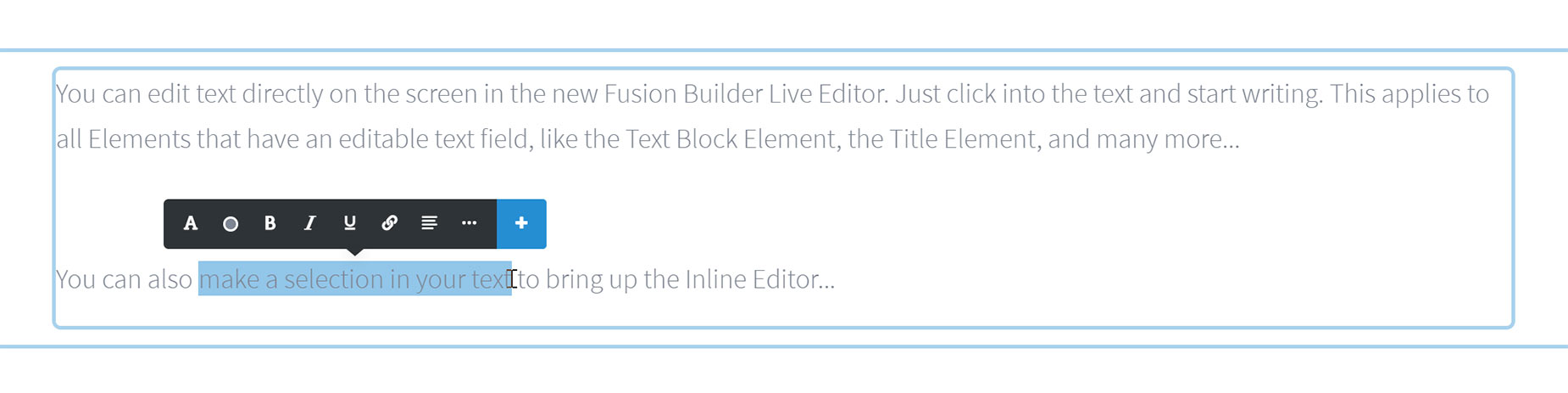
There are only a few differences when using the Text Block Element in Avada Live.

Being a text-based Element, the Text Block Element is directly editable in Avada Live. Just click inside the text on the page to start writing or editing. And if you make a selection of text on the page, the Inline Editor appears, allowing you to make formatting changes to parts of your text directly on the page.

Text Block Element in Fusion Builder Live

Please see the Best Practices for Inline Editing in Avada Live document for a good idea of how to best use the Inline Editor.

Element Options

Note: The Default setting will use the global settings assigned for this element at Options > Avada Builder Elements > Text Block. Also, please note that the displayed options screens below show ALL the available options for the element. If you have Avada’s Option Network Dependencies turned on, you will only see options relevant to your selections, and so the options screen may look somewhat different.

General

HeadingDescription
Number Of Inline ColumnsSet the number of columns the text should be broken into.IMPORTANT: This feature is designed to be used for running text, images, dropcaps and other inline content. While some block elements will work, their usage is not recommended and others can easily break the layout. Default currently set to 1. Reset to default.Using default value.
Column Min WidthSet the minimum width for each column, this allows your columns to gracefully break into the selected size as the screen width narrows. Leave this option empty if you wish to keep the same amount of columns from desktop to mobile. Enter value including any valid CSS unit, ex: 200px. Leave empty for default value of 100px.
Column SpacingControls the column spacing between one column to the next. Enter value including any valid CSS unit besides % which does not work for inline columns, ex: 2em. Leave empty for default value of 2em.
Rule StyleSelect the style of the vertical line between columns. Some of the styles depend on the rule size and color. Default currently set to None.
Rule SizeSets the size of the vertical line between columns. The rule is rendered as "below" spacing and columns, so it can span over the gap between columns if it is larger than the column spacing amount. In pixels. Default currently set to 1. Reset to default.Using default value.
Rule ColorControls the color of the vertical line between columns. Leave empty for default value of Strong Dark Gray. Reset to default.Using default value.
ContentEnter some content for this text block.
AlignmentSelect the text alignment.
Element VisibilityChoose to show or hide the element on small, medium or large screens. You can choose more than one at a time. Each of the 3 sizes has a custom width setting on the Responsive tab in the Global Options.
Element Sticky VisibilityChoose to show or hide the element, based on the current mode (normal or sticky) of its parent container. You can choose more than one at a time.
CSS ClassAdd a class to the wrapping HTML element.
CSS IDAdd an ID to the wrapping HTML element.

Design

HeadingDescription
MarginIn pixels or percentage, ex: 10px or 10%.
TypographyControls the text typography.
Font ColorControls the color of the text, ex: #000. Leave empty for default value of var(--awb-color6).

Extras

HeadingDescription
Animation TypeSelect the type of animation to use on the element.
Direction of AnimationSelect the incoming direction for the animation.
Animation ColorSelect the color of the animation
Speed of AnimationType in speed of animation in seconds (0.1 - 5).
Animation DelaySelect the delay time after the animation starts(0 - 5).
Offset of AnimationControls when the animation should start. Default currently set to Top Of Element Hits Bottom Of Viewport.