| Heading | | Description | | Interior Content Width | | Select if the interior content is contained to site width or 100% width. |
| Height | | Select if the container should be fixed to 100% height of the viewport. Larger content that is taller than the screen height will be cut off, this option works best with minimal content. IMPORTANT: Mobile devices are even shorter in height so this option can be disabled on mobile in Global Options while still being active on desktop. |
| Minimum Height | | Set the minimum height for the container. |
| Enable 100% Height Scroll | | Select to add this container to a collection of 100% height containers that share scrolling navigation. IMPORTANT: When this option is used, the mobile visibility settings are disabled. This option will not work within off canvas. |
| Row Alignment | | Defines how rows should be aligned vertically within the container. IMPORTANT: These settings will only take full effect when multiple rows are present. |
| Column Alignment | | Select how you want columns to align within rows. |
| Column Justification | | Select how the columns will be justified horizontally. |
| Content Wrap | | Controls whether flex items are forced onto one line or can wrap onto multiple lines. |
| Column Spacing | | Controls the spacing between columns of the container. |
| Center Content | | Set to "Yes" to center the content vertically on 100% height containers. |
| Set Columns to Equal Height | | Select to set all columns that are used inside the container to have equal height. |
| Container HTML Tag | | Choose container HTML tag, default is div. |
| Name Of Menu Anchor | | This name will be the id you will have to use in your one page menu. |
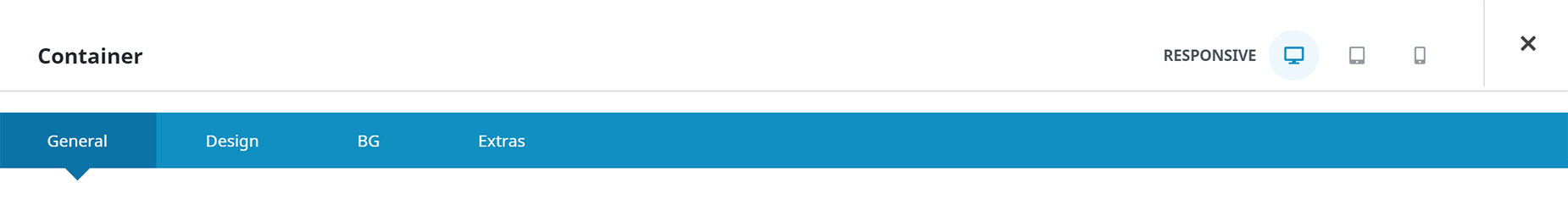
| Container Visibility | | Choose to show or hide the section on small, medium or large screens. You can choose more than one at a time. |
| Container Publishing Status | | Controls the publishing status of the container. If draft is selected the container will only be visible to logged in users with the capability to publish posts. If publish until or publish after are selected the container will be in draft mode when not published. |
| Container Publishing Date | | Controls when the container should be published. Can be before a date or after a date. Use SQL time format: YYYY-MM-DD HH:MM:SS. E.g: 2016-05-10 12:30:00. Timezone of site is used. |
| CSS Class | | Add a class to the wrapping HTML element. |
| CSS ID | | Add an ID to the wrapping HTML element. |
| Attributes | | Add custom HTML attributes to the element. |
| Heading | | Description | | Margin | | Spacing above and below the section. Enter values including any valid CSS unit, ex: 4%. |
| Padding | | Enter values including any valid CSS unit, ex: 10px or 10%. Leave empty for default value of 0px, 0px, 0px, 0px on Site Width template. Leave empty for default value of 0px, 30px, 0px, 30px on 100% Width template. |
| Container Link Color | | Controls the color of container links. |
| Container Border Size | | Controls the border size of the container element. |
| Container Border Color | | Controls the border color of the container element. |
| Border Style | | Controls the border style. |
| Border Radius | | Enter values including any valid CSS unit, ex: 10px. IMPORTANT: In order to make border radius work in browsers, the overflow CSS rule of the container will be set to hidden. Thus, depending on the setup, some contents might get clipped. You can change the overflow using the overflow option below. |
| Box Shadow | | Set to "Yes" to enable box shadows. |
| Box Shadow Position | | Set the vertical and horizontal position of the box shadow. Positive values put the shadow below and right of the box, negative values put it above and left of the box. In pixels, ex. 5px. |
| Box Shadow Blur Radius | | Set the blur radius of the box shadow. In pixels. |
| Box Shadow Spread Radius | | Set the spread radius of the box shadow. A positive value increases the size of the shadow, a negative value decreases the size of the shadow. In pixels. |
| Box Shadow Color | | Controls the color of the box shadow. |
| Box Shadow Style | | Set the style of the box shadow to either be an outer or inner shadow. |
| Z Index | | Value for container's z-index CSS property, can be both positive or negative. |
| Overflow | | Value for container's overflow CSS property. |
| Heading | | Description | | Color | | |
| Container Background Color | | Controls the background color of the container element. |
| Gradient | | |
| Gradient Start Color | | Select start color for gradient. |
| Gradient End Color | | Select end color for gradient. |
| Gradient Start Position | | Select start position for gradient. |
| Gradient End Position | | Select end position for gradient. |
| Gradient Type | | Controls gradient type. |
| Radial Direction | | Select direction for radial gradient. |
| Gradient Angle | | Controls the gradient angle. In degrees. |
| Image | | |
| Background Image | | Upload an image to display in the background. |
| Skip Lazy Loading | | Select whether you want to skip lazy loading on this image or not. |
| Background Position | | Choose the position of the background image. |
| Background Repeat | | Choose how the background image repeats. |
| Background Size | | Choose the size of the background image or set a custom size. |
| Background Custom Size | | Set the custom size of the background image. |
| Fading Animation | | Choose to have the background image fade and blur on scroll. WARNING: Only works for images. |
| Background Parallax | | Choose how the background image scrolls and responds. This does not work for videos and must be set to "No Parallax" for the video to show. |
| Enable Parallax on Mobile | | Works for up/down/left/right only. Parallax effects would most probably cause slowdowns when your site is viewed in mobile devices. If the device width is less than 980 pixels, then it is assumed that the site is being viewed in a mobile device. |
| Parallax Speed | | The movement speed, value should be between 0.1 and 1.0. A lower number means slower scrolling speed. Higher scrolling speeds will enlarge the image more. |
| Background Blend Mode | | Choose how blending should work for each background layer. |
| Slider | | |
| Slider Images | | Upload background slider Images. |
| Background Position | | Choose the position of the background slider images. |
| Skip Lazy Loading | | Select whether you want to skip lazy loading on background slider images or not. |
| Random Order | | Select whether you want to order the selected images randomly. |
| Loop | | Enable background slider Loop. |
| Pause On Hover | | Enable to pause background slider on hover. |
| Slideshow Speed | | Controls the speed of the slideshow. 1000 = 1 second. |
| Animation | | Select background slider animation. |
| Slider Direction | | Select slide animation direction. |
| Animation Speed | | Controls the speed of slide transition from slide to slide. 1000 = 1 second. |
| Blend Mode | | Choose how blending should work for background slider. |
| Video | | |
| Video MP4 Upload | | Add your MP4 video file. This format must be included to render your video with cross-browser compatibility. WebM and OGV are optional. Using videos in a 16:9 aspect ratio is recommended. |
| Video WebM Upload | | Add your WebM video file. This is optional, only MP4 is required to render your video with cross-browser compatibility. Using videos in a 16:9 aspect ratio is recommended. |
| Video OGV Upload | | Add your OGV video file. This is optional, only MP4 is required to render your video with cross-browser compatibility. Using videos in a 16:9 aspect ratio is recommended. |
| YouTube/Vimeo Video URL or ID | | Enter the URL to the video or the video ID of your YouTube or Vimeo video you want to use as your background. If your URL isn't showing a video, try inputting the video ID instead. Ads will show up in the video if it has them. |
| Video Aspect Ratio | | The video will be resized to maintain this aspect ratio, this is to prevent the video from showing any black bars. Enter an aspect ratio here such as: "16:9", "4:3" or "16:10". The default is "16:9". |
| Loop Video | | |
| Mute Video | | IMPORTANT: In some modern browsers, videos with sound won't be auto played, and thus won't show as container background when not muted. |
| Video Preview Image | | IMPORTANT: This field is a fallback for self-hosted videos in older browsers that are not able to play the video. If your site is optimized for modern browsers, this field does not need to be filled in. |
| Pattern | | |
| Pattern | | Select pattern. |
| Custom Pattern | | Upload your custom pattern. |
| Pattern Color | | Set the pattern color. |
| Pattern Style | | Select the pattern style. |
| Pattern Opacity | | Set the pattern opacity. |
| Pattern Size | | Set the pattern size. Enter values including any valid CSS unit, ex: 20%. |
| Pattern Blend Mode | | Set how pattern will blend with element background. |
| Mask | | |
| Mask | | Select mask. |
| Custom Mask | | Upload your custom mask. |
| Mask Color | | Set the mask color. |
| Mask Accent Color | | Set the mask accent color. |
| Mask Style | | Select the mask style. |
| Mask Opacity | | Set the mask opacity. |
| Mask Transform | | |
| Mask Blend Mode | | Set how mask will blend with element background. |
| Heading | | Description | | Conditional Rendering | | Add conditional rendering logic for the element. The element will only be part of the post / page contents, if the set conditions are met. NOTE: Server cache can interfere with results. |
| Conditional Logic | | Add conditional logic when the element is used within a form. |
| Position Absolute | | Turn on to set container position to absolute. |
| Responsive Position Absolute | | Choose at which screen sizes the container should get position absolute on. |
| Position Offset | | Sets the corresponding CSS position values. Enter values including any valid CSS unit, ex: 4%. |
| Position Sticky | | Turn on to have the container stick to the browser window on scroll. |
| Responsive Position Sticky | | Choose at which screen sizes the container should be sticky. |
| Sticky Container Background Color | | Controls the background color of the container element when sticky. |
| Sticky Container Minimum Height | | Controls the minimum height of the container when sticky. |
| Sticky Container Offset | | Controls how far the top of the container is offset from top of viewport when sticky. Use either a unit of measurement, or a CSS selector. |
| Sticky Container Transition Offset | | Controls the scroll offset before sticky styling transition applies. In pixels. |
| Sticky Container Hide On Scroll | | Controls the scroll distance before container is hidden while scrolling downwards. Set to 0 to keep visible as you scroll down. In pixels. |
| Collapsible / Read More | | Clip the container to a set height on the chosen screen sizes and reveal the rest with a "Read More" toggle. Leave all unchecked to disable. |
| Collapsed Height | | The visible height when collapsed. Enter a value (px, %, vh, em, rem). Leave empty to use the default. |
| Collapsed Fade Effect | | Add a fade at the bottom of the collapsed area. "To Transparent" dissolves the content itself, revealing whatever is behind it (and also fades the container's own background/border) — best over background images, gradients or transparent sections. "To Color" lays a gradient over the content toward a chosen solid color, keeping the background intact — best when blending into a known background color. |
| Collapsed Fade Color | | The color the content fades into. Set this to match the background behind the container. |
| Collapsed Fade Height | | Height of the fade at the bottom of the collapsed area, e.g. 60px. Leave empty for the default. |
| Collapse Trigger | | Use the built-in button, or control the toggle from any external link/button via the "Toggle/Open/Close Collapse" dynamic data link actions (target this container by its Element ID). |
| Expand Button Text | | Text shown on the button while the container is collapsed. |
| Collapse Button | | Show a button to collapse the container again after it has been expanded. Set to No for a one-way reveal — the button fades out once expanded. |
| Collapse Button Text | | Text shown on the button while the container is expanded. |
| Expand/Collapse Button Position | | Where the built-in button(s) sit(s). "Below Content" places it in its own row beneath the collapsed area. "Overlay On Content" floats it over the bottom of the collapsed area (on top of the fade). |
| Expand/Collapse Button Alignment | | Horizontal alignment of the built-in button(s). |
| Expand/Collapse Button Offset | | Fine-tune the button(s) position. With "Below Content" it sets the gap above the button(s). With "Overlay On Content" it lifts the button(s) up from the bottom edge. Note: "To Transparent" fades via a mask, so the button only stays fully visible if the offset is at least the Fade Height. Enter a value with a unit, e.g. 20px. |
| Expand/Collapse Animation Speed | | Duration of the expand/collapse animation in milliseconds. |
| Content Visibility | | Controls the CSS content-visibility property for this Container. "Inherit" follows the global Optimize Offscreen Rendering setting and is automatically ignored inside Header, Footer or Page Title Bar Layout Sections. "Visible" forces normal rendering (use to protect a Container with scroll-anchored features). "Auto" forces the offscreen-rendering optimization even when the global default would skip it. "Hidden" (advanced) skips rendering entirely while preserving the DOM and element state, similar to a collapsed tab — only use if you know you need it. Explicit values apply everywhere, including Layout Sections. |
| Animation Type | | Select the type of animation to use on the element. |
| Direction of Animation | | Select the incoming direction for the animation. |
| Animation Color | | Select the color of the animation |
| Speed of Animation | | Type in speed of animation in seconds (0.1 - 5). |
| Animation Delay | | Select the delay time after the animation starts(0 - 5). |
| Offset of Animation | | Controls when the animation should start. |
| Filter Type | | |
| Hue | | Filter hue. |
| Saturation | | Filter saturation. |
| Brightness | | Filter brightness. |
| Contrast | | Filter contrast. |
| Invert | | Filter invert. |
| Sepia | | Filter sepia. |
| Opacity | | Filter opacity. |
| Blur | | Filter blur. |
| Backdrop Filters | | |
| Backdrop Hue | | Backdrop filter hue. |
| Backdrop Saturation | | Backdrop filter saturation. |
| Backdrop Brightness | | Backdrop filter brightness. |
| Backdrop Contrast | | Backdrop filter contrast. |
| Backdrop Invert | | Backdrop filter invert. |
| Backdrop Sepia | | Backdrop filter sepia. |
| Backdrop Opacity | | Backdrop filter opacity. |
| Backdrop Blur | | Backdrop filter blur, e.g. for frosted glass effects. |


