Working With Color In Avada
Last Update: November 8, 2026
Color management is an integral part of designing and maintaining your website design and branding. To help with this, Avada offers advanced and streamlined color options to help you manage your color settings with ease.
It all starts with the Global Color Palette, which is used to define a palette of colors, which can then be tied to various global, page and element options on your website, allowing for quick updating of the entire site’s color scheme. Continue reading below to learn about the color options in Avada.
Setting The Global Color Palette
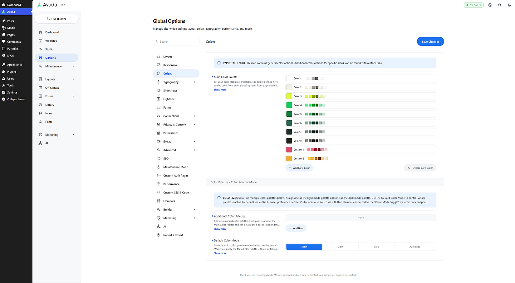
One of the best places to set your global color palette is when setting up your website with the Avada Setup Wizard. If you are choosing a Prebuilt site, the color palette will be set for you. See the Color section of the Avada Setup Wizard document for more details on this process, but regardless of whether you have used the Setup Wizard to set the initial global colors, or you have built the site and the color palette yourself, you can find them at Global Options > Colors.
The Core Color palette consists of eight colors, but you can also add extra colors to the palette, by clicking on Add New Color, and your colors can be renamed to whatever you like.
Color Variations
Next to the Colors on the Main Color Palette, a range of shades are displayed as a visual reference for each color. You can use these color variations anywhere you apply global colors.
Adding & Deleting Colors
You can add more colors to the inital color palette of eight colors by clicking on the Add New Color button at the bottom of the Color Palette. You can name them as you want, and you can delete them at any time with the trash icon next to the color. Just note, you can’t delete any of the colors in the initial palette. It’s designed for 8 colors or tones. As you can see in the screenshot above, the general idea is ist to set one or two colors, and the remaining places can be filled with a variety of tones, from white to black. You don’t have to use all the colors in the color palette, but there will always be at least 8 color places.
additional Color Palettes
In the Color Palettes / Color Scheme Mode section of the Global Color Options, there is the ability to make Additional Color Palettes.
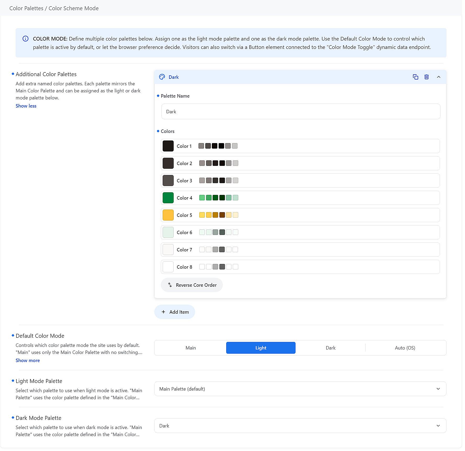
This feature is best used to create a Dark Color scheme for your website (or Light if your website is already dark). The easy way to do this is to create a new Color Palette, and then reversing the Core Colors. Then save it with an appropriate name.
In the example below, a Dark Color palette has been created by reversing the Core colors, and under that the Default Color Mode has been set to Light, and the Dark Mode Palette has been set to the ‘Dark’ color palette.
This enables switch of color modes by the user. To achieve that, you can add a Button in the header, that is using the Toggle Light/Dark Mode dynamic data item, and the user will then be able to switch between the two color palettes at will.
Alternative Color Palette
Even though it says Light and Dark Modes, in practice you could use these options to offer two alternative light (or dark) color palettes. For example, you might have the Main palette as green and yellow palette and an additional blue and orange palette and allow you users to choose between Green and Blue via the above mentioned button. All that button does is switch between the nominated Light Mode and Dark Mode palette.
Setting Global Colors
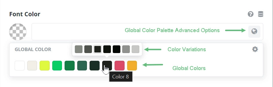
Once you have set the colors in your Global Color Palette, you can begin to set them across your site. Anywhere you find a color picker, you will find a globe icon to access the global palette colors. When you mouse over a global color, you can select it, or alternatively, a range of variations appear above the chosen global color. There are two lighter options, the global color itself, two darker options, and two semi-transprent options. As you mouse over each one, you will see a label identifying the color – for example, Color 8- Lighter 50%
Color Palette Advanced Options
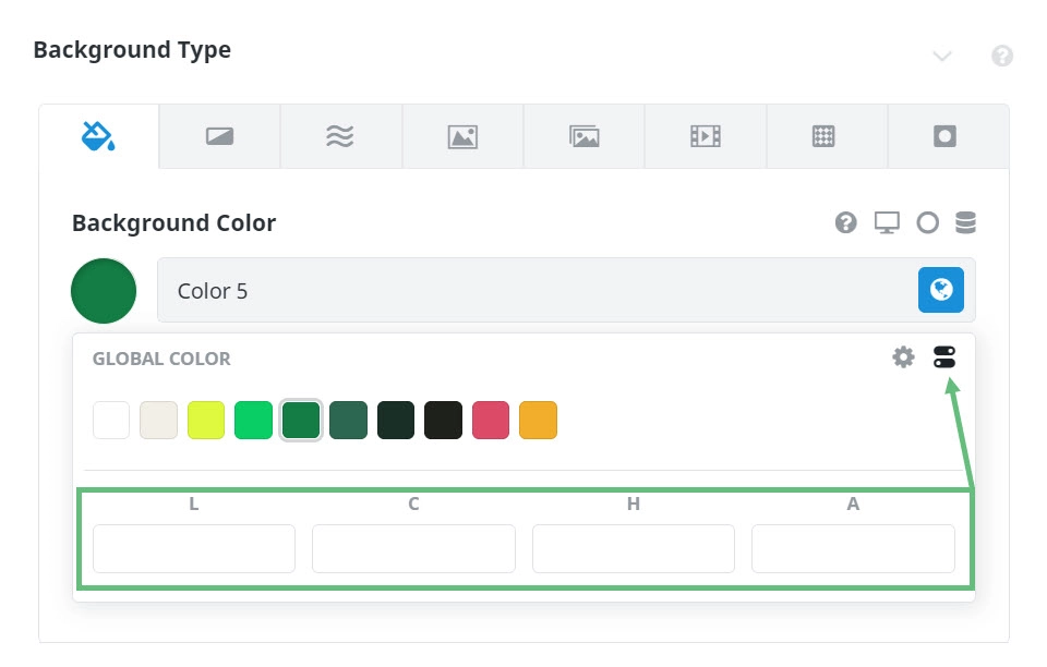
When setting a Color, there are also some advanced options available. These options, accessed by the sliders icon at the right of the dialog when adding a global color, offer the ability for Lightness, Chroma (Saturation) Hue, and Alpha value (Transparency) adjustments.
In this way, you can add extra colors into your design that are tied to the chosen global color. The best method for setting colors in Avada is to set your global color palette and use them across the board. And if you need any adjustments to them, simply use the Advanced Global Palette Color Options to make your adjustment.
Initial Color Options State
When you first go to any specific color option, it can look differently, depending on its state and whether it has default values.
Working With the Color Picker
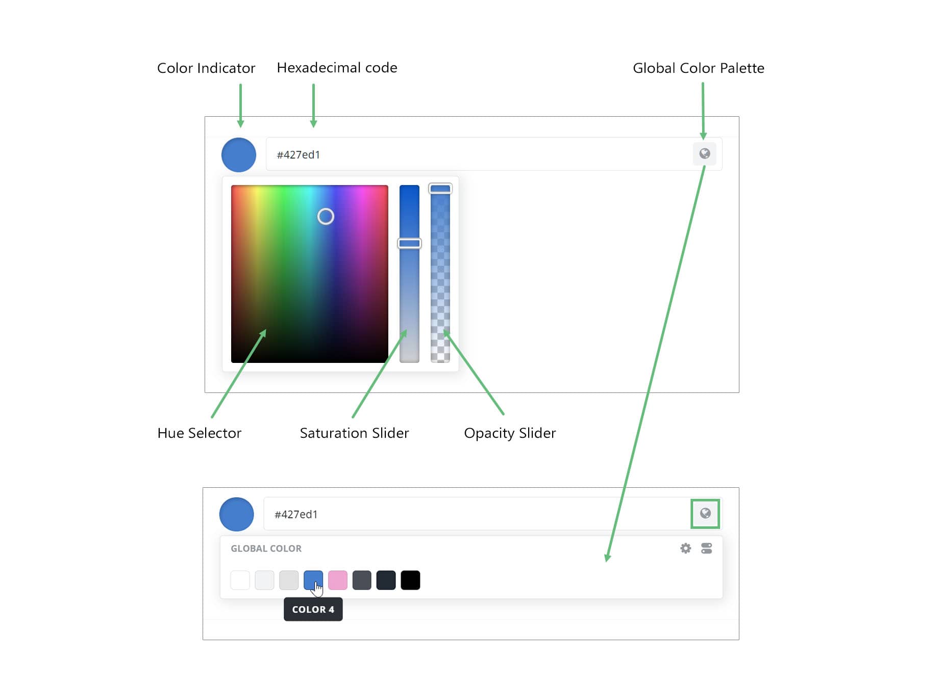
To access the standard color picker, just click on the Color indicator at the left (the circle of color). If a Global Color has previously been set, this then disconnects any global color position and changes the value to a hexadecimal code.
While it’s an accurate way of selecting colors, you don’t have to enter a hexadecimal code. You can also just drag the hue selector around in the color field, and manipulate the range with the saturation slider and alternatively, the opacity slider. See below for more information on these sliders.
On the right-hand side is the Global Color Palette icon. If you click this, you can assign a specific color from any one of the colors on the Global Color Palette. This ties it into that position on the Global Color Palette and affords you a powerful way to update colors across your site.
Color Picker Saturation and Opacity
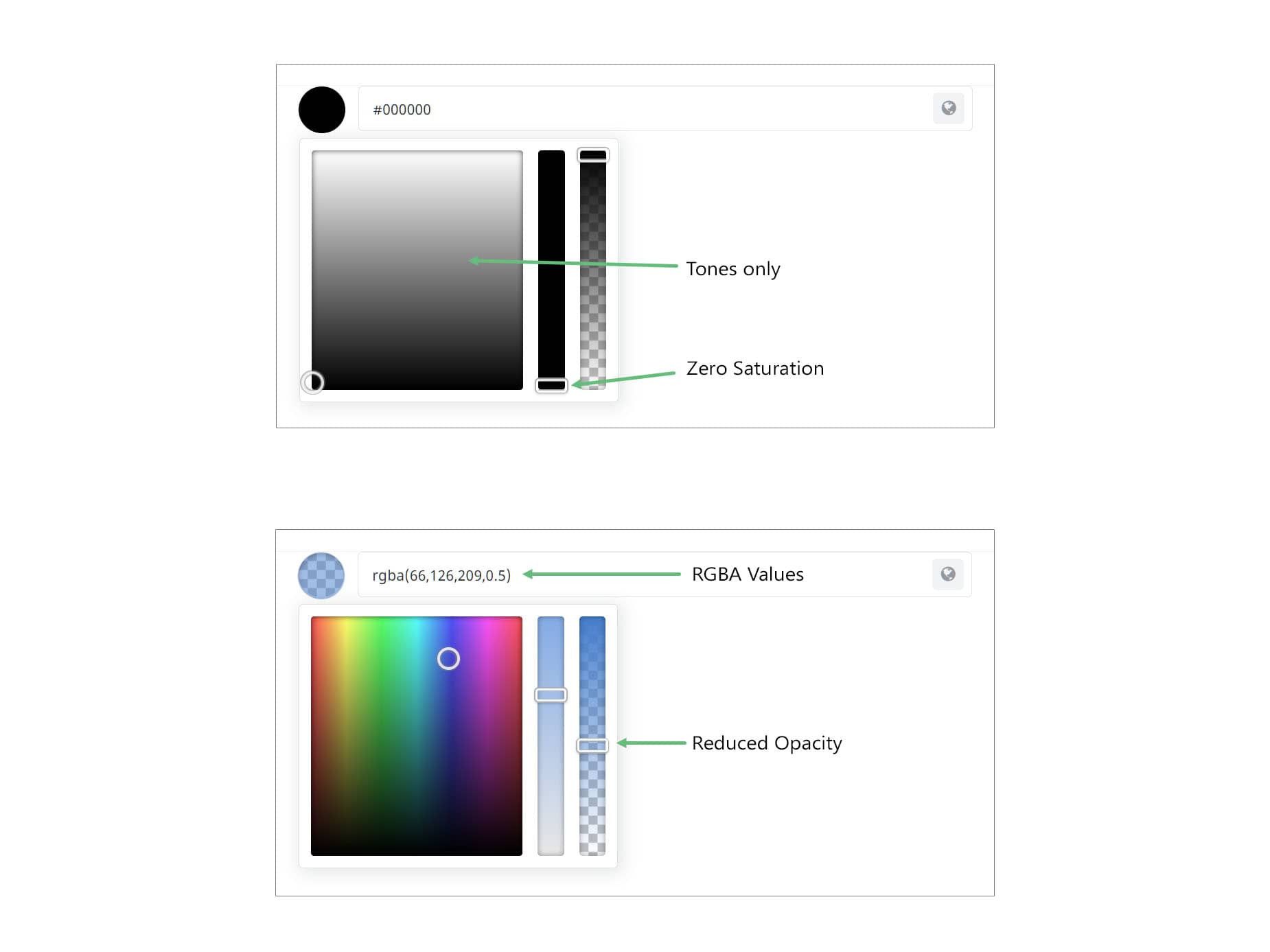
When using hexadecimal colors the Saturation and Opacity Sliders are also very powerful. If you reduce the Saturation slider, your colors will become more pastel. If you reduce the saturation to zero, then your color picker will only display tones, from white to pure black and everywhere in between.
If instead, you reduce the Opacity Slider, the Hexadecimal code will be replaced by an RGBA value. This value notates the Red, Green and Blue values of the color, as well as the Alpha value (opacity). This makes the color picker very powerful indeed, and in this way, you can choose from millions of colors for your website.