Using The Sliding Bar
Last Update: October 28, 2025
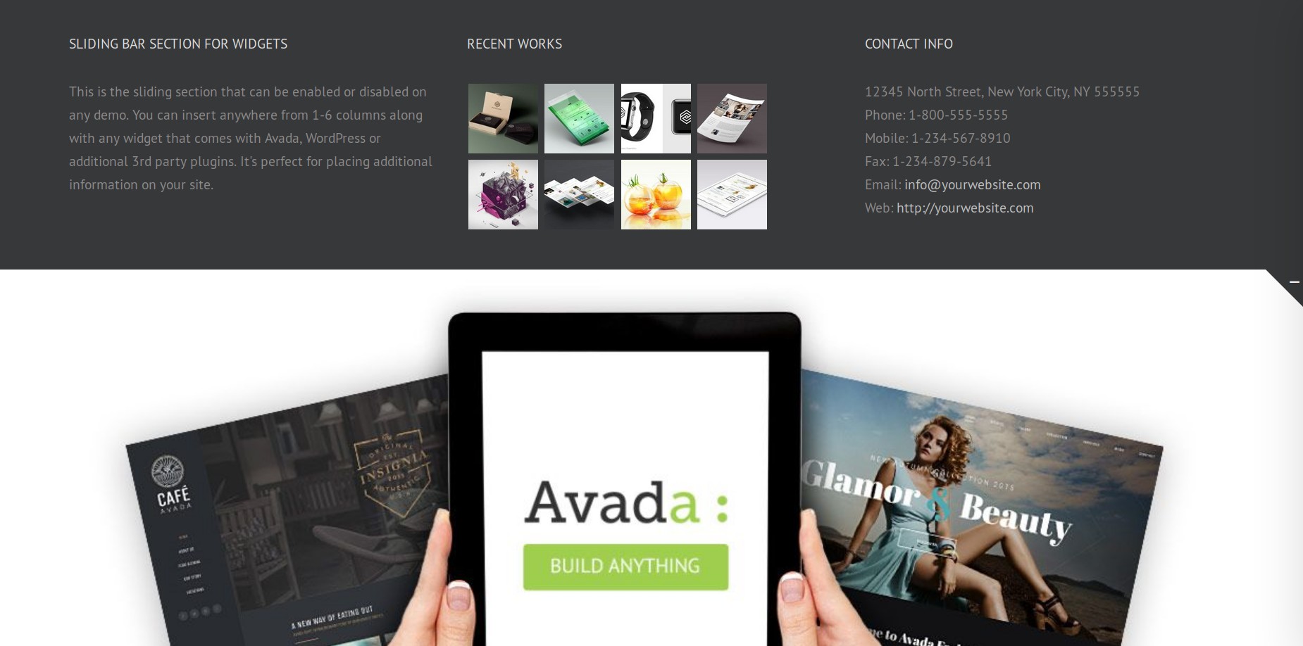
The Avada Sliding Bar is a widgetized section that can collapse and expand by clicking the active icon. This is perfect for adding information,content, widgets, buttons, menus etc to engage your audience. You can choose between 1-6 columns for the sliding bar, and you can choose the position of the sliding bar to be the top, left, right, or at the bottom of your site. You can also choose to make it sticky (for top or bottom position only). See the sliding bar live in some of our demos here: Classic, Promote, Adventure, University, and Information Technology.
How To Setup The Sliding Bar
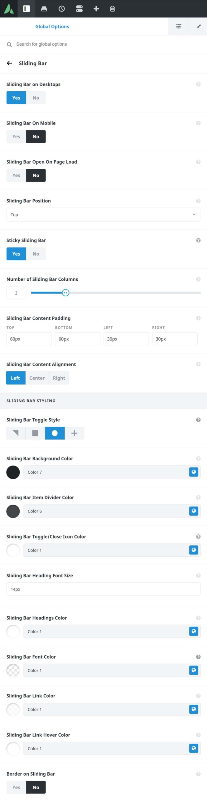
Step 1 – Navigate to Avada > Options > Sliding Bar.
Step 2 – The Slider Bar can be enabled/disabled on desktop and mobile using the ‘Sliding Bar on Desktops’ and ‘Sliding Bar On Mobile’ options. Using the sliding bar on mobile is limited due to space, please see the description in the Global Options, and the important note below.
Step 3 – Choose where you want it to be positioned (Top, Right, Bottom, or Left). For Top and Bottom positions, you will have the option to make it sticky.
Step 4 – Decide whether or not the sliding bar opens on page load by default, the number of columns (1-6), and the content alignment (Left, Center, Right).
Step 5 – New features were added in Avada version 5.5 – these options are ‘Sliding Bar Width’, ‘Sliding Bar Column Alignment’, and ‘Sliding Bar Content Padding’. The ‘Sliding Bar Width’ and ‘Sliding Bar Column Alignment’ options are only available if you choose Right or Left position only. Set these options the way you prefer.
Step 6 – Styling options are found under Sliding Bar Styling section and under this section, you can set the style you want for the sliding bar toggle. You can choose from Triangle, Rectangle, Circle, or Main Menu Icon options.
Step 7 – For the other styling options, you can choose a background color, background color opacity, toggle color, heading font size, font color and more. You can also choose to turn on or turn off the border on your sliding bar.
Step 8 – Once you’re done setting the options, click ‘Save Changes’ button.
Please continue reading below to learn more about each of the Sliding Bar options.
Sliding Bar Position
The Sliding Bar position can be selected as Top, Right, Bottom, or Left. This is set in the the Global Options at Avada > Options > Sliding Bar > Sliding Bar Position.
On top of this, the Sliding Bar can be made sticky when in either the Top or Bottom position. This means that the Sliding Bar stays visible at the Top or the Bottom of the viewport when you scroll. This Sticky setting is not needed when choosing Left or Right, as the Sliding Bar will always be visible when in those positions.
Another main option is the Sliding Bar Width. This controls the width of the sliding bar on left/right layouts. With Top, and Bottom positions, the widget content determines the height of the Sliding Bar.
Finally, in the Toggle Style Option, you can also choose Main Menu icon, which of course, places the Sliding Bar Toggle as a plus symbol in the Main Menu itself.
These changes go a long way towards enabling the type of setup, long asked for by users, such as the custom Sliding Bar on our Prebuilt sites that show the other prebuilts. With some imagination and the right content, almost anything is possible with the Sliding Bar.
Number Of Sliding Bar Columns
With the Sliding Bar, you can have anywhere from 1 to 6 columns. This is set in the Global Options at Avada > Options > Sliding Bar > Number of Sliding Bar Columns.
When using the Left or Right positions, there is also an option for the alignment of the columns. Select between Stacked or Floated. This effectively makes your widget content display in rows (Stacked) or columns (Floated).
For Top, and Bottom positions, the columns themselves are evenly distributed across the full site width. There is also the option to control the content padding in the columns via the Sliding Bar Content Padding section.
Sliding Bar Toggle Style
There are also several styles you can choose to style your Sliding Bar Toggle. These are Triangle, Rectangle, Circle, and Main Menu Icon. These options are found in the Global Options: Avada > Options > Sliding Bar > Sliding Bar Styling > Sliding Bar Toggle Style. See a screenshot of the area here.
These options also affect the placement of the Sliding Bar Toggle. For the Triangle, the Toggle is at the very corner of the viewport (corresponding to the position you have selected). For the Rectangle, the Toggle is placed in from the edge to create a tab effect, while the Round option positions the Toggle freestanding, away from the edge. The Main Menu Icon option places the Toggle in the Main Menu instead, as a + symbol. You can select the color of the Toggle via the Global Options.
When assigning a Header via the Global Options, there is an option to add a Sliding Bar Toggle to your main menu. When using the Menu Element in a Custom Header, however, you have to assign a Sliding Bar in a different way. As the Global Option for the Sliding Bar Toggle Style > Main Menu Icon will not work when using the Menu Element, there is the option to add a Sliding Bar Toggle to your Menu via the Avada Special Menu Items. Read more about this from the link below.
How To Add Widgets To The Sliding Bar
Step 1 – To add your widget areas to the Sliding Bar, navigate to WP Dashboard > Appearance > Widgets.
Step 2 – You will see a ‘Sliding Bar Widget X’ section on the right hand side for each Sliding Bar column (from 1-6 columns) selected in the global options. To add the widgets, drag and drop the widgets you want from the left side into the sliding bar widget areas on the right side.
To learn more about widgets and all they can do across the theme, please visit the Widget section of our documentation.
Sliding Bar Options
The Global Options for the Sliding Bar can be found at Avada > Options > Sliding Bar. See below for a rundown of each option.
Sliding Bar on Desktops – Allows you to display the sliding bar on desktops.
Sliding Bar on Mobile – Allows you to display the sliding bar on mobiles. Important Note: Due to mobile screen sizes and overlapping issues, when this option is enabled the triangle toggle style in the top right position will be forced for square and circle desktop styles.
Sliding Bar Open On Page Load – Allows you to have the sliding bar open when the page loads.
Sliding Bar Position – Allows you to set the position of the sliding bar to be in the top, right, bottom, or left of your site.
Sliding Bar Width – Allows you to set the width of the sliding bar on left/right layouts. Enter value including any valid CSS unit. For example: 300px
Sticky Sliding Bar – Allows you to enable a sticky sliding bar. Note: This option is available for top/bottom position only.
Number of Sliding Bar Columns – Allows you to set the number of columns you want to have in the sliding bar.
Sliding Bar Column Alignment – Allows you to have the sliding bar columns be stacked (one above the other) or floated (side by side). Note: This option is available for right/left position only.
Sliding Bar Content Padding – Allows you to set the top/right/bottom/left paddings of the sliding bar area. Enter values including any valid CSS unit. For example: 35px, 30px, 35px, 30px
Sliding Bar Content Alignment – Allows you to set the sliding bar content alignment to Left, Center, or Right.
Sliding Bar Toggle Style – Allows you to set the appearance of the sliding bar toggle to Triangle, Rectangle, Circle, or Main Menu Icon.
Sliding Bar Background Color – Allows you to set the background color of the sliding bar.
Sliding Bar Item Divider Color – Allows you to set the divider color in the sliding bar.
Sliding Bar Toggle/Close Icon Color – Allows you to set the color of the sliding bar toggle icon and the close icon when using the Main Menu Icon as toggle style.
Sliding Bar Heading Font Size – Allows you to set the font size for the sliding bar heading text. Enter value including CSS unit (px, em, rem). For example: 13px
Sliding Bar Headings Color – Allows you to set the text color of the sliding bar heading font.
Sliding Bar Font Color – Allows you to set the text color of the sliding bar font.
Sliding Bar Link Color – Allows you to set the text color of the sliding bar link font.
Sliding Bar Link Hover Color – Allows you to set the text hover color of the sliding bar link font.
Border on Sliding Bar – Allows you to display a border line on the sliding bar which makes it stand out more.


