How To Use The Off Canvas Builder
Last Update: February 25, 2026
The Avada Off-Canvas Builder allows you to create a wide range of popups, sliding bars, and even flyout and push menus for your Avada website. An Off-Canvas is positioned outside the viewport (not initially visible) and appears when activated. Read on to find out more about this very versatile builder, and watch the video below for a visual overview.
Video Tutorial
How To Create A New Avada Off-Canvas
The Avada Off-Canvas Builder is found in the WordPress Dashboard > Avada > Off Canvas, in the WordPress sidebar, or in the menu on the Avada Dashboard. This is where you create and manage all your Off-Canvas creations.
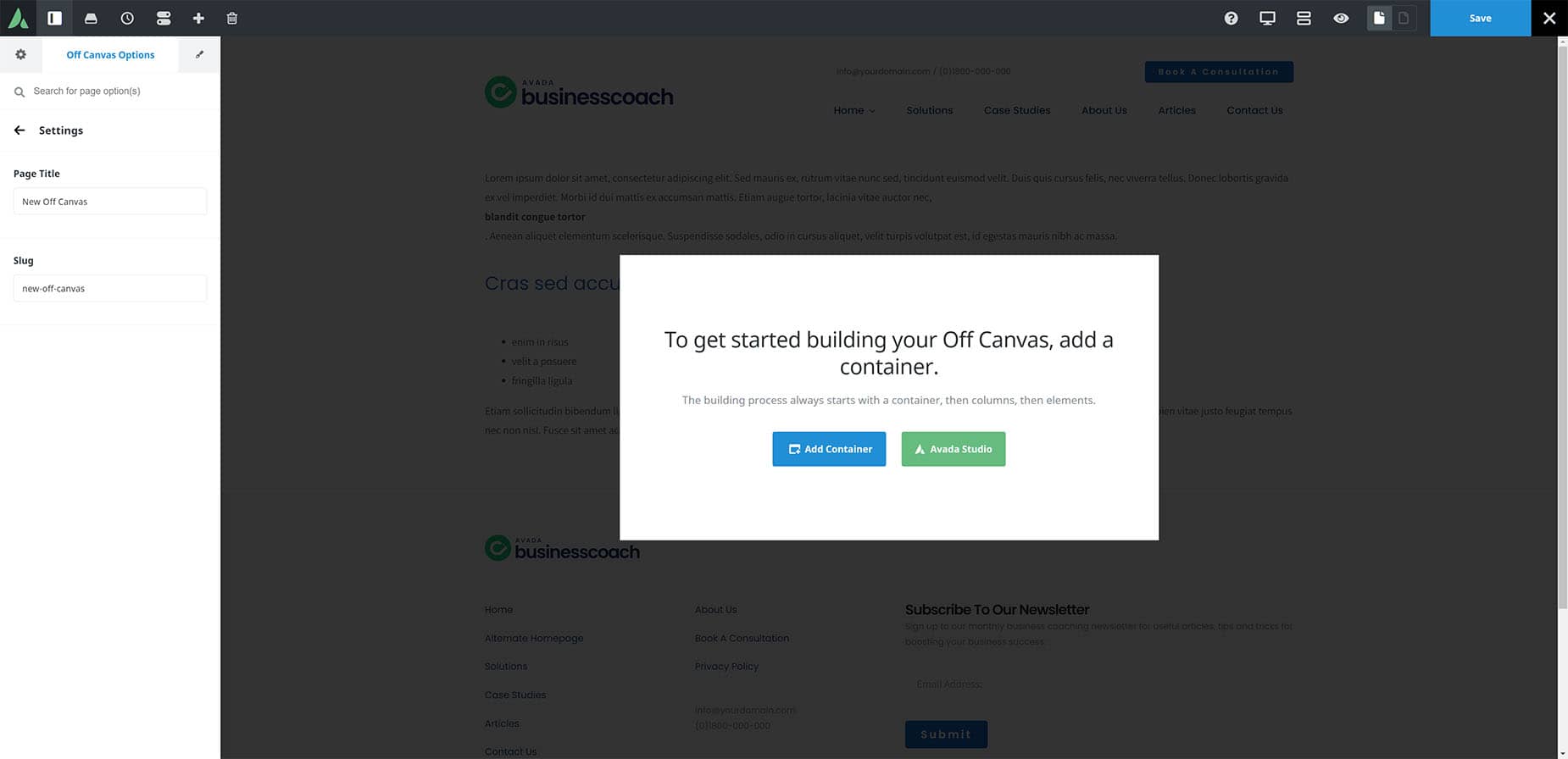
To get started, give your new Off-Canvas a name and click on “Create New Off-Canvas”. Depending on whether you have Avada Builder Auto Activation turned on or not in the Avada Builder Options (Avada Dashboard > Options > Builder Options), you will be taken directly to the Avada Builder or the WordPress editor. In that case, click on your choice of builder, either Avada Builder or Avada Live Visual Builder, to start building.
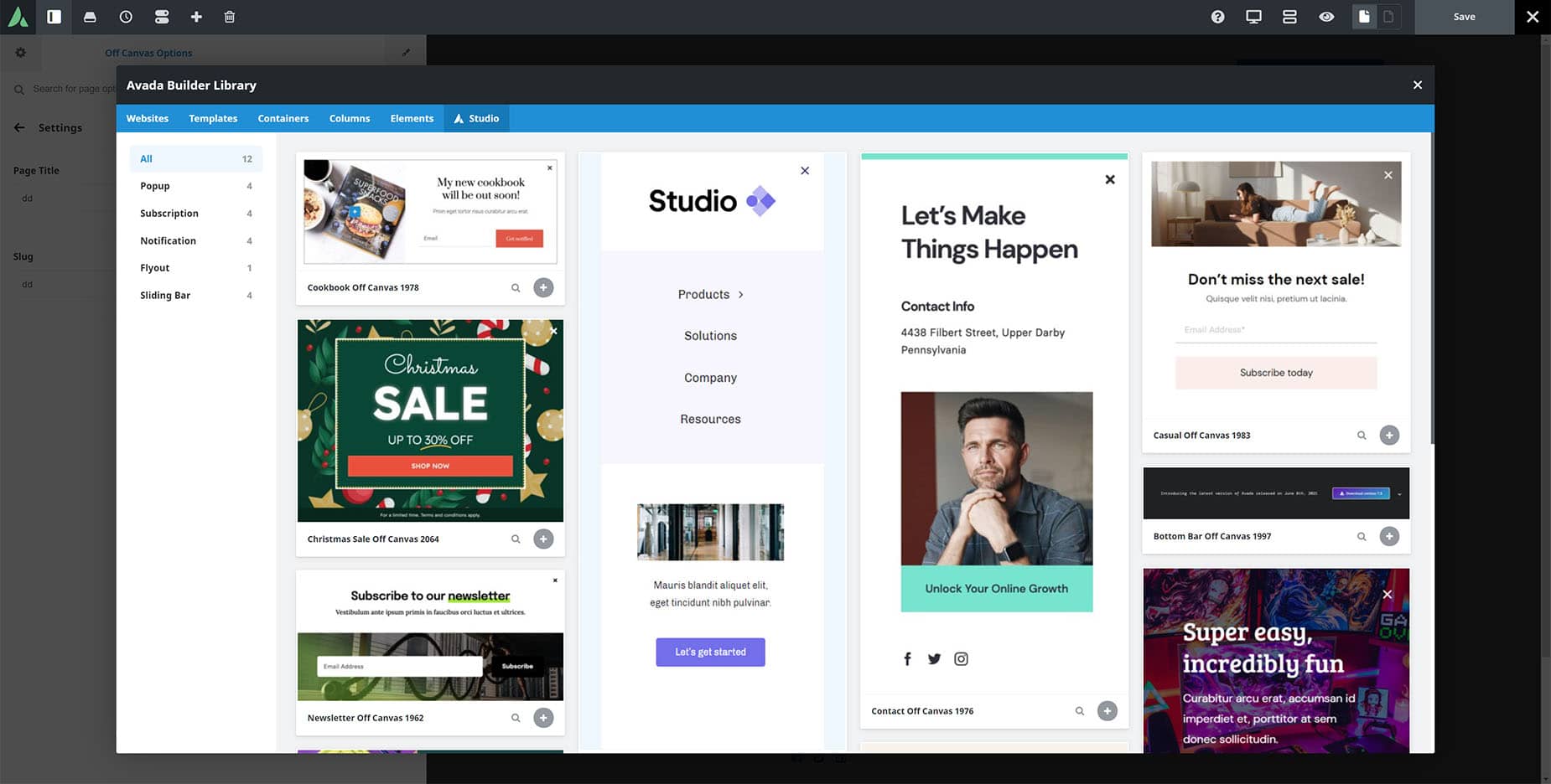
In either case, the first thing you see is a choice to either add a Container and start building from scratch, or to open Avada Studio and import a prebuilt Off-Canvas.
The Avada Studio is a great place to start. There is a range of prebuilt Off-Canvas items here you can use, all fully designed and ready for you to import and customize. This is an excellent way for you to familiarize yourself with the different types of popups, sliding bars, and even flyout and push menus that can be made, and also how to configure them.
If you choose instead to build an Avada Off-Canvas from scratch, select your starting Container/Column combination and get building. You have the full range of Avada Design Elements to build with.
Building And Configuring An Off-Canvas
Creating an Off-Canvas comes in two concurrent stages: building and configuring. The content comes from the Builder, and you can add anything at all into your Off-Canvas using the Avada Builder. You have the full range of Design Elements at your disposal. There are also a limited number of Layout Elements available.
Off-Canvas Builder can be used to create Pop-ups and a range of Sliding Bars, flyout, and Push Menus, but the reality is that these are Off-Canvas panels, and you can add anything you want to them.
Configuration is done via the Off-Canvas Options, located in the Avada Page Options panel position. In the Avada Live Visual Builder, this is on the Sidebar and remains active while you are building; in Avada Builder, it’s at the bottom of the page. As mentioned, the configuration and build processes run concurrently, as some Off-Canvas Options will also affect the Off-Canvas’s appearance. Let’s go through all the configuration tabs.
The Off-Canvas Option Tabs
Settings Tab
The Settings Tab is where you name your Off-Canvas and set its slug; this is generated automatically when you create your Off-Canvas. Unless you want to rename your Off-Canvas, you won’t need to do anything here.
Preview Tab
On this tab, you can configure Dynamic Content options for the dynamic preview.
General Tab
This is the main configuration tab for your Off-Canvas. Here, you control the type of Off-Canvas (Popup or Sliding Bar) and adjust its width, height, and various other alignment options. There are unique options for each Off-Canvas type, as shown below.
Design Tab
The Design Tab allows you to configure your Off-Canvas, with background color or image, border options, as well as any margin, padding, and box shadow.
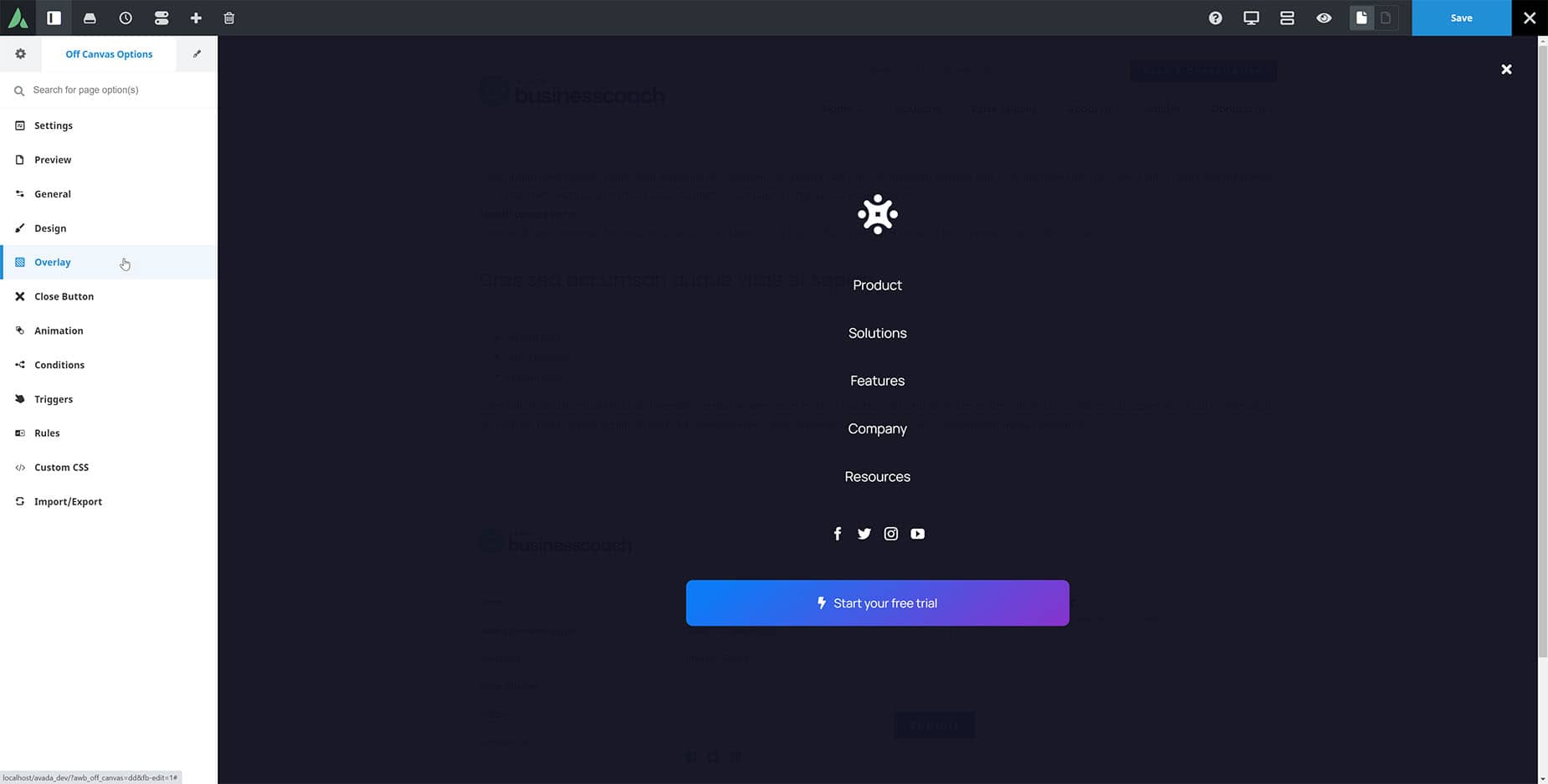
Overlay Tab
The overlay tab controls the styling of the background page content when the Off-Canvas is active. It can be disabled entirely or configured with color, scrollbars, and even background images.
CloseTab
The Close tab allows you to configure how your Off-Canvas will close, and you can adjust the close button’s icon, icon size, color, margins, and more.
Animation Tab
The Animation tab allows you to configure both an Enter and Exit animation for your Off-Canvas, giving you a range of effects for the way it enters and leaves the page.
Conditions Tab
When an Off-Canvas is created, they are not active by default. They are essentially in a draft state, so you can decide when, where, and how to activate them. This is achieved on the Conditions tab. Simply setting the Enable Conditions option to Yes makes the Off-Canvas live and global, i.e., displayed on every page.
You can also click on Manage Conditions to open the Conditions dialog, where you can specify exactly what parts of your site you want your Off-Canvas to be active for. Using this method, you must select which pages and post types to both enable and disable with the Off-Canvas.
Triggers Tab
Triggers are managed on the Triggers Tab, where you can set a range of automatic triggers, such as On Page Load, Time On Page, On Scroll, etc. There is also an option to set an Element Selector for manual triggering of your Off-Canvas from a button or other trigger.
Outside of this tab, there are also a couple more ways to trigger an Off-Canvas. The first one of these is through the use of an Avada Special Menu Item. By adding the Off-Canvas Toggle Special menu Item to a menu, you can add a menu link to toggle a specified Off-Canvas. See the Avada Special Menu Items doc for more information on this method.
Another way to trigger an Off-Canvas is through Dynamic Content. For example, you could add a Button with dynamic content as the Button URL. There are three dynamic content options: Toggle Off-Canvas, Open Off-Canvas, and Close Off-Canvas.
You can also trigger an Off-Canvas from an Avada Form Submission. With these methods, you have a great deal of flexibility in how to trigger your Off-Canvas creations. See our video on How To Trigger an Avada Off-Canvas for a rundown of the options and some examples.
Rules Tab
The Rules Tab lets you configure rules for how your Off-Canvas is displayed. These include publish date options that show the Off-Canvas first after a specified number of page views, sessions, or minutes, or when your users are coming from a specific page or exiting to a particular page. Combined with the Conditions and the Triggers, this gives you a very powerful system for controlling the display of your Off-Canvas creations.
Code Fields Tab
The Code Fields Tab has only one option that lets you add custom code to your Off-Canvas, such as structured data or JavaScript. This is for advanced users.
Custom CSS Tab
If you need even more control, there is a Custom CSS tab you can use to apply custom CSS to the specific Off-Canvas.
Import / Export Tab
Finally, as with any Page Option Set, you can import or export your Off-Canvas options for reuse on different Avada websites.
The Avada Off-Canvas Builder negates the need for any pop-up builder plugin, as well as allowing you to add a wide range of sliding bars. The flexibility this tool affords means that it is limited only by your imagination.


