How To Set Up A Global Options Header
Last Update: October 28, 2025
There are two ways to set up your header area in Avada. The way we recommend is to create your own fully custom Header using Avada Layouts, taking advantage of the full power of Avada Builder, and either starting with a blank template, or importing one of prebuilt header layouts and customizing it.
Alternatively, you can still select a prebuilt header from the Global Options (Avada > Options > Header Content), but this is a Legacy method, and we strongly recommend using Avada Layouts instead. There are 7 header layouts to choose from in the options method, each with its own unique design and set of options. In addition, the header can be positioned on the top, left or right. There are several options to customize the header, as well as the content within it.
Setting Up The Header
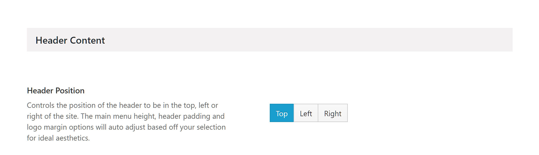
Header Positions
As mentioned above, you can set your header position to Top, Left or Right. Depending on the position you set, you will be presented with different options. To learn more about each header position, please check the links provided below.
Header Options
Each Header sub-panel contains specific options that pertain to different sections and aspects of your header. There are 4 sub-panels under the Header panel located in the Avada > Options > Header tab. These sub-panels are the Header Content sub-panel, Header Background Image sub-panel, Header Styling sub-panel, and the Sticky Header sub-panel. Continue reading below to learn about each sub-panel.
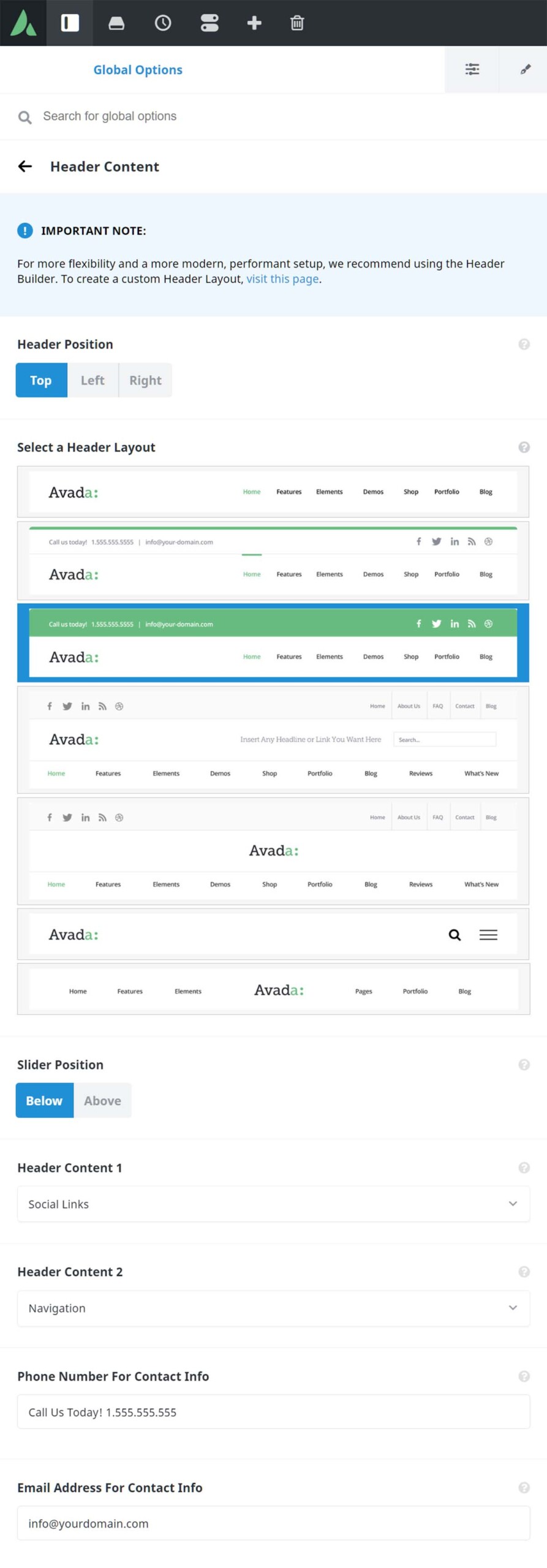
Header Content Options
In this section, you can select your Header Position, Header Layout, and Slider Position settings. Depending on the options you select here, their respective dependent options will load and appear. For example, if you select the Top header position, then the Header Layout options will load and appear.
In the Select a Header Layout section, you can choose from one of the 7 prebuilt Header designs. For a full rundown on each one of these prebuilt header designs, please see the Header Layouts doc.
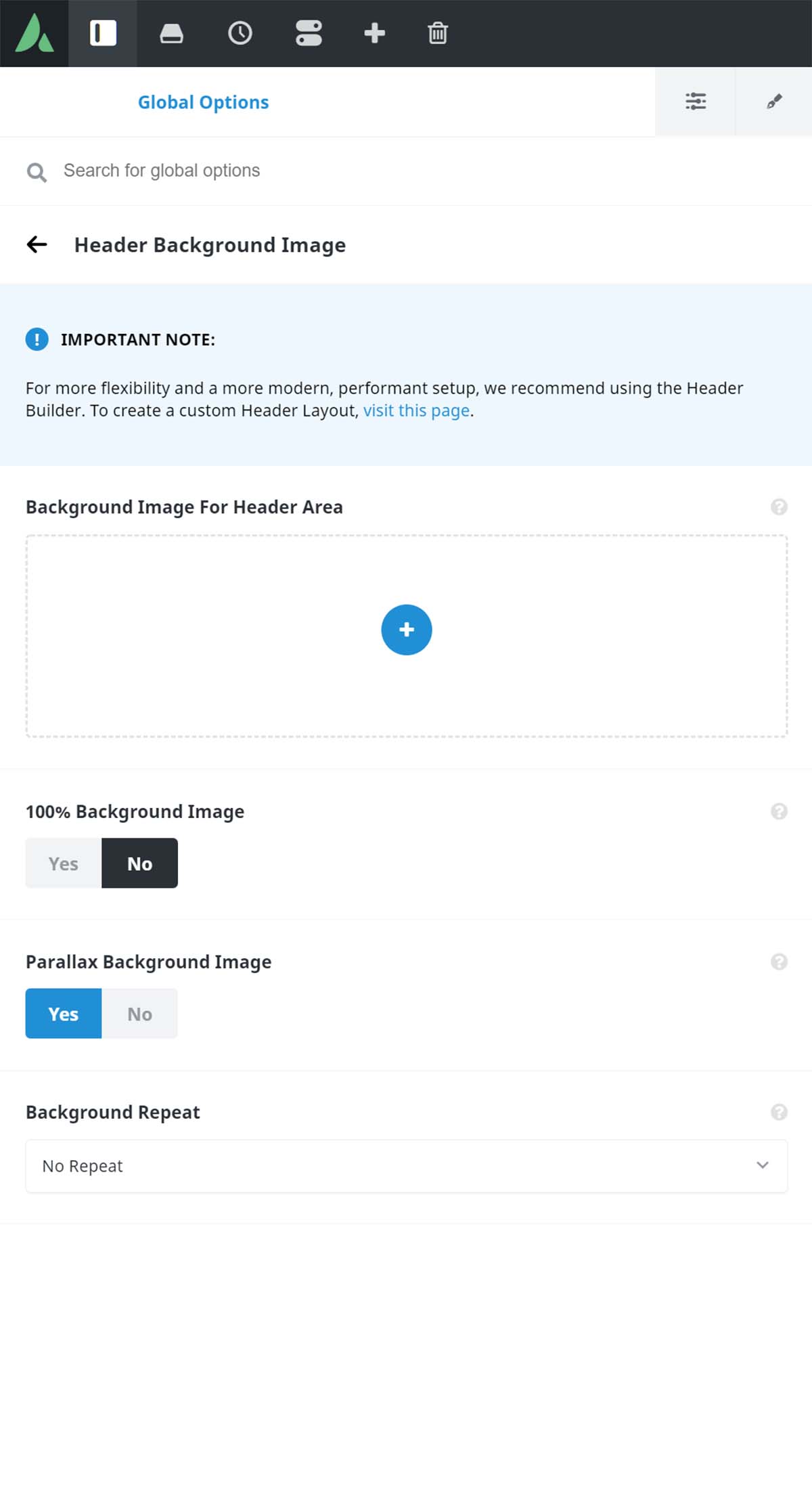
Header Background Image Options
In this section, you can upload a background image for your header. If you have a Top Header set, then the Header Opacity located in Header > Header Styling must be set to 1 for the background image to display. If you have a Side Header set, then the Header Opacity must be set to transparent for the background image to display.
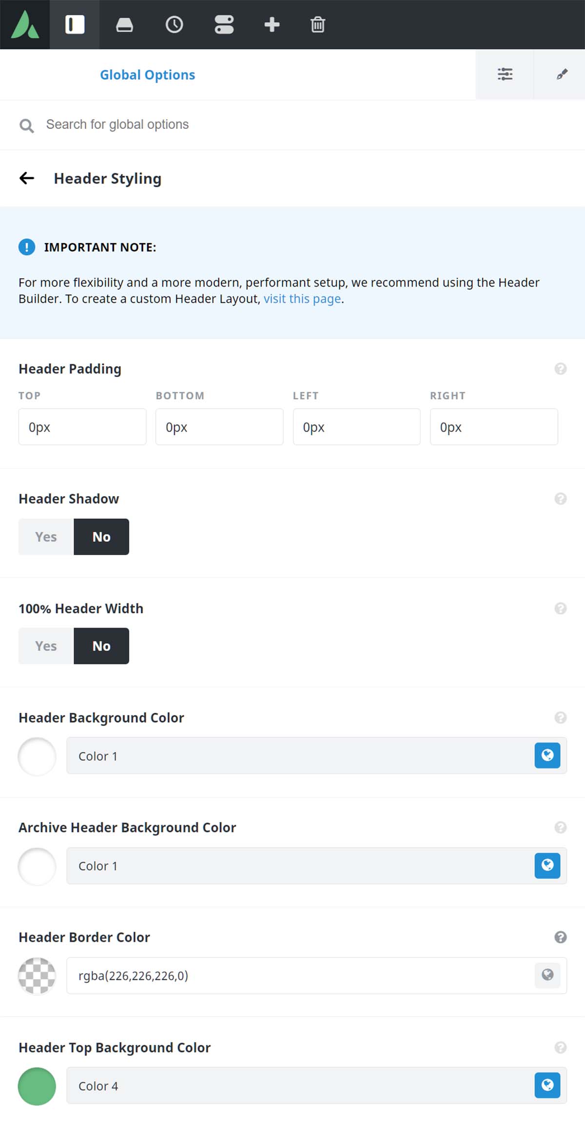
Header Styling Options
In this section, you can customize your main header’s appearance and style. For top headers, setting the background color’s opacity to below 1 will remove the header height completely. For side headers, setting the background color’s opacity to below 1 will add a color overlay over the background image.
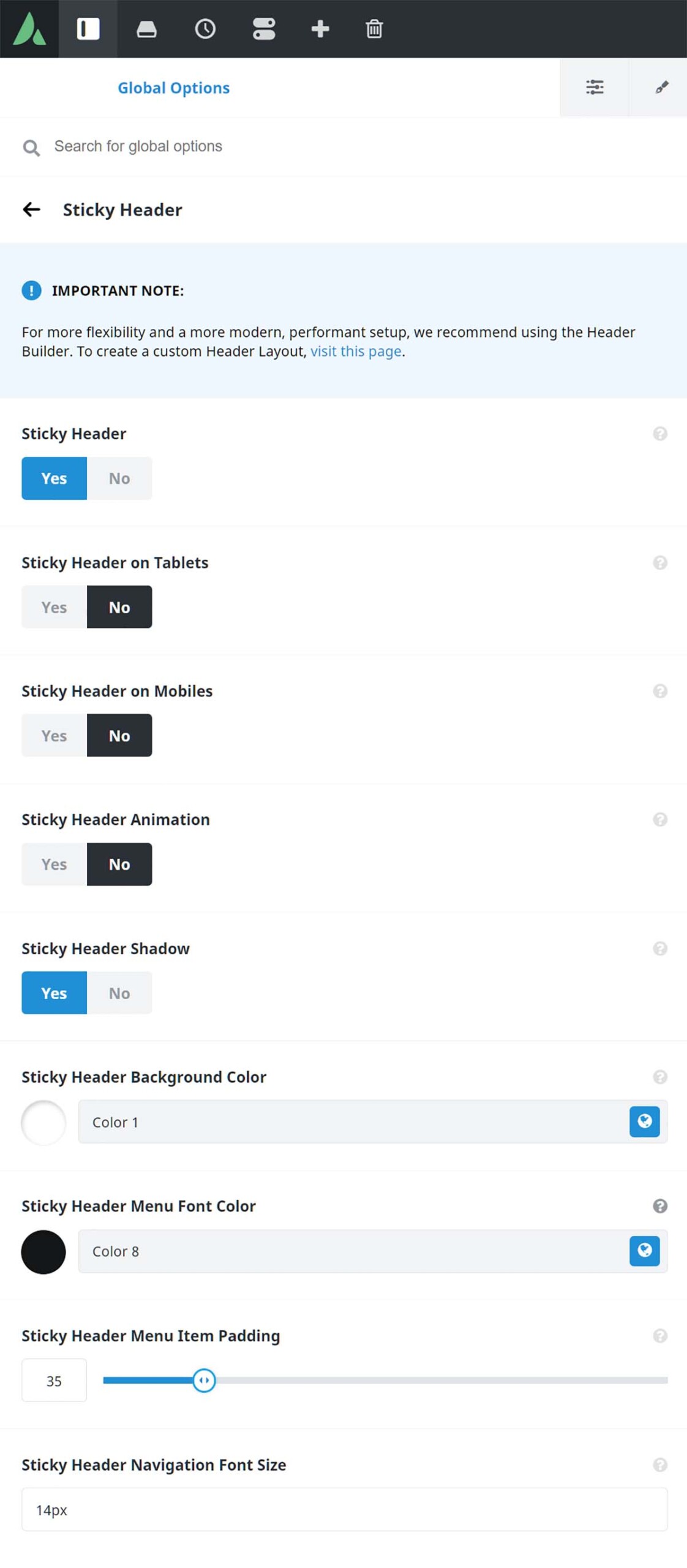
Sticky Header Options
In this section, you can enable or disable a sticky header and customize it’s features and appearance. You can choose to enable it on tablets and mobiles, enable the sticky header animation, set a header background color, set the sticky header menu item padding, and the sticky header navigation font size. Read more about it here.
Header Social Icons
You can choose to display social media icons on your header to make it easier for your viewers to connect with you. To learn how to enable and customize the social media icons on your header, please read our Social Icons article by following the link below.
Mobile Header Search Icon/Field
This option is available on all header layouts. To learn how to enable the search icon/field on your mobile header, please read our Mobile Menu Search article by following the link below.


