How To Create Sticky Headers
Last Update: October 29, 2025
A Sticky Header is one that never leaves the viewport. When the user scrolls down, the Sticky Header “sticks” to the top of the window, and depending on the method of construction, the header layout you’ve set, and the options chosen, the sticky header will display different elements of your header as you scroll down the page.
Sticky Headers have changed a lot with successive Avada releases as well as the Header Builder. Now, with the power of Avada Layouts, it’s possible to create your own custom headers for your site, and as part of this, the whole header, or just parts of it, can now be sticky.
How To Set Up The Sticky Header Using Global Options
You can also set up a Sticky Header, using a Global Options Header Layout, and the Sticky Header Options. To manage Sticky Headers, Avada includes several options for styling, as well as visibility options to enable or disable it on various screen sizes.
Sticky Header Global Options
Below is a list of all the available global options for the Sticky Header. These options are located in Avada > Options > Header > Sticky Header. Certain options are dependent, and will only be visible when specific options or header layouts are enabled.
Sticky Header – Turn sticky header On or Off.
Sticky Header on Tablets – Turn sticky header on tablets On or Off.
Sticky Header on Mobiles – Turn sticky header on mobile On or Off.
Sticky Header Animation – Turn on to allow the sticky header to animate to a smaller height when activated. Note: Only visible when header layout #1, #2, #3 or #6 is enabled.
Sticky Header Display For Headers 4-5 – Controls what displays on the sticky header when using header layouts #4 or #5. Note: Only visible when header layout #4 or #5 is enabled.
Sticky Header Shadow – Turn on to display a sticky header drop shadow. This option is incompatible with Internet Explorer versions older than IE11.
Sticky Header Background Color – Choose a background color for the sticky header.
Sticky Header Menu Font Color – Controls the color for main menu text in the sticky header.
Sticky Header Menu Item Padding – Controls the space between each menu item in the sticky header, in pixels (0px-200px).
Sticky Header Navigation Font Size – Controls the font size of the menu items in the sticky header. Enter value including CSS unit (px, em, rem), for example: 14px
Important Information When Using Global Options
When using Global Options to control your Sticky Header, it’s important to note how the options affect different layouts.
Sticky Header with Header Layouts #1 & #6
Header layouts #1 and #6 are straight forward in layout; logo to the left and menu items on the same row, to the right. Both the logo and main menu will be displayed in the sticky header as you scroll down the page.
Sticky Header with Header Layouts #2 & #3
Header layouts #2 and #3 include a top secondary header with your logo and main menu items on a row below that. Only the logo and main menu will be displayed in the sticky header as you scroll down the page, and not the top secondary header.
Sticky Header with Header Layouts #4 & #5
Header layouts #4 & #5 includes a top secondary header, logo, and menu which are all on different rows. By default, only the logo and menu will be displayed in the sticky header as you scroll down the page. You can change what displays with the ‘Sticky Header Display For Headers 4 – 5’ option. Choose ‘Menu Only’ or ‘Menu + Logo Area’.
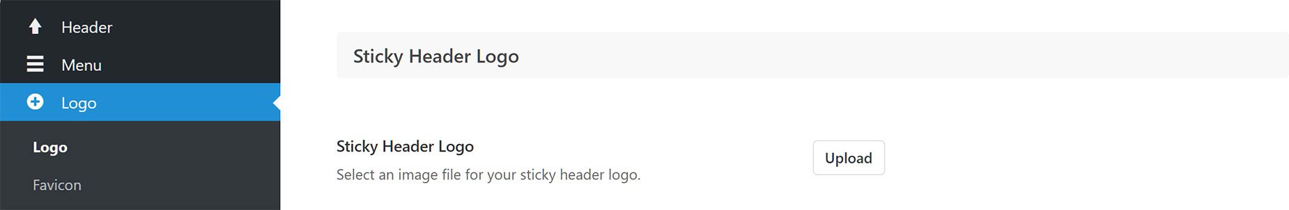
Sticky Header Logo – You can also upload a logo unique to the sticky header. You can do this in the Avada > Options > Logo > Sticky Header Logo tab.
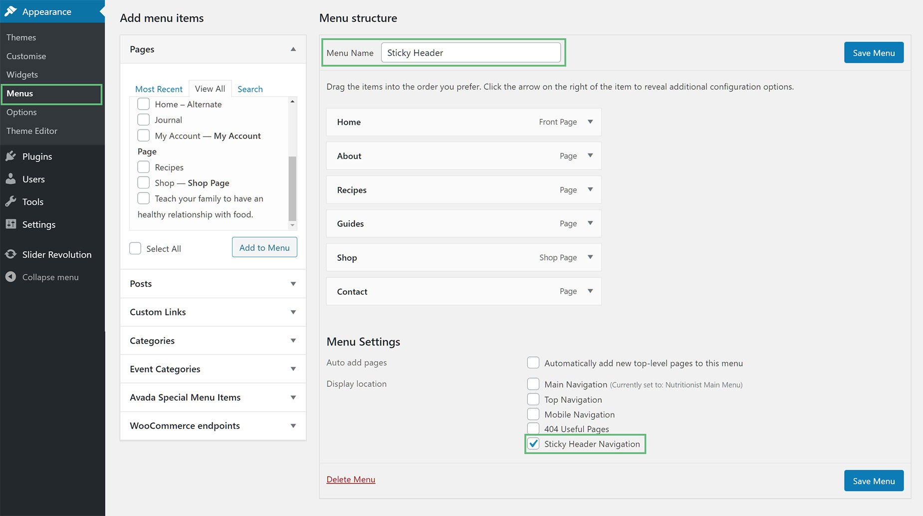
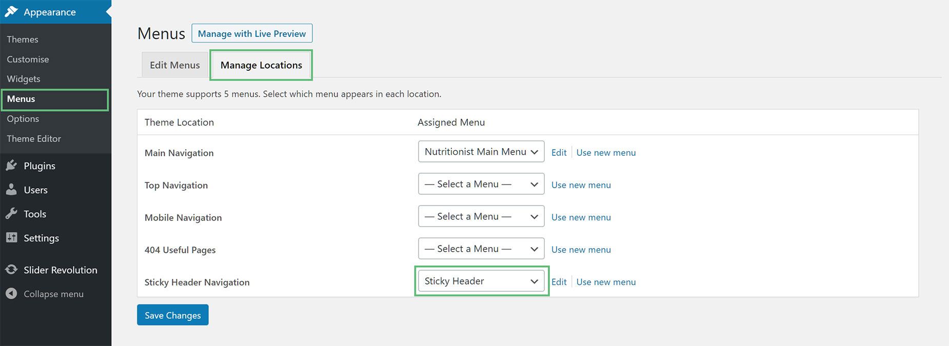
Sticky Header Custom Menu – You can add a custom menu unique to the sticky header in the Appearance > Menus panel in the WP admin panel. Create a new menu and assign it to the sticky header by checking the ‘Sticky Header Navigation’ checkbox under the Menu Settings or go to ‘Manage Locations’ tab, and set a menu for the ‘Sticky Header Navigation’ option.
Creating Sticky Headers In Avada Layouts
With Avada Layouts, and the Header Builder, it’s easy to decide exactly what parts of your Header you want to be Sticky, and what they display when sticky. There is now a ‘Position Sticky’ option in Containers, and if this is set to On, a further option called ‘Responsive Position Sticky’ appears, allowing you to determine at what screen sizes the Container should be sticky. There are also Sticky Container Background Color, Sticky Container Offset, Sticky Container Transition Offset, and Sticky Container Hide On Scroll options as well, to fully control the Container.
As Headers built in Avada Layouts are just a number of Containers, you have full control over which Containers are Sticky and how they behave.
For a full rundown on this method, please see the How To Work With Sticky Containers document and video, linked below, as well as the How To Build A Header Layout From Scratch Video to see a user case.


