Share
The Avada Column Element is pivotal in designing responsive and structured content using Avada and WordPress. This guide provides a step-by-step overview of effectively using this Layout Element to create versatile and aesthetically pleasing content. Whether you are new to Avada or looking to optimize your designs, understanding the Column Element will help you better understand how to organize Avada Design Elements on pages and posts effectively. Let’s get started!
Overview
How is The Avada Column Element Useful?
As explained in this post, the Column Element works in tandem with the Container Element to structure and organize content on a WordPress page or post. It plays a critical role in building flexible content layouts, enabling the arrangement of text, images, and other media in a neat and visually engaging format.
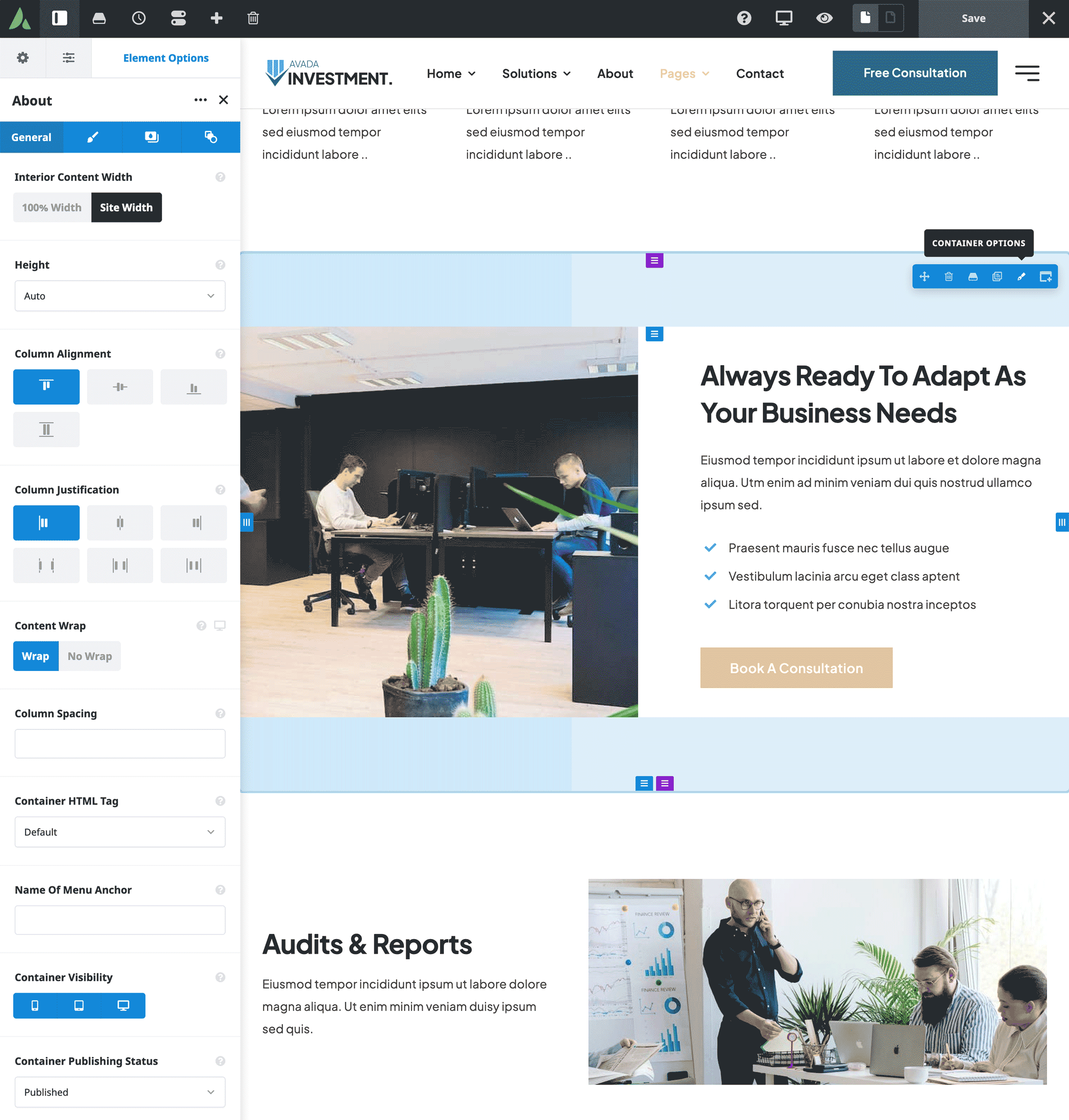
A key benefit is its responsiveness, allowing columns to adjust seamlessly across different screen sizes (Avada allows up to six columns per row) and ensuring that the layout adapts to mobile, tablet, and desktop views without sacrificing readability or design integrity. This flexibility is vital in modern web design, enhancing the user experience across all devices.
Additionally, the Column Element provides extensive customization options, from adjusting spacing and alignment to adding background colors and borders. It allows for creative freedom, helping designers achieve precise control over how content is displayed. Beyond aesthetics, it also supports various functional enhancements, such as Conditional Rendering Logic, which allows content to be displayed or hidden based on specific criteria. This adds another layer of interactivity and personalization to the site.
Adding Columns to Your Content Layout
To start using the Column Element, you first need to add it within a Container. Here’s how:
Understanding Column Controls
Understanding all available options makes applying the Column Element to your website easier.

Exploring Column Options
The Column Element offers several tabs with diverse options:
General Tab
Alignment
Adjust horizontal alignment within the container (e.g., Flex Start, Center, Flex End).
Content Layout
Choose how elements are positioned within the column (e.g., Column, Row, Block).
Content Alignment
Control vertical alignment within a stretched column.
HTML Tag
Select the HTML tag for the column (e.g., div, section, header).
Link URL
Link the entire column to a URL with options for target and accessibility labels.
Column Visibility
Set visibility for different screen sizes and add CSS classes or IDs for further customization.
CSS Class
Add a class to the wrapping HTML element.
CSS ID
Add an ID to the wrapping HTML element.
Design Tab
Width
Set column width with options for auto and custom sizes.
Flex Grow
Flex grow specifies how much of the remaining space in the container should be assigned to the column.
Flex Shrink
Flex shrink specifies how much the column may shrink within the container if not enough space is available.
Column Spacing
Adjust spacing between columns.
Margin
Fine-tune Column margins. Use the responsive icons to apply these settings for different screen sizes.
Padding
Fine-tune Column padding. Use the responsive icons to apply these settings for different screen sizes.
Hover Type
Select the hover effect type. For the effect to be noticeable, you’ll need a background color/image, and/or a border enabled. This will disable links and hover effects on elements inside the column.
Column Border Size
Controls the border size of the Column Element.
Column Border Color
Controls the border color of the Column Element.
Border Style
Controls the border style. Solid/Dashed/Dotted.
Border Radius
To make the border-radius work in browsers, the column’s overflow CSS rule needs to be set to hide. Thus, depending on the setup, some contents might get clipped.
Box Shadow
Set to “Yes” to enable box shadows.
Z-Index
The value for the Column’s z-index CSS property can be positive and negative.
Overflow
The value for Column’s overflow CSS property.
Background Tab
Background Color
This controls the background color.
Background Type
Use filters to see specific types of content.
Background Image
Upload an image to display in the background.
Slider Images
Upload background slider Images.
Extras Tab
Rendering Logic
Add conditional rendering logic for the Column Element. If the set conditions are met, the element will only be part of the post/page contents. NOTE: Server cache can interfere with results.
Position Sticky
Turn on to have the column stick inside its parent container on scroll. NOTE: This feature uses the browser’s native sticky positioning. Depending on the browser and specific setup, the feature may not be available.
Position Absolute
Turn on to have the Column in absolute position.
Filter Type Regular/Hover
Use filters to see specific types of content.
Transform Regular/Hover
Use transform options to scale, translate, rotate and skew the element.
Transition Duration
Set the transition duration in milliseconds.
Transition Duration
Select transition easing. (Ease/Ease In/Ease Out/Ease In Out/Linear/Custom)
Motion Effects
Add Motion Effects for the Column Element.
Apply Motion Scroll Effects On
Choose which devices the scroll effects will be applied to.
Animation Type
Select the type of animation to use on the Column Element. (None/Bounce/Fade/Flash/Rubberband/Shake/Slide/Zoom/Flip Vertically/Flip Horizontally/Light Speed/Reveal With Color)
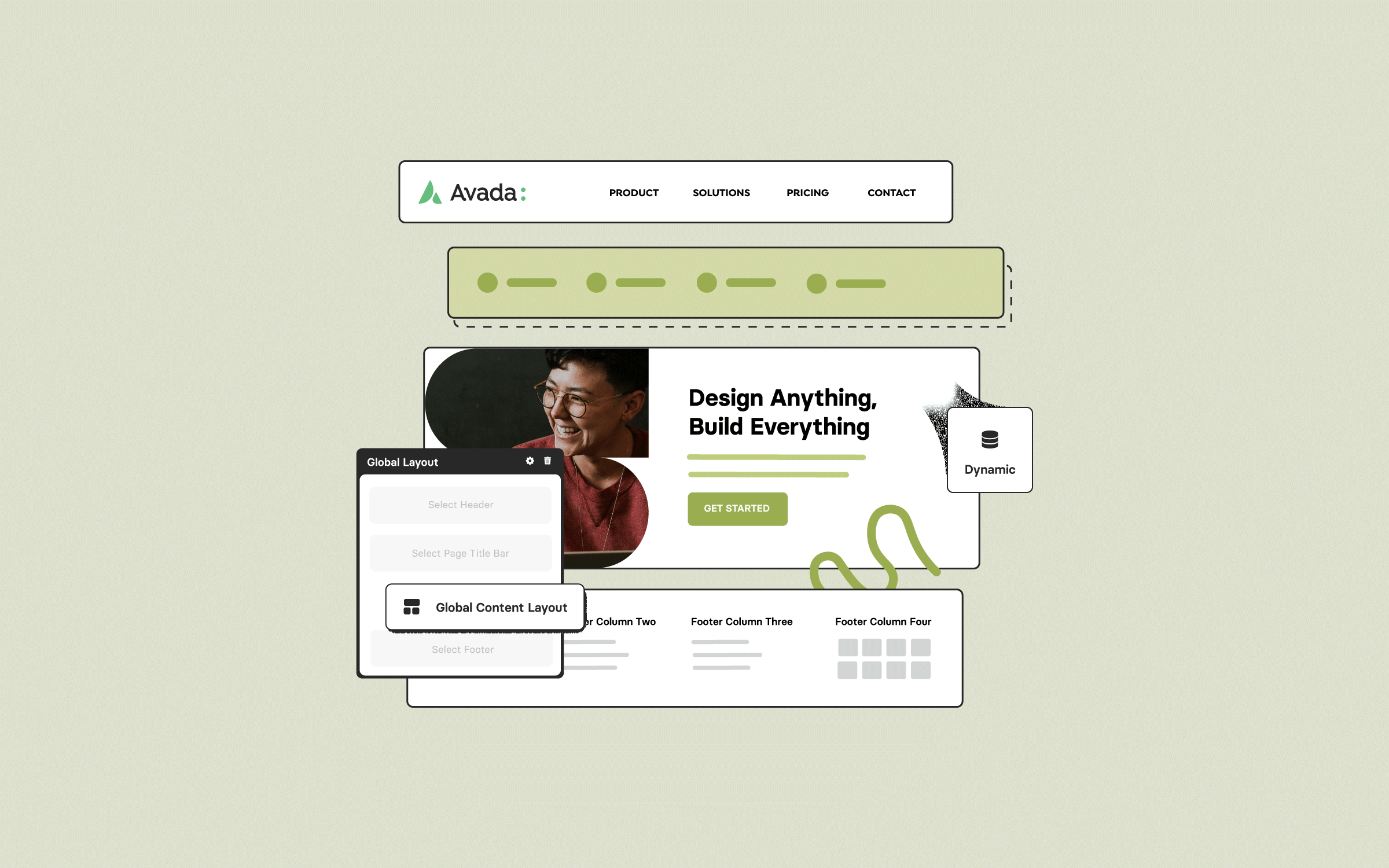
Global Options
Avada also provides global settings for columns under the global options in the Avada Builder sidebar:
Resources
Summary
The Avada Column Element, when used in conjunction with Containers, offers a powerful way to structure and design your web pages. By mastering the various settings and options available, you can create highly customizable and visually appealing layouts. For further customization, explore the nested columns element to extend your layout capabilities even more.


