Share
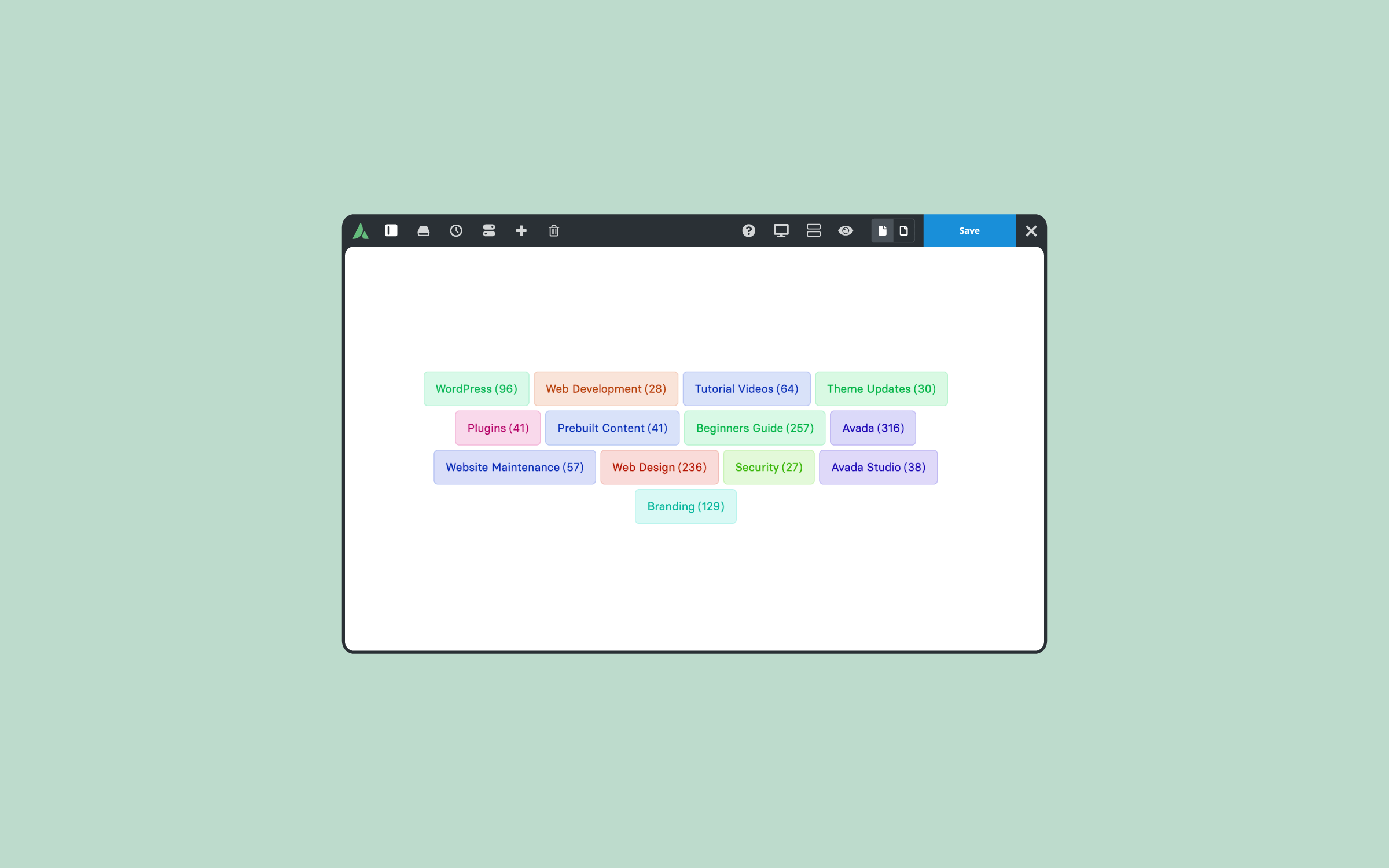
The Avada Categories Element is a single Element for displaying taxonomy terms anywhere on your site. It covers post categories and tags, WooCommerce product categories, event categories, and any custom taxonomy you have registered in WordPress, with control over which terms appear, how they are ordered, and how they are styled.
You can place it directly on a page or inside a Layout Section, and a single instance can adapt to whichever archive it renders in. The examples below use the Avada Online School prebuilt website as a working example.
Overview
Categories, Tags, & Taxonomies In WordPress
A taxonomy is how WordPress groups content. Categories and tags are the two it registers for posts by default, but they are not the only ones — they are just the pair most people meet first. A category is the main tool for grouping posts that belong together, and unless you install a plugin to generate them, you create and assign them yourself.
The difference between categories and tags is hierarchy. Categories nest into parents and children, so they work as the top-level structure of a blog. Tags are flat and work better as specific descriptors that cut across those groups.
Beyond those two, plugins and custom post types register their own taxonomies. WooCommerce adds product categories and product tags. An events plugin adds event categories. Any custom post type can register whatever grouping its content needs. All of them behave the same way underneath, which is why one Element can display any of them.
The practical value is easiest to see on a content-heavy site. A photographer who publishes regularly might separate their work into portraits, weddings, landscapes, and studio shoots. A software company’s blog might split posts into product releases, tutorials, customer stories, and engineering notes, since a developer looking for setup instructions has no interest in a funding announcement.
In both cases, the visitor arrives with a rough idea of what they want, and the taxonomy gives them a route to it. Without that structure, a large archive is just a reverse-chronological list. Taxonomies earn their place for four reasons:
Assigning terms is only half the job. Getting them in front of readers is what the Avada Categories Element handles.
Where To Use The Avada Categories Element
This Avada Element works directly on a page, or inside a Layout Section. That covers most of the places a term list is useful:
Let’s walk through two examples of these: a single post sidebar, and an archive layout that handles every taxonomy on the site.
Example 1: Categories & Tags On A Single Post
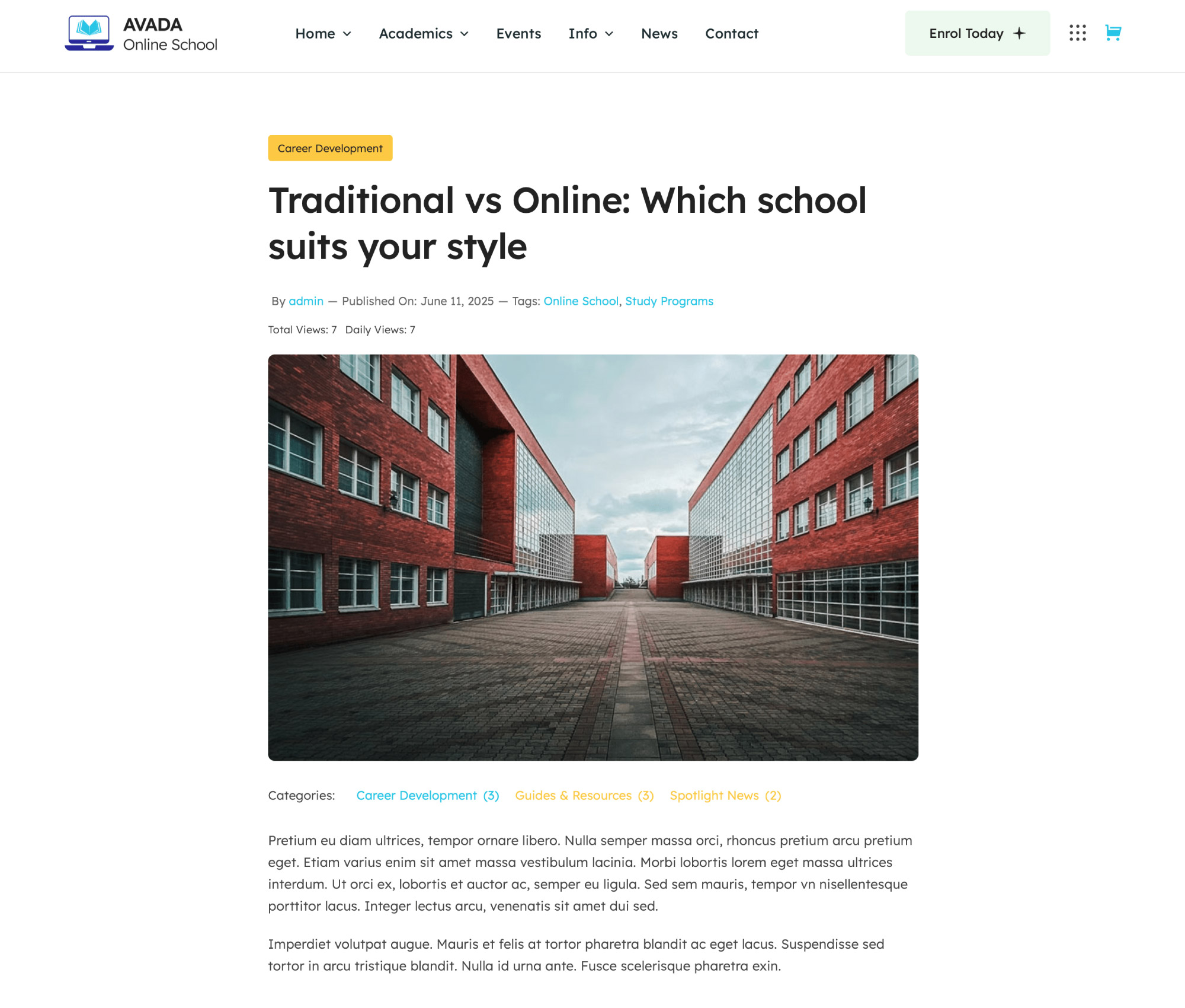
The Avada Online School website includes a Content Layout Section for single blog posts. For this example, we revamped it slightly, adding a sticky column on the right with two headings and two instances of the Categories Element beneath them — one set to Categories, one set to Tags. Editing the first instance shows the options that matter most.
Choosing Terms
Taxonomy is set to Categories, and I am displaying all terms, excluding Uncategorized. Terms are ordered by name in ascending order. Below that, Number of Terms is set to “0”, which displays everything.
If you have a long list, you can cap it anywhere up to “100”. Hide Empty Terms then removes any term with no posts behind it, which keeps a sidebar from filling up with dead links.
Styling: List Or Dropdown
Display Type is set to List here, but Select turns the whole thing into a dropdown — a better fit when you have fifty categories and a narrow Column. If you use Select, the “Select Label” option sets the text of the first empty option, so you can write something like “Choose a Category” instead of leaving it blank.
There is also a “Collapse To Select” option, which keeps the list on larger screens and switches to a dropdown on smaller ones. That is usually the answer when a list looks right on desktop and takes over the screen on mobile.
Layout controls whether terms stack or sit inline. Stacked makes sense in a narrow column. Inline suits a wider strip across the top of a page.
Child Terms
If your taxonomy has depth, “Nest Child Terms” indents children under their parents, and “Child Terms Display” controls how much is visible:
Maximum Depth then limits the number of levels that appear, with “0” meaning unlimited. This example has no child terms, but in documentation or a shop archive, a sprawling taxonomy can be useful.
Icons, Images, & Counts
You can add an icon next to each term, or display the term image set in the Avada Term Options. WooCommerce product categories use the category image, and the image renders after the icon, so both can be used together.
Show Post Count adds a count to each term, with a Post Count Format option to control how it is written. I left counts off in this example, but they are useful on a shop where stock levels vary.
The Last Few Options
Show All Items adds an entry linking to the taxonomy’s post type archive, with editable text if the default does not suit. Highlight Current Term marks the active term, which is what makes a sidebar list function as navigation rather than decoration. Under those sit the usual Element Visibility, CSS Class, and CSS ID options.
The Design tab covers margins, alignment, padding, spacing, indent and separator styles, borders, colors, and typography. The Extras tab handles conditional rendering and animation.
The second instance of the Element in that Column is identical, with the taxonomy set to Tags. On the front end, a visitor now sees both categories and tags, with the current terms highlighted, and clicking either one takes them to that archive.
Example 2: One Archive Layout For Every Taxonomy
The same site has an archives Layout Section assigned to all archive pages and search results, excluding courses. The Content Layout Section contains a Title Element and a Categories Element working together. The Title Element uses Taxonomy dynamic data, set to plural, so it prints the name of whichever taxonomy the visitor is viewing.
The Categories Element sets Taxonomy to From Current Archive. As the description explains, that takes the taxonomy from the archive the Element is rendered on, so one Layout Section can serve every taxonomy. It uses the post type categories on a post type archive or a single post, and falls back to blog categories when there is nothing to go by — which includes the preview and the builder.
One consequence to plan for: the term fields are unavailable in this setting because the taxonomy is only known at render time. No excluding, no ordering, no per-term control. That is the trade-off for a single layout instead of one per taxonomy.
The result holds up across the site. The same Layout Section renders correctly on a category archive, a post tag archive, a product tag archive, and an event category archive, with the title picking up the right taxonomy name each time.
Summary
One Avada Categories Element, any taxonomy, on any part of the site. If you have been maintaining separate layouts for post categories, product categories, and everything else, the archive example above is the one to try first.