Share
At first glance, the Avada Tag Cloud Element might seem simple, but it offers a lot more once you explore its options. Many WordPress users think of tag clouds as just blog sidebar features, but this Avada Element can do much more. It can display different types of taxonomies and be styled for various parts of your website, including blog layouts, WooCommerce sections, and even the footer.
This guide explains how the Avada Tag Cloud Element works, where you can use it, and how to customize it in Avada. It’s designed for beginners and gives practical steps to show why this element is a flexible tool for your website.
Overview
What Is the Avada Tag Cloud Element?
The Avada Tag Cloud Element shows a group of taxonomy terms on your website. Most people know tag clouds as a way to display blog post tags in a sidebar, helping visitors find related content. But in Avada, this Element is not limited to just post tags.
Since the Element supports multiple taxonomies, it can display product categories, product tags, brands, portfolio terms, FAQ categories, and more. This flexibility means you can use it in many places, not just as a blog decoration. It becomes a helpful tool for navigation and discovery.
For example, on a single page, it might display blog post tags to help readers find related articles. On another page, it could display WooCommerce product tags or categories, making it easier for shoppers to browse your store. This wide range of uses makes the Avada Tag Cloud Element very versatile.
A Practical Example of the Tag Cloud Element
One of the best ways to understand the Tag Cloud Element is to see how it works in different parts of a website. For example, you might use it on a blog post page to show post tags. This is the classic use that most people know. The tags work like keyword links, helping visitors find related content.
On the same site, you might see another Tag Cloud Element in the footer, but this time it shows product tags instead of blog tags. This shows how the same Element can have different uses depending on which taxonomy you choose.
In another example, the Element is placed next to product summaries in a WooCommerce layout. Instead of showing tags, it displays product categories. This gives users a simple way to browse store content and shows that the Tag Cloud Element can be used in more places than just sidebars and footers.
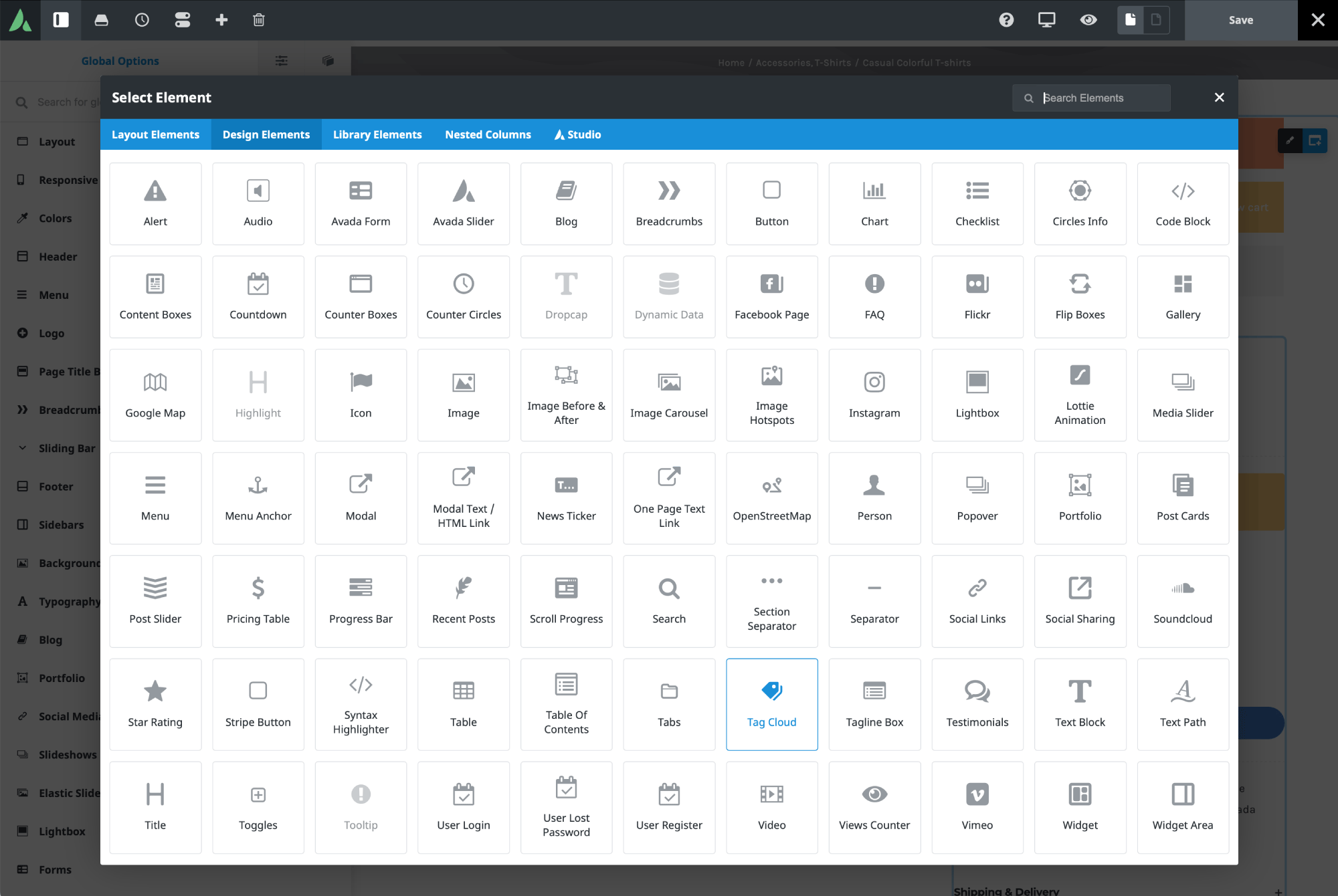
Adding the Tag Cloud Element in Avada
Adding the Tag Cloud Element is similar to adding any other Avada Element. Open the Avada Builder, pick the container or column where you want the content, and insert the Tag Cloud Element into your layout.
In the tutorial example, an existing Column is removed and replaced with a new one to make space for the tag cloud next to product summaries. This shows that you can add the Element to any custom layout, not just in one set spot.
After adding the Element, you’ll notice that styling is important. In the example, the default background color made the text hard to read, so it was changed in the Design tab. This change affected only that specific tag cloud, leaving the others on the site unchanged.
Understanding Taxonomy Options
The key setting in the Tag Cloud Element is the taxonomy selection. By default, it uses standard tags, but the dropdown menu gives you more options. Depending on your site, you might see categories, brands, product categories, product tags, product color, product size, portfolio categories, portfolio skills, portfolio tags, and FAQ categories. This lets the Element work with many types of content.
You don’t have to use it just for blog tags. It can help with navigation in an online store, highlight portfolio skills, or show FAQ categories in support sections. Each use feels a bit different, but setting it up is always familiar.
In the guide, product categories are chosen as the taxonomy. This fits the layout because the Element sits next to product summaries, helping visitors see how products are grouped. It’s a simple change, but it turns the element from a blog tool into an eCommerce navigation aid.
Ordering and Display Choices
After you pick the taxonomy, the next step is to decide how the terms will be shown. The Element has an “Order By” setting, so you can sort terms by name, by count, or randomly.
Sorting by name is usually the easiest for visitors to scan, especially if the terms are used as navigation links. Sorting by count is helpful if you want to highlight the most used tags or categories. Random order gives a more varied look, but it’s mostly decorative.
You can also choose ascending or descending order, which works with your chosen sort method. In the example, terms are sorted by name in ascending order, making the layout look neat and organized.
The “Number of Tags” setting is also important. You can show all terms, use the number set in WordPress reading settings, or pick a custom amount. Setting it to -1 shows all tags or categories, while 0 uses the WordPress default. In the tutorial, it’s set to -1 to display all product categories.
There’s also a “Show Count” option, which displays the number of items linked to each term. For product categories, it shows how many products are in each one. For post tags, it shows how many posts use that tag.
Styling the Tag Cloud Element
The Design tab lets you customize the Tag Cloud Element however you want. Here, you can adjust spacing, style, font size, borders, colors, and padding. The first setting is margin, which changes the space around the Element. In the example, a small top margin is added to make the tag cloud fit better in the layout. Small changes like this can really improve the design.
Next is the Style option, where you can choose between a basic look or an arrow style for the tags. The basic style is simple, while the arrow style makes tags look like labels. In the example, the basic style fits the layout best, but the arrow style is good if you want something more decorative. You can also set the alignment. Here, left alignment keeps everything tidy and easy to read. Tag Spacing controls the spacing between tags. Tighter spacing makes the tags look more compact, while the default spacing usually looks more balanced.
Font Size Type: Static, Variable, & Range
Font Size Type is an important styling option in the Tag Cloud Element. It controls how tag sizes are set and has a big impact on how the Element looks. If you choose Static, all tags are the same size. This is usually the cleanest and most consistent option, especially for modern layouts.
With Variable, each tag’s size changes based on the number of items it contains. Tags with more items are bigger, and those with fewer items are smaller. This creates the classic tag cloud look you might remember from older blogs.
The Range option works like Variable, but you can set the minimum and maximum font sizes. This gives you more control and helps the tags fit better in your layout.
Padding, Borders, & Border Radius
You can also adjust padding, borders, and corner rounding to refine the look. Padding changes the space inside each tag. In the example, the top and bottom padding are set to 15 pixels, making the tags look more open and comfortable. This is helpful if you want the element to serve as a visual navigation block rather than a dense keyword list.
By default, the Tag Cloud Element has a 1-pixel border for compatibility, but it might not show if the border color matches the background. You can change the border size and pick different colors for normal and hover states.
Border Radius controls how rounded the tag corners are. In the example, a 6-pixel radius is used, making the tags look softer and more modern. This small change helps the Element match the rest of your site’s design.
Keep in mind that border controls work differently depending on whether you choose the Basic or Arrow style. Some border options are available only in the Basic style, while the Arrow style offers fewer border settings.
Random Colors & Custom Color Styling
You can also use Random Colors, which can be applied to the background, the text, or both. This feature gives each tag a different color, making the tag cloud look more playful and varied.
If you use random colors only for the background, the tags stand out more, but the text style stays the same. If you apply random colors to both background and text, the tags use matching colors with semi-transparent backgrounds. This creates a bold effect, but it might not fit every website style.
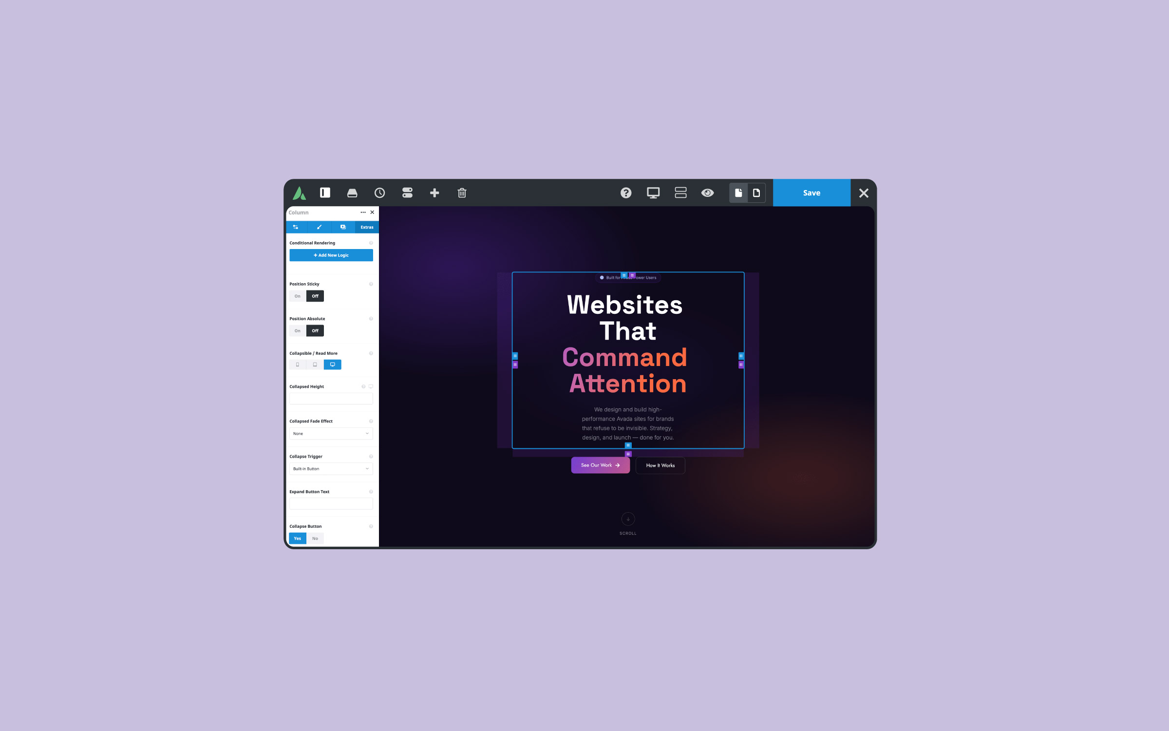
Conditional Rendering & Animation
Like other Avada Design & Layout Elements, the Tag Cloud Element has an Extras tab. Here, you’ll find settings for conditional rendering and animations. Conditional rendering lets you show the Element only when certain conditions are met, which is helpful for advanced sites. For example, you might show a tag cloud only on certain content types or in specific situations.
Animation settings let you control how the Element appears when the page loads. In the tutorial, a slide-in-from-the-right animation is used at 1 second. This adds a smooth visual effect without being distracting.
Summary
The Avada Tag Cloud Element shows how a familiar WordPress feature can become much more powerful. What starts as a simple list of terms becomes a customizable tool that supports both content discovery and site navigation.
Whether you use it for blog tags, product categories, or other taxonomies, the Tag Cloud Element is a practical way to organize and show content in Avada. It’s a small feature with a lot of potential, and when used well, it adds both function and style to your WordPress site.


