Share
What exactly is tabbed content and why should you use it? Tabs added to a page or post make it easy to turn long-form content into a stylish and prominent feature, acting as a way to organize and highlight important CTA’s and marketing material (for example) for the attention of your website visitors.
Instead of scrolling past five sections to reach the one that applies, a visitor sees the tab labels, picks the one they need, and reads it. Service tiers, product specifications, membership options, technical details — anywhere content splits into parallel sets that not everyone needs, tabs keep the page compact and let the reader choose.
The Avada Tabs Element is highly flexible and can be set as horizontal or vertical tabs, with control over layout, transitions, styling, and mobile tab behavior. This blog post uses the Avada Extreme Sports prebuilt website as a working example.
Overview
Creating an Avada Tabs Element
The Avada Tabs Element uses a parent-and-child structure. The Element parent controls the overall layout and appearance, while each Element child represents an individual tab containing its own content.
When a new Avada Tabs Element is added to a page or post, it includes an initial tab that can be edited with:
You can add additional tabs as needed, making the Element ideal for organizing multiple sections of related information.
Adding Content to Child Tabs
Each tab is highly flexible, allowing content creators to build rich, structured sections that go far beyond simple text. This makes the Tabs Element suitable for everything from concise informational snippets to more detailed layouts that include multiple content types.
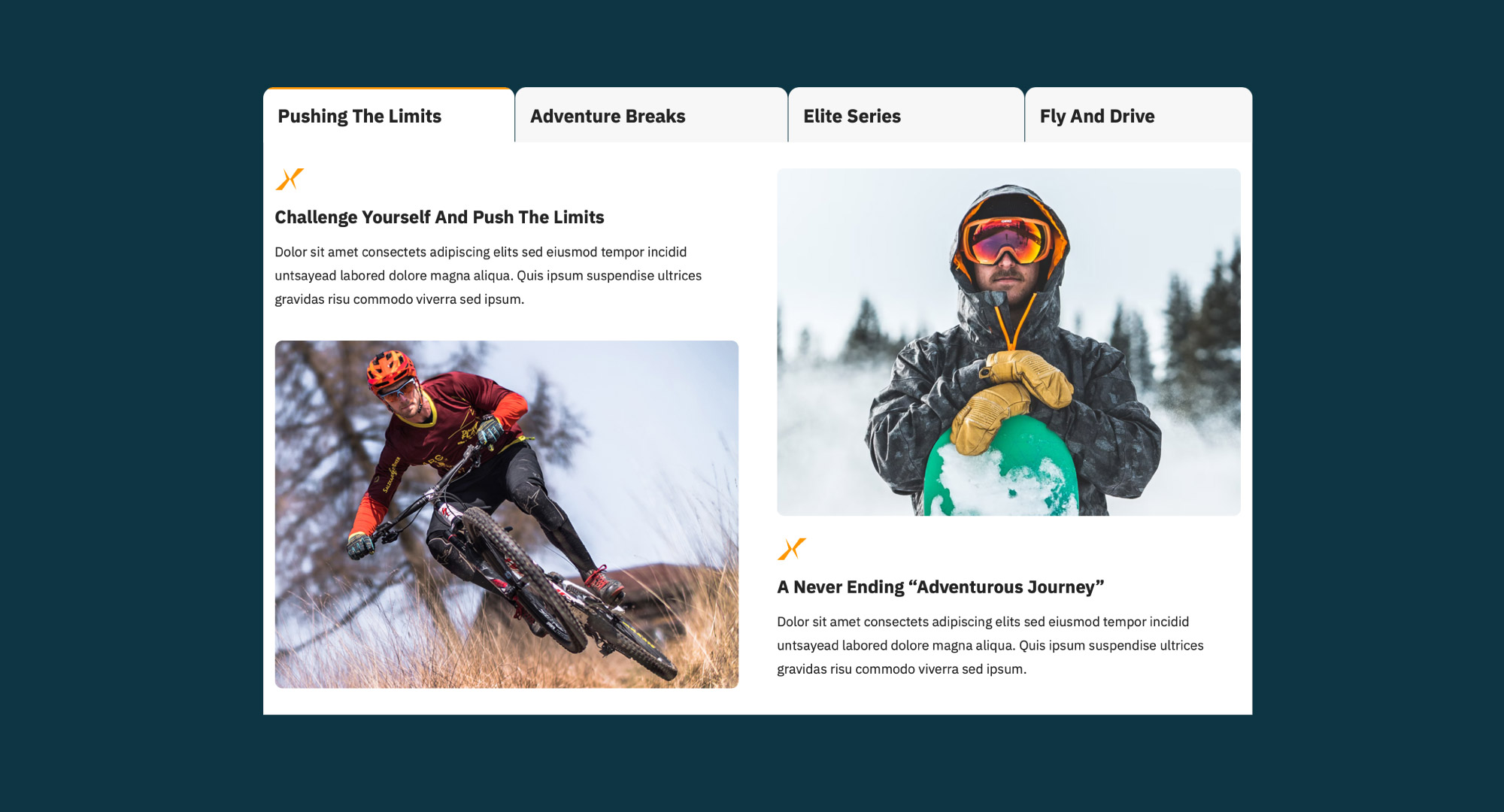
Within each tab, users can combine different Elements to present information in a clear and engaging way, including:
For more advanced layouts, such as multiple Columns or complex content sections, it is often easier to build the content elsewhere using the Avada Live Visual Builder before copying it into the tab editor.
When creating Multi-Column layouts inside a tab, use Nested Columns because the Tabs Element already resides within a Column structure.
Choosing the Right Layout
The Tabs Element provides a high degree of flexibility in how content is structured and displayed, allowing it to adapt to a wide range of design requirements and user experiences. By choosing the right layout, designers can keep tabbed content visually appealing and easy to navigate.
Design Styles
The Tabs Element offers two visual styles, Classic and Clean, each designed to accommodate different design preferences and user experiences. The Classic style delivers a more traditional tab interface with clearly defined boundaries and a structured appearance, making it well-suited for layouts that require a more formal or segmented presentation.
In contrast, the Clean style offers a more modern, minimal aesthetic with reduced visual emphasis, allowing the content to take priority while maintaining a refined, contemporary look. Both styles integrate seamlessly into a wide range of website designs, ensuring visual consistency and flexibility across different branding requirements.
Lid est laborum dolo rumes fugats untras. Etha rums ser quidem rerum facilis dolores nemis onis fugats vitaes nemo minima rerums unsers sadips amets. Ut enim ad minim veniam, quis nostrud Neque porro quisquam est, qui dolorem ipsum quia dolor sit amet, consectetur, adipisci amets uns. Etharums ser quidem rerum. Nemo enim ipsam voluptatem quia voluptas sit aspernatur aut odit auti.
The chosen design influences the overall look and some styling behaviors, helping the Element match the rest of a website’s design.
Layout Orientation
In addition to flexible styling options, tabs can be displayed in either a horizontal or vertical layout, allowing the content structure to be tailored to the available space on the page or post and the preferred user experience.
Additional alignment options let tab titles stretch across the available width or remain individually sized and aligned as needed.
Flexible Navigation Options
The Tabs Element has options that enhance how visitors navigate tabbed content, ensuring a smoother, more intuitive browsing experience. By improving accessibility and reducing the need for excessive scrolling, these options help users quickly find the information they need without leaving the page.
Sticky Tabs
For longer sections of content, sticky tabs keep navigation visible while scrolling, making it easier for visitors to switch between tabs without scrolling back to the top.
Updating the URL
The Tabs Element can update the page URL whenever a different tab is selected. This creates a unique link to the active tab, allowing users to:
Content Animation
Depending on the selected animation, additional controls for transition speed and direction become available, allowing designers to tailor the interaction to their website.
To create a smoother browsing experience, several transition effects are available when switching between tabs:
Rotating Tabs
The Element has an option to automatically cycle through tabs after a set interval, making it useful for highlighting featured content or presenting information sequentially. Rotation settings include:
Automatic rotation begins once the Element enters the visitor’s viewport and respects reduced-motion accessibility preferences for users who have those settings enabled in their operating system.
Using Icons
Icons can be incorporated into the Tabs Element in two primary ways, offering flexibility in how tab navigation is presented and styled.
One approach is to assign a single icon that is applied consistently across all tabs, creating a unified visual indicator for the entire element. Alternatively, you can configure individual tabs with unique icons, allowing each section to be visually distinguished by its content.
Additional styling controls are also available, enabling adjustments to icon size and positioning. This ensures the icons align seamlessly with the overall design and enhance usability without distracting from the tab content.
Additional controls let you adjust icon position and size to complement the overall design.
Styling the Tabs Element
The Design tab provides extensive customization options, allowing the Tabs Element to integrate seamlessly with virtually any website design.
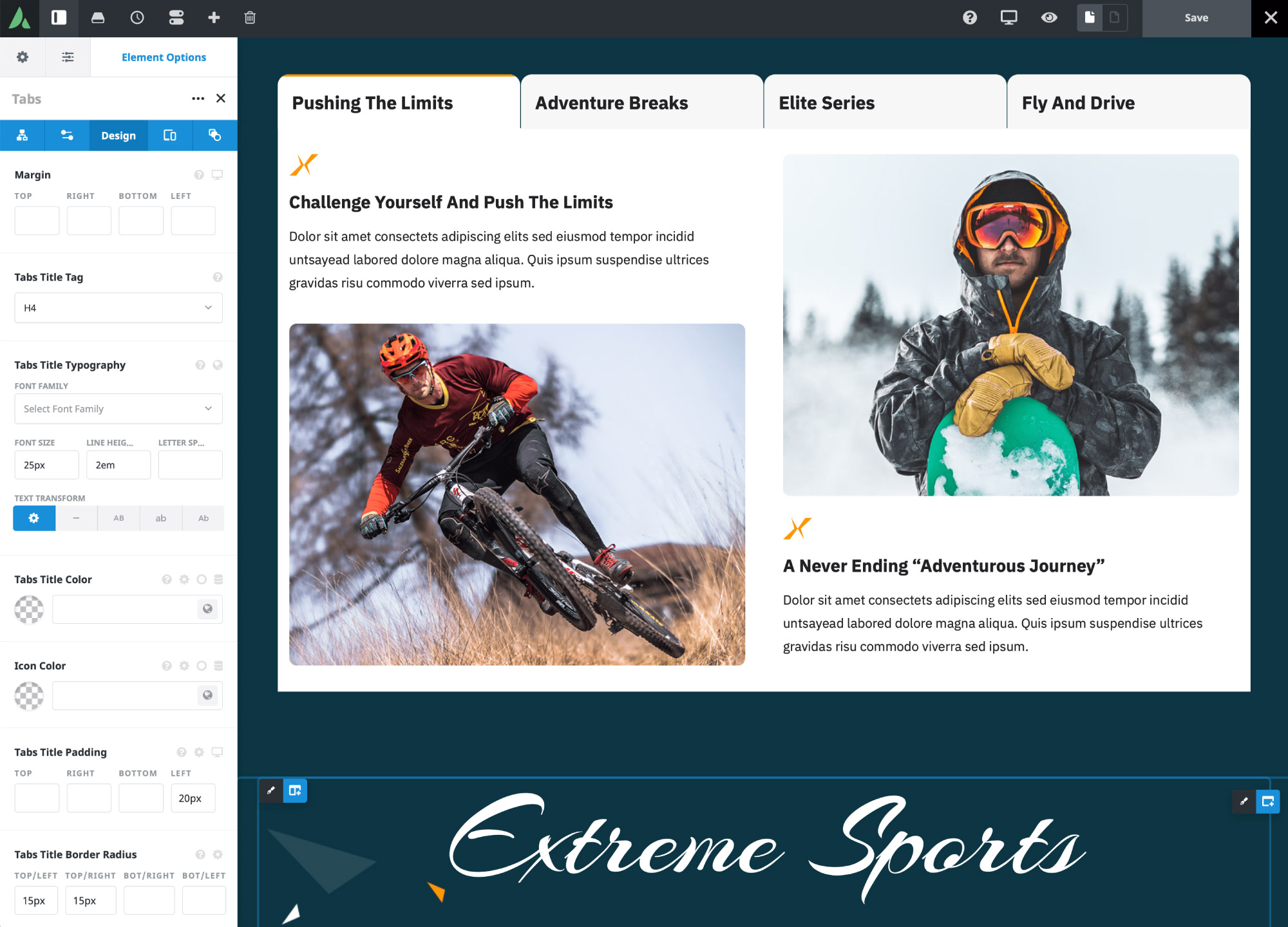
Styling options include:
These controls let you create anything from subtle, understated tabs to bold feature sections that become focal points of a page.
Optimizing the Mobile Experience
The Tabs Element includes dedicated mobile settings to ensure content remains easy to browse on smaller screens. Available mobile display modes include:
Each option provides a different browsing experience depending on the amount of content and the number of tabs. For Carousel Mode, you can also enable sticky tab navigation to keep the active tab accessible while scrolling through longer content sections.
Visitors can manually switch between tabs, use shared URLs to open specific sections directly, and, if enabled, view content through automatic tab rotation that pauses during interaction for improved usability.
Summary
The Avada Tabs Element offers a flexible solution for presenting organized, easy-to-navigate content without sacrificing valuable page space. With support for multiple layouts, responsive display modes, customizable animations, comprehensive styling controls, and advanced navigation features, it adapts to a wide variety of website designs and content types.
Whether showcasing services, organizing documentation, displaying product information, or building interactive landing pages, the Tabs Element helps deliver a cleaner, more engaging user experience.