Avada Design Elements

Rating Field

The Avada Rating Field Element lets users rate with stars or icons, defining scales, defaults, and styling for filled and unfilled icons that match your brand design.

Avada Rating Field Featured Image

User Feedback

The Element allows the collection of ratings through stars or custom icons in Avada forms.

Configurable Scale

You can easily set the scale (e.g., 1–10), a default rating, & required status.

Customization

Choose custom icons, colors, empty input notice, a tooltip, size & conditional logic.

Avada Rating Field Element Examples

The Avada Rating Field Element enables users to submit a star (or custom icons) rating within an Avada form, making it ideal for surveys, feedback, or reviews. You can set the scale (e.g., 5 stars), default values, required or optional status, color styling, icon size, and conditional logic to reflect your brand aesthetics.
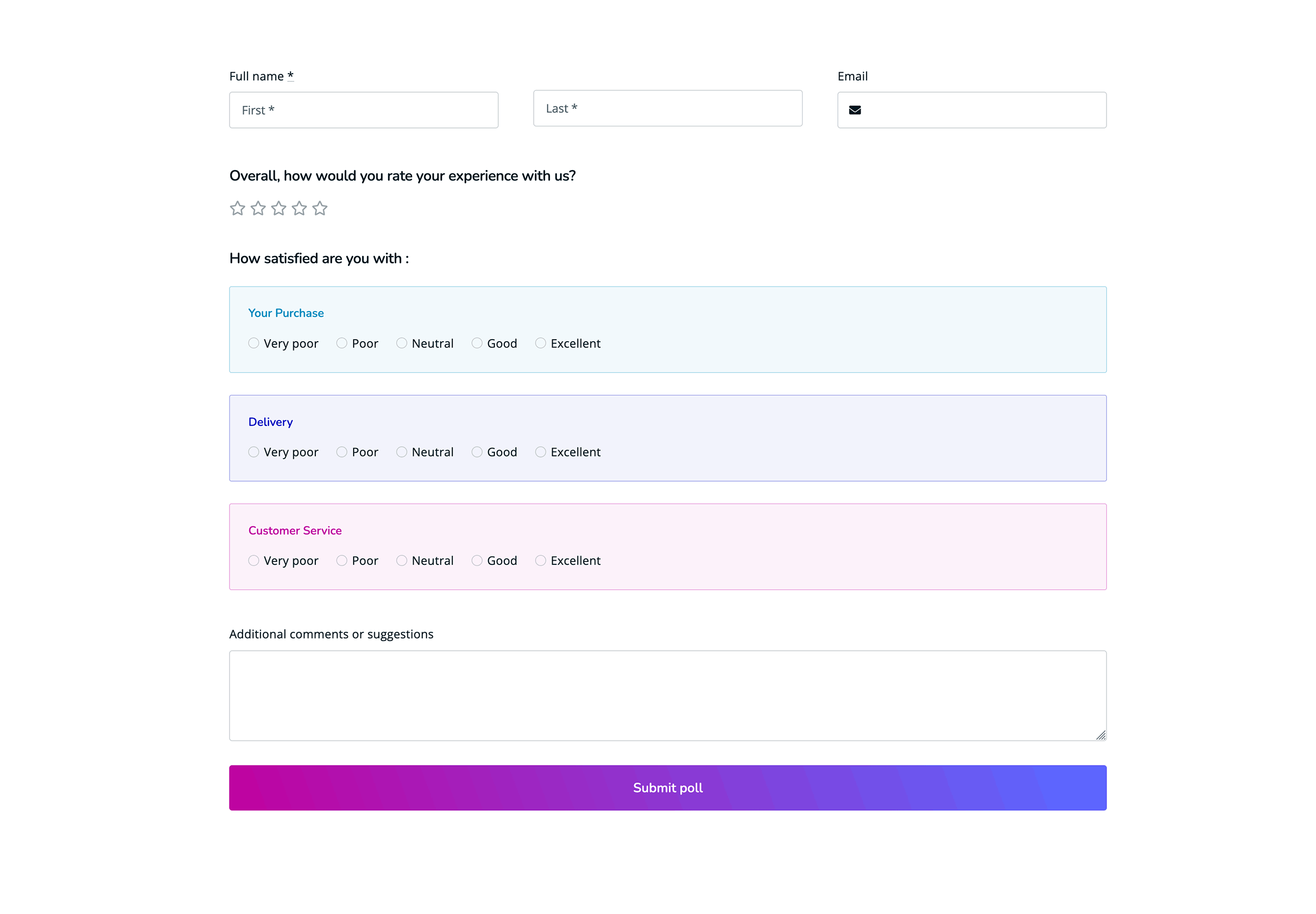
The Avada Rating Field Element is an Avada Form Builder Element that allows users to submit a rating by selecting from a series of visual indicators, such as stars or icons, typically representing a scale from low to high. It is often used for feedback, reviews, or surveys, and can be styled to fit seamlessly with the form’s design.

Examples can include the individual option values set for that particular instance; however, in some cases, not all Element variations can be shown as they may be too numerous. Where a live example cannot be shown, an image representation will be used as a substitute. For more detailed information, please refer to the related Element documentation and videos.

Avada Range Field Featured ImageRange Field
Avada Forms reCAPTCHA Featured ImagereCAPTCHA Field
Go to Top