Woo Order Table

Last Update: March 25, 2024

As part of Avada Layouts, we created a series of Dynamic Elements that help generate content in the Content Layout Section of a Layout. These are called Layout Elements.

As part of the Avada WooCommerce Builder, a range of Woo Commerce Elements were added. In this document, we are looking at the Woo Order Table Element. This Element is designed to be used in custom WooCommerce Thank You pages. See the How To Create A Custom WooCommerce Thank You Page doc for more details on that process, but here we will look at the Element, and what it offers.

For privacy reasons YouTube needs your permission to be loaded.
I Accept

How To Use The Woo order Table Element

This Element is designed to be used in custom WooCommerce Thank You Pages. See the How To Create Custom WooCommerce Thank You Pages for more details on that process, but here we will look at the Element, and what it offers.

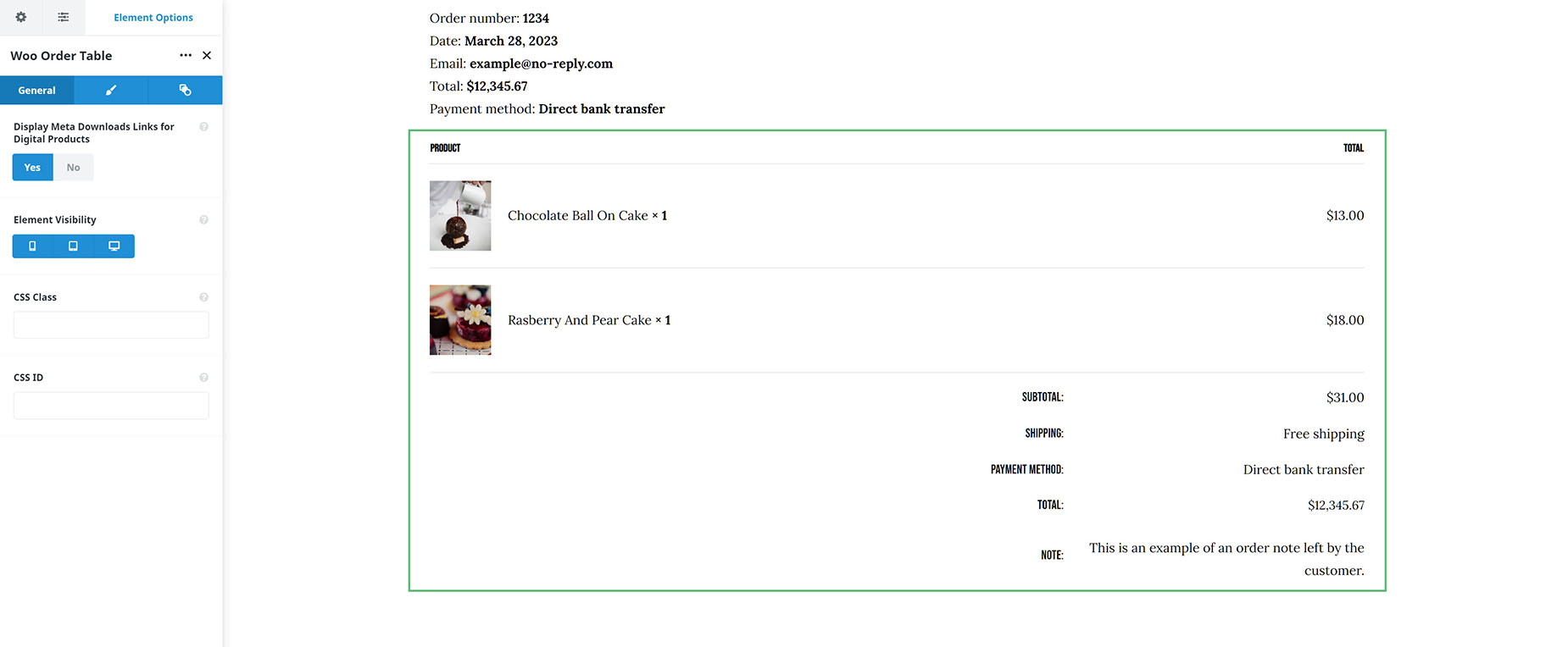
This part of the Thank You page is a simple Table Element, that displays the items purchased in the Order. Just add it to your Content Layout Section, wherever you want. There is a full range of typography, border and color options to style it however you like. See the full range of options below.

Woo Order Table Element

Element Options

Note: Please note that the displayed options screens below show ALL the available options for the element. If you have Avada’s Option Network Dependencies turned on, you will only see options relevant to your selections, and so the options screen may look somewhat different.

General

HeadingDescription
Display Meta Downloads Links for Digital ProductsWhether or not to display the download links under the products. This is a more straightforward approach instead of using Woo Order Downloads element. The downside is that the information for expiring download date, and number of downloads remaining are missing from here, unlike Woo Order Downloads element.
Element VisibilityChoose to show or hide the element on small, medium or large screens. You can choose more than one at a time.
CSS ClassAdd a class to the wrapping HTML element.
CSS IDAdd an ID to the wrapping HTML element.

Design

HeadingDescription
MarginEnter values including any valid CSS unit, ex: 4%.
Heading Cell PaddingEnter values including any valid CSS unit, ex: 10px or 10%. Leave empty to use default 1px 1px 15px 1px value.
Body Cell PaddingEnter values including any valid CSS unit, ex: 10px or 10%. Leave empty to use default 25px 0 25px 0 value.
Footer Cell PaddingEnter values including any valid CSS unit, ex: 10px or 10%. Leave empty to use default 10px 0 10px 0 value.
Heading Cell Background ColorControls the heading cell background color.
Body Cell Background ColorControls the table cell background color.
Footer Cell Background ColorControls the footer table cell background color.
Table BorderControls the border style of the table.
Table Border WidthSelect the width of the border.
Table Border ColorControls the color of the table border, ex: #000.
Heading Cell TypographyControls the typography of the heading. Leave empty for the global font family.
Body Cell TypographyControls the typography of the content text. Leave empty for the global font family.
Body Cell Link Hover ColorSelect the color of the link on hover.
Footer Heading Cell TypographyControls the typography of the heading in footer. Leave empty for the global font family.
Footer Data Cell TypographyControls the typography of the data in footer. Leave empty for the global font family.
Total Price Cell TypographyControls the typography of the total price. Leave empty for the global font family.

Extras

HeadingDescription
Animation TypeSelect the type of animation to use on the element.
Direction of AnimationSelect the incoming direction for the animation.
Animation ColorSelect the color of the animation
Speed of AnimationType in speed of animation in seconds (0.1 - 5).
Animation DelaySelect the delay time after the animation starts(0 - 5).
Offset of AnimationControls when the animation should start.