Woo Order Downloads
Last Update: February 11, 2026
The Avada Woo Order Downloads Element is designed to be used in custom WooCommerce Thank You pages. See the How To Create A Custom WooCommerce Thank You Page help file for more details.
How To Use The Woo order Downloads Element
This Avada Element is designed to be used in custom WooCommerce Thank You Pages. For more details on this process, refer to How To Create A Custom WooCommerce Thank You Page. Here, we will examine the Element and its features.
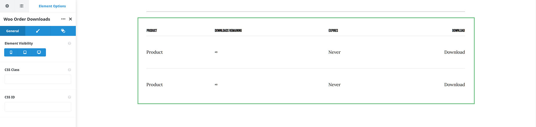
You can add this Element to your Thank-You Page Layout if your site offers digital downloads. There is also an option in the Woo Order Table Element that allows for the display of digital products. Still, this Element also displays expiring download dates, the number of downloads, and other details.
Add the Element to your Layout wherever you want it. There is a full range of typography, color, and border options on the Design tab to style it as you wish.
Element Options
Note: Please note that the displayed options screens below show ALL the available options for the element. If you have Avada’s Option Network Dependencies turned on, you will only see options relevant to your selections, and so the options screen may look somewhat different.


