Woo Order Details

Last Update: August 29, 2025

The Avada Woo Order Details Element is designed to be used in custom WooCommerce Thank You pages. See the How To Create A Custom WooCommerce Thank You Page help file for more details.

For privacy reasons YouTube needs your permission to be loaded.

How To Use The Woo order Details Element

This Avada Element is designed to be used in custom WooCommerce Thank You Pages. For more details on this process, refer to How To Create A Custom WooCommerce Thank You Page. Here, we will examine the Element and its features.

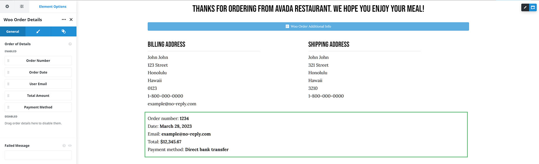
This Element adds the Order details to the Thank You page. As you can see in the screenshot below, several details are available for display. By default, they are all enabled, but if there’s one you don’t want to display, drag it to the Disabled area.

Woo Order Details Element

Element Options

Note: Please note that the displayed options screens below show ALL the available options for the element. If you have Avada’s Option Network Dependencies turned on, you will only see options relevant to your selections, and so the options screen may look somewhat different.

General

HeadingDescription
Order of DetailsChoose the order of order received details.
Failed MessageShow a custom message if the order fails. Leave empty for default Woo message translated in displayed language. You can click preview button to see how this message is displayed in case payment fails.
Element VisibilityChoose to show or hide the element on small, medium or large screens. You can choose more than one at a time.
CSS ClassAdd a class to the wrapping HTML element.
CSS IDAdd an ID to the wrapping HTML element.

Design

HeadingDescription
MarginEnter values including any valid CSS unit, ex: 4%.
Item/Failed Message TypographyControls the item typography.
Item Detail TypographyControls the item detail(information) typography.
Failed Button Colors
Button ColorSelect the color of the text of buttons.
Button Background ColorSelect the background color of buttons.
Button Border ColorSelect the border color of buttons.
Button PaddingEnter values including any valid CSS unit, ex: 10px or 10%.
Button Border WidthSelect the width of the button border.
Button Border RadiusEnter values including any valid CSS unit, ex: 10px or 10%.
Buttons Distance From ParagraphEnter values including any valid CSS unit, ex: 10px or 10%.
Distance Between ButtonsEnter values including any valid CSS unit, ex: 10px or 10%.

Extras

HeadingDescription
Animation TypeSelect the type of animation to use on the element.
Direction of AnimationSelect the incoming direction for the animation.
Animation ColorSelect the color of the animation
Speed of AnimationType in speed of animation in seconds (0.1 - 5).
Animation DelaySelect the delay time after the animation starts(0 - 5).
Offset of AnimationControls when the animation should start.

In this article