Tag Cloud Element
Last Update: March 25, 2026
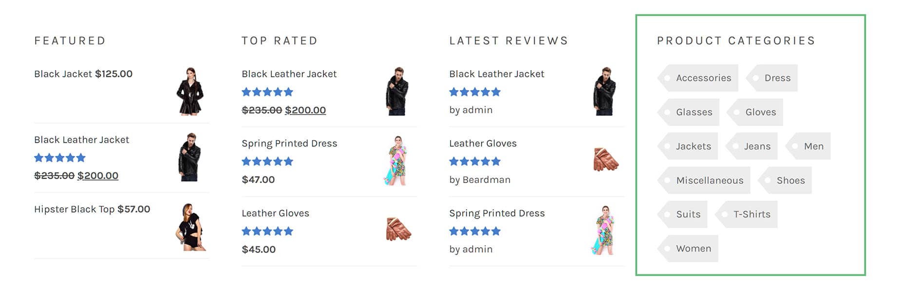
The Avada Tag Cloud Element allows you to add a tag cloud into your content. Watch the video below for a visual overview of the Element, view the Avada Tag Cloud Element page for live examples, and read on to see the complete list of options.
How To Use The Tag Cloud Element
To start, select where you’d like to place your Tag Cloud. Add the Avada Tag Cloud Element from the Element Dialog. Configure the Element as required. Choosing the taxonomy is the most important option, as this determines what is displayed. Configure the style of the Tag Cloud on the design tab.
Here, you can choose a range of design options to style the Tag Cloud exactly as you want. If you wish, you can choose to animate the Element on the Extras tab.
Element Options
Note: Please note that the displayed option screens below show ALL the available options for the element. If you have Avada’s Option Network Dependencies turned on, you will only see options relevant to your selections, and so the options screen may look somewhat different.


