Woo Order Customer Details
Last Update: August 29, 2025
The Avada Woo Order Customer Details Element is designed to be used in custom WooCommerce Thank You pages. See the How To Create A Custom WooCommerce Thank You Page help file for more details.
How To Use The Woo Order Customer Details Element
This Avada Layout Element is designed to be used in custom WooCommerce Thank You Pages. For more details on this process, refer to ‘How to Create Custom WooCommerce Thank You Pages.’ Here, we will examine the Element and its features.
It adds both the Billing and Shipping addresses, as well as other details. There is a full range of typography, color, and border options, allowing you to style this element as you wish. Add it to your Woo Thank You Content Layout Section wherever you want, and style it as desired.
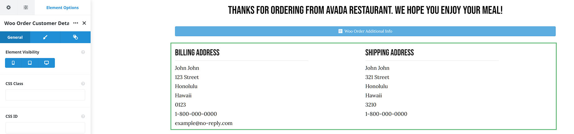
Element Options
Note: Please note that the displayed options screens below show ALL the available options for the element. If you have Avada’s Option Network Dependencies turned on, you will only see options relevant to your selections, and so the options screen may look somewhat different.


