Avada Logo
Avada Design Elements

Submit / Button

The Avada Form Submit Button Element finalizes form submissions, with full styling, hover effects, icons, and alignment options to make the action stand out visually.

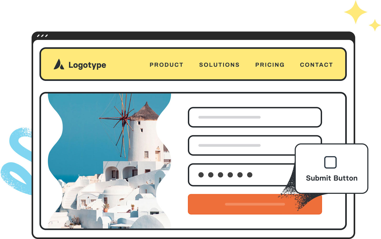
Avada Forms Submit Button Featured Image

Style Control

Control the size, shape, colors, hover states, icons, & border options to suit your site's design.

Action Trigger

This Element is designed & intended as the primary button to submit the data from Avada forms.

100% Mobile-Friendly

Alignment, styling, & sizes adapt for mobile devices so buttons look good everywhere on your site.

Avada Submit / Button Element Examples

The Avada Form Submit Button Element is the final trigger for Avada form submissions, and can be styled to match your site's design while driving user action. You can control label text, icon inclusion, size, layout, hover effects, and button alignment, ensuring the submission action is visually strong and intuitive.
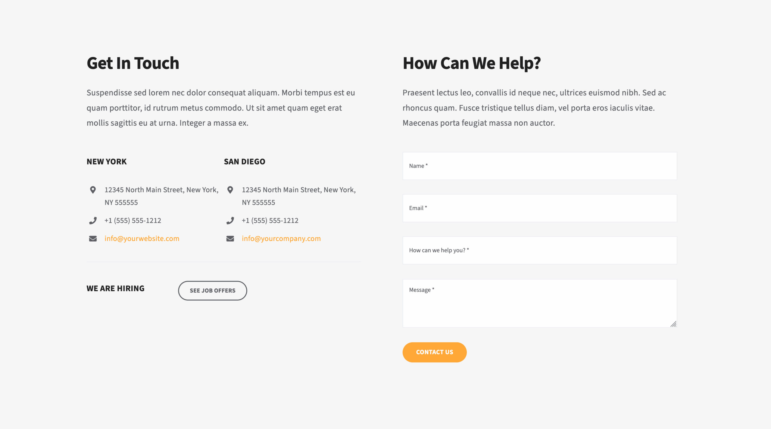
The Avada Submit Button Element is an Avada Form Builder Element that serves as the final action trigger for a web form, enabling users to submit their entered data for processing. It can be fully styled to match the site’s design, with customizable text, size, color, hover effects, and alignment, while also supporting additional actions, such as redirecting users or displaying confirmation messages after submission.

Examples can include the individual option values set for that particular instance; however, in some cases, not all Element variations can be shown as they may be too numerous. Where a live example cannot be shown, an image representation will be used as a substitute. For more detailed information, please refer to the related Element documentation and videos.
Avada Forms Select Field Featured ImageSelect Field
Avada Forms Text Field Featured ImageText Field
Go to Top