
Avada Select Field Element Examples
The Avada Select Field Element adds a dropdown (select) menu to your forms, allowing users to choose a single option from a list. You can supply custom choices, set default selection, placeholder text, group options, and style the dropdown’s appearance, typography, colors, and hover states to integrate seamlessly.

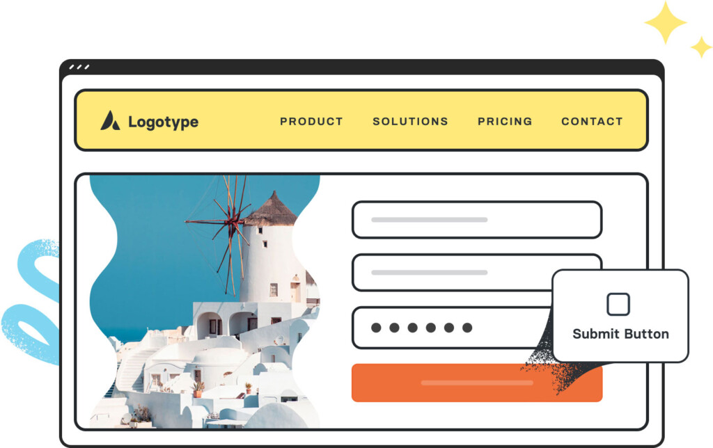
Examples can include the individual option values set for that particular instance; however, in some cases, not all Element variations can be shown as they may be too numerous. Where a live example cannot be shown, an image representation will be used as a substitute. For more detailed information, please refer to the related Element documentation and videos.


