Avada Date Field Element Examples
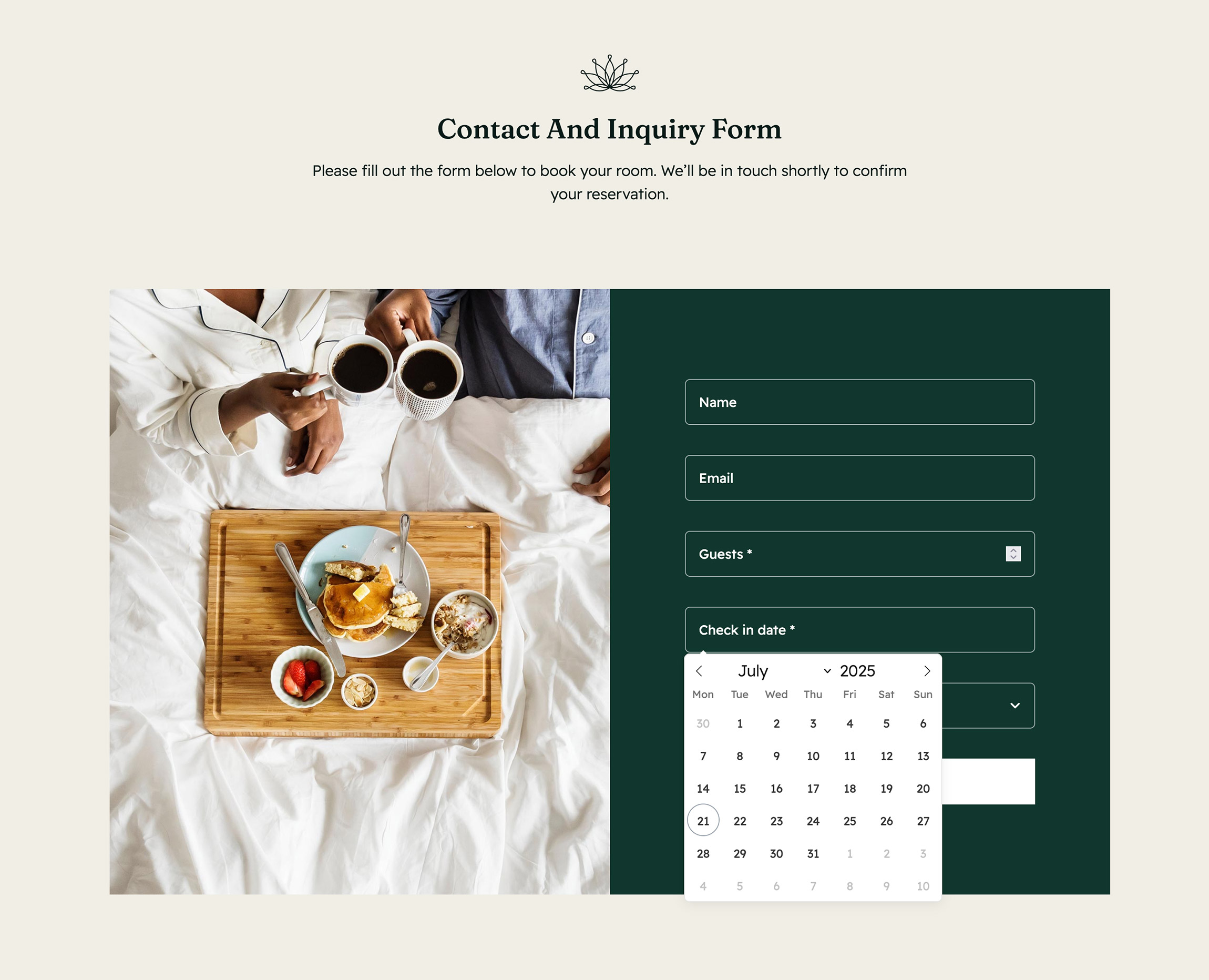
The Avada Date Field Element enables users to select a date from a calendar UI within forms or content sections, making it ideal for bookings, scheduling, or event registration. You can set date formats, placeholder text, default values, minimum/maximum ranges, and style the field to match your design.
Examples can include the individual option values set for that particular instance; however, in some cases, not all Element variations can be shown as they may be too numerous. Where a live example cannot be shown, an image representation will be used as a substitute. For more detailed information, please refer to the related Element documentation and videos.


