Avada Logo
Avada Design Elements

Checkbox Field

The Avada Checkbox Field Element adds styled checkboxes for options or consents, with full control over labels, alignment, default states, styling, and validation.

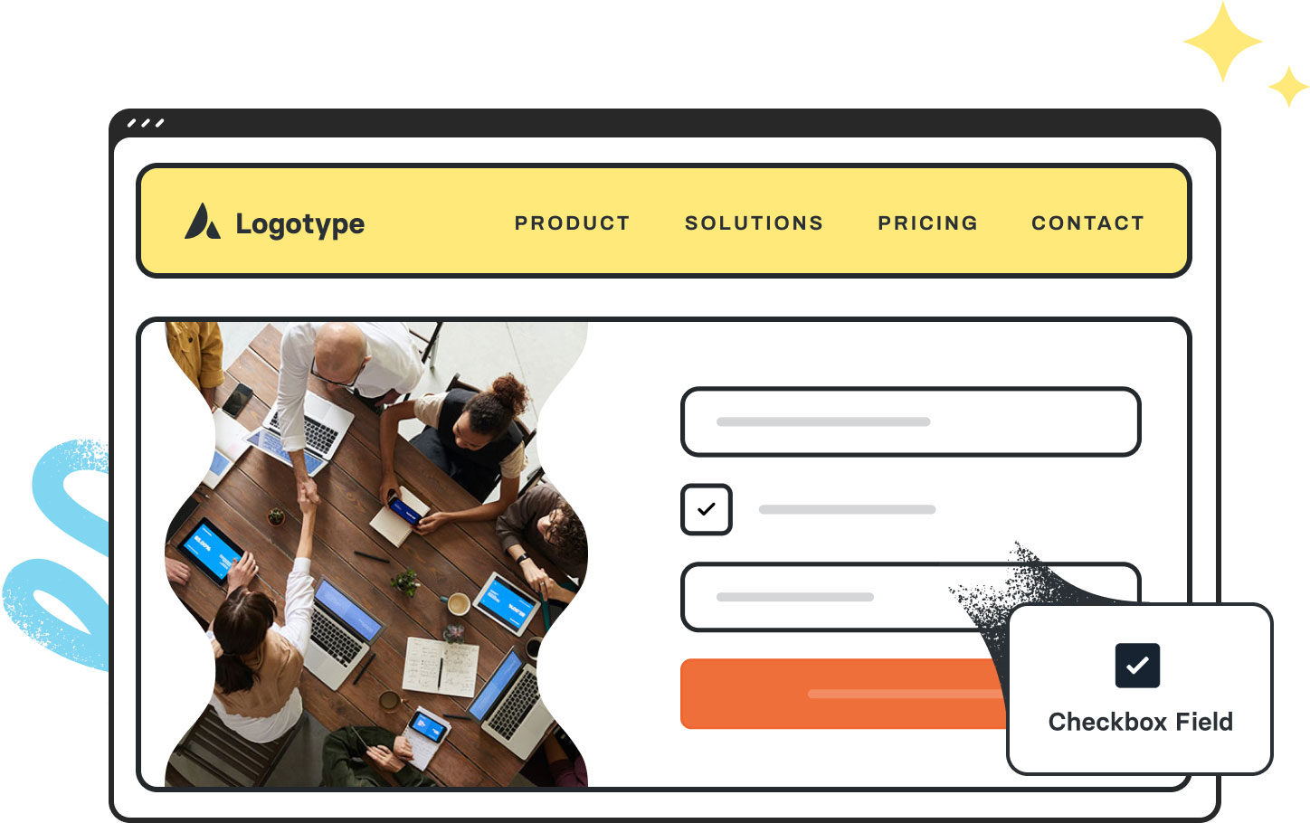
Avada Checkbox Field Featured Image

Interactive Inputs

Allows users to, for example, toggle features, select options, or agree to terms.

Label & State Control

Easily configure the label text, checked defaults, text validation notices, & more.

Styling Freedom

You can style the box shape, color, hover/checked states, & text alignment.

Avada Checkbox Field Element Examples

The Avada Checkbox Field Element gives you a way to add checkboxes into forms or layout areas—for options, consents, or multiple choices—with control over label text, default states, alignment, styling, and validation behavior.

The Avada Checkbox Field Element is an Avada Form Builder Element that allows you to include single or multiple checkbox options within Avada Forms, making it easy for users to select one or more choices when submitting information. It integrates seamlessly with the Avada Form Builder, letting you style the field, control its layout, and connect the selected responses to your form’s functionality, ensuring flexibility for surveys, opt-ins, agreements, or preference selections.

Examples can include the individual option values set for that particular instance; however, in some cases, not all Element variations can be shown as they may be too numerous. Where a live example cannot be shown, an image representation will be used as a substitute. For more detailed information, please refer to the related Element documentation and videos.
Avada Woo Tabs Element Featured ImageWoo Tabs
Avada Date Field Featured ImageDate Field
Go to Top