Woo Reviews Element

Last Update: September 8, 2025

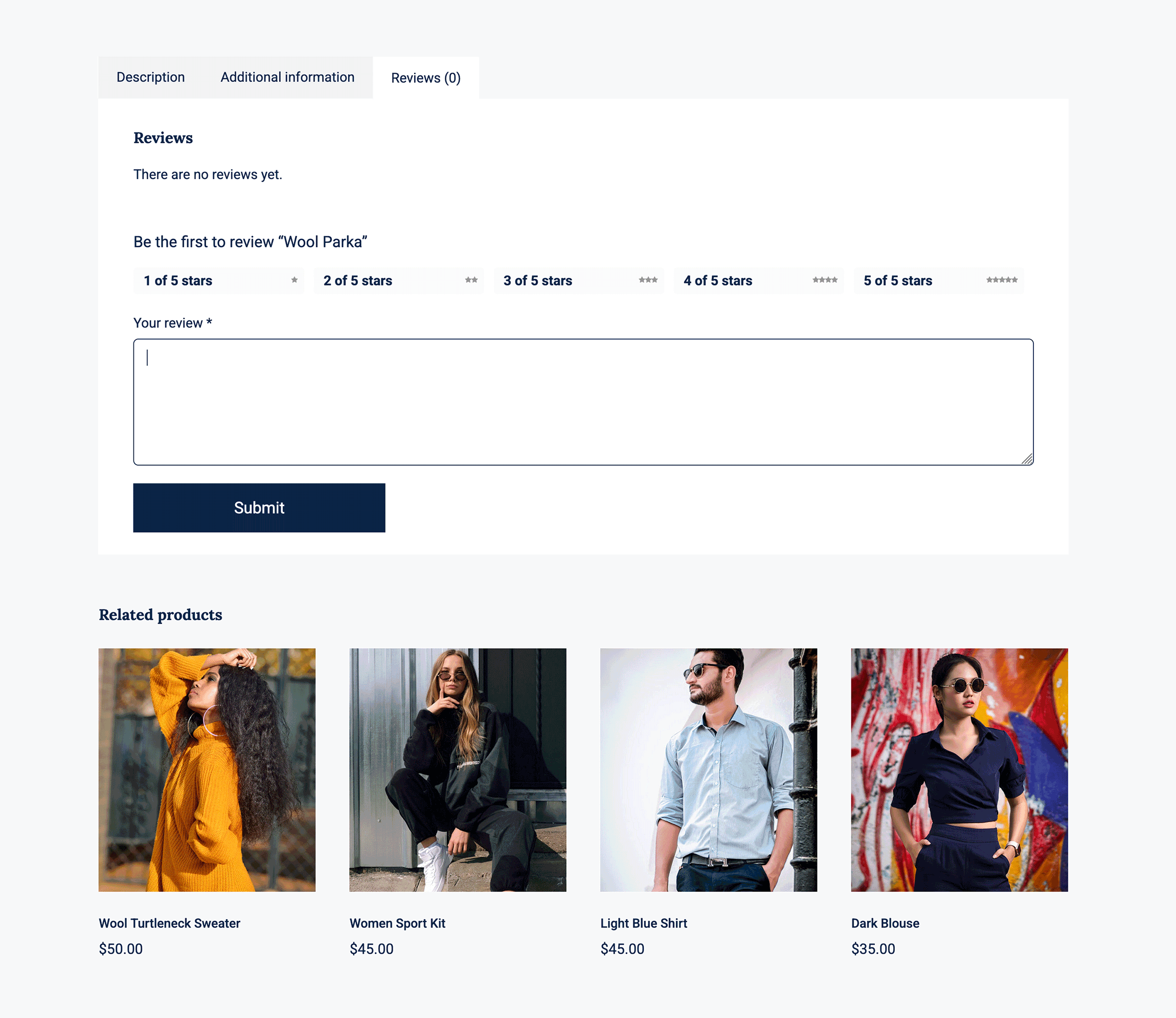
The Avada Woo Reviews Element displays customer reviews for a WooCommerce product, including written feedback about the product or service. The Element displays ratings and comments in a structured format, helping to build trust and social proof for potential buyers.

Watch the video below for a visual overview of Avada Layout Elements, and view the Avada Woo Reviews Element page. Read on to see the complete list of options.

For privacy reasons YouTube needs your permission to be loaded.

How To Use The Avada Woo Reviews Element

The Avada Woo Reviews Element provides an independent way to add customer reviews to your online products. This Element will display existing reviews for a product, and provide an opportunity for a user to leave a review. This functionality is also in the Avada Woo Tabs Element, but can be disabled if desired and used as a standalone Element.

Avada Woo Reviews Element

Element Options

Note: Please note that the displayed options screens below show ALL the available options for the element. If you have Avada’s Option Network Dependencies turned on, you will only see options relevant to your selections, and so the options screen may look somewhat different.

General

HeadingDescription
Show HeadingChoose to have heading displayed.
HTML Heading TagChoose HTML tag of the heading, either div, p or the heading tag, h1-h6.
Element VisibilityChoose to show or hide the element on small, medium or large screens. You can choose more than one at a time.
CSS ClassAdd a class to the wrapping HTML element.
CSS IDAdd an ID to the wrapping HTML element.

Design

HeadingDescription
MarginIn pixels or percentage, ex: 10px or 10%.
Content TypographyControls the typography of the text. Leave empty for the global font family.
Review Border SizeControls the review border size. In pixels.
Review Border ColorControls the review border color.
Stars ColorControls the color of review stars, ex: #000.
Rating Box Background ColorControls the rating box background color, ex: #000.
Submit Review Button StyleSelect whether you want to custom style the submit review button.
Button SizeControls the button size.
Button SpanControls if the button spans the full width/remaining width of row.
Button Border SizeControls the border size. In pixels or percentage, ex: 10px or 10%.
Button Text ColorControls the text color of the button.
Button Gradient Top ColorControls the text color of the button.
Button Gradient Bottom ColorControls the text color of the button.
Button Border ColorControls the border color of the button.

Extras

HeadingDescription
Animation TypeSelect the type of animation to use on the element.
Direction of AnimationSelect the incoming direction for the animation.
Animation ColorSelect the color of the animation
Speed of AnimationType in speed of animation in seconds (0.1 - 5).
Animation DelaySelect the delay time after the animation starts(0 - 5).
Offset of AnimationControls when the animation should start.

In this article