Woo Tabs Element
Last Update: February 11, 2026
The Avada Woo Tabs Element displays product information in a tabbed format, such as product details, additional information, and product reviews. The Woo Tabs Element organizes the content into separate panels that can be switched between. With full styling and layout options, you can control the appearance, order, and design of the tabs, ensuring they fit seamlessly into your store’s layout while improving usability.
Watch the video below for a visual overview of Avada Layout Elements, and view the Avada Woo Tabs Element page. Read on to see the complete list of options.
How To Use The Avada Woo Tabs Element
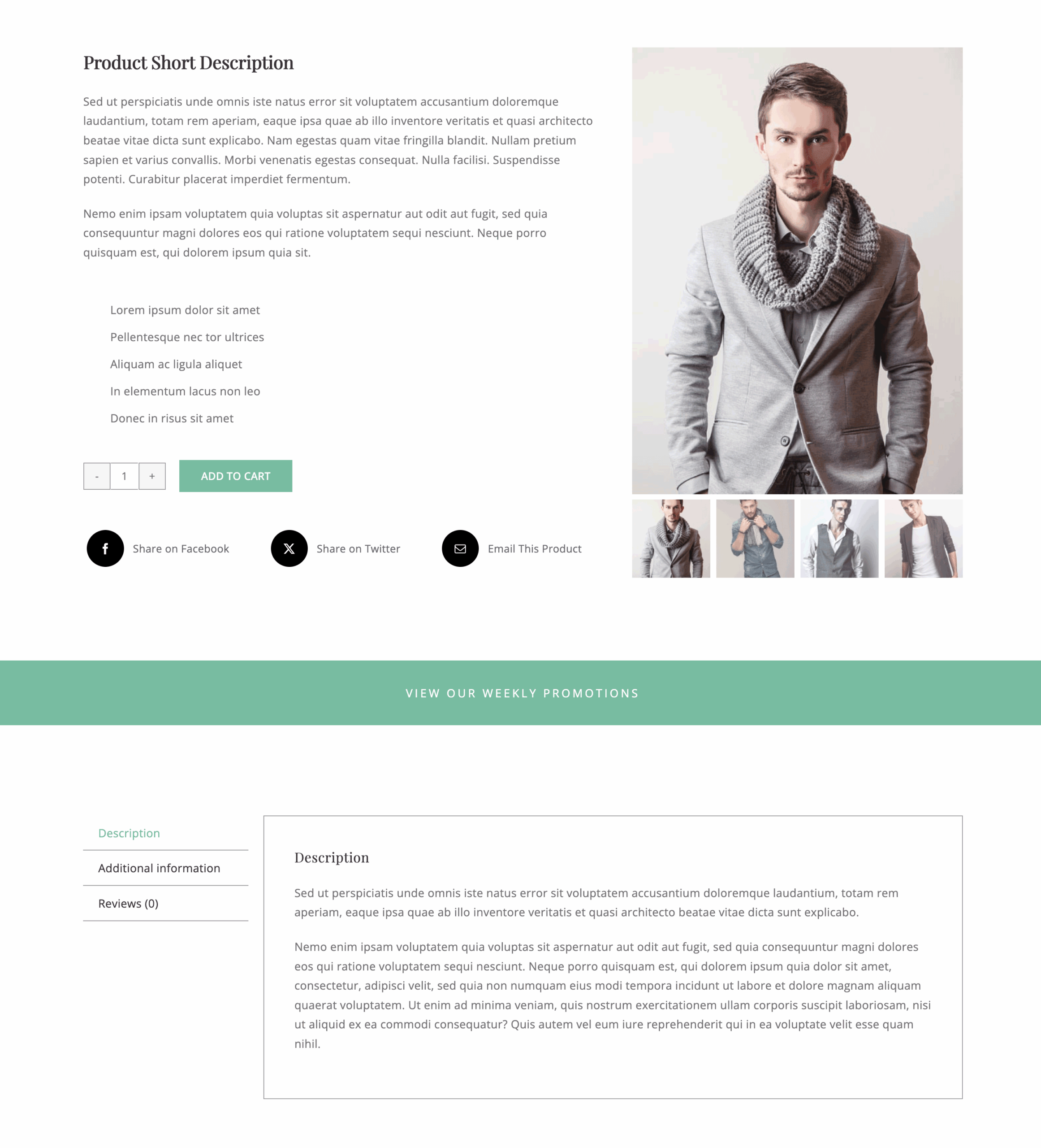
The Avada Woo Tabs Element allows you to display the WooCommerce Tabs, which are usually found under the product image and short descriptions. These tabs can display the full descriptions, any additional information for variable products, and any reviews that have been left.
With this Element, you can configure the layout to be horizontal or vertical and customize the area with an extensive range of design options.
Element Options
Note: Please note that the displayed options screens below show ALL the available options for the element. If you have Avada’s Option Network Dependencies turned on, you will only see options relevant to your selections, and so the options screen may look somewhat different.


