Responsive Option Sets
Last Update: March 31, 2025
This is the main responsive feature in the Builder, which allows you to set certain options independently for different screen sizes. This is achieved by allowing some specific Element options to hold up to three sets of values, corresponding with the three Responsive screen sizes, Large (Desktop), Medium (Tablet) and Small (Phone). Read on to learn how to use it, or watch the video below, for a visual overview.
Isn’t Avada Already Responsive?
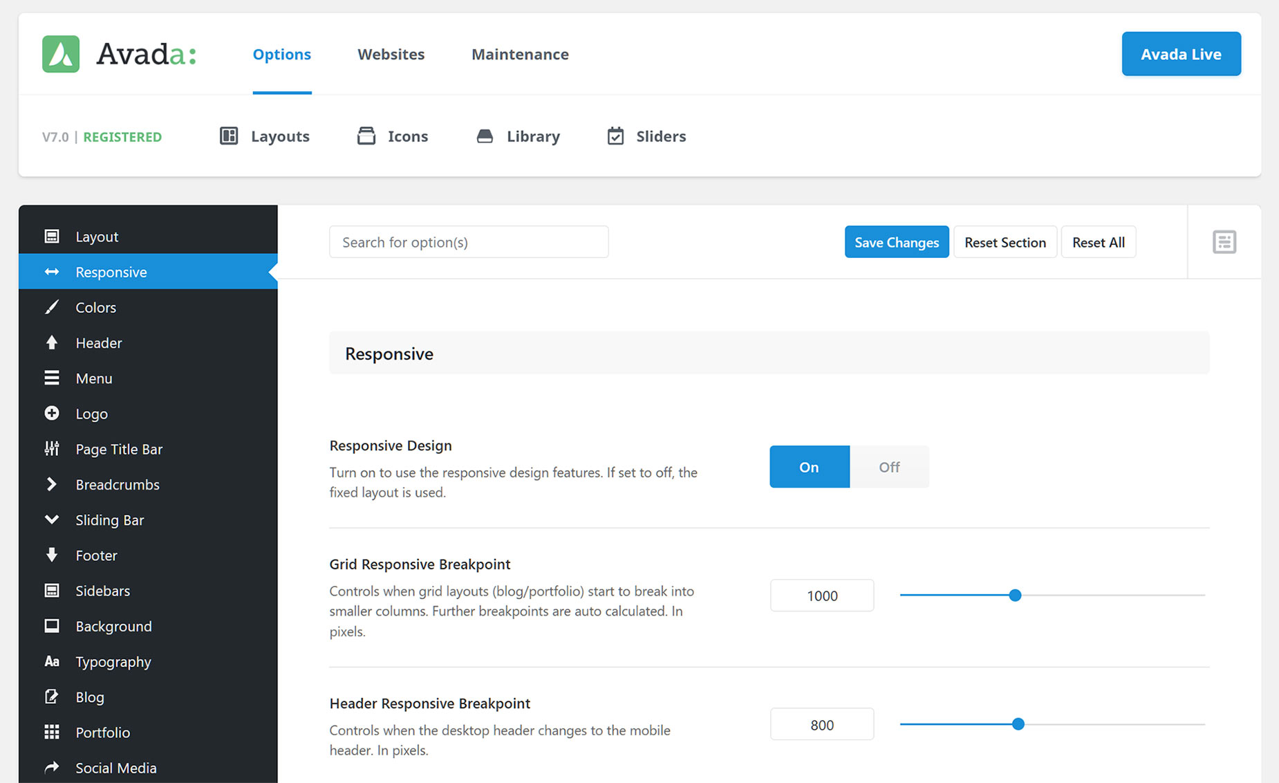
Yes, it is. If you haven’t disabled the Responsive Design option, found under Options > Responsive, then your site is already responsive, and will alter its layout when it is viewed in tablet or mobile view, according to the options and breakpoints set in the Global Options. For example, a Container displaying two 1/2 Columns on Desktop will, by default, display them as 1/1 Columns when on a Small (Phone) device, to compensate for the narrow viewport.
There are many Responsive options you can set in Avada, and you can set your own breakpoints for several areas of the layout. Please see the Responsive Options in Avada video for full details on that. But Responsive Option Sets offers you much greater granular control with your content, and work in conjunction with the Avada Options to give you the freedom to decide exactly how you want your Columns to display on both Medium and Small size screens.
So now, if you want 1/2 width columns on Small Screens, that’s no problem. You can even drag and drop containers to change their order on various layouts. In short, you can have three completely different layouts for the same Containers and Columns, giving you all the flexibility you need for responsive design.
Where To Find It
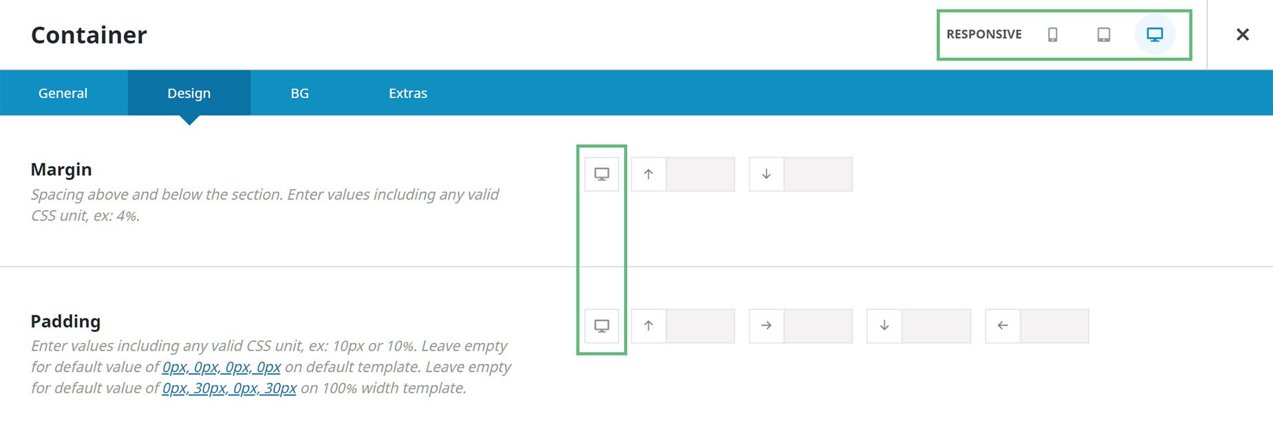
Responsive Options Sets are available on selected options in the Container and Column Elements (including background images), as well as a few other selected Design Elements; at this point the Button, Image, Text Block, and Title Elements. This feature will expand over time to other Elements and options.
There are very clear indicators for when Responsive Option Sets are available. In the back end editor interface, you will see the word ‘Responsive’ and a set of icons in the Title Bar of any Element that uses it. As well, a screen icon will be visible next to the options available for use with the feature, as seen below.
In Avada Live, on the right hand side of the toolbar, you will find the Responsive Icon. This is not just a preview option to see how the site looks on different screen sizes, but is also a new responsive editing mode. When you select a specific screen size, like Medium or Small, not only does the layout change on the screen, but any Responsive Options that you set while in that view, will apply only for that view.
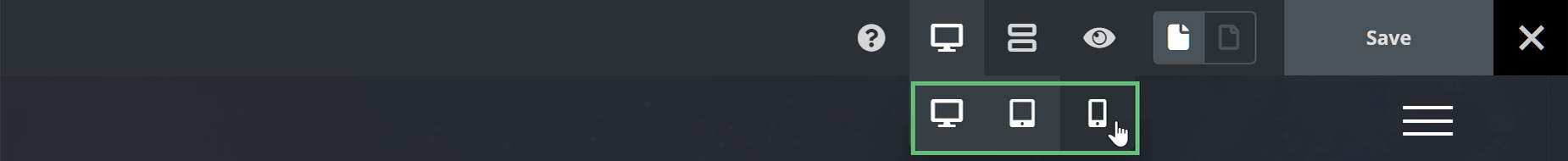
You can also adjust the Responsive Screen view in Avada Live from the actual Element options that support it, by clicking on the icon in the option.

How To Use It
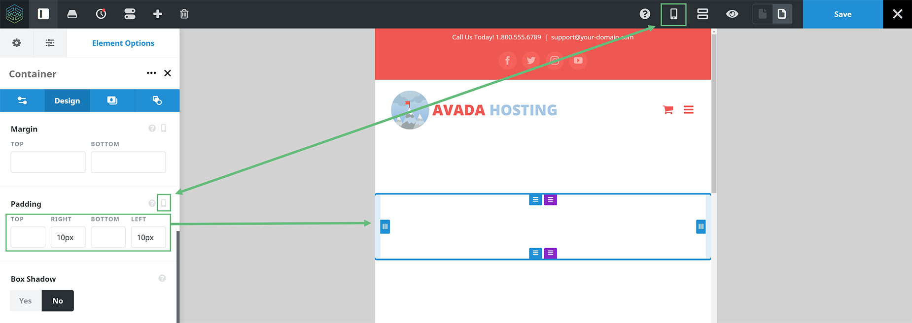
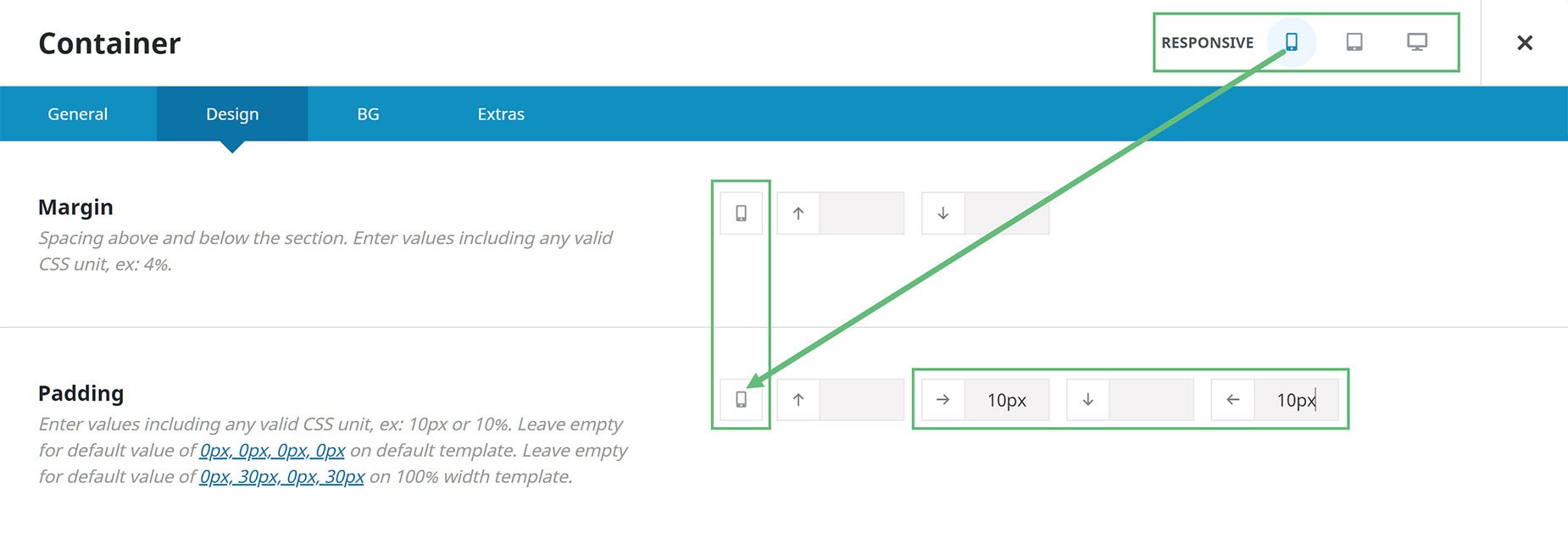
As you can see in the example of the Live Builder below, I have chosen the Small (Phone) Responsive Icon in the toolbar, and in the Padding Option for the Container I am editing, the icon has changed to the same icon, signifying that the values inserted (in this case 10px padding on the left and right sides of the Container) will only apply when the screen is at Small size.
Any responsive option set while in the Desktop view will carry through to both medium and small layouts, but if you want a specific value, for either Tablet or Phone for example, you would just click on the respective icon and then enter a different value into the relevant option.
It works the same way in the back end interface of the builder, but it just looks a little different. If we look at the Container or Column Element in the back-end interface of Avada Builder, we can see three Responsive icons at the top of the Element. If we select a specific icon along the top, the options included in this feature and that also have a responsive icon, will change their icons to match the one selected at the top. This shows that the values you set in this options will apply only to the selected layout.
See the image below to see how this works. Note how in the image, the Mobile Responsive view has been selected in the Container header, and in the Margin and Padding options of the Container, the Responsive Icons there have changed to a phone, showing that the values entered there will only apply when the page is viewed at Mobile size.
There are many options and situations you can change with this system to help you fine tune your design on Tablets and Mobile, including How To Set The Display Order And Size Of Columns In Responsive Layouts, and Alignment options on several Elements, including the Button, Image, Text Block, and Title Elements.
Global Options
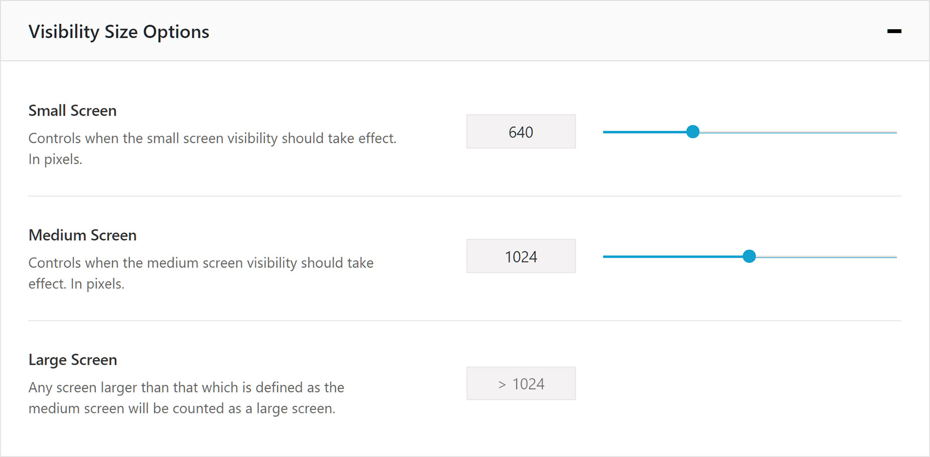
It’s also important to realize you have full control over the responsive sizes and behaviors in Avada. For example, under the Responsive Options, found at Avada > Options > Responsive > Element Responsive Breakpoints, you can determine the breakpoints at which a Medium Screen and a Small Screen kick in.
And under the Global Column options, found at Avada > Options > Avada Builder Elements > Columns, you can control the default behavior for Columns in responsive situations.
By default, Medium size screens inherit the layout from Desktop, and Small size screens revert to full width Columns, but you can, of course, change these default behaviors as you wish.

This feature is a real game changer. With Responsive Option Sets, you now have full control over your responsive layouts, all within the same containers and columns.


