Title Element
Last Update: October 31, 2025
The Avada Title Element is a versatile Avada Design Element that does exactly what it says: adds a Title to your content. You can select any Header Tag from H1 through to H6, and there are a variety of styling options including Alignment, Separator styling, and overrides for Font Size, Family, Line Height, and Letter Spacing. There are five types of Title Types: Text, Marquee, Rotating, Highlight, and Scroll Reveal.
Watch the video below for a visual overview of the Element, view the Avada Title Element page for live examples, and read on to see the complete list of options.
How To Use The Avada Title Element
The Avada Title Element allows you to add customized titles to your page content. The Title Element is very easy to use and allows for some interesting customization. On the General Tab, choose whether you want a standard Text tile, a Rotating title, a Highlighted title, or a Marquee title. Each one has its own set of options. A standard Text Title is pre-selected, and you can enter the Title content you wish to display. Then, on the Design Tab, you can customize the title.
The design options start with alignment, and then the HTML Heading Size you wish the title to have. You can also add a font size override, but otherwise, the Title will take the font size of the corresponding Header size specified in the Global Options Heading Settings. There are also override options for line height, letter spacing, margins, and font color.
There is also a separator option built into the Title Element, which allows you to choose from any of Avada’s preset separators, or not to use one at all. Read further below for a description of all element options.
How to Use the Title Element: Title Types
Apart from the standard Text Title, there are four other title types – Marquee, Rotating, Highlight, and Scroll Reveal. With these, you can create a wide variety of titles. For a full rundown on all four of these special title types, watch the video below or check out the How to Use the Title Element Title Types help file.
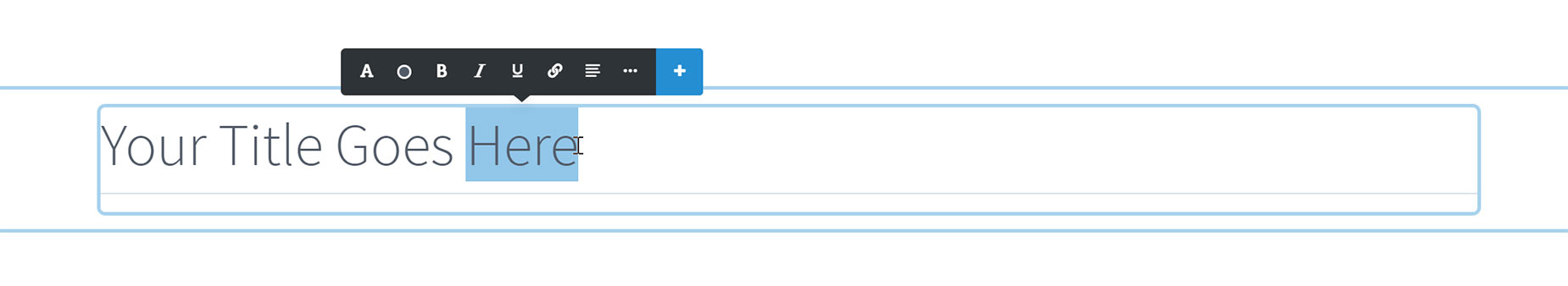
Using The Title Element in Avada Live
There are only a few differences when using the Title Element in Avada Live. Being a text-based Element, the Title Element is directly editable in Avada Live. And if you make a selection of text on the page, the Inline Editor appears, allowing you to make formatting changes to parts of your Title directly on the page.
Please see the Best Practices for Inline Editing in Avada Live document for a good idea of how to use the Inline Editor best.
Element Options
Note: The Default setting will use the global settings assigned for this element at Options > Avada Builder Elements > Title. Also, please note that the displayed option screens below show ALL the available options for the element. If you have Avada’s Option Network Dependencies turned on, you will only see options relevant to your selections, and so the options screen may look somewhat different.


