Post Meta Element
Last Update: September 2, 2025
The Avada Post Meta Element displays contextual details about a post, such as the author, date, categories, tags, or comment count, within an Avada Post Card layout by dynamically pulling this information from WordPress. With extensive customization options, you can choose which metadata to display and how it appears, making it a valuable tool for adding clarity and professionalism to your Avada website content.
Watch the video below for a visual overview of Avada Layout Elements, and view the Avada Post meta Element page. Read on to see the complete list of options.
How To Use The Post Meta Element
The Avada Post Meta Element is a specific single post/product Layout Element, designed to add customized meta information anywhere within a Single Post, Page, Portfolio, or WooCommerce product Layout. Of course, you can also use the full range of Avada Design Elements when building your Layout, and combine them with the Layout Section Elements.
When you go to add an Element in a Content Layout Section, the Element dialog opens in a new tab called “Layout Elements”. This is where you will find the Post Meta Element. The Post Meta Element can be placed anywhere in your Layout Section and displays meta content based on the options selected in the Element, on pages/posts that meet the conditions set in the Layout. There are three tabs of options in the Element, controlling functionality and design. Refer to the options panels below for specific details.
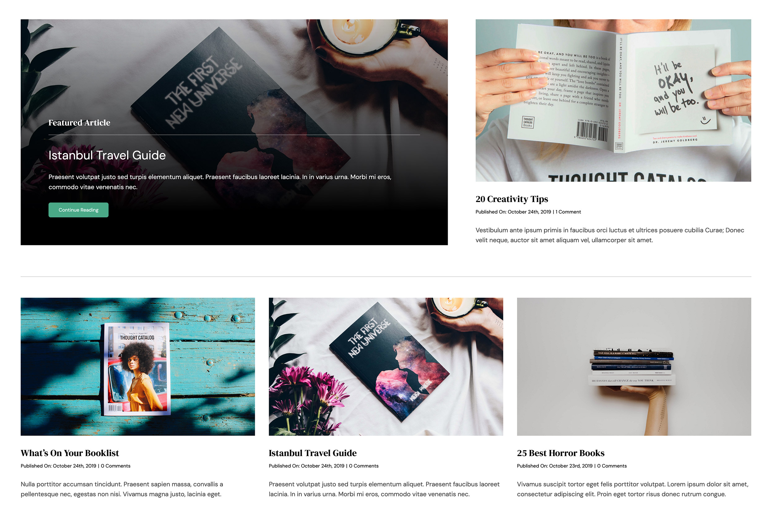
You select which metadata to enable or disable, add your preferred Separator, and then choose your design options to customize how the metadata displays on the page/post. You can also control Height, Font Size, and Text Colors. See below for an example of the Avada Post Meta Element in action on the Avada Author pre-built website.
Element Options
Note: Please note that the displayed options screens below show ALL the available options for the element. If you have Avada’s Option Network Dependencies turned on, you will only see options relevant to your selections, and so the options screen may look somewhat different.


