How To Use Post Cards In Avada
Last Update: November 18, 2025
Post Cards are a very versatile feature. Basically, a Post Card is a custom layout template for various post types including Blog posts, Portfolio posts, FAQs, Events and WooCommerce products. Using the Post Cards Element, the individual Post Cards can then be displayed in Grids, Masonry Grids, Carousels, in a Marquee, a Coverflow Carousel, or as Stacking Cards or Sliders in your pages and Layouts. They introduce a massive amount of flexibility to the layout and display of custom post types.
The basic process is that you create a Post Card Library Element via the Avada Library, which can then be applied through the Posts Cards Element on a page, or in an Avada Layout. The easiest way to understand this is that a Post Card is a type of template, and the Post Cards Element allows you to use a Post Card to display one of the available post types in various ways. Read on to find out more about this important feature, and watch the video below for a visual overview.
Creating A Post Card Library Element
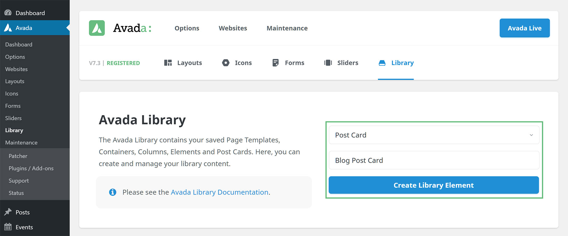
The first step in the Post Cards process is to create the Post Card Library Element. This is done in the Avada Builder Library. To create a Post Card, selecting Post Card as the type of Element, give your Post Card a name, and then click on Create New Element. This redirects you to the builder you have selected as default in the Builder Options. As can be seen below, here I’m going to create a Post Card called Blog Post Card.
Choosing An Avada Studio Prebuilt Post Card Design
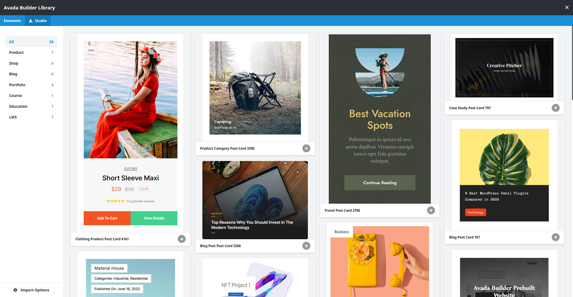
Once you have created your Post Card, you can start building from a blank slate, or you can use one of the Avada Studio Prebuilt Posts Cards. To access these, simply go to the Library by clicking on the Library icon on the Toolbar and choose the Studio tab. There you will find a variety of Prebuilt Post Cards, including Blog, Portfolio and Product Post Cards. These can be used as they are or can be used as a starting point for your Post Card design. You can preview the individual post cards or just import them directly from this window. See the Avada Studio Import Options for full details on the import process. Once you have set your import options and clicked on Import, the Post Card will be then loaded into the Avada Builder.
Designing The Post Card
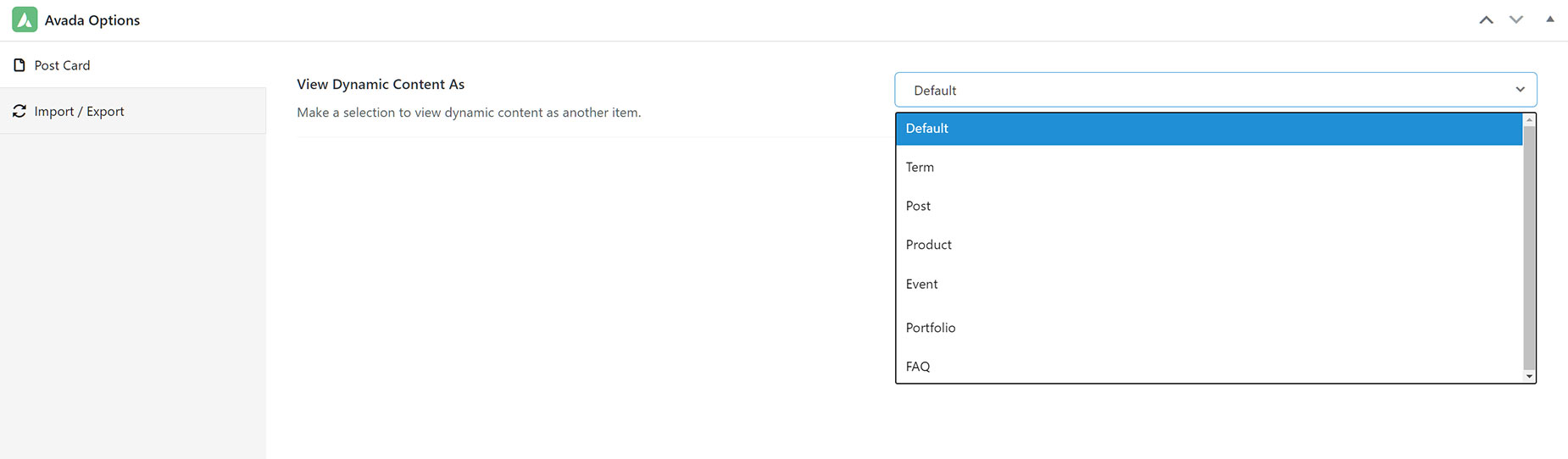
Regardless of whether you have used a Prebuilt Avada Studio Post Card, or you are starting from scratch, the first thing to do is to go to the Post Card Page Options tab, and set the “View Dynamic Content As” option to the type of content you will be creating the Post Card for. You can even choose a specific piece of content. This is important because a Post Card is a dynamic design template, and this step allows you to choose what content the builder will use for the preview of the design.
As can be seen below, this can be a Term (for example, a Category), Post, Product, Event, Portfolio, or an FAQ. As per our example, here I would choose Post, as I want the Post Card to display Blog Posts, and then I’d choose a specific post to display my Dynamic Content.
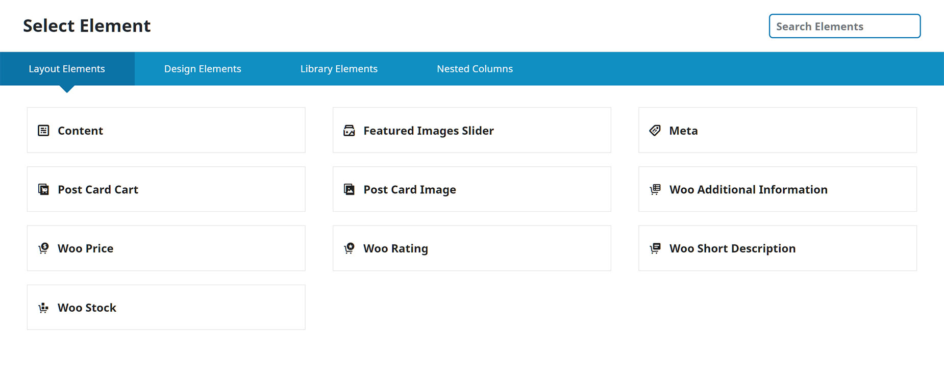
When first adding Elements to your Post Card, you are met with a Layout Elements tab. This is because Post Cards will be pulling dynamic content into the layout, and so dynamic Layout Elements are a neccesary component. As can be seen in the screenshot below, there are a range of Layout Elements that suit various types of post types. You can, of course, also use any of the Design Elements in your Post Card, like the Title Element with Dynamic Content options. Because a Post Card is a template, you don’t want to use non dynamic content unless you are happy that it displays on every piece of content the Post Card is designed for.
For this example, I designed and built a Blog Post Card, but as mentioned earlier, you can use Post Cards for products, portfolio posts; indeed any custom post type at all.
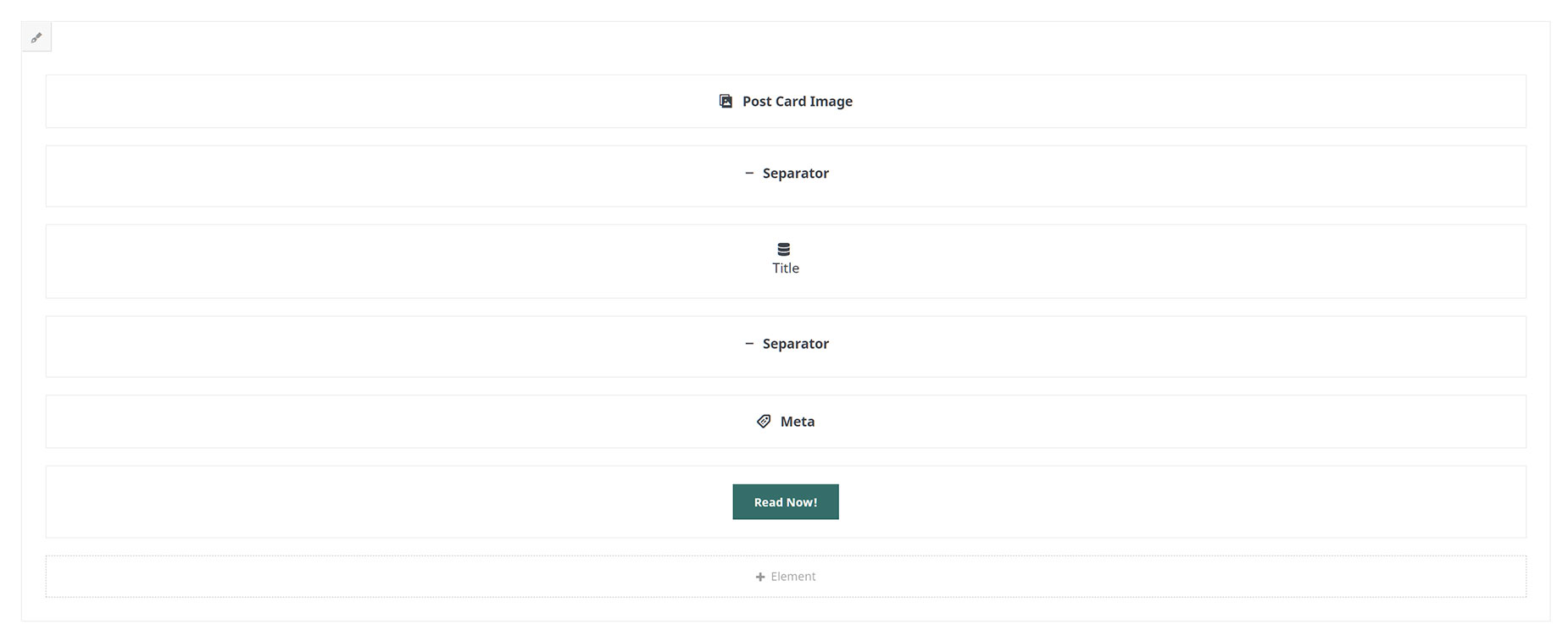
As you can see in the first screenshot below, there are six Elements in all. As well as the Elements, I also applied a border radius top and bottom and a background color to the Column itself. At the very top of the Column is a Post Card Image Element. Then there are invisible Separators above and below a Title Element, with Flex Grow set to 1, which will keep the Post Cards the same size if the Titles run to a new line. The Title Element itself has Dynamic Content set to the Page Title. Then there is an instance of the Meta Element, with various options enabled, and finally, a Button Element set to Span, with the Dynamic Content option set to Permalink.
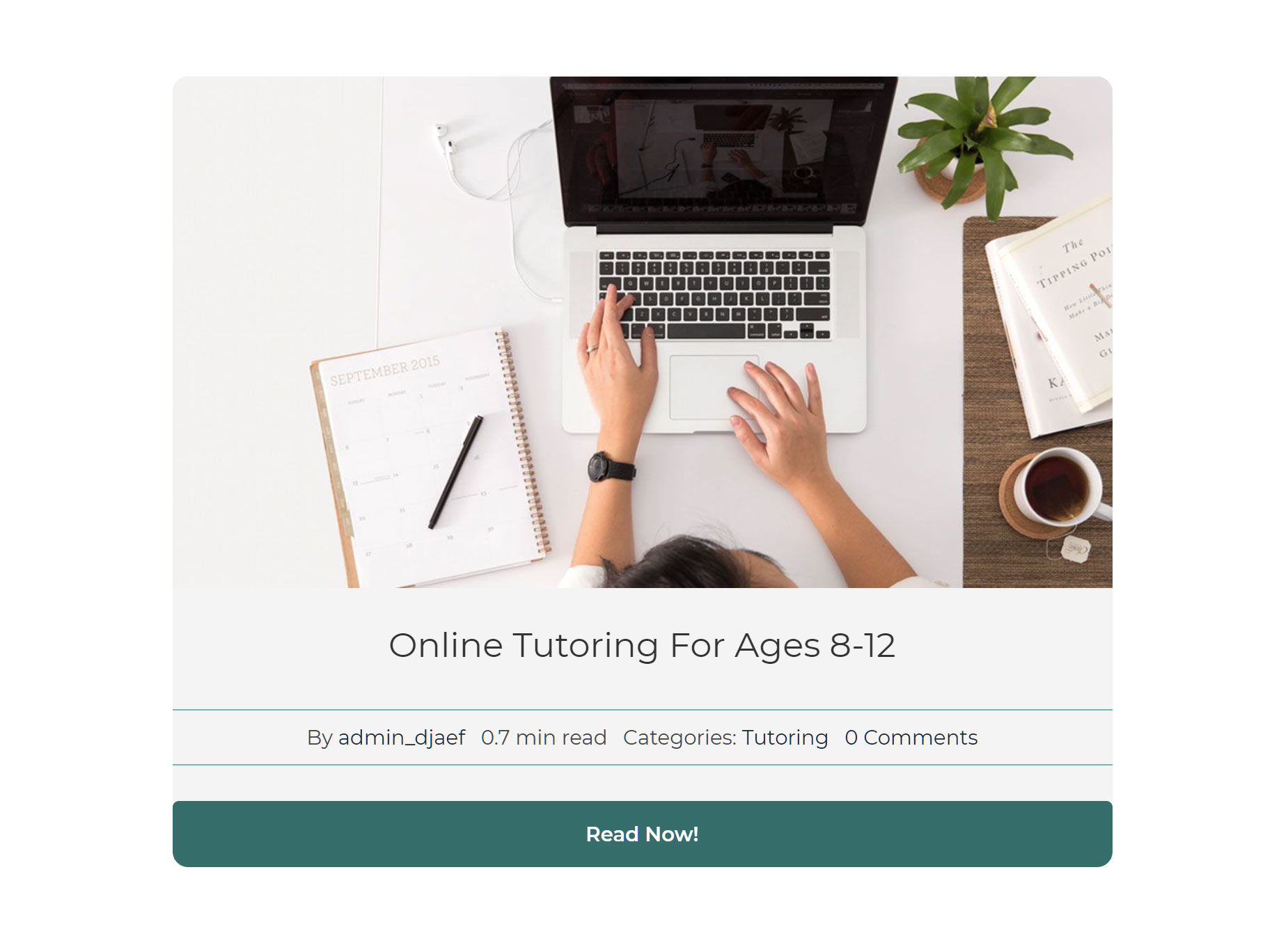
In Avada Live, with the Dynamic preview set to a post, the finished Post Card looks like this.
Adding The Post Cards Element
When you have finished the Post Card Library Element, you can then use it on a page or in a Layout, using the Post Cards Element. See that document for a full rundown of specific Element options, but basically, this is where you choose how to lay out the Post Card on the page, and which content to use.
As an example, I will walk through using the Post Cards Element to display the Blog Post Card Library Element we created above.
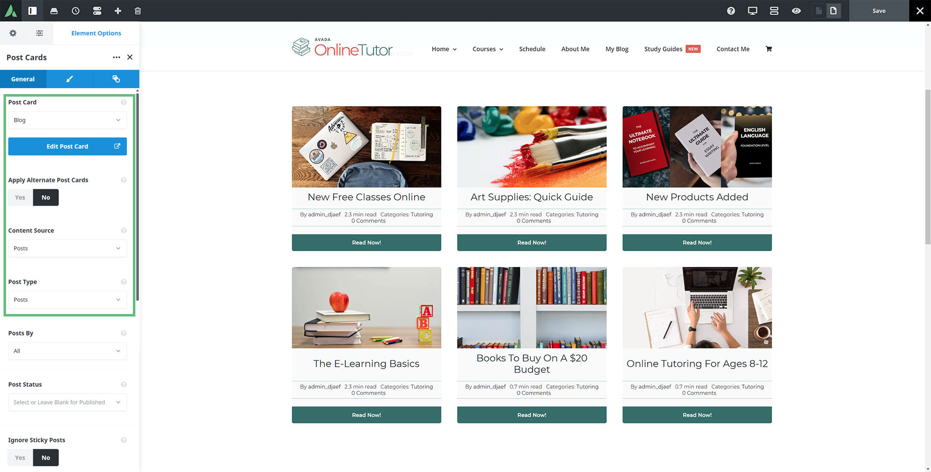
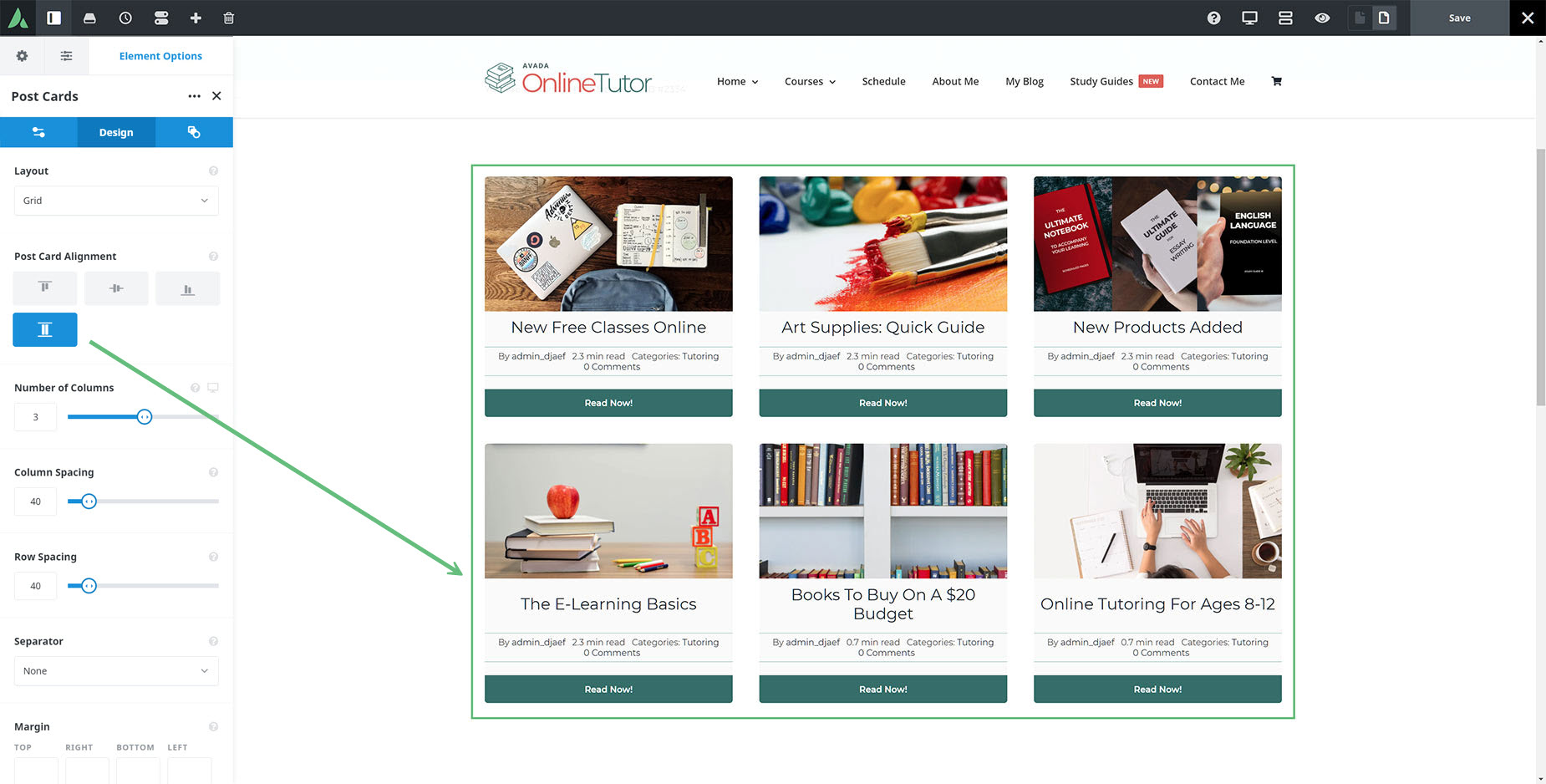
There are three tabs on the Post Cards Element. In the General Tab, you decide what Post Card you will be using, the content source and post type, and how it will be ordered etc. Then on the Design tab, you choose the Layout and the Alignment, and other design options, and finally on the Extras tab, you can apply animation to the Element.
For our example, on the General tab, as you can see below, we want to use the Blog Post Card, with a Content Source of Posts, and a Post Type of Posts (if we chose Terms with a Post Type of Posts, it would display the Blog Categories, rather than the individual blog posts themselves).
And in the Design Tab, I would choose to display the Post Cards in a three column Grid, and I’ll also choose Stretch as the Alignment, so the Cards are all the same height. You can see this in action in the second row, where the middle Title stretches over two lines, but the other two posts in the row are the same height.
This Element could then be used on the Blog page as an alternative to the Blog Element, giving you more control over the design and information displayed. And in the same way, you could create individual Post Cards for WooCommerce Products, portfolio posts, FAQ items etc. Post Cards are a very powerful, and very flexible way to present post types throughout your site.


