How To Set Up Different Headers / Logos For Mobile (And/Or Sticky)
Last Update: June 17, 2026
The incredible flexibility of the Avada Header Builder means that not only can you design and create fully customized headers for your site, but you can also have special Mobile or Sticky Headers that behave exactly as you want. Read on to explore a variety of situations with the Header Builder and small-screen (mobile) and/or Sticky Layouts.
How To Set Up A Mobile Header
If you want a Header that just reverts to a Mobile Menu (Hamburger Menu) when the site is viewed on a small screen, then you only need to change one very simple setting. This is found in the Menu Element, in the Mobile tab. It is the Collapse to Mobile Breakpoint option. This is, of course, the breakpoint at which your navigation will collapse to mobile mode. There are five options – Never, Small Screen, Medium Screen, Large Screen, and Custom.
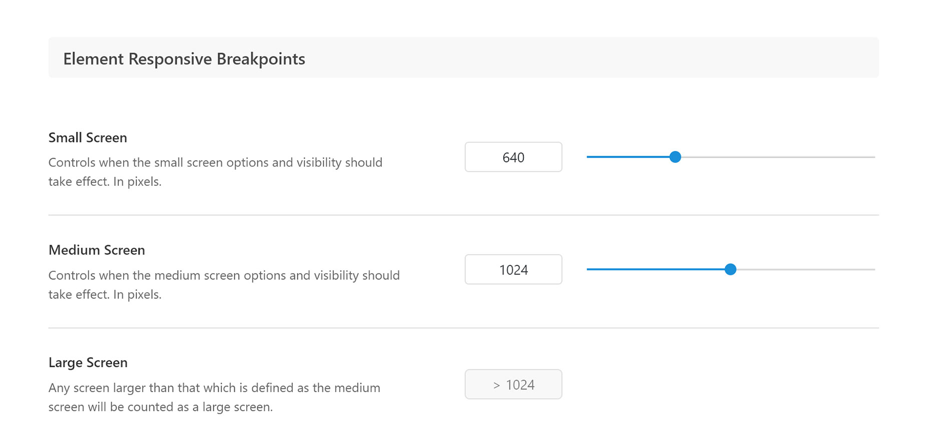
For a typical Mobile only menu, just set the Collapse to Mobile Breakpoint option to Small Screen. If you wish, you can customize the pixel value of that breakpoint in the Global Options, under Avada > Global Options > Responsive > Element Responsive Breakpoints, as you can see in the image below. You also have full control over what icons are used with the Mobile Menu with the Mobile Menu Trigger Expand Icon and Mobile Menu Trigger Collapse Icon options, which you will find on the Mobile tab of the Menu Element.
Logo Options In The Image Element
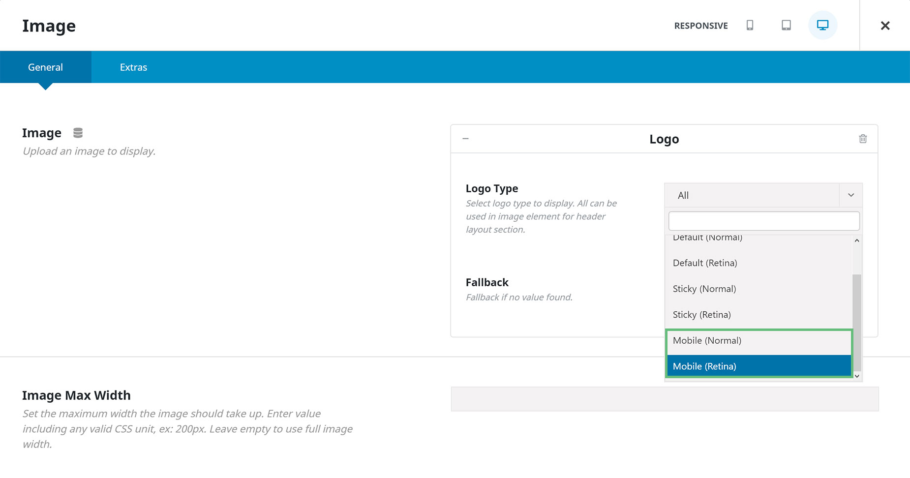
If you want to create a specific Mobile Only Container in your Header Layout, by using the Container Visibility options, there is also a useful option in the Image Element. This allows you to only pull a Mobile Logo into the Element via the Dynamic Source option. To do this, click on the Dynamic Data icon (next to the Element title), select Logo as the Dynamic Content, and then you can choose from Mobile (Normal) or Mobile (Retina). If selecting Retina, you can then also use the Image Max Width Option below to set the logo to half of its full size, thereby creating a Retina Ready Logo.
You might also want to create a Mobile menu that’s visible on all devices. This is also easy to do with the combined forces of the Menu Element and the menu itself.
The first step is to add a Custom Home Link (#) as the top level menu item in your menu, and make all desired submenu pages as children of that top level item, as seen below. In this example, I have also added two more Icon Only menu items below the submenu items, both from the Avada Special Menu Items – a Search icon, and a WooCommerce Cart Icon.
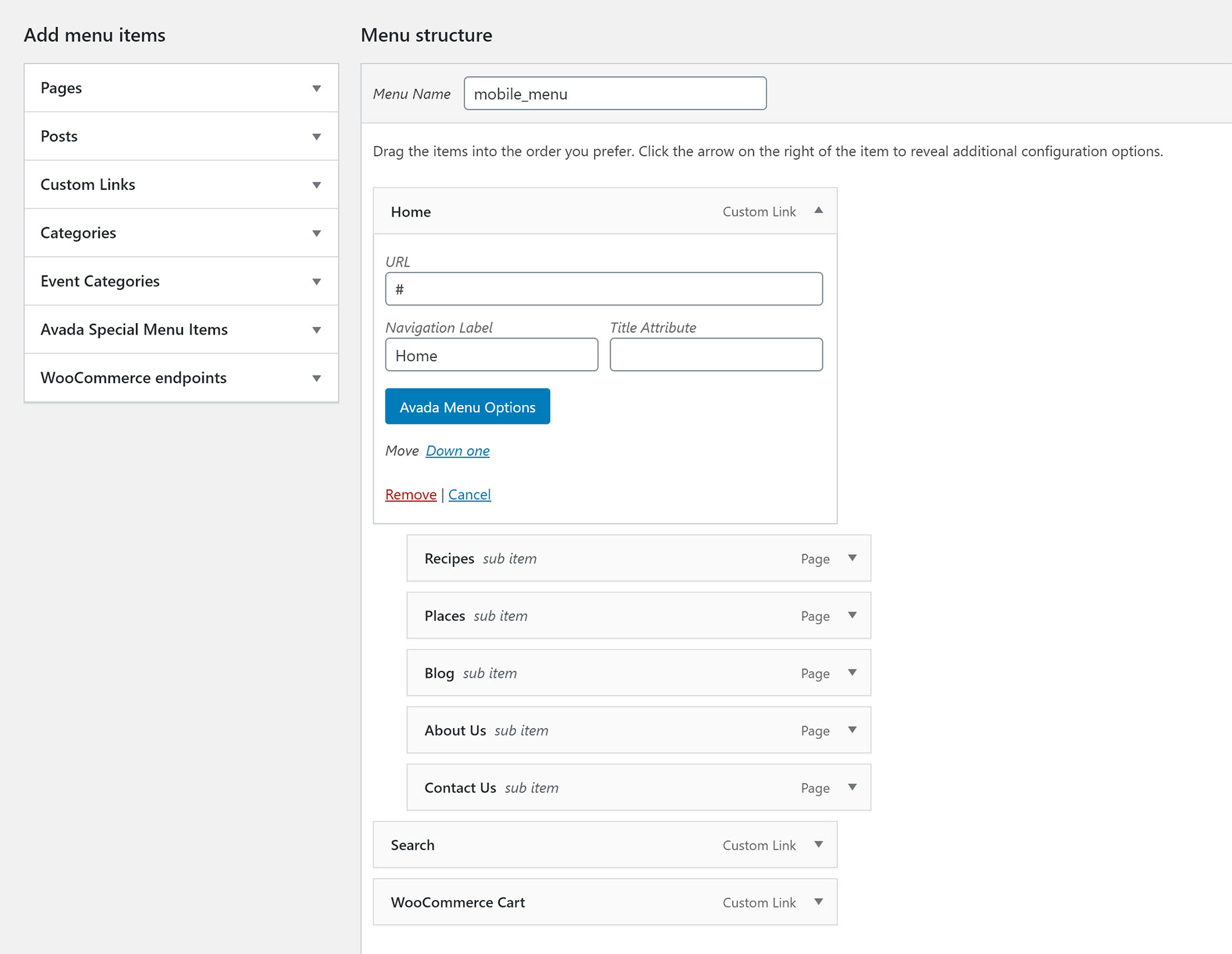
It’s also important to change the top level menu item to Icon Only through the Avada Menu Options. Here, you can set the icon to a Hamburger menu, or whatever you prefer.
Then the Menu Element takes over. Here you select your Menu, and then you can customize it as you wish. You can control the Icon size, the item spacing and styling, the submenu mode, and many other things.
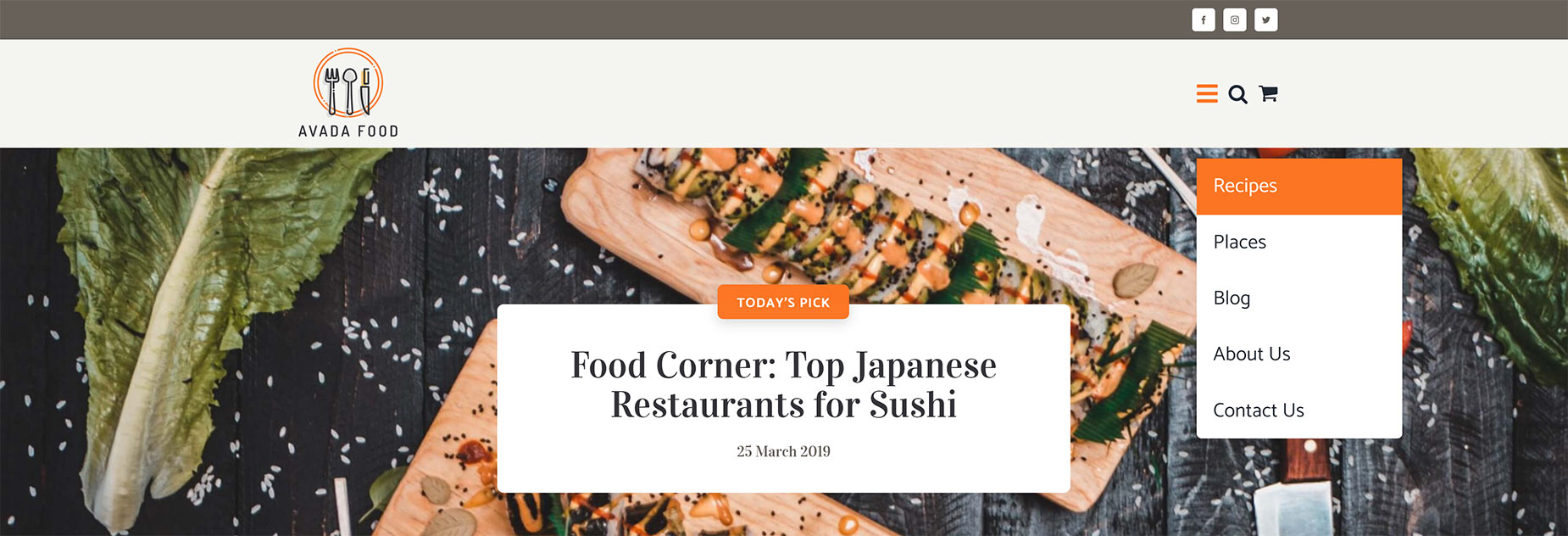
Here you can see an example of this method, using the Avada Food website. In this example, I set the Submenu Mode to Dropdown, and set the Space Between Main Menu and Submenu to be 50px.
This menu then looks the same at all screen sizes, from Desktop, through tablet to mobile.
Element Visibility / Element Sticky Visibility Options
Another couple of very helpful tools when designing Mobile and Sticky Header Layouts, are the Element Visibility Options, and the new Element Sticky Visibility Options. The Element Viability Options are found on all Elements and can be used, for example, to hide a Container until the Screen size is Small. In this way, you can easily have individual Containers for various screen sizes.
The new Element Sticky Visibility options are found on Columns and a selected range of other Elements, and can be used to hide Elements in certain states. For example, you can add Elements into a Column, which is then visible only when the Container is in Sticky mode. For more information on these two, very useful helper options, please see the Avada’s Visibility System and the How To Work With Sticky Containers docs.


