Avada Menu Options
Last Update: November 17, 2025
The Avada Menu Options are found when editing individual menu items in WordPress menus (Appearance > Menus). They allow a range of customization to menu items. Read on to discover more about this excellent menu addition, and to see these options in action, watch the video below.
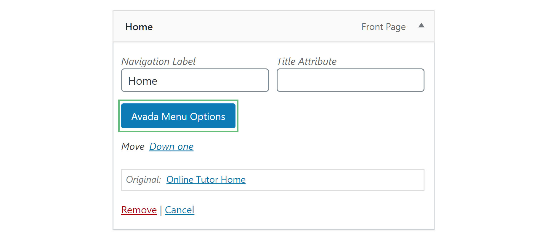
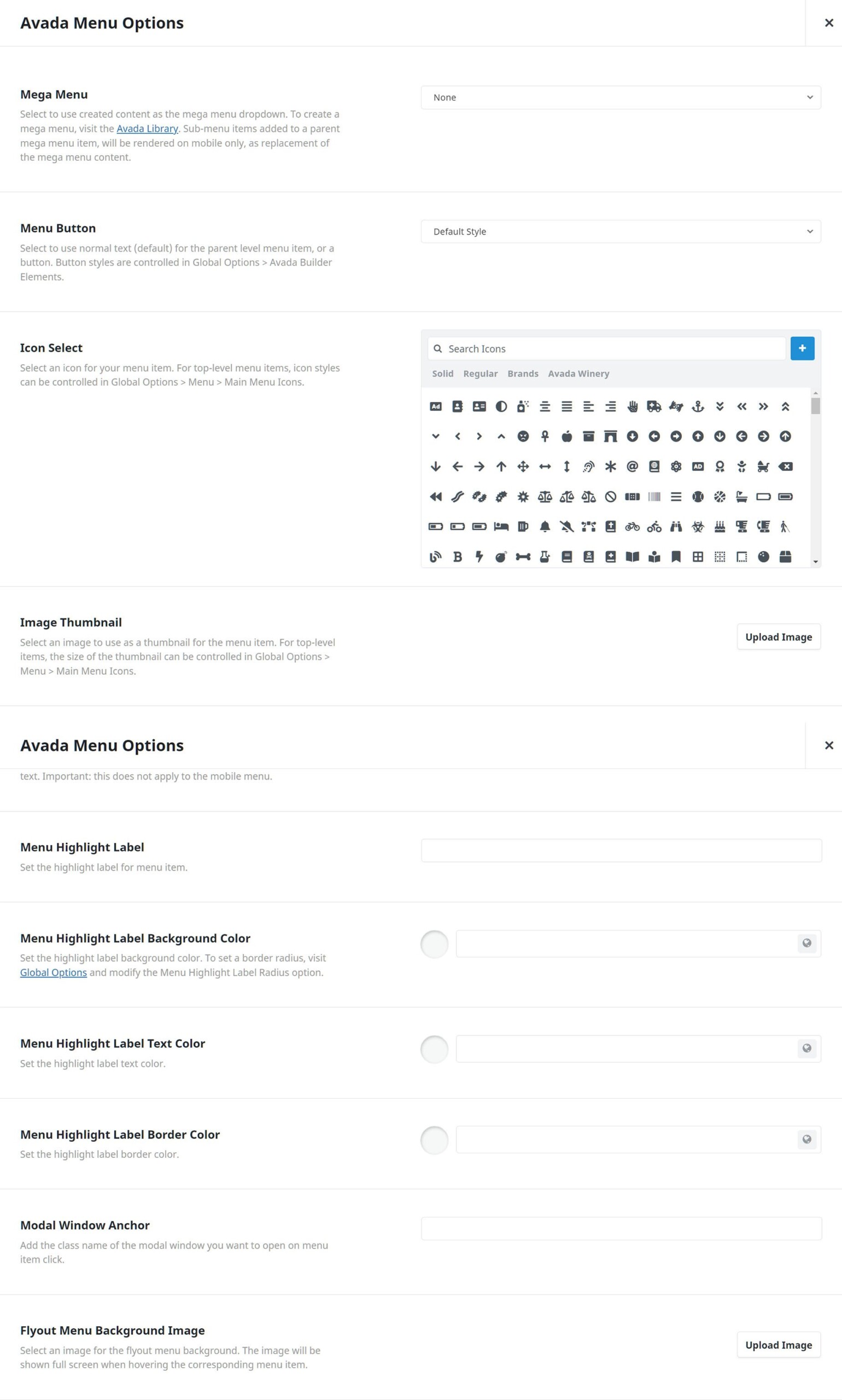
Parent Level Item Avada Menu Options
Mega Menu – Select to use created content as the mega menu dropdown. To create a mega menu, visit the Avada Library. Sub-menu items added to a parent mega menu item will be rendered on mobile only, as a replacement for the mega menu content.
Menu Button – Allows you to make the menu item regular text or a button. Choose between Default Style which is regular text, Button Small, Button Medium, Button Large, Button xLarge. The button styling is determined by the default button styles in Avada > Options > Avada Builder Elements > Button.
Icon Select – Allows you to select an icon for the menu item.
Image Thumbnail – Select an image to use as a thumbnail for the menu item. For top-level items, the size of the thumbnail can be controlled in Global Options > Menu > Main Menu Icons.
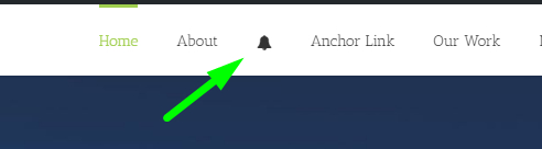
Icon/Thumbnail Only – Allows you to optionally show only the selected icon or only the thumbnail image without the menu text, as the menu item. Note: This option doesn’t apply to mobile. Click here for frontend example.
Menu Highlight Label – Allows you to add the label text for the menu item. This text will appear beside the menu text.
Menu Highlight Label Background Color – Allows you to add the background color for your menu highlight label.
Menu Highlight Label Text Color – Allows you to set the menu item’s highlight label text color.
Menu Highlight Label Border Color – Allows you to set the menu item’s highlight label border color.
Modal Window Anchor – Allows you to set the name of a modal element to launch a modal from the main menu on click. For more information on modals, click here!
Flyout Menu Background Image – Select an image for the flyout menu background. The image will be shown on full screen when hovering over the corresponding menu item.
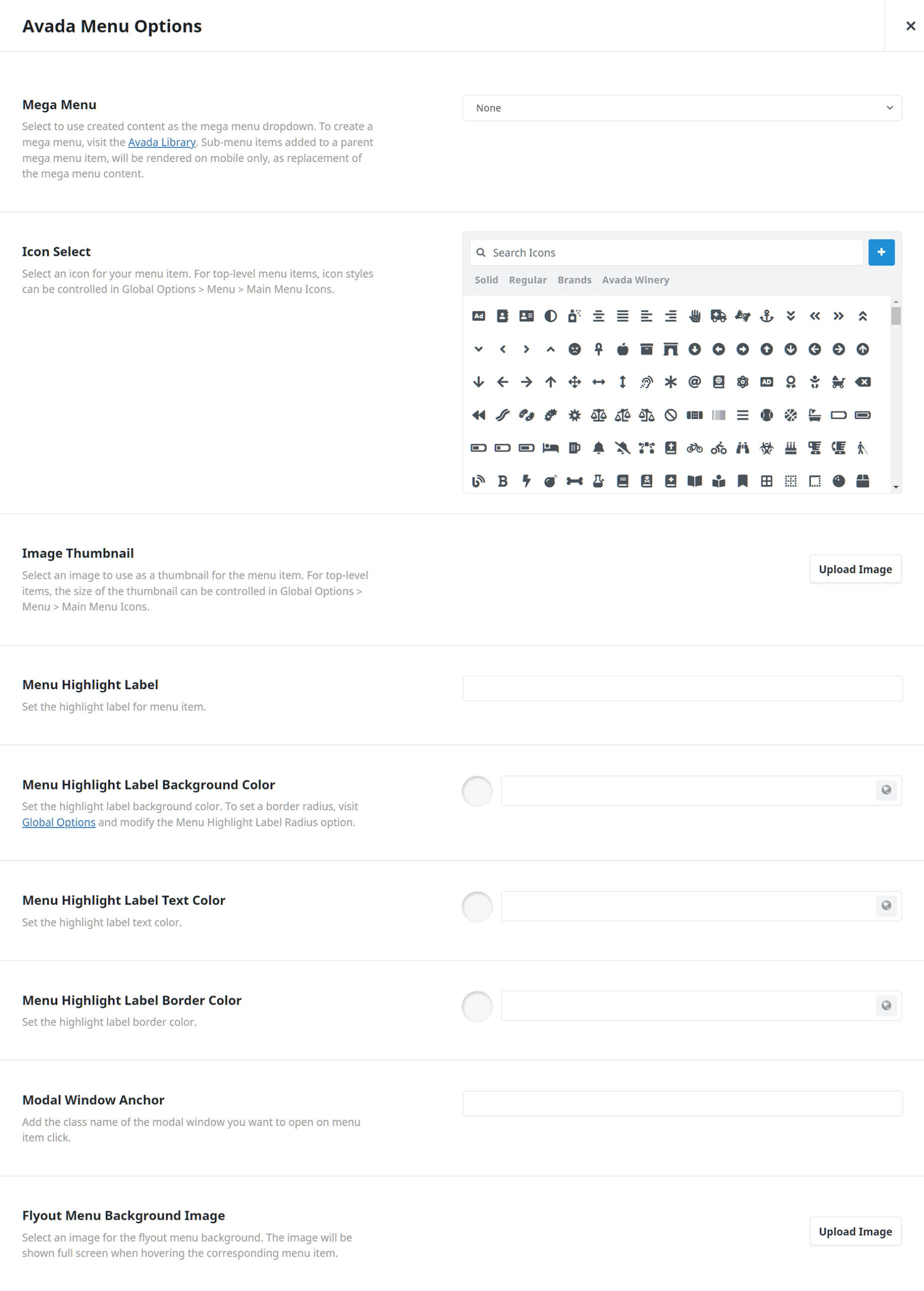
Child Level Item Avada Menu Options
These settings are located in any child level menu item’s Avada Menu Options area.
Mega Menu – Select to use created content as the mega menu dropdown. To create a mega menu, visit the Avada Library. Sub-menu items added to a parent mega menu item, will be rendered on mobile only, as replacement of the mega menu content.
Icon Select – Allows you to select an icon for the menu item.
Image Thumbnail – Select an image to use as a thumbnail for the menu item. For top-level items, the size of the thumbnail can be controlled in Global Options > Menu > Main Menu Icons.
Icon/Thumbnail Only – Allows you to optionally show only the selected icon or only the thumbnail image without the menu text, as the menu item. Note: This option doesn’t apply to mobile. Click here for frontend example.
Menu Highlight Label – Allows you to add the label text for the menu item. This text will appear beside the menu text.
Menu Highlight Label Background Color – Allows you to add the background color for your menu highlight label.
Menu Highlight Label Text Color – Allows you to set the menu item’s highlight label text color.
Menu Highlight Label Border Color – Allows you to set the menu item’s highlight label border color.
Modal Window Anchor – Allows you to set the name of a modal element to launch a modal from the main menu on click. For more information on modals, click here!
Flyout Menu Background Image – Select an image for the flyout menu background. The image will be shown full screen when hovering the corresponding menu item.
Avada Special Menu Items
Special menu Items has been added to the Menu page, and these all have their own unique Avada Menu Option panels. Please see the Avada Special Menu Items page for more information on these.


