Container and Column Element Legacy Settings

Legacy Doc

Last Update: July 3, 2023

With the introduction of Flex Containers and Columns in Avada 7.0, we have entered a new era when it comes to flexibility of layout and design. Please see Introducing Flexbox for Containers and Columns to get up to date with how Flexbox opens up a new world of layout possibilities.

But it’s a big change, and so we have kept the Legacy settings for Containers and Column Elements on existing sites, so you can have the choice whether you want to use them or not.

Upon update to Avada 7.0, Legacy Support will be enabled for existing sites, and all existing Containers and Columns will remain as they were. Any new Containers, however, will use the new Flex version. So for completed sites, nothing will change, and as such, you would be using the Legacy options when editing containers and columns.

For a full rundown on these elements, please see the Container Element and Column Element docs, but in this document, you can see a rundown of all the Legacy settings that differ from the new Flex settings.

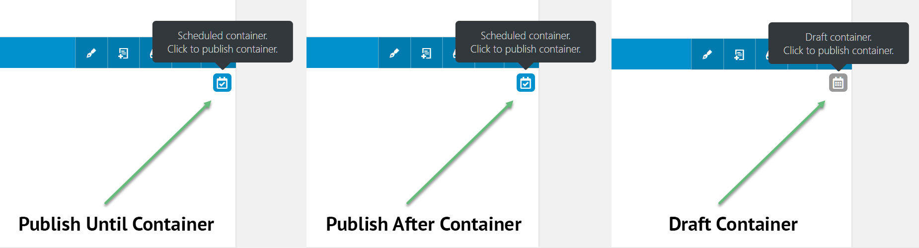
For the Container Element, the differences between Flex and Legacy are found in the General tab. Please see below for the options for this tab on the Container Element.

Container Element

Container – General Tab (Legacy)

  • Container Type – This option will only be visible on sites with Enable Legacy Support enabled (Options > Avada Builder Elements > Container). Select the type of container you want. Choose from Flex or Legacy. See the Introducing Flexbox to Containers and Columns doc for more information.
  • Interior Content Width – Select if the interior content of the Container is contained to Site Width or 100% Width. This option is only available when the page is using the 100% Width Template. Note that this option is for the Interior Content. When the 100% Width Template is in use, any background color or images of a Container will fill the full width of the viewport by default. Also note that enabling 100% Interior Content Width will remove left and right padding.

  • Height – Select the height of the Container. Choose from Auto, Full Height, or Minimum Height. In Avada 7.0, this replaces the 100% Height option. Larger content that is taller than the screen height will be cut off, this option works best with minimal content. Note: Mobile devices are even shorter in height so this option can be disabled on mobile in Global Options while still being active on desktop.

  • Enable 100% Height Scroll – Allows you to add the container into a collection of 100% height containers that share scrolling navigation. This option is available only if you have set ‘100% Height’ option to ‘Yes’. Note: When this option is used, the mobile visibility settings are disabled. This option is only visible when Full Height is selected.

  • Center Content – Allows you to center the content vertically on 100% height containers. Note. This option is only available on Legacy containers, when Full Height is selected.

  • Minimum Height – Allows you to set a minimum height for the container. This sets a minimum height for the container regardless of content. Once the content is longer than the value set, it will grow automatically. This option shows only when Minimum Height is selected in the Height Option.

  • Set Columns to Equal HeightSelect to set all columns that are used inside the container to have equal height. When using a set of columns in the Container Element, the height of each column is determined by the length of the content displayed inside it. However when designing, columns with equal heights — regardless of content — looks much cleaner and organized. This is why we’ve added an option called ‘Set Columns to Equal Height’ to the Container Element. When enabled, this option will make all columns inside the Container equal in height. The height for all columns will follow the tallest column in the set.

  • Container HTML TagChoose container HTML tag. The default is div. Options are Default, Section, Header, Footer, Main, Article, Aside & Nav.
  • Name Of Menu Anchor – This option lets you assign an anchor to the Container Element. The same anchor can be used to reference that particular section in your navigation menu, or one page text links. Learn more about Anchors here.

  • Container Visibility – This option lets you show or hide the container in small, medium, or large screens. Each of the 3 sizes has a custom width setting on the Avada Builder Elements tab > Visibility Size Options in the Global Options.

  • Container Publishing Status – We introduced this very useful feature with Avada 5.7. Now you can create containers and control their front end visibility through a set of simple publishing options. There are now 4 states a container can have – Published (default), Published Until, Published After, and Draft.
    Published is the default state for all Containers. If you choose Published Until, you set a date, and optionally a time, and the Container will be published until that date, after which it will revert to a draft. If you choose Published After, the Container will remain unpublished in draft mode, until the time specified. If you choose Draft, the Container will simply remain unpublished. This gives you a lot of options to develop content for a specific event or time period, while being able to see how it interacts with your other page content. Logged in users (Author user role or above) will always be able to see Containers in ALL states on the front end, so to check the front end for how visitors will see it, you will need to log out.
    To give clarity in the back end, when a Container has either a Published Until, Published After, or a Draft state, an icon will be visible at the top right on the Container. See a screenshot here to see the Icons. The Published After and Published Until states show an icon for a Scheduled Container, while the Draft Icon shows an icon for a Draft Container. At any time, you can click on the icons to override the Publish status. This will immediately publish the Container and remove the icon.
  • Container Publishing Date – This option will be visible when you have chosen Published Until, or Published After selected. To set the date and time on a container, click the Calendar Icon in the Container Publishing Date Field. This brings up the Date Picker (see screenshot here). The current month comes up by default, and current day is selected. To change the date you can select a date, navigate using the arrows backwards and forwards through the months, or you can click on the Month Title to see a wider range of months, and then the Year Title to see a wider range of years. To set a specific time, click on the Clock icon at the bottom of the Date Picker to open the Time Picker. You can move the hours, minutes and seconds up and down, or you can click on the hour, minute or second to choose from a wider range of times. Alternatively, you can just type in the date and time, but if you do this, make sure you enter it in the correct SQL time format: YYYY-MM-DD HH:MM:SS, e.g: 2018-10-10 12:30:00. The timezone of the website (as set in Dashboard > Settings > General) is used for time calculations.
  • CSS Class – Allows you to add a class for the Element. The class name does not have to be unique, but all areas with the same name will reflect any changes made to the class.

  • CSS ID – Allows you to add an ID for the Element. The ID must be unique to each CSS ID.

Column Element

For the Column Element, the differences between Flex and Legacy are found in both the General and the Design tabs. Please see below for the options for these tabs on the Column Element.

Column – General Tab (Legacy)

  • Content Spacing – Controls the column spacing between one column to the next. Enter value including any valid CSS unit, ex: 4%.

  • Center Content – Allows you to center content vertically. This option only works if the ‘Equal Heights’ option is enabled in the Container it’s in. Choose between Yes or No.

  • Link URL – Allows you to add the URL the column will link to when clicked. Note: This will disable links on elements inside the column.

  • Link Target – Allows you to choose to open the link in same browser tab, in new browser tab or in a Lightbox. Choose between _self, _blank or Lightbox. _self = open in same browser tab, _blank = open in new browser tab.

  • Ignore Equal Heights – Allows you to ignore equal heights on this column if equal heights is enabled on the surrounding container. Choose between Yes or No.

  • Column Visibility – Allows you to control the Element’s visibility. Choose one or more between Small Screen, Medium Screen, or Large Screen.

  • CSS Class – Allows you to add a class for the Element.

  • CSS ID – Allows you to add an ID for the Element.

Column – Design Tab (Legacy)

  • Margin – Enter values including any valid CSS unit, ex: 4%. Leave empty for default value.

  • Padding – Enter padding values for the Column. Enter values including any valid CSS unit, ex: 4%.

  • Hover Type – Controls the hover effect type. Choose between None, Zoom In, Zoom Out, or Lift Up. IMPORTANT: For the effect to be noticeable, you’ll need a background color/image, and/or a border enabled. This will disable links and hover effects on elements inside the column.

  • Column Border Size – Accepts a pixel value that sets the size of the column’s border.

  • Column Border Color – Allows you to set the color of the column’s border.

  • Border Style – Allows you to set the style of the column’s border. Choose between Solid, Dashed, or Dotted.

  • Border Radius – Enter values including any valid CSS unit, ex: 10px. IMPORTANT: In order to make border radius work in browsers, the overflow CSS rule of the column needs to be set to hidden. Thus, depending on the setup, some contents might get clipped.

  • Box Shadow –  Set to “Yes” to enable box shadows.

  • Box Shadow Position – Set the vertical and horizontal position of the box shadow. Positive values put the shadow below and right of the box, negative values put it above and left of the box. In pixels.

  • Box Shadow Blur Radius – Set the blur radius of the box shadow. In pixels. From 0 – 100.

  • Box Shadow Spread Radius – Set the spread radius of the box shadow. A positive value increases the size of the shadow, a negative value decreases the size of the shadow. In pixels, from 0- 100.

  • Box Shadow Color – Controls the color of the box shadow.

  • Box Shadow Style – Set the style of the box shadow to either be an Outer or Inner shadow.