Avada Form Options
Last Update: March 3, 2026
For each Avada Form you create in the Avada Form Builder, there is an Options panel to customize its appearance, specify submission options, create notifications and confirmation messages, and set privacy options.
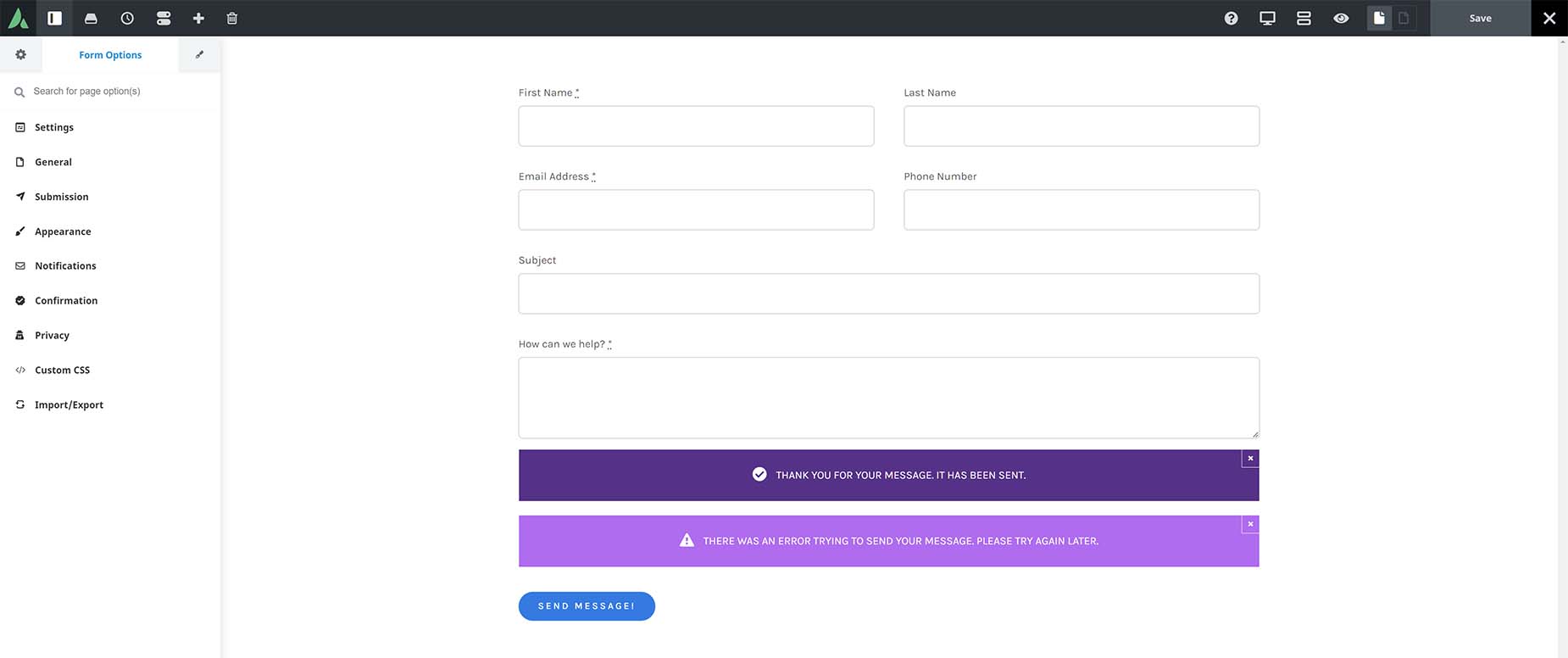
In the Avada Builder (the back-end editor), the Form Options are found at the bottom of the page, where the Page Options usually reside. In Avada Live, as you can see in the image below, they’re in the Sidebar, again, where the Page Options typically reside.
Settings
- Page Title
- Slug
General
- Enable Member Only Form – Yes – Select if you want to display this form to only logged in users with specific user roles.
- Select User Role(s) – (Administrator/Editor/Author/Contributor/Subscriber/etc) – Select user role(s) you want to display this form to. Leaving blank will display form to any logged in user.
- Views Counter – (Default/Page Load/Ajax/Disabled) – Set the method to update the form views, or disable them entirely. “Page Load” option will update using PHP when a page is retrieved. “Ajax” will send an additional request after the page loads. Leave empty for default value of Ajax.
- Form Views Counting – (Default/All/Logged Out/Non-Admins) – Select which types of users will increase the form views on visit. Leave empty for default value of All.
- Security Nonce Method – (None/Ajax/Localized) – Select the method which is used to add nonce field to the form. Note that Localized might cause problems if page’s HTML is cached.
- Enable Member Only Form – No – Select if you want to display this form to only logged in users with specific user roles.
- Views Counter – (Default/Page Load/Ajax/Disabled) – Set the method to update the form views, or disable them entirely. “Page Load” option will update using PHP when a page is retrieved. “Ajax” will send an additional request after the page loads. Leave empty for default value of Ajax.
- Form Views Counting – (Default/All/Logged Out/Non-Admins) – Select which types of users will increase the form views on visit. Leave empty for default value of All.
- Security Nonce Method – (None/Ajax/Localized) – Select the method which is used to add nonce field to the form. Note that Localized might cause problems if page’s HTML is cached.
Submission
The Submission options control what happens when someone submits the form. Depending on the Submission Type selected (AJAX or POST), various options will be available. Select “AJAX” to store form data using predefined methods and “POST” if you want to implement your own.
- Submission Type – AJAX – Select “AJAX” to store form data using predefined methods and “POST” if you want to implement your own. NOTE: Notification will be only sent when submission type is set to “AJAX”. To receive Email submission notifications, please visit the Notifications tab.
- Action – Save To Database – You can view and manage form submissions by going to Form Entries section and selecting the form from the dropdown list. In general, storing form data in a database table is a convenient way to manipulate the data and create stats, perform analysis, etc. The database table can be easily exported or connected to an automated script that can perform all sorts of data analysis for you.
- Action – Send To URL – Depending on the script running on that URL, submission data could be caught and processed, either by a custom script, or through a dedicated URL provided by a newsletter service supplier. Also, it allows you to show a custom success page, with Call To Actions, etc.
- Submission Method: Post – Appends form-data inside the body of the HTTP request. There are no size limitations, and the data is not part of the URL, thus it is more secure.
- Submission Method: Get – Appends form-data into the URL in name/value pairs. It has a limit of a few thousand characters, so it is not the right option if you send sensitive data. It is convenient, though, for creating bookmarks and for extracting the data (which the site owner has to do).
- Form Submission URL – Enter the URL where form data should be sent to.
- Custom Headers – If you are using this form to integrate with a third-party API, you can use custom headers to implement authentication or pass-on any extra headers the API requires.
- Custom Header Key – (Displays when “Add Header” is selected) Enter the key for the request’s custom header. Example: Content-Type
- Custom Header Value – (Displays when “Add Header” is selected) Enter the value for your custom header.
- Action – Mailchimp – Sign up for a Mailchimp account and manage your contacts in their free CRM. For more information check out this Avada + Mailchimp integration guide.
- Mailchimp Action – Select if you want to perform a Mailchimp action after form submission.
- Action -HubSpot – Sign up for a HubSpot account and manage your contacts in their free CRM. For more information check out this Avada + HubSpot integration guide.
- HubSpot Action – Select if you want to perform a HubSpot action after form submission.
- Action – Open Off-Canvas – You can also trigger an Off-Canvas to display upon the submission of an Avada Form.
- Off-Canvas Action – Select Off-Canvas to open after form submission.
- Action – Login – This action allows you to map fields from the form to the WordPress login fields.
- Action – Register – This action allows you to map fields from the form to the WordPress registration fields.
- Action – Lost Password – This action allows you to map fields from the form to the WordPress lost password field.
- Action – Reset Password – This action allows you to map fields from the form to the WordPress reset password field.
- Submission Type – POST – Select “AJAX” to store form data using predefined methods and “POST” if you want to implement your own. NOTE: Notification will be only sent when submission type is set to “AJAX”. To receive Email submission notifications, please visit the Notifications tab.
- Submission Method – Post – Appends form-data inside the body of the HTTP request. There are no size limitations, and the data is not part of the URL, thus it is more secure.
- Form Submission URL – Enter the URL where form data should be sent to.
- Submission Method – Get – Appends form-data into the URL in name/value pairs. It has a limit of a few thousand characters, so it is not the right option if you send sensitive data. It is convenient, though, for creating bookmarks and for extracting the data (which the site owner has to do).
- Form Submission URL – Enter the URL where form data should be sent to.
Appearance
- Preview Width – (0-100) – Select the width to preview the form at in the live editor. NOTE: This is only used for previewing purposes.
- Preview Background Color – Choose a background color for the form preview in live editor. NOTE: This is only used for previewing purposes.
- Label Position – (Above/Below) – Make a selection for form input fields labels position.
- Label Typography – Controls the font family, line height, letter spacing & Text Transform option for the Form Labels. Leave empty for default values set in the Global Options.
- Label Font Size – Controls the font size of the form labels text. Use any valid CSS value. Leave empty for default value set in the Global Options.
- Required Field Symbol Decoration – (Yes/No) – Choose if you want to display the required field symbol text decoration or not.
- Tooltip Text Color – Controls the text color of the field tooltip.
- Tooltip Background Color – Controls the background color of the field tooltip.
- Field Margin – (Top/Bottom) – Controls the vertical height between form fields. In pixels (px), ex: 10px.
- Field Height – Controls the height of the form fields. Use any valid CSS value. Leave empty for default value set in the Global Options.
- Field Font Size – Controls the font size of the form fields text. Use any valid CSS value. Leave empty for default value set in the Global Options.
- Field Background Color – Controls the background color of the form input field. Leave empty for default value set in the Global Options.
- Field Text Color – Controls the text color of the form input field. Leave empty for default value set in the Global Options.
- Field Label Color – Controls the label color of the form input field. Leave empty for default value set in the Global Options.
- Field Placeholder Color – Controls the label placeholder of the form input field. Leave empty to use a faded version of the form text color.
- Field Placeholder Focus Animation – Choose to animate the field placeholders to the top or bottom of the form fields. The animation only works, if no form labels are used. If set to “none” placeholders will disappear on field focus. Options are None, To Top, & To Bottom.
- Field Border Size – (Top/Right/Bottom/Left) – Controls the border size of the form fields. Leave empty for default value set in the Global Options.
- Field Border Color – Controls the border color of the form input field. Leave empty for default value set in the Global Options.
- Form Border Color on Focus – Controls the border color of the form input field on focus. Leave empty for default value set in the Global Options.
- Field Border Radius – (0-50) – Controls the border radius of input field. In pixels. Leave empty for default value set in the Global Options.
Notifications
In email options, field names within square brackets can be used as placeholders, which will be replaced when the form is submitted, ie, [email_address]. For more information check out our Avada Forms Email Notification Placeholders help file.
- Notifications – Add form notifications.
- Label – Enter notification label.
- Email – Enter the email address to which the form data should be sent to. If left empty, an email will be sent to the WordPress Admin.
- CC Email – Enter additional CC Emails. Add one address per line.
- BCC Email – Enter additional BCC Emails. Add one address per line.
- Email Subject – Enter email subject. If left empty, the form title will be used.
- Encode Email Subject – (Yes/No) – Select if you want to encode email subjects. This helps to display special characters correctly in the subject field. A few hosting environments and email clients might have issues with this setting.
- Email From Name – Enter email from name. If left empty, WordPress will be used.
- Sender Email – Enter sender email address. If left empty, wordpress@sitename.com will be used.
- Reply to Email – Enter reply to email address.
- Attach Uploaded Files – (Yes/No) – Add uploaded files as email attachments.
- Custom Attachment – Select a custom attachment to be sent along in the notification email.
- Wordwrap For Labels – (Yes/No) – Set to “Yes” to enable wordwrap for labels in the notification email.
- Email Message – Enter an email message, or leave empty to get the default message with all form fields. You can add form fields to the message by inserting a field name wrapped with square brackets, i.e., [email_address]. You can add all fields with the [all_fields] tag.
- Conditional Logic – Add conditional logic for the notification. The notification will only be sent if the set conditions are met.
With the Notification options, you can add as many notifications as you like for your form submission. These could be in the form of an auto reply to the sender, or a direct email submission, to name a few. You can also have multiple notifications for the same form. See the How To Set Up Form Notifications help file for a full rundown on Notifications.
Confirmation
With these options you can control the overall appearance of your Form, including colors, margins and borders.
- Form Confirmation Type – Select what should happen after the form is submitted successfully.
- Display Mesage
- Notice: – Use the Avada Notice Element in the Avada Form Builder to display confirmation notices for your form upon submission.
- Redirect to URL
- Redirect URL – Enter the URL which the user should be redirected to after a successful submission.
- Redirect After – (0-5000) – Set a timeout before the redirect takes place. In milliseconds.
Step Progress
Insert the special Avada Form Step Element to split up your form into steps. For each step, add a submit button to progress to the next step. For more information, check out our multi-step form post.
- Form Steps Navigation – Select main steps navigation style.
- Timeline
- Step Type – (Above/Below) – Make a selection for form input fields labels position.
- Steps Wrapper Margin – (Top/Right/Bottom/Left) – Enter values including any valid CSS unit, ex: 10px or 10%.
- Steps Background Color – Controls the background color of the step.
- Steps Padding – (Top/Right/Bottom/Left) – Enter values including any valid CSS unit, ex: 10px or 10%.
- Steps Border Radius – (Top-Left/Top-Right/Bottom-Right/Bottom-Left) – Enter values including any valid CSS unit, ex: 10px or 10%.
- Steps Border Width – (0-15) – Controls the border width of the step.
- Step Justification – Controls the spacing justification around the steps.
- Space Around
- Between Steps Space Size – (0.1-10) – Controls the internal spacing between the steps in relation with the external space.
- Between Steps Separator Width – (0-15) – Select the width of the separator.
- Step Separator – Select the separator style between the steps.
- None
- Solid
- Between Steps Separator Color – Select the color of the separator.
- Step Separator Margin – (Left/Right) – Enter values including any valid CSS unit, ex: 10px or 10%.
- Dashed
- Between Steps Separator Color – Select the color of the separator.
- Step Separator Margin – (Left/Right) – Enter values including any valid CSS unit, ex: 10px or 10%.
- Dotted
- Between Steps Separator Color – Select the color of the separator.
- Step Separator Margin – (Left/Right) – Enter values including any valid CSS unit, ex: 10px or 10%.
- Double
- Between Steps Separator Color – Select the color of the separator.
- Step Separator Margin – (Left/Right) – Enter values including any valid CSS unit, ex: 10px or 10%.
- Steps Icons/Numbers – Whether to show number or icons in the steps.
- None
- Icons
- Icon/Number Color – Controls the color of the icons or the numbers.
- Icon Size – (1-40) – Controls the size of the icon. In pixels.
- Icon/Number Background – Turn on to display a background behind the icon.
- No
- Yes
- Icon/Number Background Color – Controls the background color of the icons or the numbers.
- Icon/Number Padding – (1-40) – Controls the size of the icon padding. In pixels.
- Icon/Number Border Radius – (Top-Left/Top-Right/Bottom-Right/Bottom-Left) – Enter values including any valid CSS unit, ex: 10px or 10%.
- Icon Border Width – (0-15) – Enter values including any valid CSS unit, ex: 10px.
- Numbers
- Icon/Number Color – Controls the color of the icons or the numbers.
- Icon Size – (1-40) – Controls the size of the icon. In pixels.
- Icon/Number Background – Turn on to display a background behind the icon.
- No
- Yes
- Icon/Number Background Color – Controls the background color of the icons or the numbers.
- Icon/Number Padding – (1-40) – Controls the size of the icon padding. In pixels.
- Icon/Number Border Radius – (Top-Left/Top-Right/Bottom-Right/Bottom-Left) – Enter values including any valid CSS unit, ex: 10px or 10%.
- Icon Border Width – (0-15) – Enter values including any valid CSS unit, ex: 10px.
- Steps Title – Whether to display title or not. If set to no, step title will still be heard by users using screen readers (for accessibility).
- No
- Yes
- Steps Title Position – (After/Before/Above/Below) – Select the step title position in relation with the icon/number.
- Gap Between Icon and Title – Enter values including any valid CSS unit, ex: 10px or 10%.
- Step Title Typography – (Font Family/Font Size/Line Height/Letter Spacing/Text Transform) – Controls the typography of the title. Leave empty for the global font family.
- Steps Title Color – Controls the color of the step title font.
Privacy & Expiration
- Store IP And User Agent – Select if you want to store the IP and User Agent on submissions. Depending on the legislation that applies to your site, you may need to disable this option.
- No
- Yes
- Submission Expiration Time(Months) – Set the number of months after which form submissions will expire. Choose the expiration action below.
- Submission Expiration Action – Choose what should happen after form submissions expire (as set above). If you have selected to log the user’s IP & UA above, selecting “Anonymize” will delete these from the log. If you want old entries to be deleted automatically after they expire, then select “Delete”.
- No Action
- Anonymize IP And User-Agent
- Delete Submission
Custom CSS
- CSS Code – Enter your CSS code in the field below. Do not include any tags or HTML in the field. Custom CSS entered here will override the theme CSS. In some cases, the “!important” tag may be needed. Don’t URL-encode image or SVG paths. Contents of this field will be auto encoded.
Import / Export
- Import Page Options – Import Page Options. You can import via file or copy and paste from JSON data.
- Code – Import
- File – Import – Click the import button to select a previously exported JSON file to upload and import.
- Databse – Import
- Export Page Options – Export your Page Options. You can either export as a file or copy the data.
- Code – Copy to Clipboard
- File – Export – Click the export button to export your current set of options as a json file.
- Databse – Save Page Options


