Share
Anyone can create a WordPress website in less than five minutes. However, whether redesigning an existing website or starting from scratch, making design decisions that best suit your plans can be challenging for beginners. Creating a functional, consistent, and visually appealing design leads to more engaged viewers, who are likelier to take action and return to a website.
With the above in mind, this article will cover the significance of an engaging web aesthetic and how to support an aesthetic by choosing quality photos and fonts to bring it all together.
Overview
How to Choose a Memorable Aesthetic
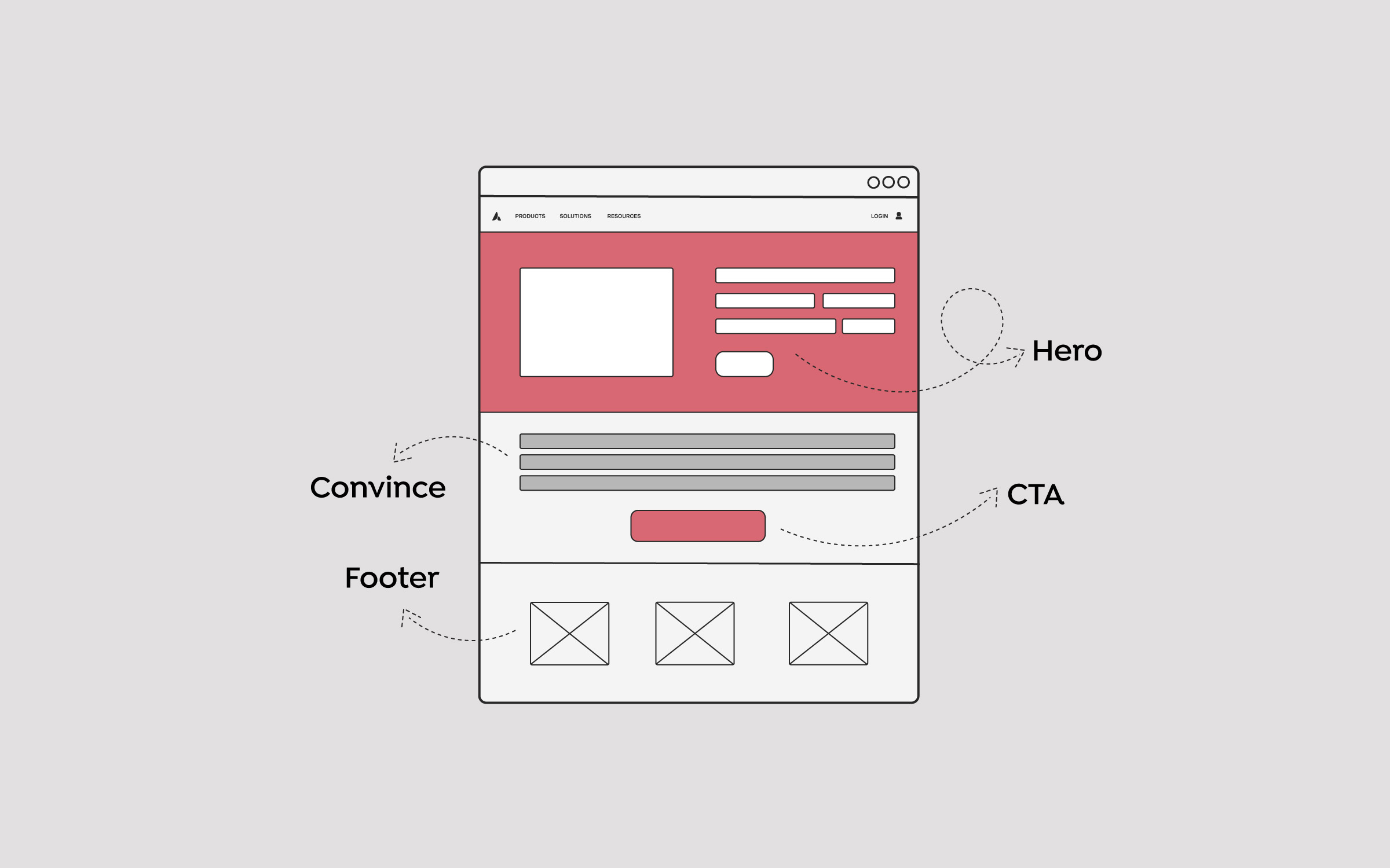
When you first set up WordPress, you naturally begin filling in the blanks right away. However, if you start adding photos and selecting font combinations without having chosen an aesthetic, you’re going to pick things you like, but not necessarily things that go well together. There’s an obvious difference between a well-designed WordPress website and one that isn’t. For example, this:

Or this?

Deciding on an aesthetic beforehand will enable you to make cohesive content choices, creating a more functional and appealing website that will engage viewers. Even if you’ve already created a website with WordPress, that’s okay – you can use these tips to evaluate and tweak what you already have in place.
Why Web Aesthetics Matter
“Attractive things work better,” Right? This claim was tested in Japan in 1995 when researchers Kurosu and Kashimura conducted a study to see which would be easier to use: an “attractively” designed ATM or an “unattractively” designed one. Guess which won?
Skeptical of their results, Researcher Tranctinsky conducted the exact same experiment in Israel only to come to the same conclusion. Expanding further on their research, Donald Norman went beyond determining that attractive things work better by answering the most important question: Why?
Norman concluded that human emotions affect the decision-making process. Viewing something appealing or well-designed triggers a positive response that “broadens our thought processes and facilitates creative learning.”

Still not entirely convinced, five researchers collaborated on a study in 2003 to determine the connection between perceptions of aesthetics and product functionality. They concluded that a user perceives something as more functional if it is attractive. In coming to this conclusion, they call their own readers to action:
“As users take aesthetically pleasing interfaces as an indication of usable systems, designers must take the two seemingly unrelated phenomena as being equally influential in design to ensure success”.
Practical Ways to Choose a Web Aesthetic
When you hear (or read) the word “aesthetic,” you may already have something in mind—perhaps a favorite website, logo, or poster that stands out to you.
Or you might be drawing a blank. Either way, it’s clear now that implementing a visually appealing aesthetic is vital to the success of your site. Here are some practical suggestions to help you find an aesthetic:
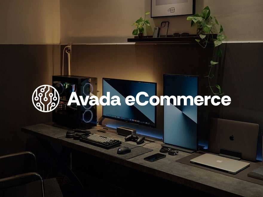
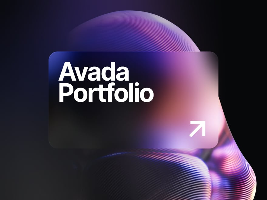
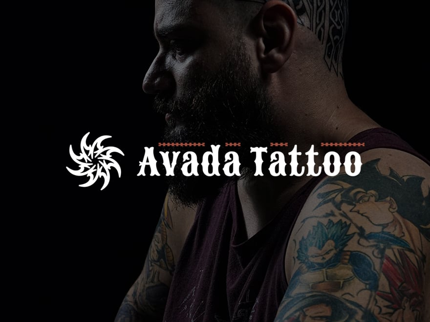
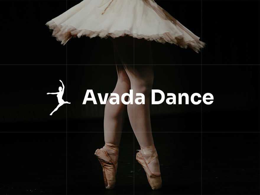
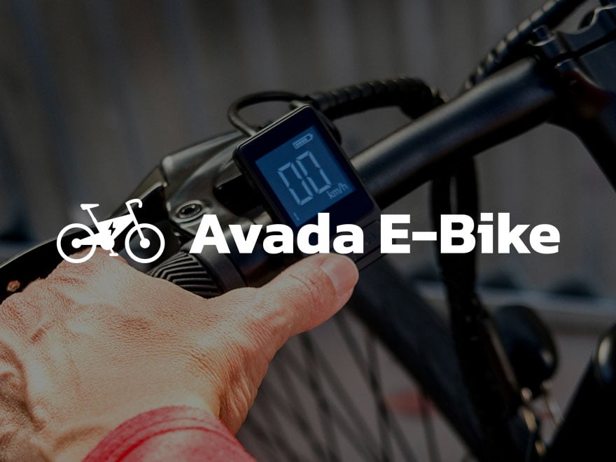
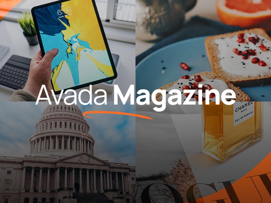
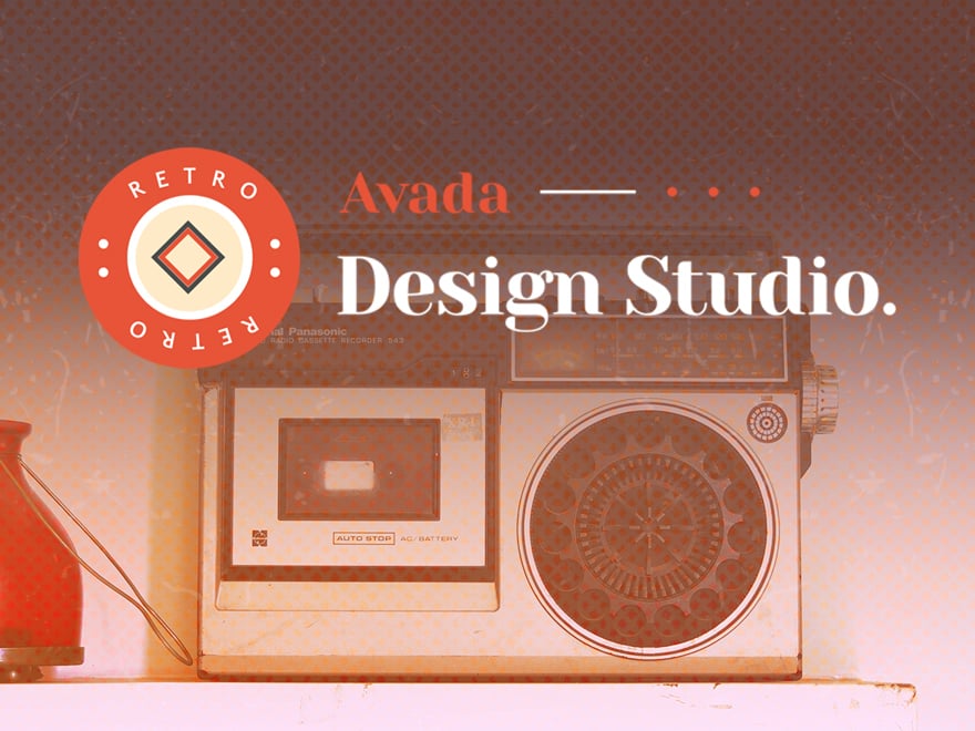
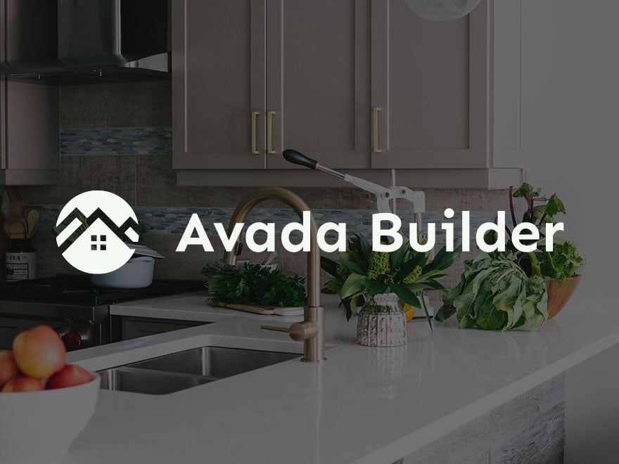
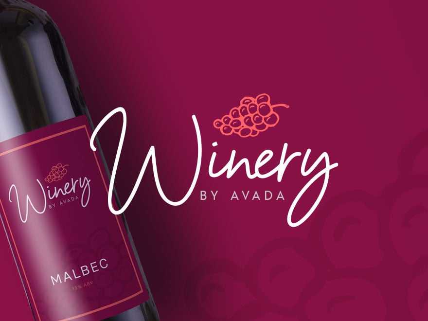
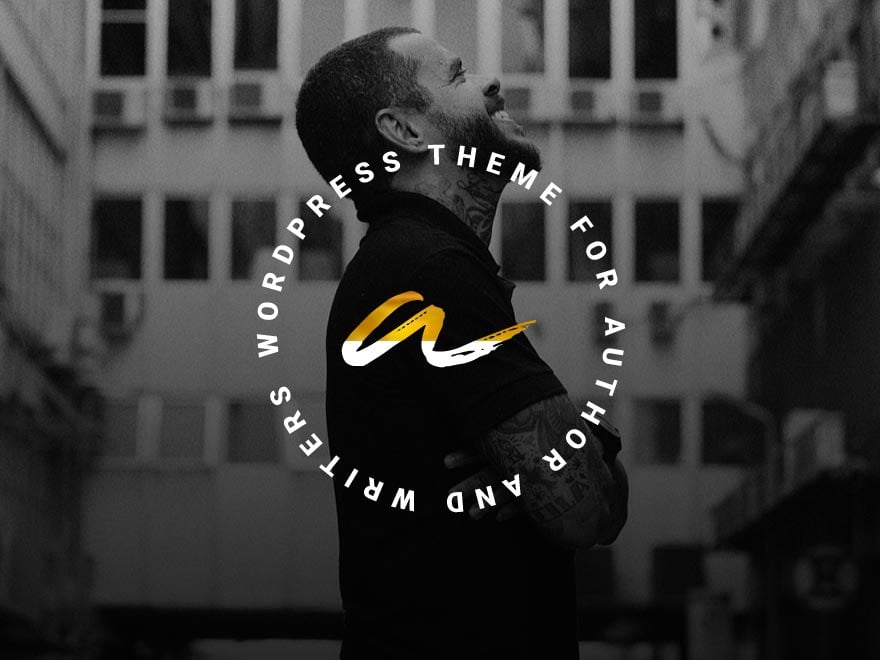
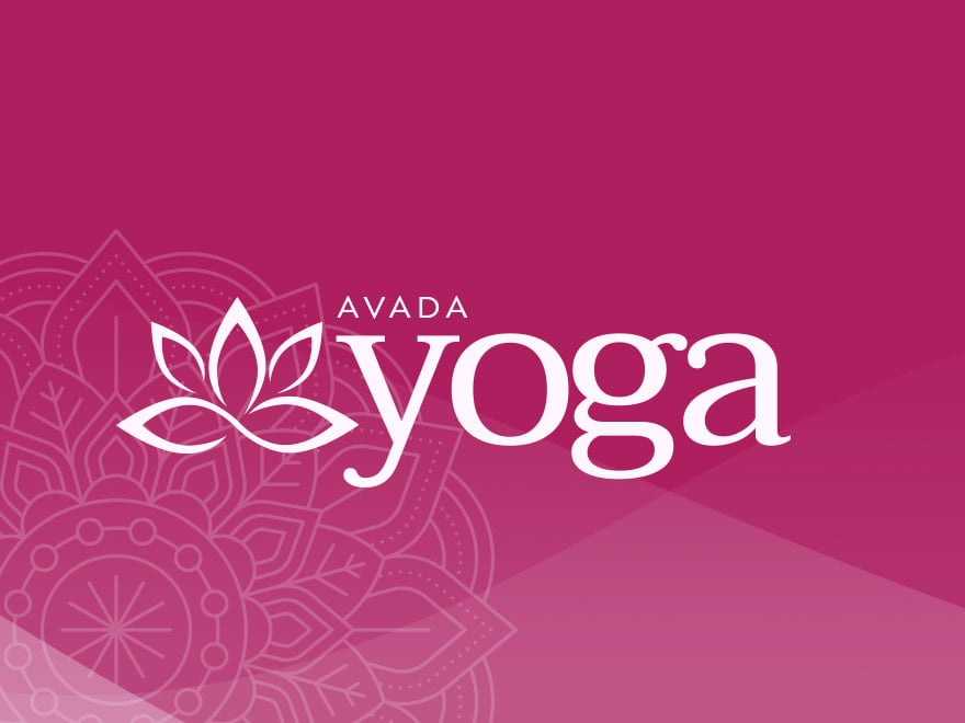
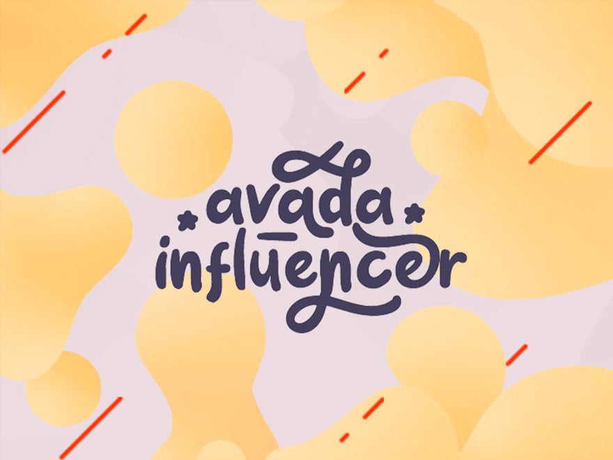
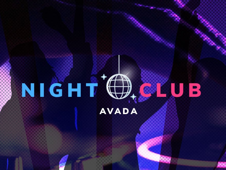
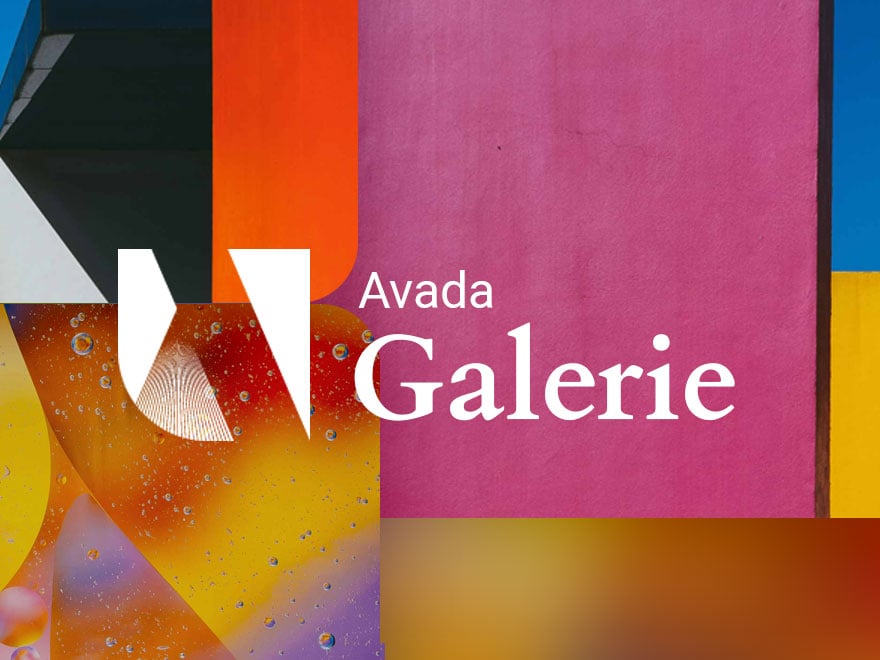
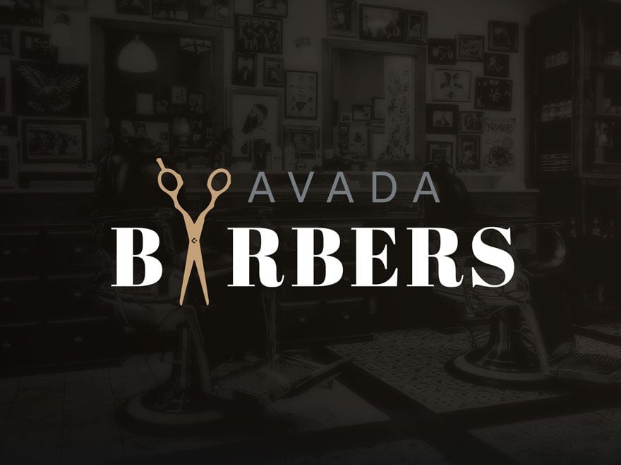
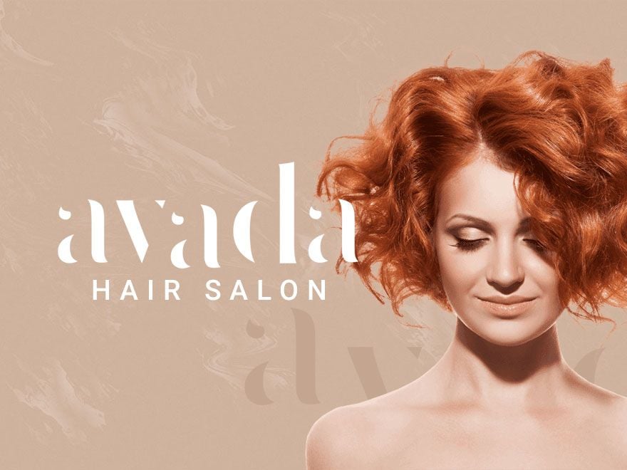
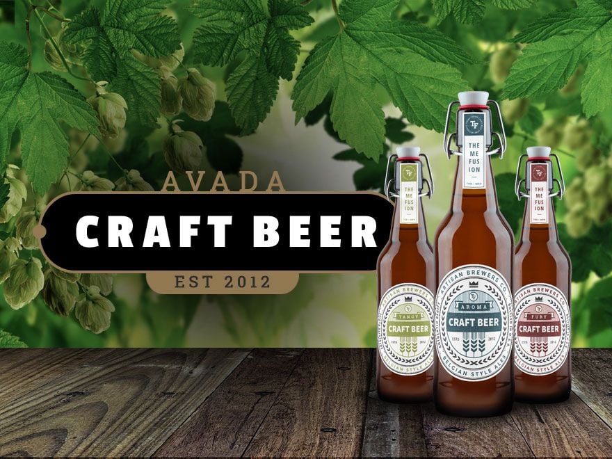
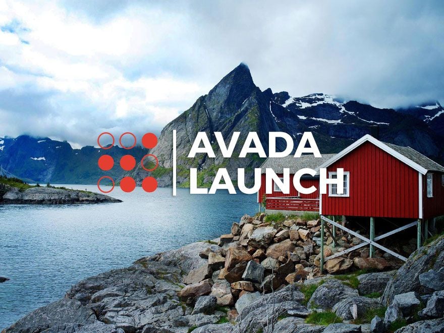
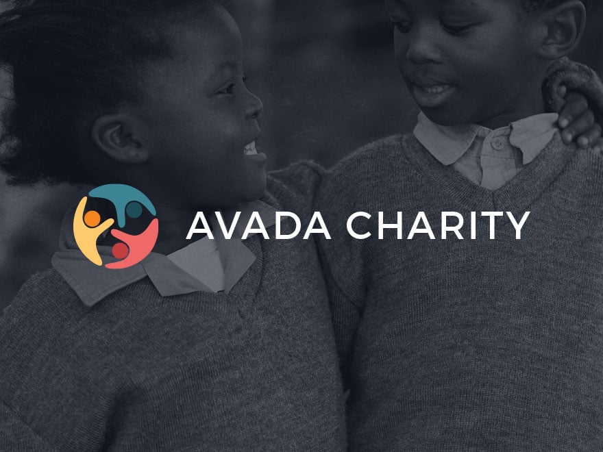
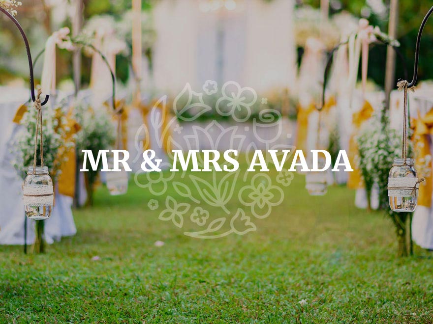
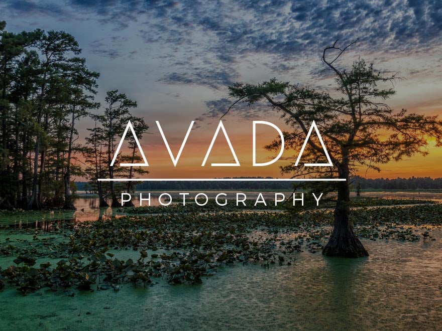
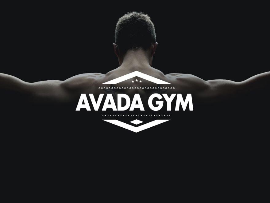
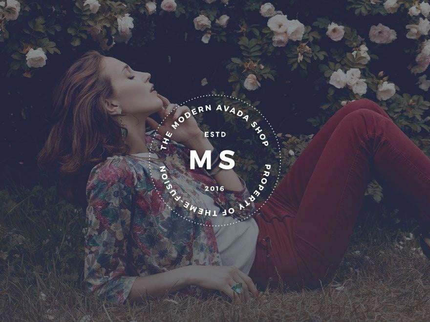
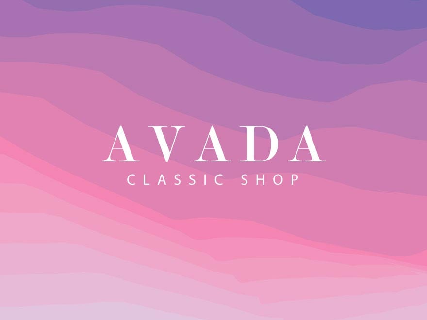
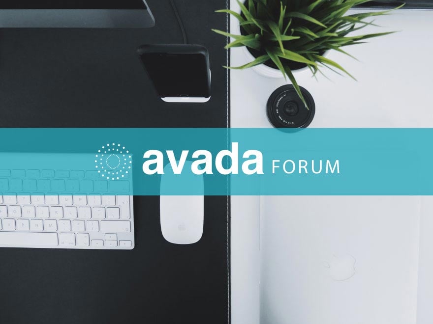
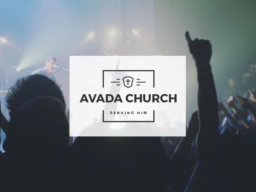
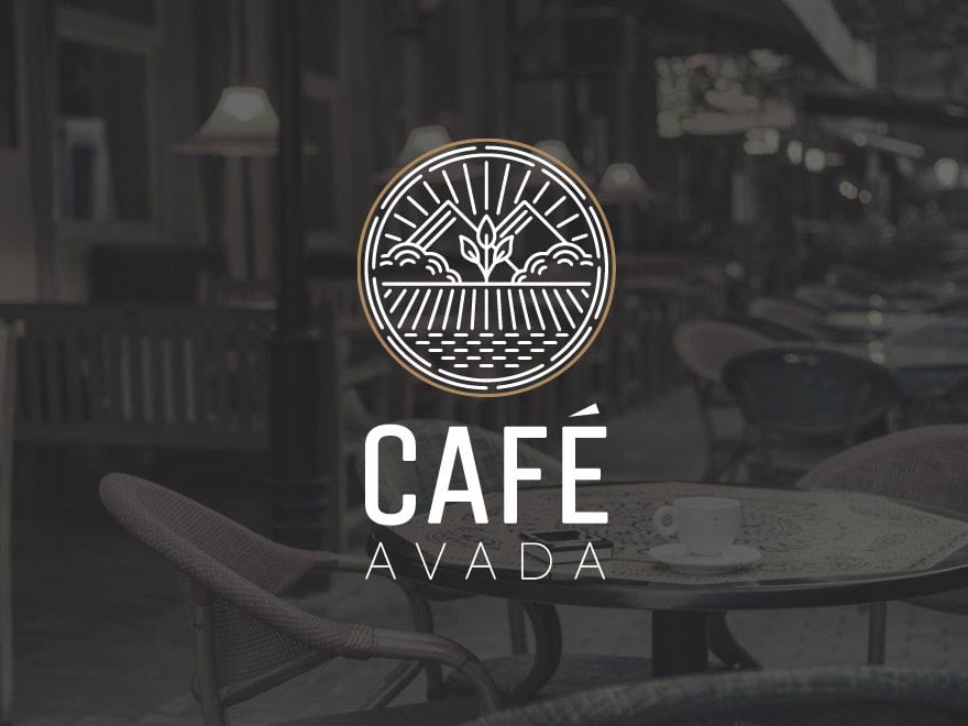
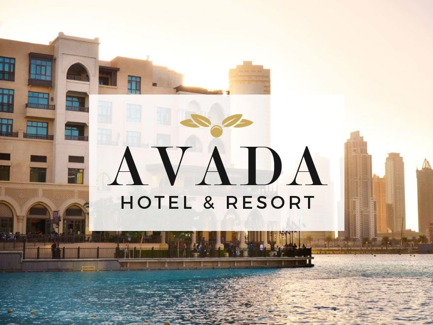
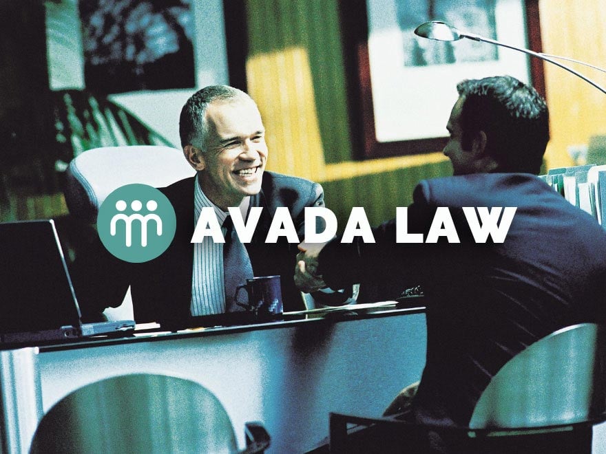
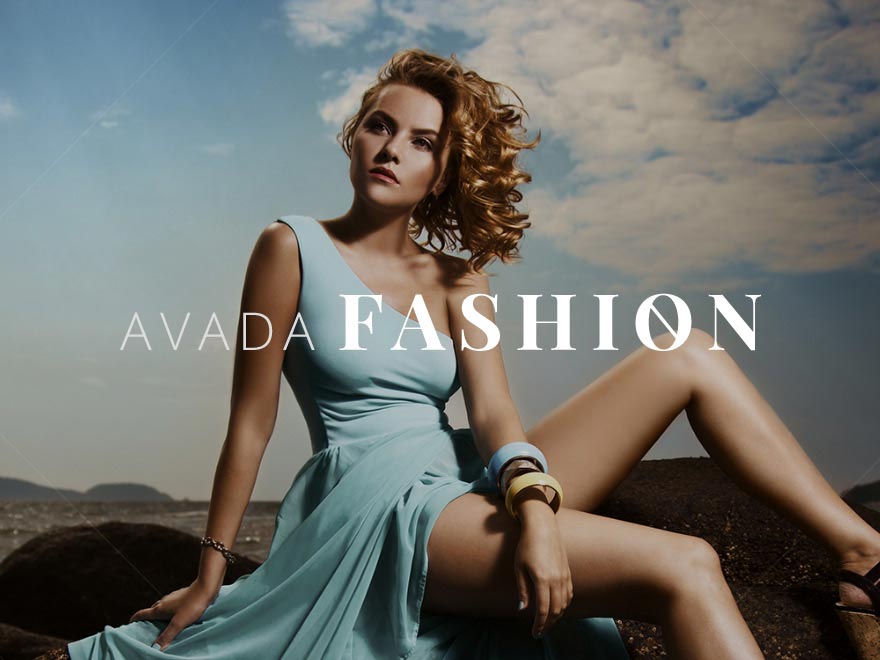
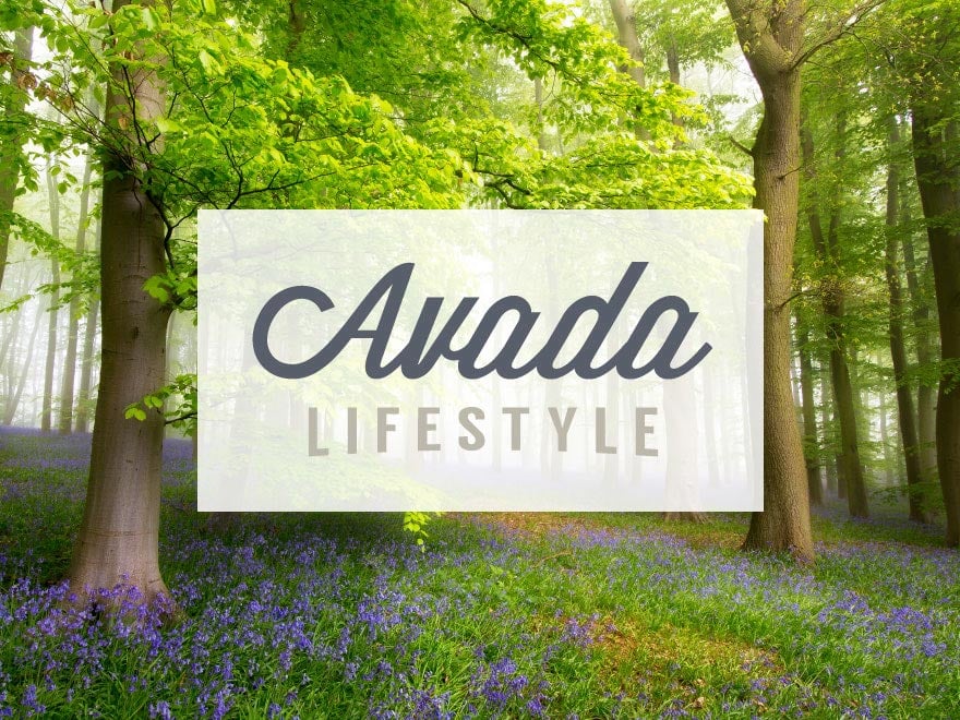
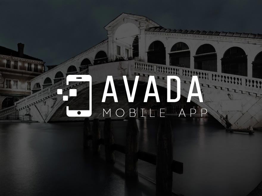
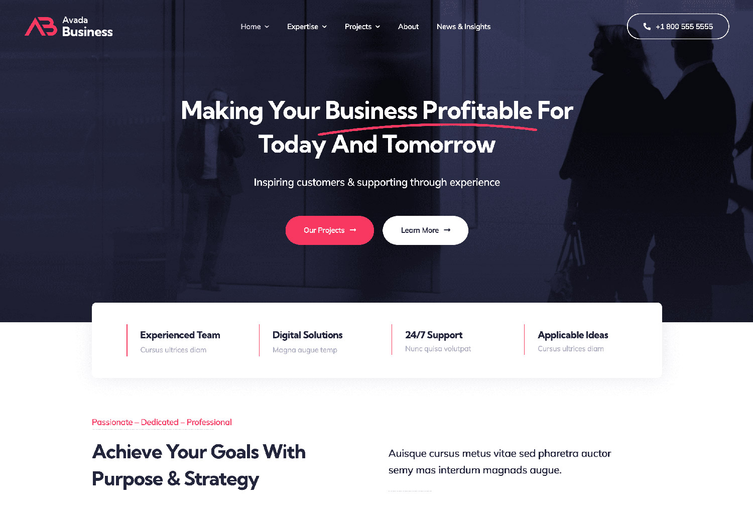
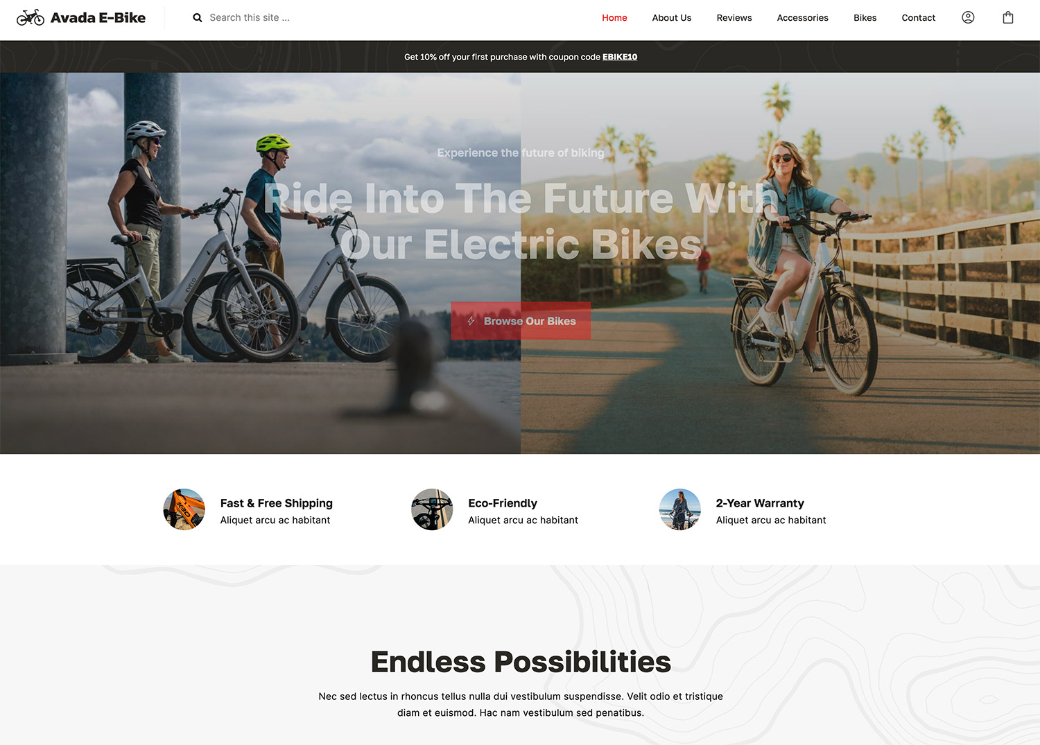
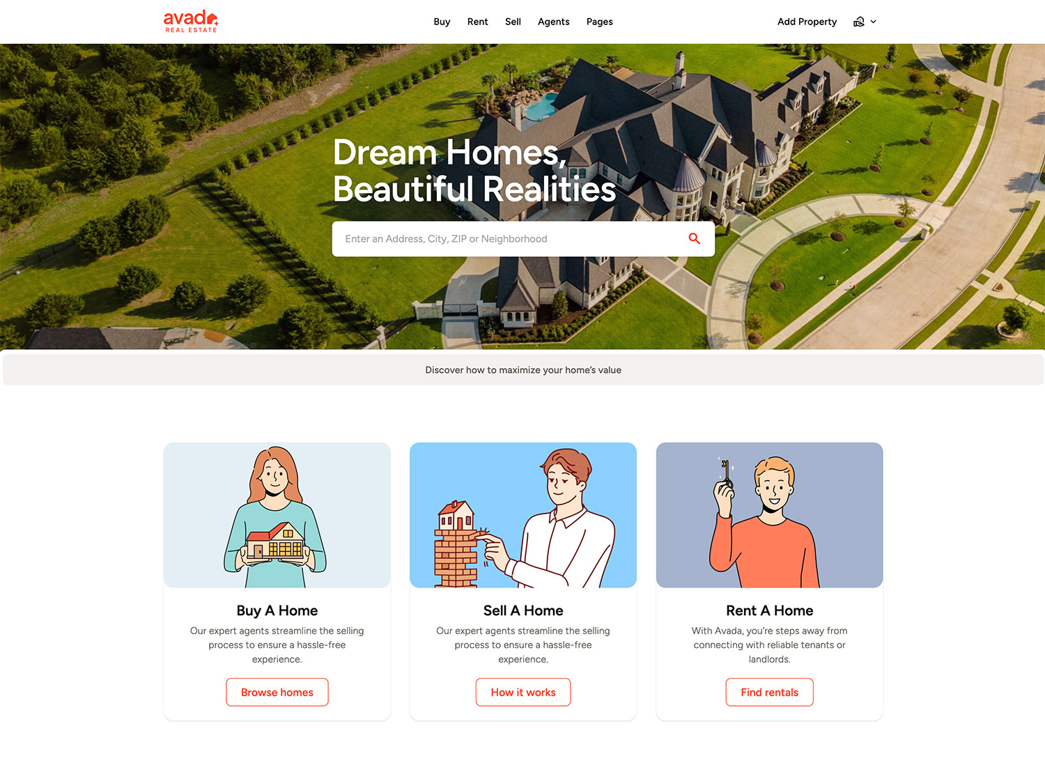
For example, if I were launching an e-commerce, blog, marketing, or business website, I would spend some time reviewing these Avada websites and ask myself the questions listed above.
Now that you have a clear idea of what you like in other sites choose a few keywords to base your aesthetic around (“minimal, whitespace, black and white,” “vibrant, loud, clear,” etc.).
Choosing Fonts, Images, and Designing Layouts
Now you know that choosing an aesthetic is vital to a visually appealing website. How do you apply it to your site, though? Your aesthetic moves from an idea to the page when you choose the fonts, images, and website layout to express it.
In a 2008 study, The Aesthetics of Reading, Kevin Larson (Microsoft) & Rosalind Picard (MIT) demonstrate how to measure aesthetic differences by examining the cognitive effects produced by elevated mood.
“We examine the benefits of good typography and find that good typography induces a good mood. When participants were asked to read text with either good or poor typography in two studies, the participants who received the good typography performed better on relative subjective duration and on certain cognitive tasks.”.
How Fonts Elicit Emotion
Just like design affects the perception of usability, fonts elicit subconscious responses from viewers. When you choose a font, you choose how a reader will engage with the text. For example, take a look at the font used for the “Toys R Us” logo.
Now take a look at US Bank’s logo.
What kind of response do these two logos elicit from you? Is your response to US Bank the same as “Toys R Us”? Of course not. Your responses to each of these logos are very different—and with good reason.
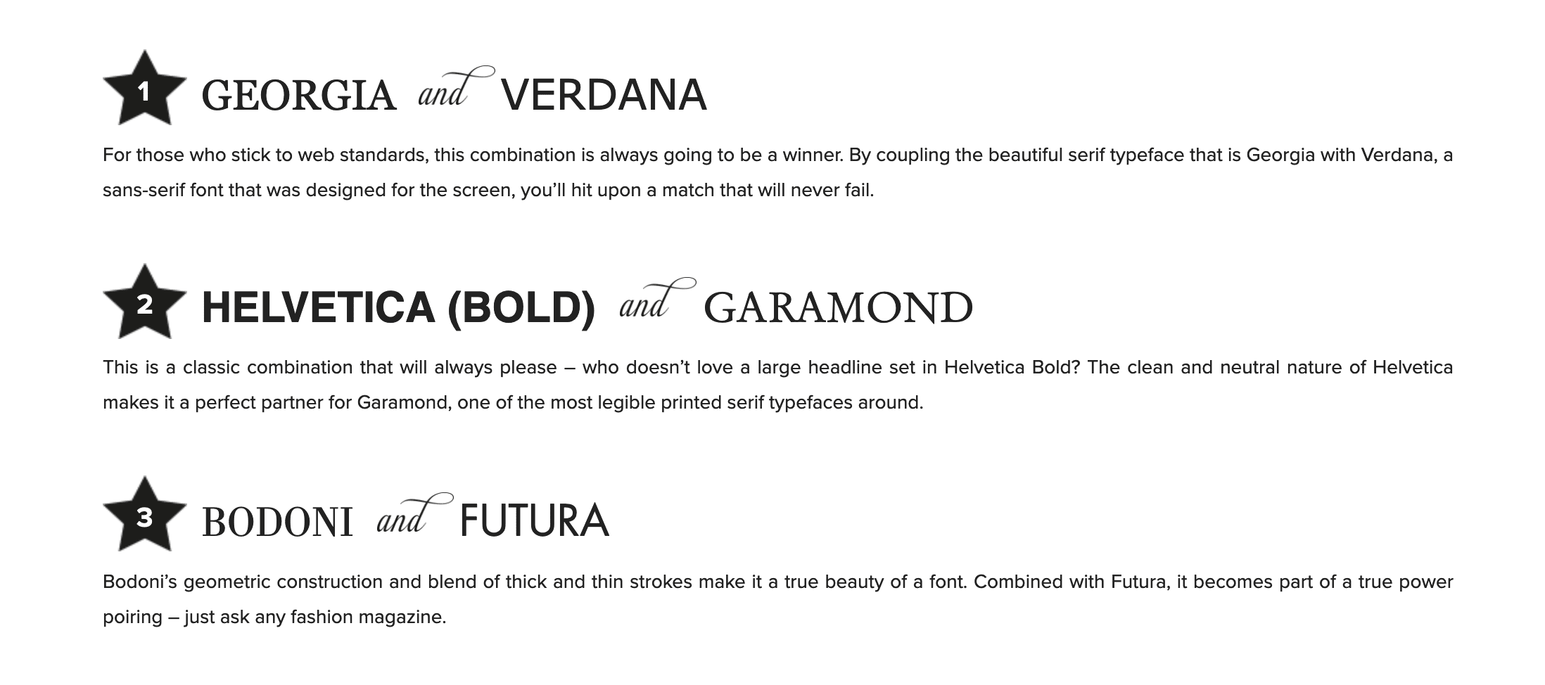
Font choices vary from site to site and will depend significantly on the company you create the site for. If you design a website for a children’s clothing boutique, your font choices will likely be a little more playful. On the other hand, if you run a financial services company, your font choices need to be professional and evoke trust. Head over to Stepto and Son for their top ten great web font combinations. Here’s a little sampler:
Also, check out this article from Tuts+ for advice on what fonts to use for optimal readability and legibility, and head to this Piktochart post to read more about combining fonts!
Choosing Images by Quality and Color
Images are just as important to implementing an aesthetic as font choice: they both elicit a subconscious response from viewers, affecting how they interact with your site. When it comes to images, quality, and color are all important.
Several studies have been conducted on the effect of colors and color saturation on viewers. In a 2014 study that evaluated the colors present in “most pinned” and “least pinned” photos on Pinterest, researchers noted that “(colors) have remarkable power to move us emotionally.” Some practical advice on choosing quality photos for your site:
The Layout Brings It All Together
When a website is cluttered with too many photos, ads, and text boxes, it can be more challenging to engage with the content. Conversely, content is easier to read when a website has fewer well-organized photos, ads, and text boxes.
Just take a look at the subtle differences in these two layouts. It’s evident that it is easier to read and more visually pleasing to engage with.

One rule of clean, readable layout: Space it out. Allow for some white space between your headline, images, and body text.

Designing a website with Avada Layouts can significantly enhance its aesthetic appeal and accessibility, directly addressing the points raised in this article. Avada’s pre-designed content and websites provide a strong foundation for creating visually appealing and well-organized sites. These layouts are crafted with a focus on balance and spacing, making it easier to achieve an uncluttered look that prioritizes content readability.
Website designers have the flexibility to customize layouts extensively. This means you can easily adjust the number and arrangement of photos, ads, and text boxes on your website, ensuring that each element serves a purpose and contributes to a coherent and engaging user experience addressing the challenges of clutter and disorganization.
Conclusion
Memorable design is an absolute necessity for a successful website today. By creating a visually appealing site, you ensure that your viewers will be more engaged with your content, making them more likely to return to your site and purchase your products or services.
The quickest way to get started is to choose cohesive fonts, photos, and a layout that works well together, which Avada has built in from the beginning with sleek and modern design schemes.