Share
Revamping your website is like giving your digital home a fresh coat of paint—an exciting opportunity to breathe new life into your online presence! It is an opportunity to showcase the very best of what you offer, wrapped in a user-friendly package that will appeal to a collection of new customers. A redesign isn’t just about keeping up with the latest trends; it’s about making your site more accessible, engaging, and mobile-friendly.
In this article, we will touch on the basics to look out for and provide a prospect to kick-start your next project with Avada and WordPress.
Overview
The Tell-Tale Signs
Technology trends change over time, and so do consumer expectations. To be competitive in a challenging digital arena, paying attention to the finer details will help you stand out.

Identifying the right time for a website makeover involves recognizing specific indicators that suggest your site might have fallen behind. These signs range from technical issues to aesthetic obsolescence and consistency. We will take a bird’s eye view of seven critical factors to evaluate when accessing your website and future plans.
Sign 1: Outdated Design
Web design trends evolve rapidly, and a design that was cutting-edge a few years ago might now look dated. An outdated design will make your site appear neglected, reflect poorly on your brand, and, more certainly, discourage people from using your services or purchasing products from your online store.
The Evolution of Web Design Trends
Web design has evolved immensely over the last thirty years, with many styles long forgotten in history archives. Staying abreast of current trends is crucial if you want to make a difference. Minimalism, responsive design, and block-based design elements are just a few examples of trends that have dominated in recent years.
How to Recognize an Outdated Website Design
In general terms, an outdated design is when a website fails to meet current standards of aesthetics, functionality, and user experience established by the latest trends, technologies, and user expectations on the internet. This can manifest in several ways:
Sign 2: Poor Mobile Responsiveness
Google takes a mobile-first approach to crawling, indexing, and ranking web pages. With significant internet traffic now coming from mobile devices, a site that isn’t optimized for mobile is at a considerable disadvantage. Besides desktops, tablets and smartphones are considered mobile devices. Thus, the amount of screen real estate available to showcase information is considerably less than that of a desktop PC.
Percentage of internet traffic from mobile devices
There are plenty of WordPress plugins and browser-based tools that can be used (nothing beats real physical devices) to test a website for responsiveness. A tool we can recommend is Responsinator.
How to Resolve Website Responsive Issues
It cannot be understated how vital it is that websites present content efficiently with a logical flow on mobile devices. Building sites with Avada makes this part of the design process straightforward, even for beginners in web design.
Avada is a great solution for addressing website mobile responsiveness issues primarily due to its inherent design philosophy and built-in features that prioritize adaptability across various devices. Its fully responsive framework ensures that any website built with Avada automatically adjusts to the screen size of the device it’s being viewed on, offering a seamless user experience from desktops to smartphones.
Users can create Custom Layouts with mobile responsiveness in mind, including options to adjust visibility, sizing, and spacing for different devices. Furthermore, Avada offers a vast selection of prebuilt, mobile-optimized templates and content.
Sign 3: Slow Loading Times
One of the most glaring signs that your WordPress site needs a revamp is sluggish loading times. Speed is critical in user experience and search engine optimization (SEO). A delay of just a few seconds can increase bounce rates and lost opportunities.
Tools for Measuring Website Speed
Online tools like Google’s PageSpeed Insights and GTmetrix can help you assess your site’s speed. These resources offer insights into what might be slowing down your site and suggestions for improvement.
Tools for Optimization
The Avada Performance Wizard is a built-in feature designed to enhance website speed and efficiency. It is a guided step-by-step process that analyses your website and simplifies configuring various performance-related settings to optimize website loading times and overall performance. Upon activation, the Performance Wizard presents users with a sequence of recommended settings, including options for file compression, lazy loading images, JavaScript and CSS optimization, and more.

Discover how to use the Performance Wizard by checking this help file and explainer video. These recommendations are based on best practices for web performance and can be customized by the user to achieve the desired balance between website functionality and speed.
Sign 4: High Bounce Rates
Bounce rate is a metric that calculates the percentage of sessions on your website that trigger a conversion event or include a second pageview. A high bounce rate indicates that your site is not engaging or relevant to your audience’s needs.
According to Google Analytics [SIC]:
A bounce is a single-page session on your site. In Analytics, a bounce is calculated specifically as a session that triggers only a single request to the Analytics server, such as when a user opens a single page on your site and then exits without triggering any other requests to the Analytics server during that session.
Bounce rate is single-page sessions divided by all sessions, or the percentage of all sessions on your site in which users viewed only a single page and triggered only a single request to the Analytics server.
These single-page sessions have a session duration of 0 seconds since there are no subsequent hits after the first one that would let Analytics calculate the length of the session.
How Can You Lower Bounce Rates?
Start with analysis! In addition to the performance-related tools mentioned above, analyzing bounce rates alongside metrics such as average session duration can provide insights into user engagement and content effectiveness, and using Google Analytics is ideal for this.
Various factors may need to be addressed, such as improving site speed, enhancing navigation, and offering valuable content to reduce bounce rates and keep visitors engaged. There is a wealth of online data that provides clear information based on sector and industry to consider. We can also suggest analysis tools like aHrefs or Semrush that integrate with Google Analytics to further enhance your remedial strategies.
Sign 5: Low Search Engine Rankings
If your WordPress site does not rank well in search engine results, it could be due to incorrect search engine optimization (SEO) practices and content quality. There is a distinct relationship between healthy SEO and content quality, as well as content hierarchy, which, in turn, leads visitors to discover what they are looking for without having to jump through hoops to find it.

If your website’s general layout and performance conflict with the expected benchmarks or do not follow a logical and coherent flow, it may be time for a complete design overhaul. Website performance, conversions, and sales are all related and linked inextricably. Simply put, performance affects visitor satisfaction.
How Does SEO Relate to Web Design?
Search engines like Google, for example, expect high-quality content from websites, which will affect their ranking within the search engine results pages (SERPS). Google’s guidelines have become more sophisticated with a dedicated approach to people-first and mobile-first objectives.
SEO is more than keywords; it should be the foundation of your website’s UX experience. Likewise, you will want your web design to be an engaging experience for visitors, and a big part of this equation is creating high-quality content in the form of relevant visuals, informative copy, and influential brand messaging, all of which are good SEO practices.
E-E-A-T (Experience, Expertise, Authoritativeness, and Trustworthiness) refers to Google’s parameters for evaluating quality content. These guidelines are essential to observe when creating long-form content. However, E-E-A-T also applies to website content that builds on your brand’s expertise.
Sign 6: The Lack of Content Hierarchy
The lack of content hierarchy in a website or design refers to a situation where information is presented without clear organization or prioritization, making it difficult for users to discern the importance of different elements. This absence of structure can lead to challenges and negative consequences for the user experience and conversion rates.
Addressing the lack of content hierarchy involves employing design and content organization principles to create a logical flow of information. This includes effectively using headings and subheadings correctly, implementing a consistent layout, and utilizing visual elements like color, typography, and spacing to differentiate and emphasize essential parts of the content.
According to a 2020 survey conducted by HubSpot, one common aspect that stands out is that design is a communication tool, and its power should not be underestimated.
Sign 7: Disorganized Navigation
Website navigation is one of the first things you encounter when accessing a website and is, hence, crucial for customer engagement. Think of the navigation as a map of your website’s most important content.
Problematic website navigation can significantly impair user experience, potentially necessitating a redesign, but it doesn’t always mandate a complete overhaul of the entire website. Ultimately, whether difficult navigation means a website needs a redesign depends on the nature and severity of the issues and how they fit within the broader context of the site’s design and user experience goals.
Consider a Mega Menu For Improved UX
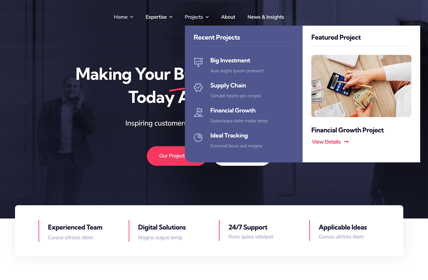
Mega Menus allow for the organization of links, media, and CTA’s (Call to Action) in a visually structured manner. By displaying all available choices at once, they help users understand the site’s structure at a glance, making it easier to find what they’re looking for without navigating multiple pages.
When building a Mega Menu layout using the Avada Mega Menu Builder, you can easily group items and sub-items logically, providing a clear visual hierarchy. Different font sizes, colors, and icons can be used to indicate levels of importance or content categories, helping users to prioritize where to look first. This will lead to higher conversions and user retention.
It’s important to remember that the amount of information in the Mega Menu must be balanced to avoid overwhelming users and ensure that the menu remains a tool for simplification rather than a source of complexity.
FAQs
Summary
Creating a detailed plan that outlines your redesign goals, timeline, and budget will help make this process manageable. The effort invested in updating your site will pay dividends in improved user experience and enhanced brand perception, giving you the edge over your competitors. We also suggest reading our quick-start guide, “How To Set Up A WordPress Site with Avada And Start Designing.”
Whether you’re a business owner, blogger, or digital marketer, this guide offers valuable insights into revitalizing your online presence and ensuring your online presence shines in the crowded digital landscape.

