Share
Designing effective website page layouts is essential for higher reader engagement and conversions. Still, most people don’t understand how or when to use the correct type of layout for their content. By learning about a few patterns that readers on the web follow, you can create layouts that fit these patterns, making them more likely to be read and acted upon.
Using Avada and WordPress and following basic design principles, you can decide how to best structure your website content. In this article, we will examine studies performed by user experience experts to determine how reader patterns interact with the most common types of web pages to create effective page layouts. Let’s get started!
Overview
What is a Web Page Layout?
A web page layout refers to the arrangement and organization of visual elements on a web page. It defines how content, such as text, images, navigation menus, and multimedia, is structured and displayed to users. The layout is a crucial aspect of web design as it impacts user experience, readability, navigation, and the overall effectiveness of the web page.
While you can apply the techniques explained in this article to the headers, footers, and sidebars, we’ll focus on the text, media, and clickable actions unique to the Avada web page(s) you create. Each section focuses on a typical ‘type’ of web content and then explains how to lay out that content to create an engaging user experience.
Example 1: The Gutenberg Diagram for Plain Text Pages
Before moving on to building more complex layouts using the Avada Layout Builder, it’s good to start with the basic concept of the Gutenberg Diagram. If you’re working on a page that must consist of plain text Columns (for example: long-winded documentation, reports, or privacy statements), this layout is for you. It is one of the layouts that have been addressed the least, but it calls for your consideration.
The main idea is that attention begins in the upper left-hand corner and is drawn down to a final stopping point in the lower right-hand corner. You can visualize this as follows:
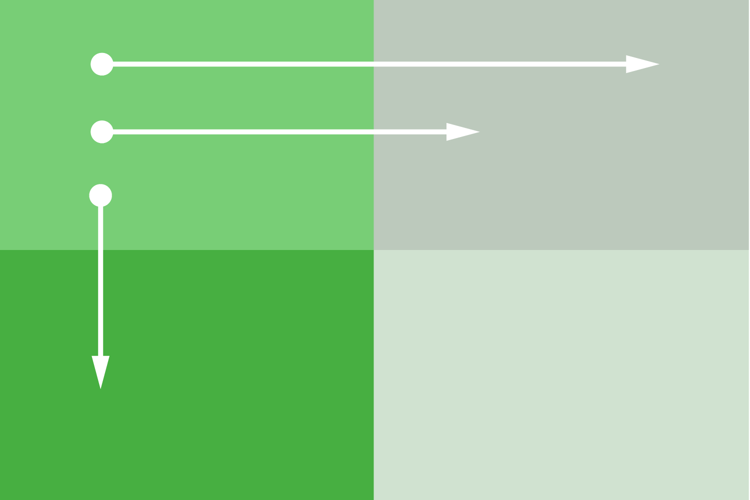
You will usually work on pages other than this, but understanding how this theory applies will improve your ability to write better content and design more complex layouts.
How to Apply the Gutenberg Diagram
Using the Gutenberg Diagram is simple – you must write your content appropriately.
Indeed, plain text pages without any headings are rare, but if you are designing one, the strategies you should use are as follows. We recommend using headers and tying your content into Layout 3 below.
Regardless, the design theory that the reader’s eye naturally travels from the top left and looks for an action point on the bottom right goes far beyond plain text, as you’ll see with the following layouts.
Example 2: Z Pattern for Content Groups With a Variety of Media
Let’s say you’re building a homepage or landing page for your most recent product. These pages usually have many big images, videos, and strong typography, leaving out large bodies of smaller text. In these situations, create your design layout using the Z pattern design principle that capitalizes on natural eye movement and reading behavior of users in Western cultures.
The Z pattern is an extension of the Gutenberg Diagram and how it applies to readers scanning a web page when you’re offering more than plain text. You can see how similar the concept is:
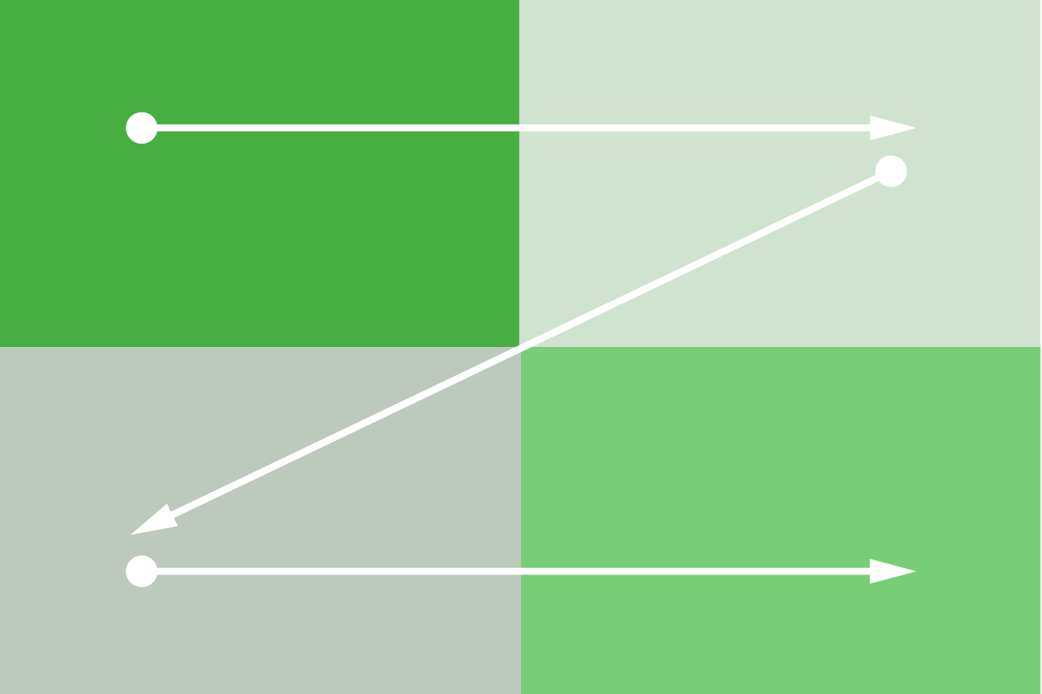
Since there is more to take in on the page, the reader tends to do a full scan in a Z-shaped pattern before finally reaching the lower right corner. It fits right on top of the Gutenberg Diagram, with the strongest points being the top left and lower right corners. Here’s how it comes together in practical terms:
As a practical example, you can check out how our design team employed this tactic on the Avada homepage.

You can create an alternative visual hierarchy with strong graphics to manipulate the Z pattern. However, this is not recommended as it can create user experience friction.
Suppose you’re really into design theory and want to learn more. In that case, we recommend reading How the Human Eye Reads a Website and Understanding the Z Layout in Web Design.
How to Implement the Z Pattern
Implementing the Z pattern is more complicated than writing your content in a certain way. You’ll want to plan out your content’s layout before building it on your website. This is called wireframing, and it’s a lot easier than you think! We recommend sketching out your ideas first. Here are a few resources to get you started:
Once you’ve sketched a practical layout, it’s time to implement it on your website, which is incredibly easy to do with Avada’s Layout Builder. You can go from concept to a completed page in minutes!
Example 3: F Pattern for Text-Heavy Pages With a Strong Hierarchy
Your most typical scenario for the F pattern will be blog posts and articles. A strong hierarchy is created for the F pattern when using headings to split the page. This is compared to Example 1 in this article, which relates to lots of text without many headings.
Due to the nature of the content (lots of text), the reader’s attention is different here. You can see how it changes with the following graphic:
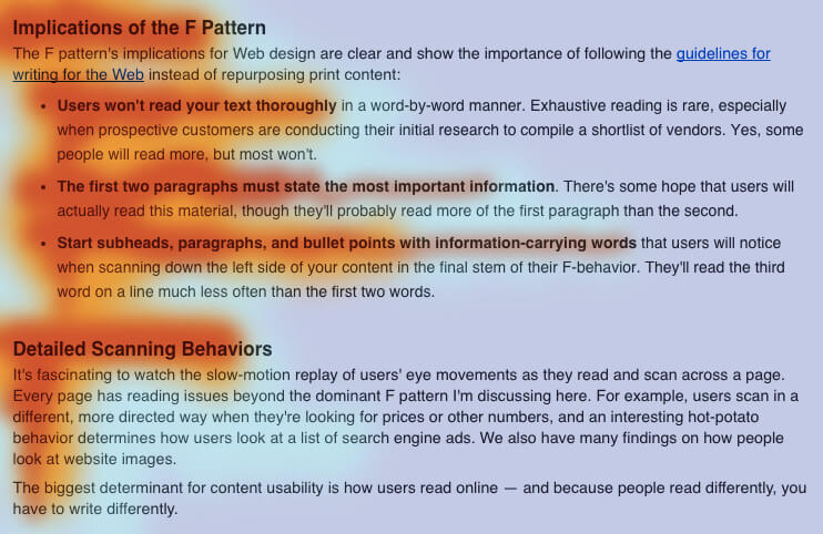
Even ignoring the differences, this pattern still borrows from some of the ideas in the Gutenberg Diagram, particularly that readers will always begin in the upper left-hand corner of the page. A few of the overarching principles to keep in mind:
The F pattern greatly benefits from adding imagery to the page. Images throughout the page help maintain attention by moving the eye through the page, much like using large and bolded text headings. It’s easiest to understand how the F pattern works by using a hypothetical heat map.
Red is where the user is likely to pay attention, while purple is where readers will spend the least time scanning the page. For further education, read Understanding the F Layout in Web Design.
How to Implement the F Pattern
From the example above, you can see that headings build a structure for the reader to scan through. Use effective headings to construct a virtual outline to help the reader understand your content’s most important ideas. Once readers know your content has what they are looking for, they’ll likely slow down and pay attention.
If you need another example, try skimming through this article, reading only the headings! We use this principle with every blog post we write.
Summary
Building an effective Avada page layout depends on what kind of content you are dealing with. Most people do not know how to recognize the reader patterns on which to build page layouts.
By understanding the type of content you are working with and how to pair it with common reader patterns, you can intentionally direct attention to the most critical elements on your page by using the principles for each pattern.
