Share
Avada offers robust tools and options for building fully responsive websites in WordPress. By default, Avada is responsive. Still, it also provides detailed customization features that allow users to fine-tune how their sites appear on various devices—from large desktop screens to small mobile phones, such as Avada Column size and order, as detailed in this article and Avada’s Responsive Option Sets Et al. Below is an overview of Avada’s responsive design features and how they can optimize any website. Let’s dive in!
Overview
The Benefits Of Responsive Web Design
In today’s world, where internet access is only a mobile device away, responsive web design offers a range of benefits, including:
Avada’s Built-In Responsive Capabilities
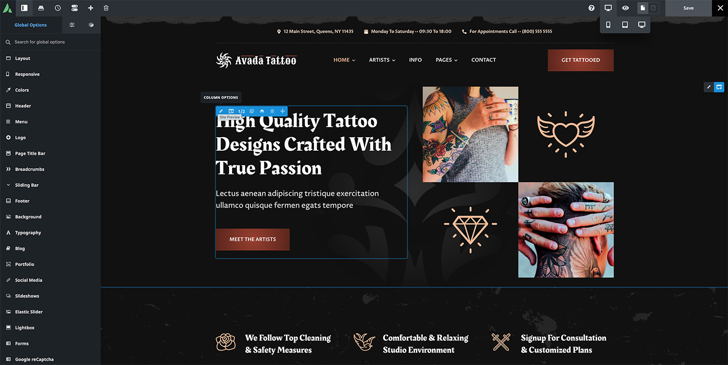
Avada is designed to adapt automatically to different screen sizes. However, several responsive tools and settings allow site owners to refine the layout and appearance of web pages. For instance, users can see how the pre-built Avada Tattoo website changes across screen sizes.

On desktops, it displays one header style; on medium-sized screens (like tablets), the header shifts; and on small screens (like mobile phones), it adapts further for a more streamlined look.
These adjustments are determined by the Avada Global Responsive Options and the responsive Avada Element settings chosen during the website-building process.
Avada Global Responsive Options
The primary responsive settings are located under Options > Responsive in the Avada Dashboard. However, other global options throughout Avada also affect how a site looks on different devices.
1: Responsive Design Enable/Disable
By default, responsive design is enabled. If it is ever turned off, Avada switches to a fixed layout. Since responsive layouts are now an industry standard, it is generally best to keep this turned on.
2: Various Responsive Breakpoints
– Grid Responsive Breakpoint
Determines when grid layouts (e.g., blog, portfolio) begin rearranging into fewer Columns.
– Header Responsive Breakpoint
Specifies when the desktop header switches to the mobile header and uses a mobile menu. This is especially relevant for sites using an option-based header (rather than a custom header built with Avada Layouts).
– Site Content Responsive Breakpoint
Controls when the main content area switches to a mobile layout, which includes stacking Columns vertically for smaller screens.
– Sidebar Responsive Breakpoint
Dictates when sidebars switch to a mobile-friendly layout. This is more of a legacy option now that sticky columns have become the recommended practice.
3: Mobile Device Zoom
Turn on or off pinch-to-zoom capabilities on mobile devices.
4: Element Responsive Breakpoints
Allows site owners to define at which pixel values small and medium screen previews (and visibility toggles) activate in the Avada Builder.
5: Responsive Typography
– Responsive Typography Sensitivity
Controls how heading fonts shrink toward the smaller end of the size range as the screen narrows.
– Minimum Font Size Factor
This sets the smallest possible font size as a multiple of the Element’s initial font size. For instance, a factor of 2 doubles the Element’s font size as the minimum. In contrast, a factor of 0 removes the minimum constraint entirely.
Avada Global Column Options
Avada Columns, which are the fundamental building blocks of the page layout, also include responsive settings. In the Avada Builder Elements panel under Column, default behaviors are set for how columns respond on medium and small screens:
These defaults can be overridden either globally or at the individual Column level. Depending on the design requirements, users might display two Columns on tablets and a single Column on mobile devices.
Responsive Editing with the Avada Builder
When creating content, the Responsive Icon on the Avada Builder toolbar is key to previewing and adjusting layouts for different devices.
This icon toggles among Large, Medium, and Small screen views, emulating how the final site will appear on desktops, tablets, and mobile. By selecting a view size:
Avada Responsive Option Sets
By default, many settings flow down from the larger screen to smaller screens (for example, a 60-pixel margin set on a column for large screens will also appear on medium and small screens). However, responsive option sets allow editors to break this inheritance. This means each screen size can have its own unique styling or layout properties.
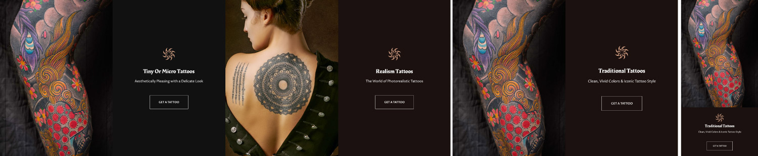
For example, a row of four Columns on a large desktop screen might be reconfigured as two Columns on a tablet (medium view) while reverting to a single full-width Column on mobile (small view). This ability to individually tweak each screen size gives unprecedented control over site design, ensuring a seamless and optimized user experience across all devices.
Avada Responsive Images
Avada also handles images with an advanced system that automatically serves different image sizes depending on the viewer’s device:
This system helps maintain fast performance and a professional appearance across all devices. For background images specifically, Avada offers additional responsive settings to ensure backgrounds are correctly displayed on various screen sizes.
Summary
While Avada provides extensive options, it is crucial to use them thoughtfully. For instance, multiple Columns can be forced to display on small screens, but such a layout may not always be user-friendly. It is best to test different configurations on actual devices whenever possible to confirm that the design choices enhance, rather than hinder, the user experience.
Avada’s comprehensive range of responsive settings—global breakpoints, column controls, element-specific responsive options, and intelligent image handling—empowers site owners and designers to craft web experiences that look and function perfectly on any screen size.


