The Avada Visibility System
Last Update: July 23, 2024
In Avada, you will find an intuitive Visibility System for all Elements that you use on the page. This easy to use system allows you to choose when Elements are displayed, and when they are hidden, based on the screen size they are being viewed on.
For example, if you want a section of your page to only display on mobile devices and not on desktops, then our Visibility System lets you do that effortlessly. Continue reading below to learn more about the Avada Builder’s Visibility System.
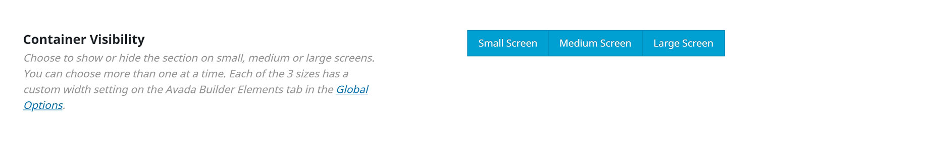
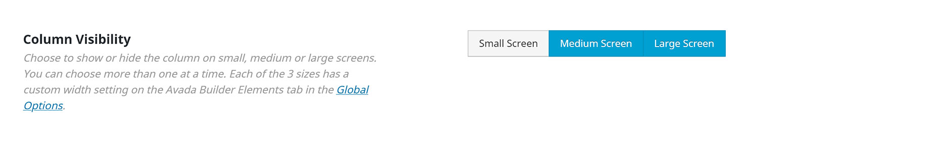
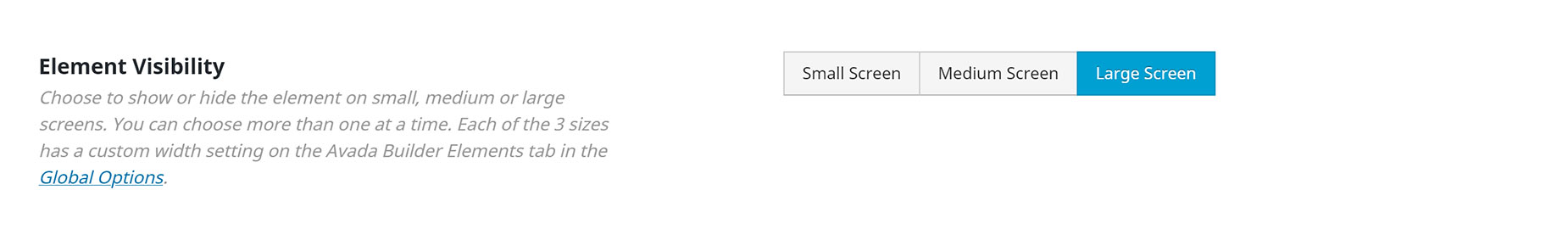
Container, Column, and Element Visibility
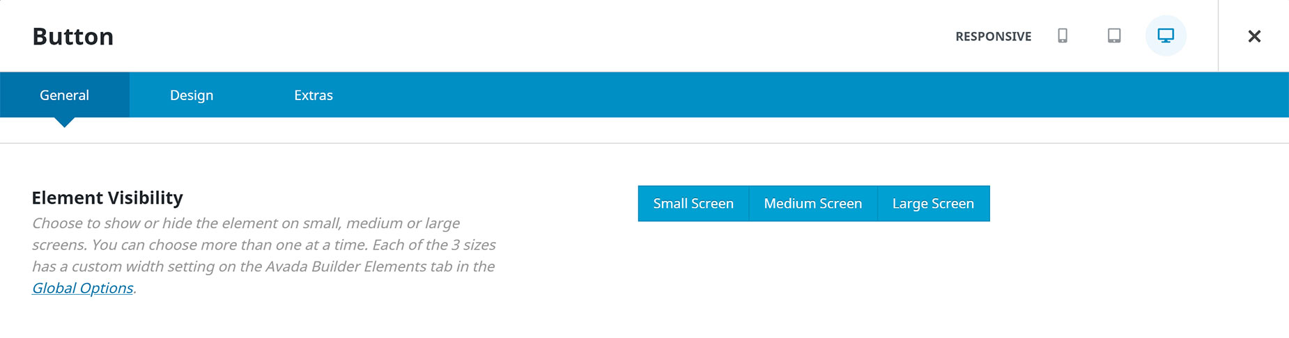
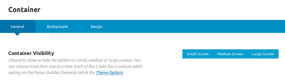
The ‘Visibility’ option is available to use in all Elements, including Containers and Columns. This option is called ‘Container Visibility’ for Containers, ‘Column Visibility’ for Columns, and ‘Element Visibility’ for all other Elements. By default, visibility is set on all three screen sizes, but you can enable or disable any number of screen sizes in the option. Continue reading below to learn more about how to use this option.
How To Use The Visibility Options
Step 1 – On any Container, Column, or Element, locate the ‘Element Visibility’ option and select which screens you’d like to display the element for. You can choose more than one option, but at least one must be selected. If you want to hide a container completely, instead use the Container Publishing Status options.
Step 2 – Once finished, click ‘Save’.
Container Publishing Status Options
These options are only found on Containers, but are another useful tool to control the visibility of any elements within the container. This can be very useful with seasonal content.
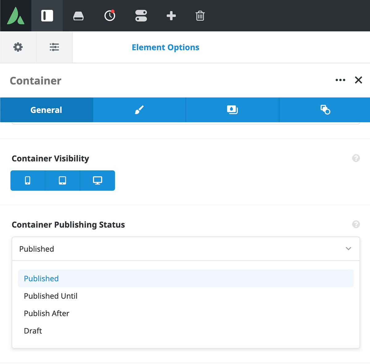
There are four states a container can have:
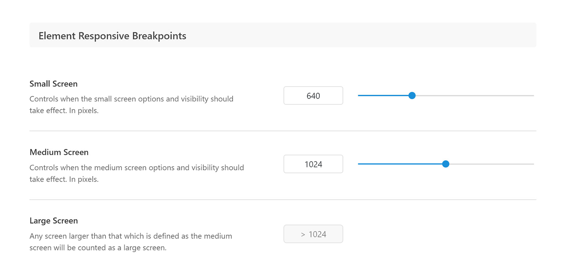
Element Responsive Breakpoints
All three size settings have an Element Responsive Breakpoint, which you can set in the Avada > Global Options > Responsive tab. This allows you to set the responsive breakpoint for the small, medium, and large screens and determine when your site will switch to a different screen visibility. For example, if you set 640 pixels for the Small Screen’s custom width settings, then when your site is viewed on a resolution that is equal or less to 640 pixels, any element with the ‘Small Screen’ option enabled will display on your site.
How To Set Element Responsive Breakpoints
Step 1 – Navigate to the Avada > Global Options > Responsive panel.
Step 2 – On this panel, locate the ‘Element Responsive Breakpoints’ section.
Step 3 – Set the Small Screen’s custom width by entering a value in the text box, or by dragging the slider. When your site is viewed on a resolution that is less than or equal to the width set on this field, then the small screen visibility will take effect.
Step 4 – Set the Medium Screen’s custom width by entering a value in the text box, or by dragging the slider. When your site is viewed on a resolution that is less than or equal to the width set on this field, then the medium screen visibility will take effect.
Step 5 – The Large Screen’s custom width is automatically filled in depending on what width you’ve entered for the Medium Screen option. When your site is viewed on a resolution that is greater than the Medium Screen width, then the large screen visibility will take effect.
Step 6 – Once finished, click ‘Save Changes’.
Element Sticky Visibility Option
You can find the Element Sticky Visibility option in some Elements. This is a dependent option which only appears if the parent Container is set to Sticky. It allows you to determine when the Element will be visible, based on whether the Container it is in, is in Sticky mode or not. You can choose from Normal and Sticky visibility, and by default, they are both selected, meaning the Element is always visible. But if you deselect the Normal option, the Element will ONLY be visible when the parent Container is in Sticky mode.
This can be used in a number of creative ways, particularly with Header Layouts, but generally as well. The Column Element has this option as well, and in the above example with an individual Sticky Container, you would set the Column Element Visibility to only sticky, so the entire Column would only display when the parent Container went into Sticky mode.
An example of this technique can be seen in New Header 5, one of the Prebuilt Headers for Layouts. In this Layout, as you can see below, there are two Containers, with the second one being set to Sticky. The two outside Columns on the second Container have their Element Visibility set to Sticky only, and so in the normal state of the Container, these two Columns, and the Elements inside them, are not visible, but when the Sticky Container activates, the logo and the Woo Menu suddenly appear in the Container.
Currently, this option is only available for the Columns, Nested Columns, Alert, Breadcrumbs, Button, Icon, Image, Menu, Search, Separator, Sharing Box, Social Links, Title, and Text Block Elements.

Normal Container

Container in Sticky Mode


