Share
Typography is a critical component of web design that can make or break a website’s readability, usability, and overall aesthetic appeal. Whether you’re a beginner just starting or a seasoned designer looking for a refresher, understanding the fundamentals of web typography is essential for creating compelling, visually appealing digital experiences.
Overview
Difference Between Print & Web Typography
Print and web typography serve similar purposes but differ significantly in application and constraints. Print typography is static and predictable because the layout, size, and resolution remain consistent once printed. This consistency allows designers complete control over precise spacing, line lengths, font sizes, and color accuracy. The physical nature of print also influences the typeface choice, with printed materials often favoring high-resolution serif fonts due to their readability on paper.

Conversely, web typography must be flexible and responsive, adapting dynamically to various devices and screen resolutions. Designers have less control over exact layouts because the typography must adjust to different screen sizes, resolutions, and orientations. Web typography relies heavily on user interaction and must account for accessibility standards, ensuring text remains legible and comfortable to read regardless of the device. Additionally, web typography must optimize font loading performance, as page load speeds significantly impact user experience and search rankings.
What is Web Typography?
Web typography refers to using fonts, typefaces, and text formatting on digital platforms. Unlike print typography, web typography must be adaptable to different screen sizes, resolutions, and device types.

The goal is to present text in a way that is both aesthetically pleasing and easy to read, ensuring a positive user experience.
Why Web Typography Matters
Good typography enhances user engagement, while poor typography can drive visitors away. Typography plays a significant role in:
Basic Elements of Typography
Before diving into web typography best practices, it’s crucial to understand the key elements that define typography:
1. Typefaces and Fonts
A typeface is a family of fonts that share a common design. In contrast, a font is a specific style within a typeface. For example, Helvetica is a typeface, while Helvetica Bold and Helvetica Light are fonts within that typeface. Web designers typically categorize fonts into the following:
Serif Fonts (Georgia)
Fonts with small strokes at the ends of characters (e.g., Times New Roman, Georgia). They are often used for traditional, elegant, or formal designs.
Sans-Serif Fonts (Trebuchet MS)
Fonts without strokes at the ends (e.g., Trebuchet MS, Arial, Helvetica). They offer a modern, clean, and minimalistic look.
Monospace Fonts (Courier)
Fonts where each character occupies the same width (e.g., Courier, Consolas). These are commonly used in coding environments.
Display Fonts (Poppins)
Decorative fonts are designed for headlines and large text but are unsuitable for body content (e.g., Lobster, Pacifico).
2. Font Size
Font size is typically measured in pixels (px), points (pt), ems (em), or relative units like rem. Web typography uses these measurement units to define font sizes and spacing. The standard for body text on the web is around 16px, ensuring legibility across devices.
CSS Examples
3. Line Height and Spacing
Line height and spacing significantly impact readability and overall visual comfort. Effective line height ensures sufficient space between lines, improving readability by preventing text from looking crowded or overwhelming. Optimal line height typically ranges between 1.4 and 1.6 times the font size, creating a visually balanced and comfortable reading experience.
Line Spacing (0.1em)
Line Spacing (0.3em)
Line Spacing (0.5em)
Line Spacing (0.7em)
Line Spacing (1em)
Proper letter-spacing (tracking) helps to clarify the distinction between letters, enhancing readability, particularly in smaller fonts or dense paragraphs. Appropriate word spacing further contributes to readability and ensures visual harmony. Thoughtfully adjusting line height and spacing helps to reduce eye strain, facilitate effortless scanning, and maintain reader engagement throughout the content.
4. Line Length
The ideal length for optimal readability is 50-75 characters per line, including spaces. Long lines make reading difficult, while short lines can disrupt the reading flow.
5. Contrast And Color
Text contrast is crucial for readability. High contrast (e.g., black text on a white background) improves clarity, while low contrast (e.g., light gray on white) can strain the eyes. Consider accessibility guidelines when choosing color combinations.
Best Practices for Web Typography
Typography best practices matter because they directly influence user experience and how effectively users can interact with content. Adhering to typography best practices ensures readability, which helps users quickly comprehend and retain information. Good typography enhances the aesthetic quality of a website, making it visually appealing and professional, which fosters user trust and satisfaction. Moreover, typography best practices support accessibility, ensuring content is usable by individuals with various visual abilities.
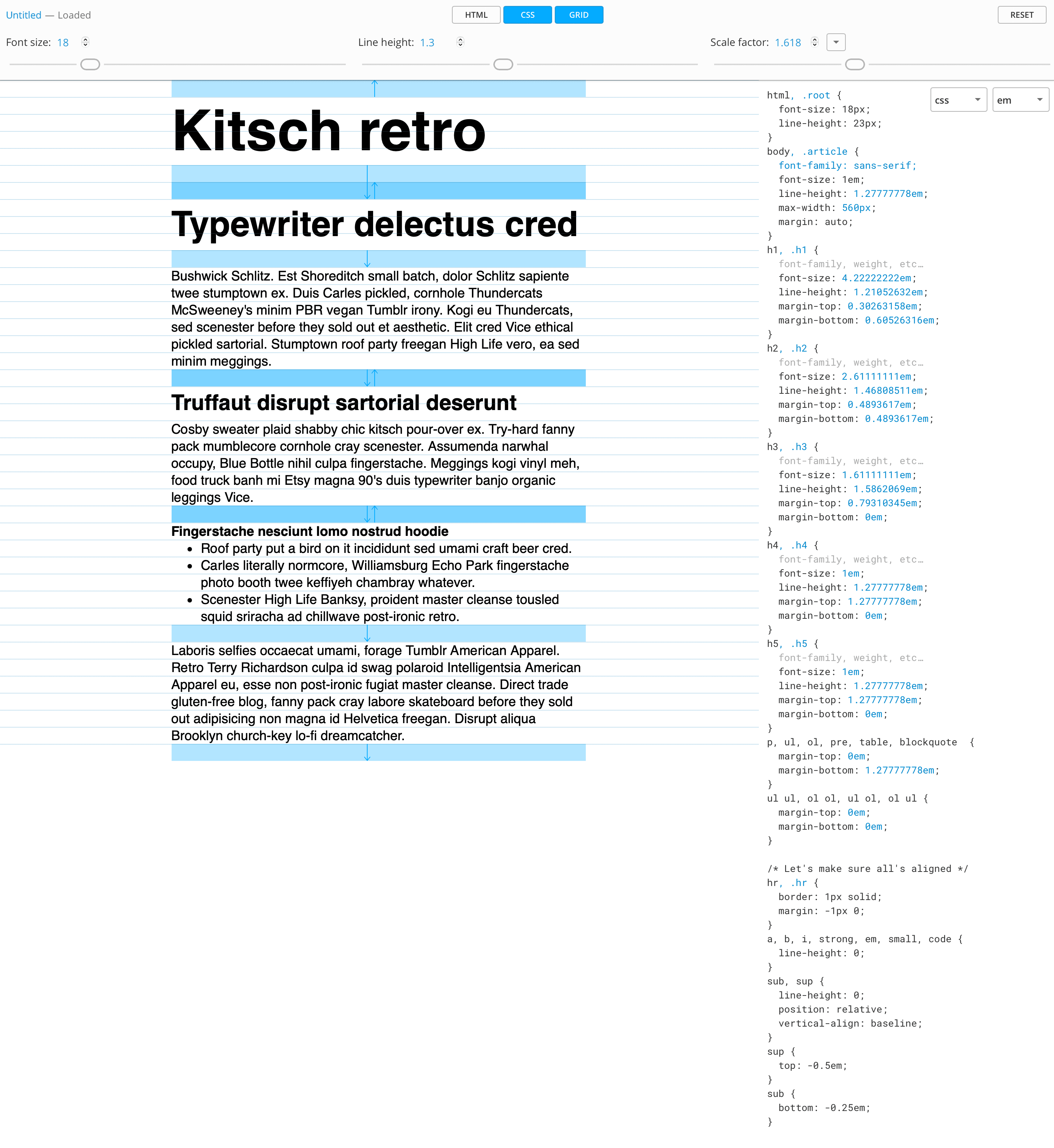
When determining the ideal text size, consider the chosen typeface, as factors like x-height and counter openness significantly affect legibility. This text size influences line height and length, impacting overall readability. Tools such as Grid Lover can help test and visualize the relationship between font size, line height, and length, allowing you to adjust each parameter easily.
Furthermore, selecting a suitable background color behind the text is as crucial as choosing the text color to ensure sufficient contrast between text and background colors, which is vital for readability and accessibility. The Web Content Accessibility Guidelines (WCAG) recommend a contrast ratio of at least 4.5:1 for most text and 3:1 for large, bolded text. Tools like WebAIM’s Contrast Checker enable designers to quickly verify whether their color combinations meet accessibility standards, improving user usability.
1. Choose Readable Fonts
Prioritize readability over fancy styles. Google Fonts offers a wide range of web-friendly fonts optimized for readability and performance.
2. Use a Font Pairing Strategy
A combination of fonts can create a visual hierarchy and interest. Common pairings include:
3. Limit the Number of Fonts
Using more than two or three font families can make a design look cluttered. Stick to a maximum of two complementary fonts for a clean and professional look.
4. Ensure Proper Text Hierarchy
Establish a clear visual hierarchy with headings (H1, H2, H3), subheadings, and body text. This helps users scan content efficiently.
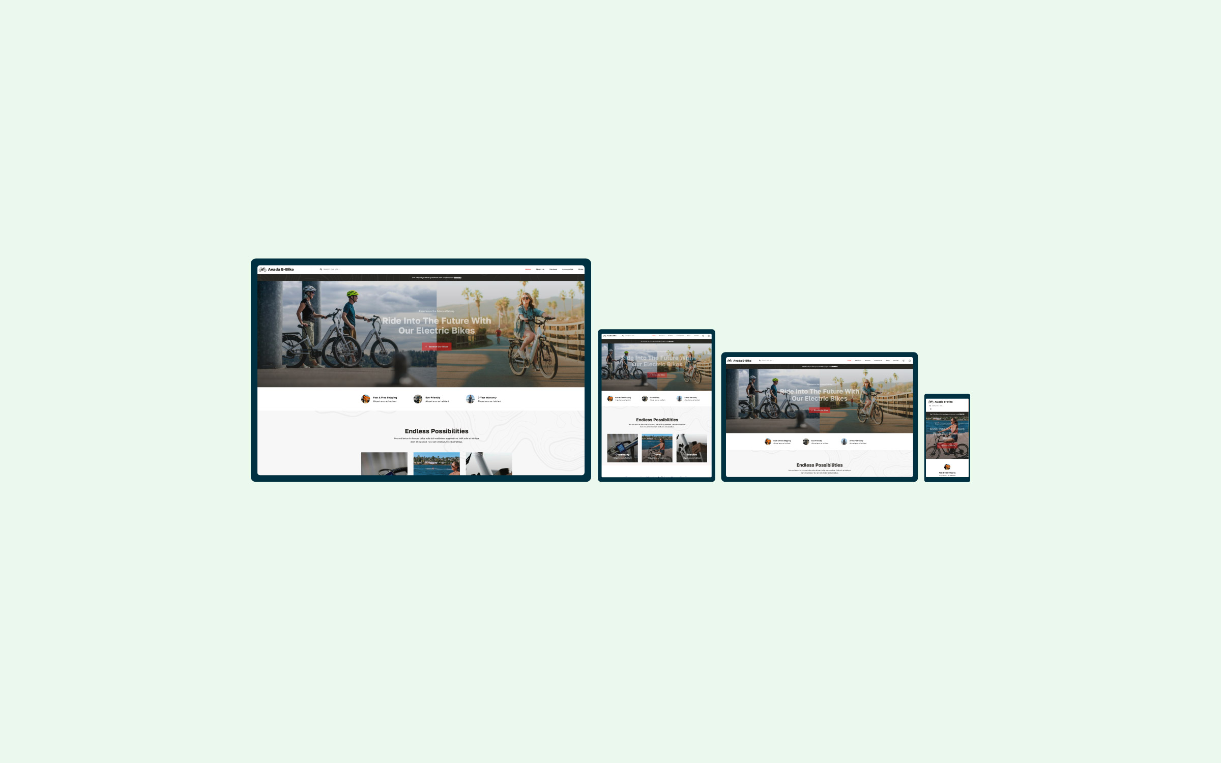
5. Optimize for Responsiveness
Ensure fonts scale correctly on different devices using relative units (em, rem, vw, vh) instead of fixed pixels.
6. Improve accessibility
Follow WCAG (Web Content Accessibility Guidelines) to make text accessible to all users, including those with visual impairments:
7. Use Web-Safe Fonts and Font Loading Strategies
Not all fonts are available on all devices. Web-safe fonts like Arial, Verdana, and Georgia ensure consistency. When using custom fonts, optimize performance with font-display: swap in CSS to avoid invisible text during loading.
8. Test and Iterate
Always test typography on multiple devices and screen sizes. Tools like Google’s Lighthouse can help assess legibility and performance.
Common Typography Mistakes to Avoid
Typography Options In Avada
Avada offers extensive typography customization options to ensure your website’s text aligns perfectly with your design vision. Here’s a summary of the key typography features available in Avada.
Avada Global Typography Options
Located under “Avada > Options > Typography,” the Avada Global Typography settings are divided into four primary tabs:
Global Typography Tab
Create and manage Typography Sets that can be applied across various site elements. Each set includes settings for font family, backup font, variant, size, line height, letter spacing, and text transform. Avada provides five default sets—Headings, Subheadings, Lead, Body, and Small—but you can customize these or create new ones.
Body Typography Tab
You can control the main body font, including settings for link color and text decoration. These options ensure consistent styling throughout your site’s content.
Heading Typography Tab
Customize H1–H6 headings and post titles. You can pull styles from the Avada Global Typography sets and override specific attributes like font size for individual heading levels.
Custom Fonts Tab
Upload and manage custom fonts to use anywhere on your site. Avada supports various font formats, ensuring compatibility across browsers.
Avada Responsive Typography
Avada includes responsive typography options to ensure text scales appropriately across devices. In the “Avada > Options > Responsive” section, you can adjust settings like Responsive Typography Sensitivity and Minimum Font Size Factor to control how typography adapts to different screen sizes.
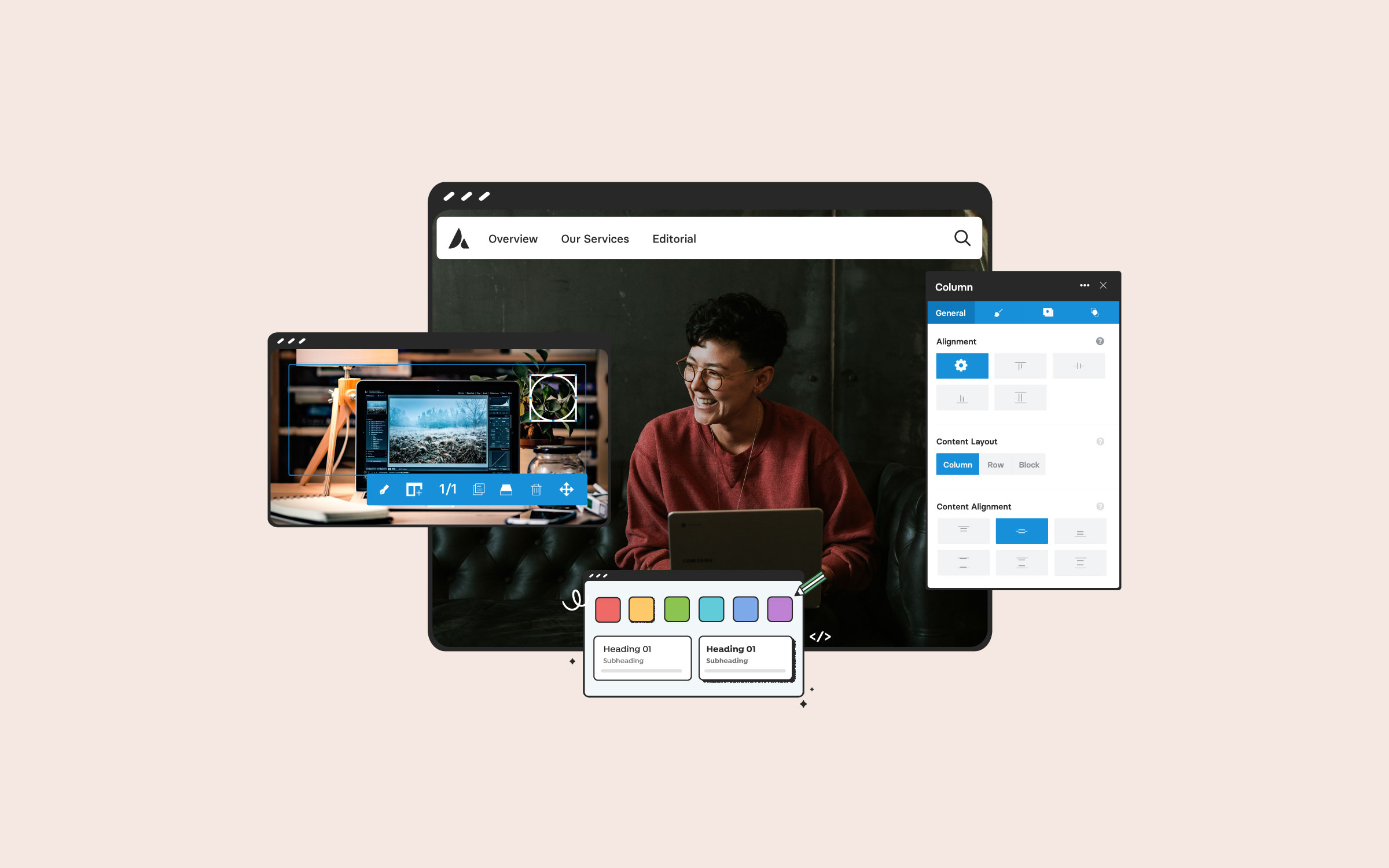
Avada Inline Editing
When using the Avada Live Visual Builder, the Inline Editor allows for on-the-fly typography adjustments. Selecting any text brings up the editor, where you can modify font family, variant, size, and other attributes, providing immediate visual feedback.
By leveraging these comprehensive typography options, Avada enables precise control over your site’s textual elements, enhancing aesthetics and user experience.
Summary
Web typography is an essential skill for designers and developers alike. By choosing the right fonts, optimizing readability, and following best practices, you can create a visually appealing and user-friendly web experience. Mastering typography will enhance your digital presence and user engagement, whether designing a personal blog, an e-commerce site, or a corporate website.
Experiment with different font pairings, sizes, and layouts to find what works best for your projects. Happy designing!