| Heading | | Description | | Show Heading | | Choose to have heading displayed. |
| HTML Heading Tag | | Choose HTML tag of the heading, either div, p or the heading tag, h1-h6. |
| Experiment Events | | Select any available Avada Experiment events to this element. Note: if you are already using the selector to trigger this, no need to add here. |
| Element Visibility | | Choose to show or hide the element on small, medium or large screens. You can choose more than one at a time. |
| CSS Class | | Add a class to the wrapping HTML element. |
| CSS ID | | Add an ID to the wrapping HTML element. |
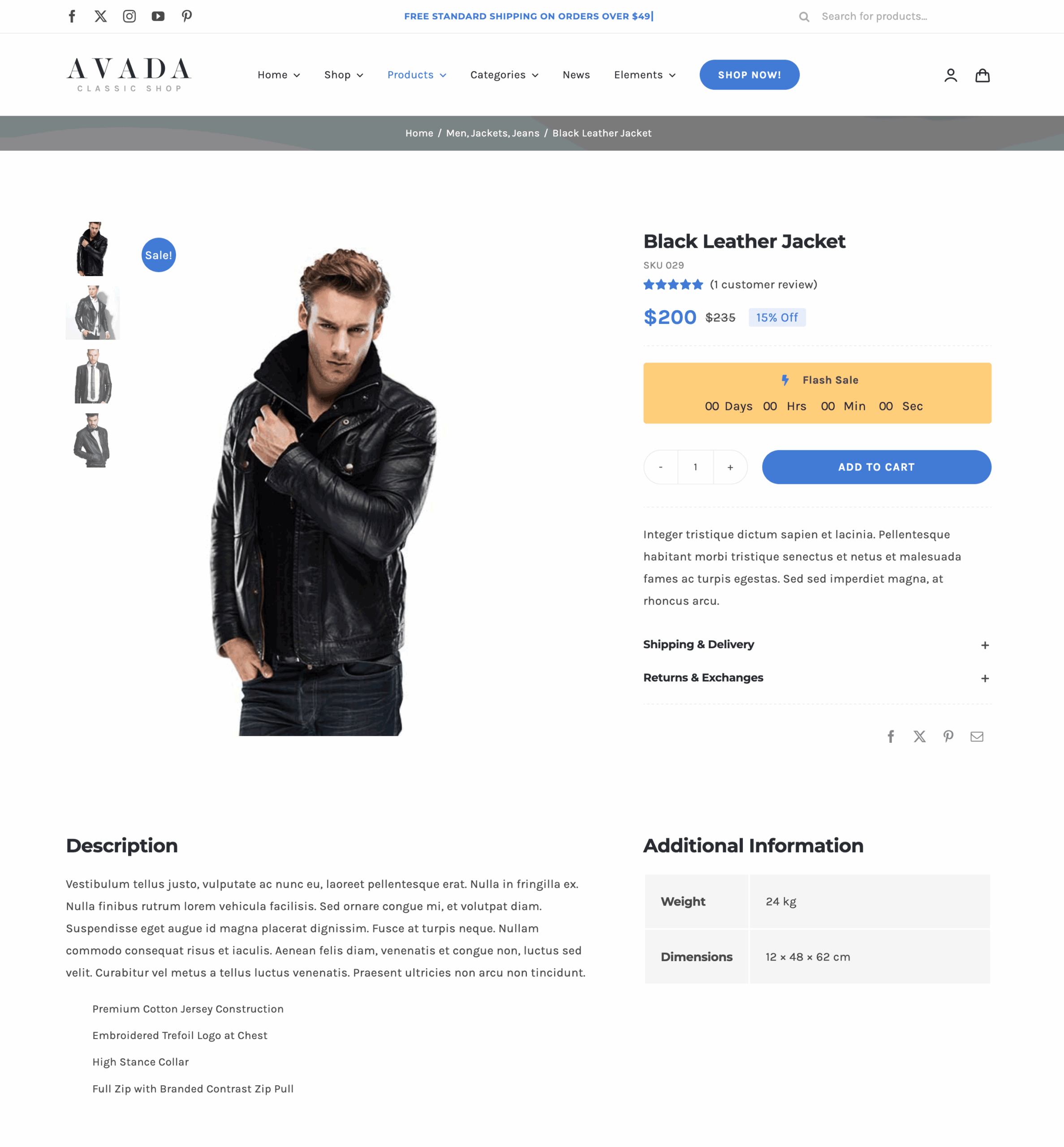
| Heading | | Description | | Attributes | | Select which product attributes to display. Leave empty to show every visible attribute (default behavior). |
| Empty Value | | Choose what to do when the product does not have one of the selected attributes. Only applies when specific attributes are selected above. |
| Empty Value Text | | Text shown for an attribute the product does not have. |
| Attribute Labels Layout | | Choose what the label column shows for each attribute. Icons are set per attribute, on the WooCommerce attributes screen, and any attribute without one keeps its label. Choose "None" to hide the label column and show the values only. |
| Attribute Values Layout | | Choose what the value column shows for each attribute. "Swatches" shows the colors, images and buttons of attributes that use an Avada attribute type, set on the WooCommerce attributes screen. Any other attribute keeps its text. Requires the "WooCommerce Product Variation Swatches" option to be enabled in the Global Options. |
| Label Column Alignment | | Select the text alignment for the attribute labels. Leave on "Text Flow" to follow the reading direction. |
| Value Column Alignment | | Select the text alignment for the attribute values, swatches included. Leave on "Text Flow" to follow the reading direction. |
| Swatch Style | | Select whether you want to custom style the attribute swatches. The default is the styling the Woo Add To Cart element uses. |
| Swatch Item Margin | | In pixels or percentage, ex: 10px or 10%. |
| Swatch Background Color | | Controls the background color of the color, image and button swatch fields. |
| Swatch Border Size | | Controls the border size of the color, image and button swatch fields. |
| Swatch Border Color | | Controls the border color of the color, image and button swatch fields. |
| Color Swatch Dimensions | | Enter values including any valid CSS unit, ex: 10px. |
| Color Swatch Padding | | Controls the padding of the color swatches. Enter values including any valid CSS unit, ex: 10px or 10%. |
| Color Swatch Border Radius | | Enter values including any valid CSS unit, ex: 10px. |
| Image Swatch Dimensions | | Enter values including any valid CSS unit, ex: 10px. |
| Image Swatch Padding | | Controls the padding of the image swatches. Enter values including any valid CSS unit, ex: 10px or 10%. |
| Image Swatch Border Radius | | Enter values including any valid CSS unit, ex: 10px. |
| Button Swatch Dimensions | | Enter values including any valid CSS unit, ex: 10px. |
| Button Swatch Padding | | Controls the padding of the button swatches. Enter values including any valid CSS unit, ex: 10px or 10%. |
| Button Swatch Border Radius | | Enter values including any valid CSS unit, ex: 10px. |
| Button Swatch Font Size | | Enter a value including any valid CSS unit, ex: 14px. |
| Button Swatch Text Color | | Controls the text color of the button swatches. |
| Heading | | Description | | Margin | | In pixels or percentage, ex: 10px or 10%. |
| Table Cell Padding | | Enter values including any valid CSS unit, ex: 10px or 10%. Leave empty to use default 5px 0 5px 0 value. |
| Label Column Width | | Controls the width of the label column, the value column takes the rest. Enter a value including any valid CSS unit, ex: 30% or 180px, or "fit-content" to shrink the column to the widest label. Leave empty for the default 30%, or for the icon width when labels are set to "Icon". |
| Gap | | Controls the gap between the label and the value column (column gap) and between the table rows (row gap). The column gap opens up space between the two columns without indenting the table, which is what cell padding on its own does. Enter values including any valid CSS unit, ex: 20px or 1em. |
| Heading Cell Background Color | | Controls the heading cell background color. |
| Table Cell Background Color | | Controls the table cell background color. |
| Table Border Color | | Controls the color of the table border, ex: #000. |
| Table Border Size | | Controls the size of the divider drawn between the table rows. Enter a value including any valid CSS unit, ex: 1px. Enter 0 for no divider at all. |
| Table Border Radius | | In pixels or percentage, ex: 10px or 10%. |
| Heading Cell Typography | | Controls the typography of the heading cell. |
| Text Typography | | Controls the typography of the text. |
| Heading | | Description | | Conditional Rendering | | Add conditional rendering logic for the element. The element will only be part of the post / page contents, if the set conditions are met. NOTE: Server cache can interfere with results. |
| Animation Type | | Select the type of animation to use on the element. |
| Direction of Animation | | Select the incoming direction for the animation. |
| Animation Color | | Select the color of the animation |
| Speed of Animation | | Type in speed of animation in seconds (0.1 - 5). |
| Animation Delay | | Select the delay time after the animation starts(0 - 5). |
| Offset of Animation | | Controls when the animation should start. |
| Dynamic Display | | Show or hide this element dynamically based on real-time cart and wishlist state. Changes apply immediately without a page reload. NOTE: Server cache can interfere with initial visibility. |