
Avada Image Select Field Element Examples
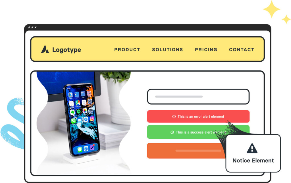
The Avada Image Select Field Element enables users to select options using images (e.g., color swatches, design variants) instead of traditional text or radio buttons. You configure image sources, labels, default selection, and styling so the input looks visually intuitive.

Examples can include the individual option values set for that particular instance; however, in some cases, not all Element variations can be shown as they may be too numerous. Where a live example cannot be shown, an image representation will be used as a substitute. For more detailed information, please refer to the related Element documentation and videos.


