Woo Reviews Element

Last Update: March 25, 2024

As part of Avada Layouts, we created a series of Dynamic Elements that help generate content in the Content Layout Section of a Layout. These are called Layout Elements.

In Avada 7.2, as part of the Avada WooCommerce Builder, a range of Woo Commerce Elements were added. In this document, we are looking at the Woo Reviews Element.

For privacy reasons YouTube needs your permission to be loaded.
I Accept

How To Use The Woo Reviews Element

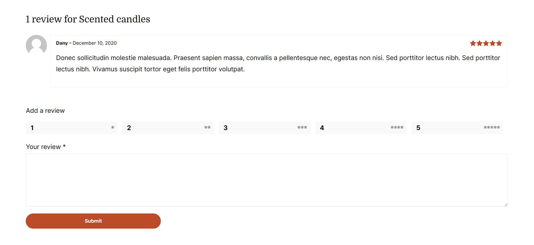
The Woo Reviews Element provides an independant way to add WooCommerce Reviews to your Product Layouts. This Element will display existing reviews for a product, and provide an opportunity for a user to leave a review. This functionality is also in the Woo Tabs Element, but can be disabled if desired in that Element and used as a standalone Element.

Woo Reviews Element Example

Element Options

Note: Please note that the displayed options screens below show ALL the available options for the element. If you have Avada’s Option Network Dependencies turned on, you will only see options relevant to your selections, and so the options screen may look somewhat different.

General

HeadingDescription
Show HeadingChoose to have heading displayed.
HTML Heading TagChoose HTML tag of the heading, either div, p or the heading tag, h1-h6.
Element VisibilityChoose to show or hide the element on small, medium or large screens. You can choose more than one at a time.
CSS ClassAdd a class to the wrapping HTML element.
CSS IDAdd an ID to the wrapping HTML element.

Design

HeadingDescription
MarginIn pixels or percentage, ex: 10px or 10%.
Content TypographyControls the typography of the text. Leave empty for the global font family.
Review Border SizeControls the review border size. In pixels.
Review Border ColorControls the review border color.
Stars ColorControls the color of review stars, ex: #000.
Rating Box Background ColorControls the rating box background color, ex: #000.
Submit Review Button StyleSelect whether you want to custom style the submit review button.
Button SizeControls the button size.
Button SpanControls if the button spans the full width/remaining width of row.
Button Border SizeControls the border size. In pixels or percentage, ex: 10px or 10%.
Button Text ColorControls the text color of the button.
Button Gradient Top ColorControls the text color of the button.
Button Gradient Bottom ColorControls the text color of the button.
Button Border ColorControls the border color of the button.

Extras

HeadingDescription
Animation TypeSelect the type of animation to use on the element.
Direction of AnimationSelect the incoming direction for the animation.
Animation ColorSelect the color of the animation
Speed of AnimationType in speed of animation in seconds (0.1 - 5).
Animation DelaySelect the delay time after the animation starts(0 - 5).
Offset of AnimationControls when the animation should start.