Woo Related Products Element
Last Update: February 11, 2026
The Avada Woo Related Products Element showcases products that WooCommerce identifies as related to the one being viewed, usually based on categories or tags. It pulls these items into your single product layout, helping to keep customers engaged and encouraging them to explore and potentially upsell more products.
Watch the video below for a visual overview of Avada Layout Elements, and view the Avada Woo Related Products Element page. Read on to see the complete list of options.
How To Use The Avada Woo Related Products Element
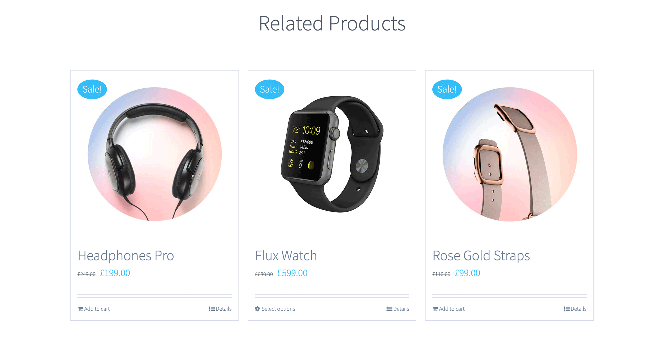
The Avada Woo Related Products Element allows you to display related products on single product pages. A related product falls into the same category or shares a common tag. You can display these in Columns or as a Carousel. A similar Element is the Avada Woo Up/Cross-Sells Element, which is identical in Element options, but it displays products you select as “Upsells”.
To use the Avada Woo Related Products Element, add the Element to a single product layout and configure the Element options to display the related products as you require. As you can see below in the Element Options, there is a range of Options to control both the functionality and design.
Element Options
Note: Please note that the displayed options screens below show ALL the available options for the element. If you have Avada’s Option Network Dependencies turned on, you will only see options relevant to your selections, and so the options screen may look somewhat different.


