Woo Add To Cart Element
Last Update: February 11, 2026
The Avada Woo Add to Cart Element adds an e-commerce cart button to a WooCommerce product layout, enabling customers to add items directly to their shopping cart. It connects to the product being displayed and can show variations, quantities, and pricing as required.
Watch the video below for a visual overview of Avada Layout Elements, and view the Avada Woo Add to Cart Element page. Read on to see the complete list of options.
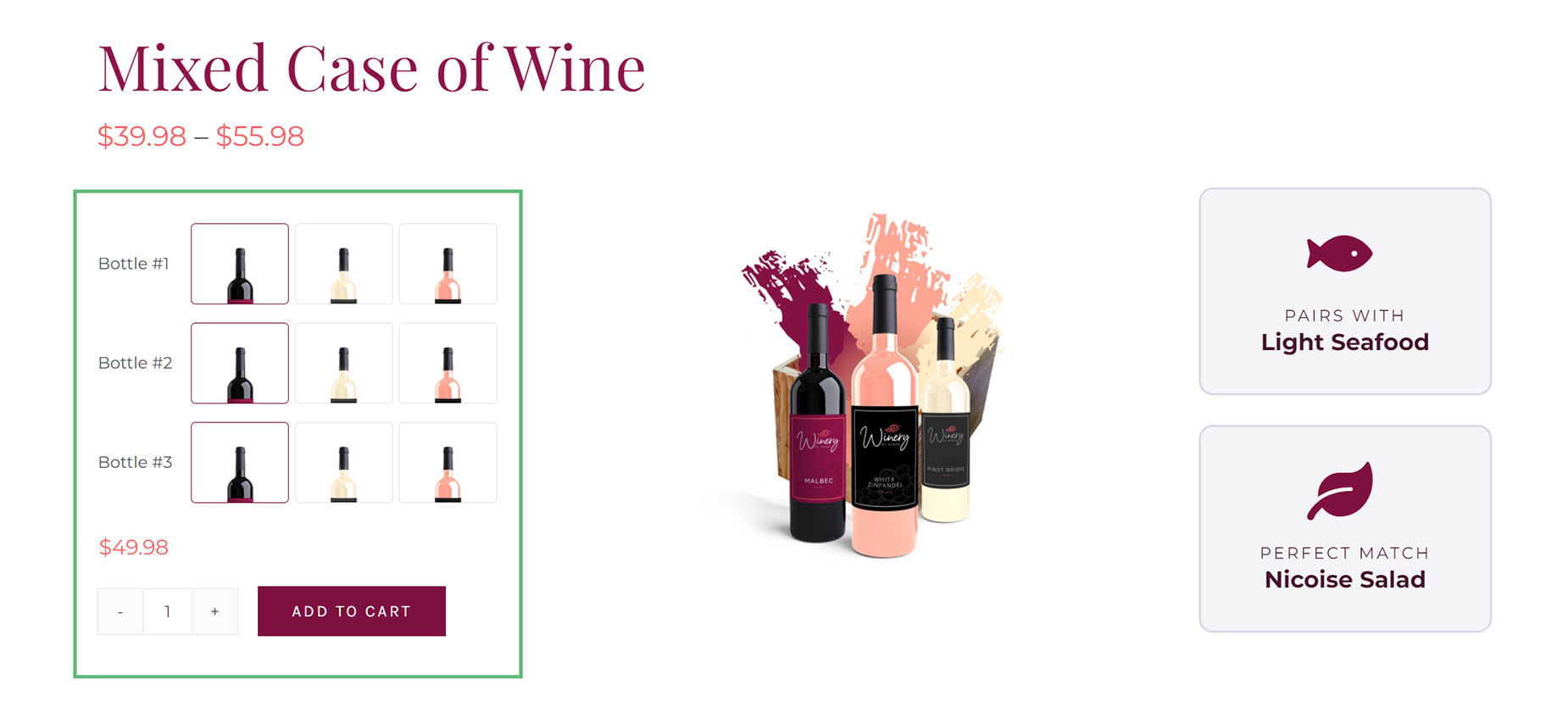
How To Use The Avada Woo Add To Cart Element
The Avada Woo Add To Cart Element allows you to add an Add To Cart button anywhere within a single product page. There are significant styling and configuration options, as shown in the options below; yet, for a simple product, the defaults will likely be sufficient.
Element Options
Note: The displayed options screens below show ALL the available options for the Element. If you have Avada’s Option Network Dependencies turned on, you will only see options relevant to your selections, and so the options screen may look somewhat different.
General
| Heading | Description | |
|---|---|---|
| Element Visibility | Choose to show or hide the element on small, medium or large screens. You can choose more than one at a time. | |
| CSS Class | Add a class to the wrapping HTML element. | |
| CSS ID | Add an ID to the wrapping HTML element. |
Variations
| Heading | Description | |
|---|---|---|
| Variations Margin | In pixels or percentage, ex: 10px or 10%. | |
| Cell Border Size | Controls the border size of the variation table cells. | |
| Cell Border Color | Controls the border color of the variation table cells | |
| Cell Padding | Controls the padding of the variation table cells. Enter values including any valid CSS unit, ex: 10px or 10%. | |
| Cell Background Color | Controls the background color of the variation table cells. | |
| Variation Layout | Select the layout for the variations. Floated will have the label and select side by side. Stacked will have one per row. | |
| Label Width | Leave empty for automatic width. Enter values including any valid CSS unit, ex: 10px. | |
| Text Alignment | Select the text alignment for the variation label and variation swatches. | |
| Label Typography | Controls the typography of the label text. Leave empty for the global font family. | |
| Select Style | Select whether you want to custom style the select fields for variations. | |
| Select Height | Enter values including any valid CSS unit, ex: 10px. | |
| Select Font Size | Controls the font size of the select field. Enter value including any valid CSS unit, ex: 20px. | |
| Select Text Color | Controls the text color of the select fields. | |
| Select Background Color | Controls the background color of the select fields. | |
| Select Border Size | Controls the border size of the select fields. | |
| Select Border Color | Controls the border color of the select fields. | |
| Select Border Radius | Enter values including any valid CSS unit, ex: 10px. | |
| Swatch Style | Select whether you want to custom style the Avada variation swatches. | |
| Swatch Item Margin | In pixels or percentage, ex: 10px or 10%. | |
| Swatch Background Color | Controls the background color of the color, image and button swatch fields. | |
| Swatch Border Size | Controls the border size of the color, image and button swatch fields. | |
| Swatch Border Color | Controls the border color of the color, image and button swatch fields. | |
| Color Swatch Dimensions | Enter values including any valid CSS unit, ex: 10px. | |
| Color Swatch Padding | Controls the padding of the color swatches. Enter values including any valid CSS unit, ex: 10px or 10%. | |
| Color Swatch Border Radius | Enter values including any valid CSS unit, ex: 10px. | |
| Image Swatch Dimensions | Enter values including any valid CSS unit, ex: 10px. | |
| Image Swatch Padding | Controls the padding of the image swatches. Enter values including any valid CSS unit, ex: 10px or 10%. | |
| Image Swatch Border Radius | Enter values including any valid CSS unit, ex: 10px. | |
| Button Swatch Dimensions | Enter values including any valid CSS unit, ex: 10px. Leave empty for auto. | |
| Button Swatch Padding | Controls the padding of the button swatches. Enter values including any valid CSS unit, ex: 10px or 10%. | |
| Button Swatch Border Radius | Enter values including any valid CSS unit, ex: 10px. | |
| Button Swatch Font Size | Controls the font size of the button swatches. Enter value including any valid CSS unit, ex: 20px. | |
| Button Swatch Text Color | Controls the text color of the button swatches. | |
| Variation Clear | Controls how you want to disable the variation clear link. | |
| Clear Content | Controls the content type for the clear link. Default will use WooCommerce text string. | |
| Clear Icon | Click an icon to select, click again to deselect. | |
| Clear Text | Custom text to use for the variation clear link. | |
| Clear Margin | Controls the margin of the clear link. Enter values including any valid CSS unit, ex: 10px or 10%. | |
| Clear Color | Controls the text color of the clear link. |
Details
| Heading | Description | |
|---|---|---|
| Details Padding | Controls the padding of the variation details area. Enter values including any valid CSS unit, ex: 10px or 10%. | |
| Details Background Color | Controls the background color of the variation details area. | |
| Details Border Size | Controls the border size of the variation details area. | |
| Details Border Color | Controls the border color of the variation details area. | |
| Details Border Radius | Enter values including any valid CSS unit, ex: 10px. | |
| Details Alignment | Select the content alignment within the details area. | |
| Description Typography | Controls the typography of the description text. Leave empty for the global font family. | |
| Description Order | Display order for description. Can be before price/stock or after.. | |
| Show Price | Make a selection to show or hide the variation price. "Always" will display the price even if all variations share the same. "Auto" will only display the price when variations have different prices. | |
| Price Typography | Controls the typography of the price text. Leave empty for the global font family. | |
| Show Sale Old Price | Make a selection to show or hide sale old price. | |
| Sale Old Price Position | Select if the sale old price should be before or after the regular price. | |
| Sale Old Price Typography | Controls the typography of the sale old price text. Leave empty for the global font family. | |
| Show Stock | Make a selection to show or hide the variation stock. | |
| Stock Typography | Controls the typography of the stock text. Leave empty for the global font family. |
Cart
| Heading | Description | |
|---|---|---|
| Cart Margin | In pixels or percentage, ex: 10px or 10%. | |
| Cart Layout | Select the layout for the quantity and add to cart button. Floated will have them side by side. Stacked will have one per row. | |
| Cart Alignment | Select the content alignment. | |
| Quantity Style | Select whether you want to custom style the quantity field. | |
| Quantity Input Dimensions | Enter values including any valid CSS unit, ex: 10px. | |
| Quantity Border Radius | Enter values including any valid CSS unit, ex: 10px. | |
| Quantity Input Font Size | Controls the font size of the select field. Enter value including any valid CSS unit, ex: 20px. | |
| Quantity Input Text Color | Controls the text color of the select fields. | |
| Quantity Input Background Color | Controls the background color of the select fields. | |
| Quantity Input Border Size | Controls the border size of the select fields. | |
| Quantity Input Border Color | Controls the border color of the select fields. | |
| Quantity Button Border Size | Controls the border size of the select fields. | |
| Quantity Button Styling | ||
| Quantity Button Text Color | Controls the text color of the select fields. | |
| Quantity Button Background Color | Controls the background color of the select fields. | |
| Quantity Button Border Color | Controls the border color of the select fields. | |
| Add To Cart Button Style | Select whether you want to custom style the add to cart button. | |
| Button Size | Controls the button size. | |
| Button Span | Controls if the button spans the full width/remaining width of row. | |
| Button Border Size | Controls the border size. In pixels or percentage, ex: 10px or 10%. | |
| Icon | Click an icon to select, click again to deselect. | |
| Icon Position | Choose the position of the icon on the button. | |
| Button Styling | ||
| Button Text Color | Controls the text color of the button. | |
| Button Gradient Top Color | Controls the text color of the button. | |
| Button Gradient Bottom Color | Controls the text color of the button. | |
| Button Border Color | Controls the border color of the button. |
Extras
| Heading | Description | |
|---|---|---|
| Conditional Rendering | Add conditional rendering logic for the element. The element will only be part of the post / page contents, if the set conditions are met. NOTE: Server cache can interfere with results. | |
| Animation Type | Select the type of animation to use on the element. | |
| Direction of Animation | Select the incoming direction for the animation. | |
| Animation Color | Select the color of the animation | |
| Speed of Animation | Type in speed of animation in seconds (0.1 - 5). | |
| Animation Delay | Select the delay time after the animation starts(0 - 5). | |
| Offset of Animation | Controls when the animation should start. |


