Woo Cart Totals Element
Last Update: May 27, 2025
The Woo Cart Totals Element allows you to place a Totals section anywhere on your custom WooCommerce Cart page. There is a range of alignment and design options for this Element, which makes it a very flexible Element.
Watch the video below for a visual overview of the Element, view the Element demo page for live examples, and read on to see the full list of options.
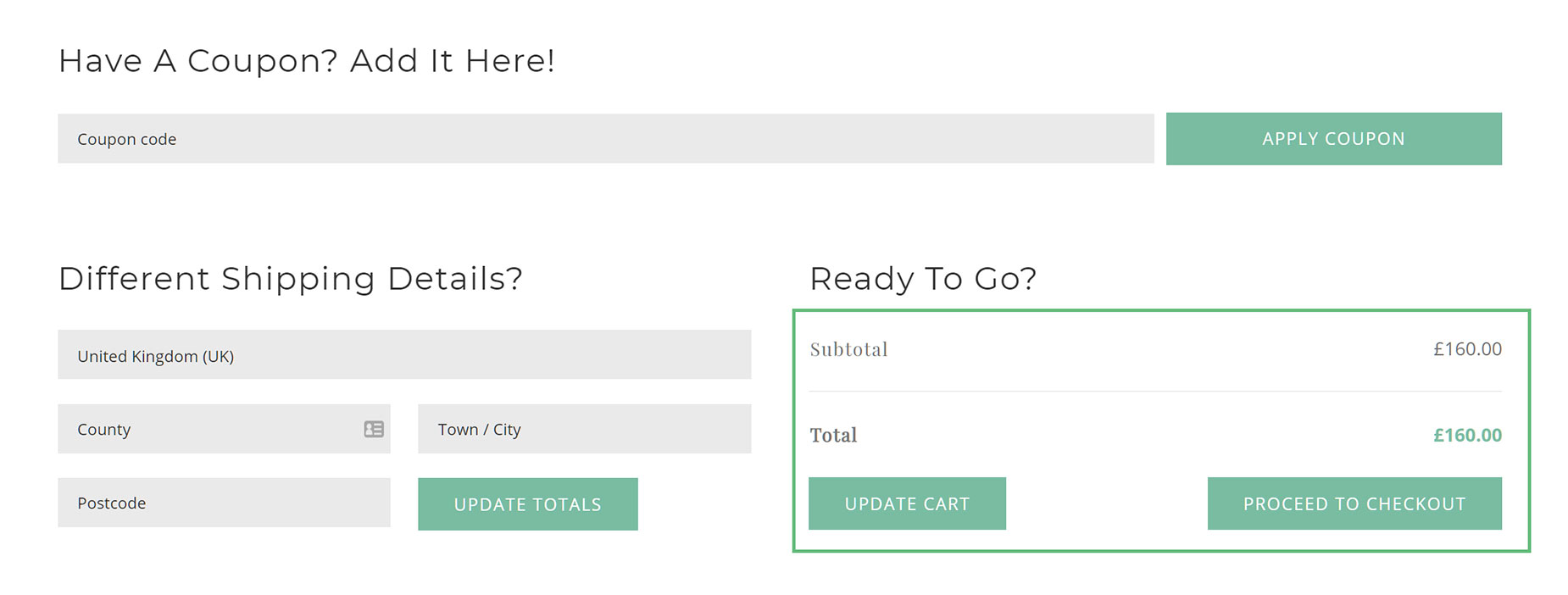
How To Use The Woo Cart Totals Element
The Woo Cart Totals Element has a pretty simple job, and that’s to dispay the cart totals. This is usually presented at the bottom of the Cart, and its from here, the user proceeds to the Checkout.
There are many display and styling options with this Element, allowing you to customize it to suit your page and your style. To use this Element, simply add it to a Column in your Cart Page Layout. You can control margins around the Element, as well as styling it to your liking. You can hide or show the Buttons, as well as control their alignment and size. Read below for a description of all Element options.
Element Options
Note: The displayed option screens below show ALL the available options for the element. If you have Avada’s Option Network Dependencies turned on, you will only see options relevant to your selections, and so the options screen may look somewhat different.


