Woo Cart Table Element

Last Update: April 19, 2024

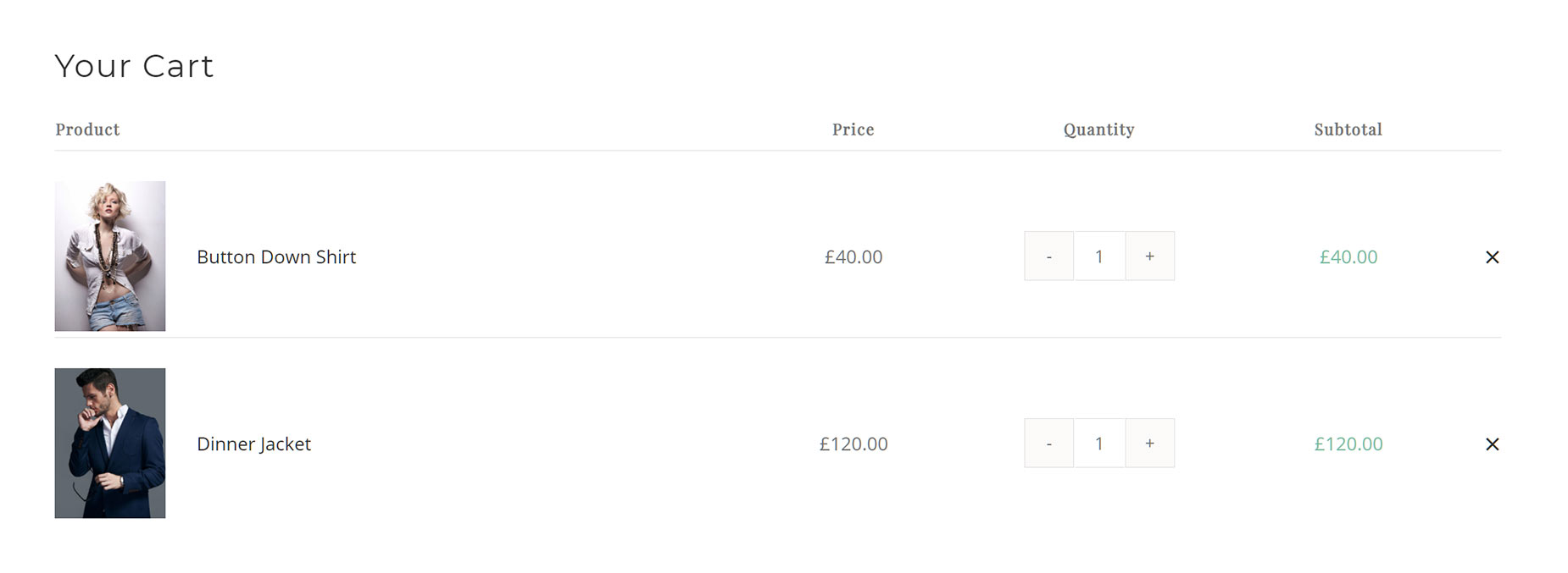
The Woo Cart Table Element allows you to build and display a table on your cart page that displays the items currently in the Cart. This table can be customized to include or exclude various items, such as Product, Price, Remove Icon, Quantity, Subtotal, Product Title, or Product Image.

For privacy reasons YouTube needs your permission to be loaded.
I Accept

How To Use The Woo Cart Table Element

The Avada Woo Cart Table Element allows you to place a customized product table into your WooCommerce Cart Layout. It displays the items currently added to the cart. There are several product details that can be enabled or disabled in the table, allowing you to customize the content, and there is an area to place a custom Empty Cart Message for when the cart is empty.

To use this Element, simply add it to a Column in your Cart Page Layout. You can control margins around the Element, turn headers on or off, and decide which table columns to show, as well as styling it to your liking. Read below for a description of all Element options.

Woo Cart Table Element Example

Element Options

Note: The displayed option screens below show ALL the available options for the element. If you have Avada’s Option Network Dependencies turned on, you will only see options relevant to your selections, and so the options screen may look somewhat different.

General

HeadingDescription
Table ColumnsChoose the order of cart table columns.
Show Table HeadersChoose to have table headers displayed.
Empty Cart MessageShow a message when the cart is empty.
Element VisibilityChoose to show or hide the element on small, medium or large screens. You can choose more than one at a time.
CSS ClassAdd a class to the wrapping HTML element.
CSS IDAdd an ID to the wrapping HTML element.

Design

HeadingDescription
MarginIn pixels or percentage, ex: 10px or 10%.
Table Cell PaddingEnter values including any valid CSS unit, ex: 10px or 10%. Leave empty to use default 5px 0 5px 0 value.
Heading Cell Background ColorControls the heading cell background color.
Table Cell Background ColorControls the table cell background color.
Table Border ColorControls the color of the table border, ex: #000.
Heading Cell TypographyControls the typography of the heading. Leave empty for the global font family.
Content TypographyControls the typography of the content text. Leave empty for the global font family.

Extras

HeadingDescription
Animation TypeSelect the type of animation to use on the element.
Direction of AnimationSelect the incoming direction for the animation.
Animation ColorSelect the color of the animation
Speed of AnimationType in speed of animation in seconds (0.1 - 5).
Animation DelaySelect the delay time after the animation starts(0 - 5).
Offset of AnimationControls when the animation should start.