Woo Archives Element
Last Update: September 4, 2025
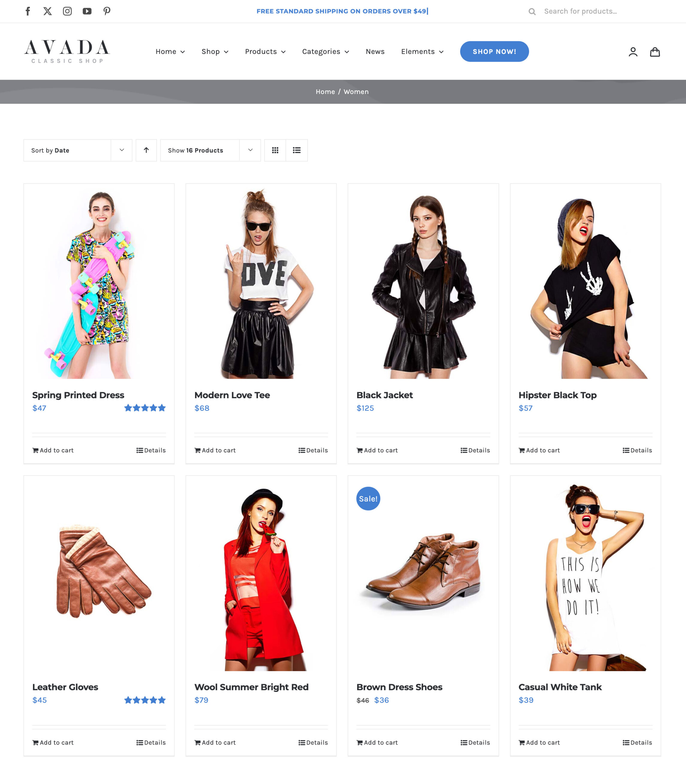
The Avada Woo Archives Element displays WooCommerce product archives, such as shop, category, or tag pages, in a flexible layout. The Element allows you to control how products are presented, including grid or list styles, columns, spacing, and product details such as images, prices, and add-to-cart buttons.
Watch the video below for a visual overview of Avada Layout Elements, and view the Avada Woo Archives Element page. Read on to see the complete list of options.
How To Use The Avada Woo Archives Element
The Avada Woo Archives Element provides the option for adding WooCommerce Product Archives to your WordPress website. Using Avada Layout Conditions, this layout can then be applied to any or all WooCommerce archives, such as Categories or Tags. You can customize the number of products to display, the number of columns, and styling, among other options.
Element Options
Note: Please note that the displayed options screens below show ALL the available options for the element. If you have Avada’s Option Network Dependencies turned on, you will only see options relevant to your selections, and so the options screen may look somewhat different.


