Woo Additional Information Element
Last Update: February 11, 2026
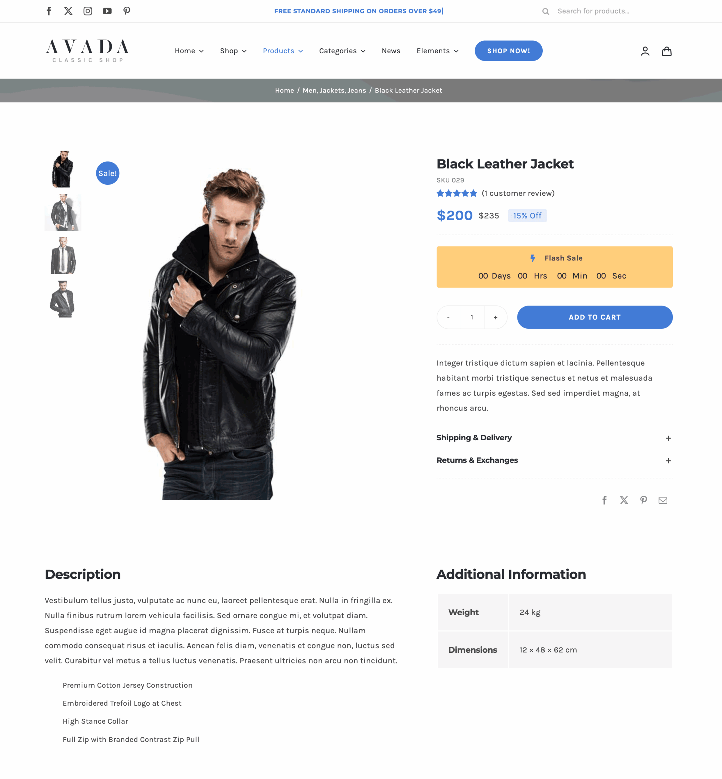
The Avada Woo Additional Info Element displays extra product details, such as attributes, dimensions, specifications, and more, that are added to the product. The information is presented in a structured format on the single product page. With styling and layout options in the Avada WooCommerce Builder, you can control how these details appear, blending in seamlessly with your website’s branding.
Watch the video below for a visual overview of Avada Layout Elements, and view the Avada Woo Additional Information Element page. Read on to see the complete list of options.
How To Use The Woo Additional Information Element
The Avada Woo Additional Information Element will display information from the product, such as Weight or Dimensions (which are added in the Shipping tab) or any Attributes added in the Attributes tab.
Element Options
Location: The edit screen within each Element.
Within each of the Elements, you will see a tab or tabs that house an array of options that make it possible for you to configure each Element independently, and greatly enhance your flexibility and creative options.
Note: Please note that the displayed options screens below show ALL the available options for the element. If you have Avada’s Option Network Dependencies turned on, you will only see options relevant to your selections, and so the options screen may look somewhat different.


